Search Results for: bigquery
A Vision Of The Future: GDELT + Google Cloud Vision API
The past year has been an incredible year for GDELT. With the public release of GDELT 2.0, we now monitor…
O'Reilly Ideas: Analyzing The World's News
Kalev and Felipe wrote an article for O'Reilly Ideas titled "Analyzing the world’s news: Exploring the GDELT Project through Google…
Complex Queries: Combining Events, EventMentions, and GKG
A common request revolves around filtering events to just those mentioned in articles that focus on certain themes or groups….
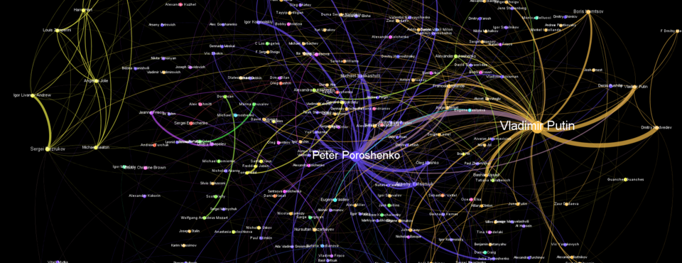
Visualizing The Global Influencer Network
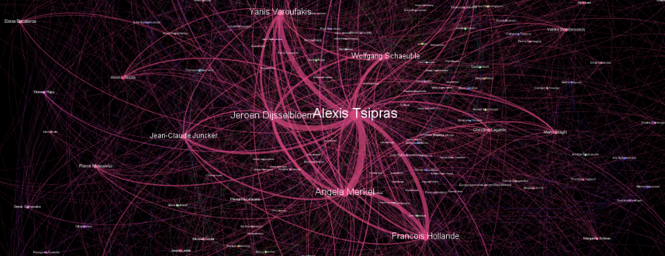
Kalev's latest Forbes piece explores the connections that defined 2015 by constructing a network diagram over the people mentioned in…
GDELT 2.0 GKG Reaches 150 Million Records
We're excited to announce that earlier today the GDELT 2.0 Global Knowledge Graph (GKG) reached a total of just over 150 million…
Getting Started with GDELT + Google Cloud Datalab: Simple Network Visualizations
Following up from our last post of simple timeline visualizations you can make using Google's new Cloud Datalab, Felipe Hoffa…
Getting Started with GDELT + Google Cloud Datalab: Simple Timelines
Google recently released Google Cloud Datalab which provides a cloud-hosted version of Jupyter/IPython that is tightly coupled with Google BigQuery, Google…
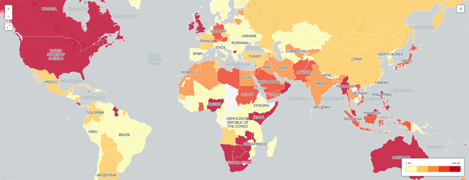
Map of Global Antitank and MANPADS Weapons
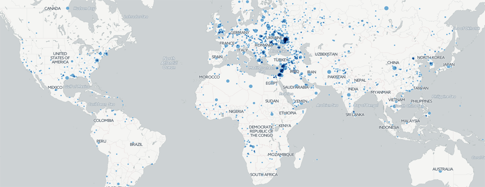
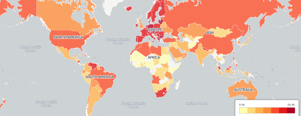
Kalev's latest piece for Forbes includes an interactive CartoDB map visualizing eight months of global coverage of antitank and MANPADS…
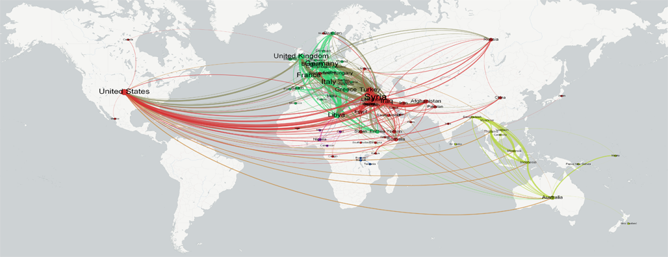
Network Visualization of Global Refugee Flows
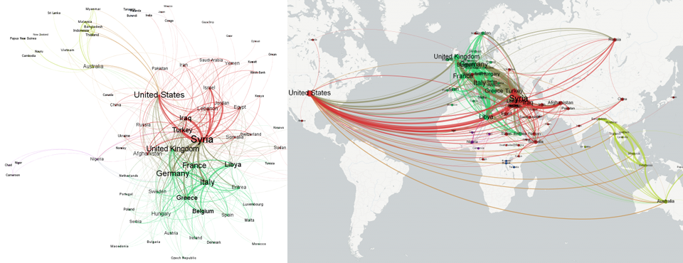
Kalev's latest piece for Forbes, mapping the global flow of refugees through creating geographic networks from GDELT, includes several visualizations…
Mapping The Global Flow of Refugees Through News Coverage
Kalev's latest piece for Forbes explores creating geographic networks tracing the global flow of refugees using network co-occurrence analysis to…
Assessing Turkey's Physical Stability And Societal "Mood"
Kalev's latest piece for Forbes explores how GDELT can be used to assess Turkey's physical stability using the GDELT Event…
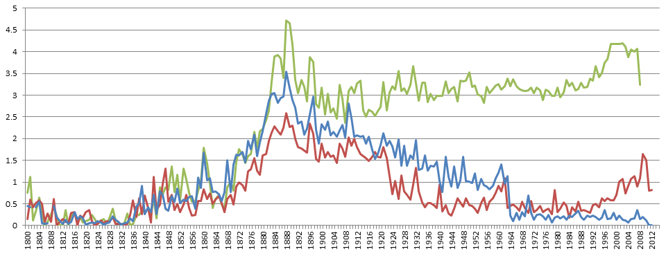
The World As Seen Through Books: Comparing the Internet Archive, HathiTrust, and Google Books Ngrams Collections
With the proliferation of cheap high-resolution digital imaging hardware and falling storage costs, mass digitization initiatives have gone mainstream, bringing…
Mapping 212 Years of History Through Books
Kalev's latest Forbes piece includes an incredible new interactive animated zoomable map of 212 years of world history as seen through…
What It Looks Like to Process 3.5 Million Books
While we'll be putting together a longer piece soon that goes into far more detail on how we processed the…
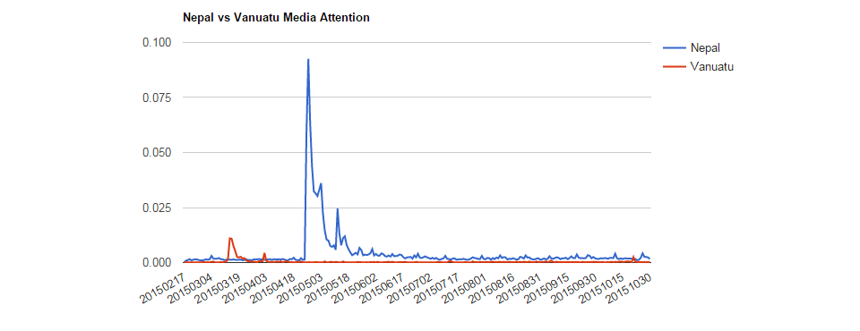
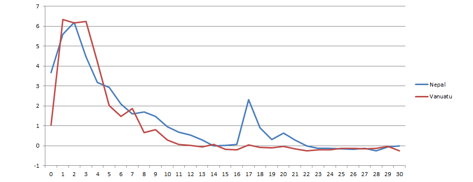
Towards a Generalized Model of Media Fatigue: Vanuatu & Nepal
The results of our collaboration with IRIN to explore the effects of media fatigue in coverage of the April 24th,…
IRIN News: The Nepal Earthquake at Three Months: Media Fatigue and Bias
In collaboration with IRIN News, on the three-month anniversary of the Nepal Earthquake, we wanted to explore what it looks like…
Mapping the Geographic Networks of Global Refugee Flows
Today we unveil a visualization of global refugee flows as seen through the eyes of the world's press. More precisely,…
Mapping Greece Through the Eyes of the World
Today we unveil a map of the unfolding Greek crisis as seen through the eyes of the world's news media…
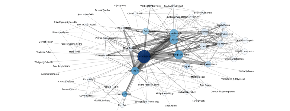
A Network Diagram of Greece July 1-15
Using the sample GKG 2.0 BigQuery network query, the following visualization shows the network of the top 1,500 connections among…
Linguistic Geography: Mapping the Languages of GDELT February-July 2015
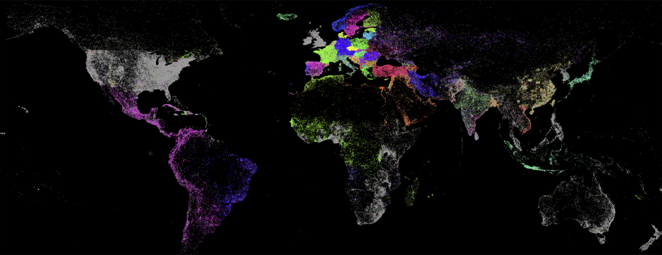
We're excited to unveil a new visualization that showcases the power of GDELT's realtime machine translation of the world's local news…
Mapping the Geography of GDELT: February-July 2015
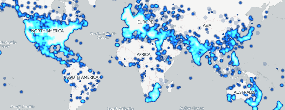
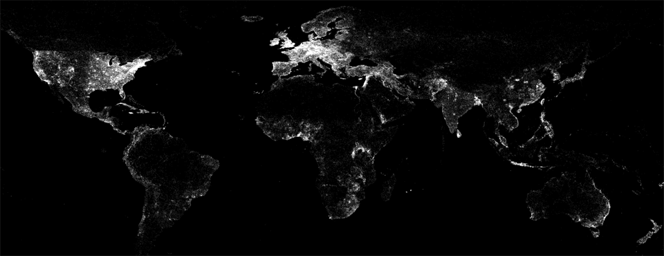
We're excited to unveil a new visualization that showcases the incredible reach of GDELT 2.0. The map below displays a…
Mapping Global Protests Redux
Two years ago Pennsylvania State University doctoral student John Beieler put together an animated map of global protests over the…
Mapping ISIS: Three Months of Global ISIS Narrative
In the latest addition to our map series using CartoDB, we plot all worldwide news coverage monitored by GDELT 2.0 from…
Making Of: Mapping Three Months of Poaching, Drones, and Cyber
Despite being up less than 12 hours, we've already been getting some great feedback on our latest map series, which…
