Search Results for: bigquery

Google Cloud Platform Global User Conference NEXT 2016
GDELT was mentioned briefly during the "DATA & ANALYTICS: Pushing the Limits of BigQuery" session at the Google Cloud Platform Global…
NGramming 9.5 Billion Words of Arabic News
One of the amazing things that happens when you monitor the world at GDELT's scale is that you begin to…
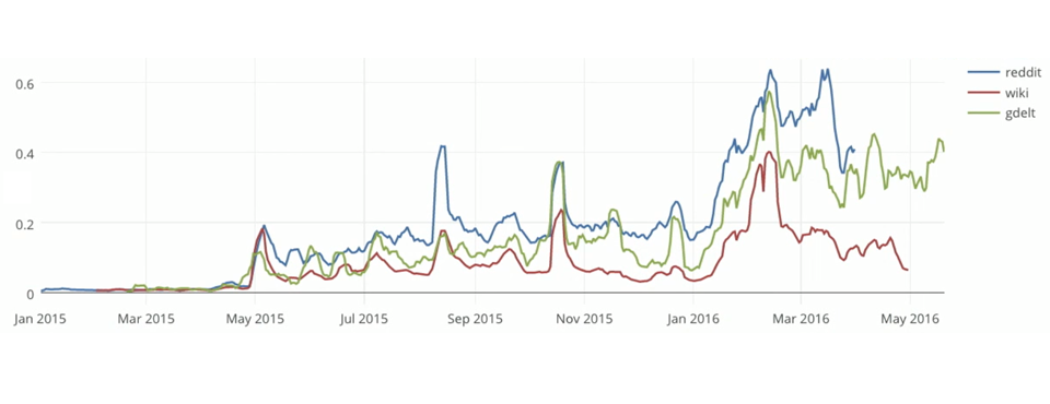
Google I/O 2016: Tracking The Election Through GDELT / Reddit / Wikipedia
In their lively and fast-paced Google I/O 2016 talk, Felipe Hoffa and Jordan Tigani trace mainstream and social media coverage of…

Google I/O 2016: Election 2016 The Big Data Showdown
Felipe Hoffa and Jordan Tigani offered a fantastic fast-paced look at Google BigQuery in their session at Google I/O 2016, showcasing how…

Paris, Georgia and Trump Fixes
We recently made three bug fixes to address two geographic issues and one person name extraction issue. Mapping the textual geography…
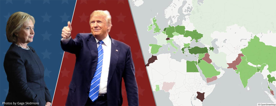
CuriousGnu: How The World Sees Hillary Clinton & Donald Trump
CuriousGnu used BigQuery put together a set of fantastic maps in CartoDB using GDELT to map the average tone of…
GDELT Visual Knowledge Graph Reaches 46 Million Images
We are tremendously excited to announce that as of this afternoon, the GDELT Visual Knowledge Graph (VGKG) has reached 46…
New GKG 2.0 Article Metadata Fields
With the debut this week of our massive new document extraction platform, we are tremendously excited to unveil several new…
The Datasets Of GDELT As Of February 2016
What would it look like to use massive computing power to see the world through others’ eyes, to break down…
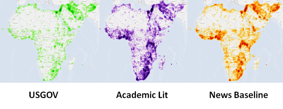
Announcing The GDELT 2.0 Release Of The Africa And Middle East Global Knowledge Graph (AME-GKG)
Today we are enormously excited to announce the GDELT 2.0 release of the Africa And Middle East Global Knowledge Graph (AME-GKG)…
Mapping Global News Imagery Via Google Cloud Vision API
To showcase the power of the new Visual Global Knowledge Graph (VGKG), which reached 19.6 million images as of March 1st,…

US Department of Defense SMA Speaker Series Presentation 2016
Kalev presented today as part of the US Department of Defense SMA Speaker Series, providing an update on GDELT's massive progress…
What It Looks Like To Process 3.5 Million Books In Google’s Cloud
GDELT's processing of the complete 1800-2015 English-language public domain digitized books collections from the Internet Archive and HathiTrust (totaling 3.5…
Visual Global Knowledge Graph (VGKG) February 2016 Snapshot Dataset
Given the enormous interest we've been receiving in the new GDELT Visual Knowledge Graph (VGKG), which processes an ever-growing fraction…
GDELT Visual Knowledge Graph (VGKG) V1.0 Available
We're excited to announce that as of late yesterday afternoon, Version 1.0 of the GDELT Visual Knowledge Graph (VGKG) is…
Announcing the American Television Global Knowledge Graph (TV-GKG)
We are enormously excited to announce today the unveiling of our latest massive new dataset: the American Television Global Knowledge…

Fortune Article On Big Data For Research Era Mentions GDELT
A article in Fortune from last month about Yahoo's latest release of another large web dataset for academic use cites…

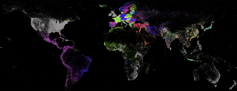
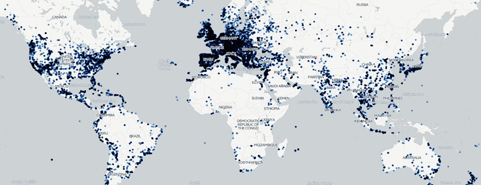
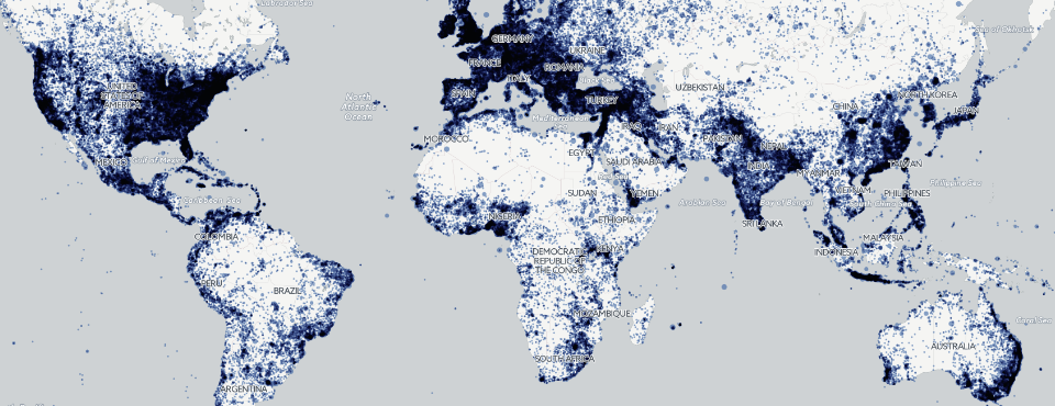
Mapping World Happiness And Conflict Through Global News And Image Mining
A series of maps of the world as seen through nearly 200 million global news articles, 1.4 million photographs, 89 million…
Making a Global Conflict Map of 2015
A perennially popular request is the creation of global "conflict maps" summarizing the state of world events over time and…
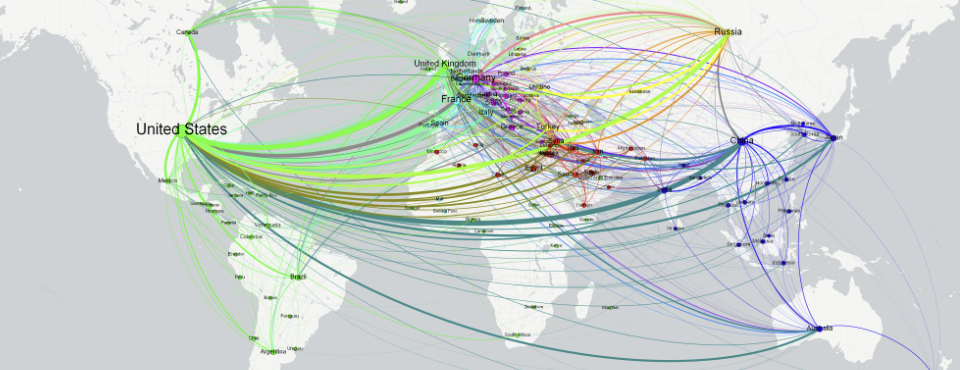
A Country-Level Network Diagram of 2015
Following in the footsteps of yesterday's city-level network diagram of the world, we've put together the following two visuals, illustrating…
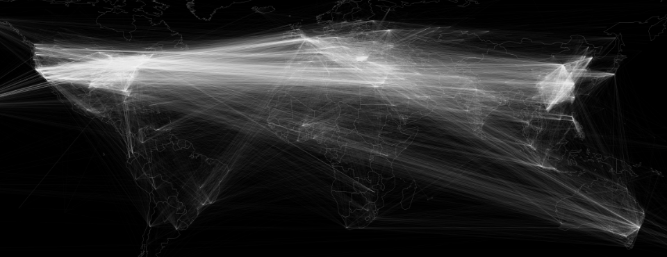
A City-Level Network Diagram of 2015 In One Line of SQL
What would it look like to visualize how the world's cities are connected through worldwide news reporting in 2015? Looking…
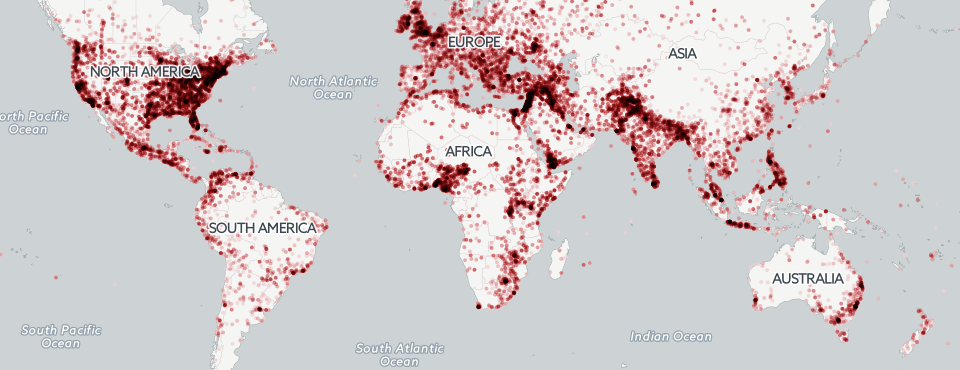
Mapping The 2015 Media Geography In One Line of SQL
Kalev's latest Forbes piece includes an interactive clickable map of the major news outlets covering each location on earth, as…
72 Hours Of Fire Imagery: Saudi Protests & Yemen Bombings
With the arson attack on the Saudi Arabian embassy in Iran last night, we wanted to see how well the…
Announcing The New GDELT Visual Global Knowledge Graph (VGKG)
We’re enormously excited to announce today a transformative moment for GDELT: the alpha release of a highly experimental, but extraordinarily…