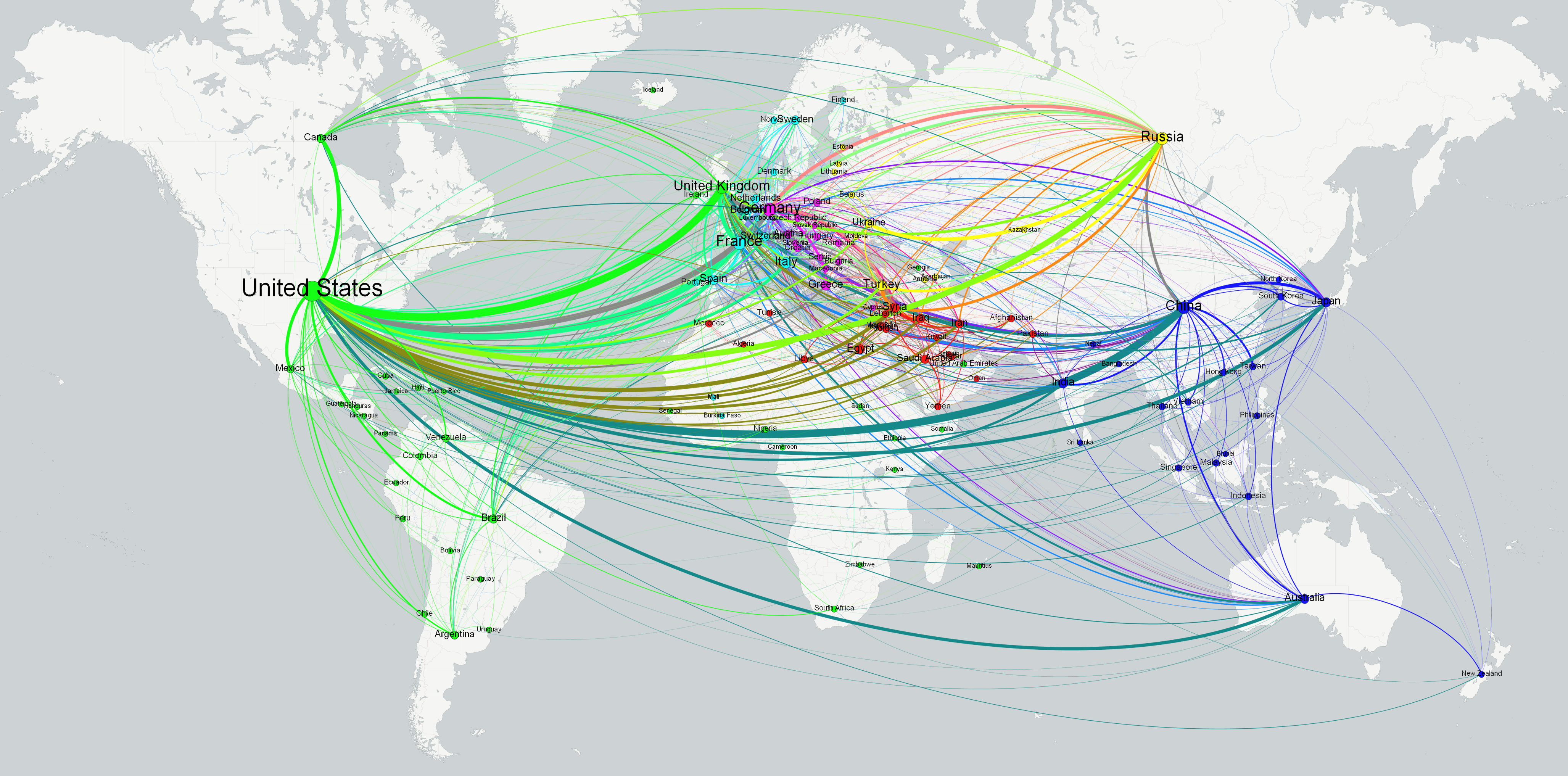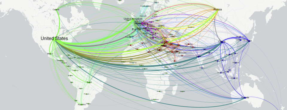
Following in the footsteps of yesterday's city-level network diagram of the world, we've put together the following two visuals, illustrating how the world's countries co-occurred through the nearly 200 million news articles monitored by the GKG in 2015. We used the exact same code from last July's refugee networks, requiring just a single block of SQL in Google BigQuery and a simple PERL script to convert the output to GEXF format, and then visualized using Gephi.