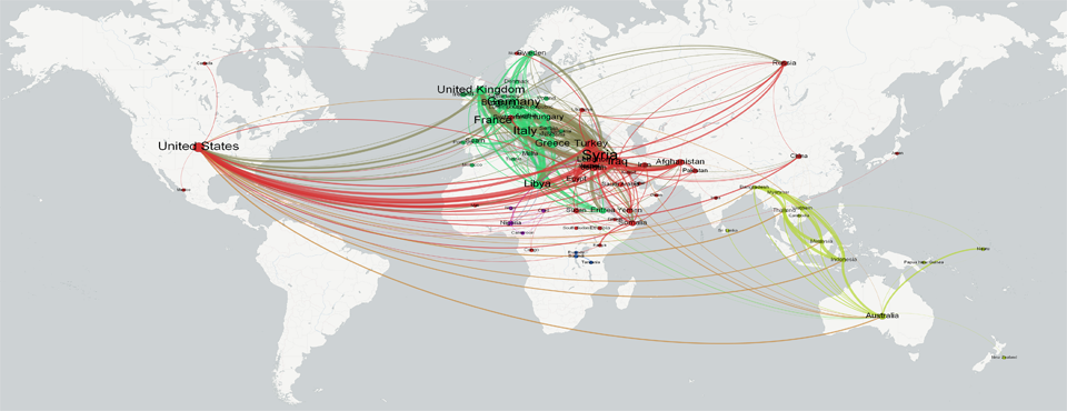
Today we unveil a visualization of global refugee flows as seen through the eyes of the world's press. More precisely, the network diagrams below map which countries appear most frequently together in global news coverage of refugees from February to July 2015. A connect reflects only that two countries are mentioned closely together in news coverage, which does not guarantee that there is a strong flow of refugees between the two countries, but a quick glance at the networks below suggests that this approach offers a strong approximation of actual flows. Only the top 500 strongest links are shown below, so not all of the world is visible, but this approach offers a powerful way of visualizing geographic flows data through GDELT.
The network diagram below positions nodes based on connection strength, with countries that appear more frequently together being placed closer together in the network. Nodes are sized based on degree strength and color-coded by modularity finding (countries that co-occur more frequently with each other than with other countries are colored the same – offering a rough approximation of community/clustering).

The visualization below shows the same network, but orients nodes geographically to make regional flows more visible.

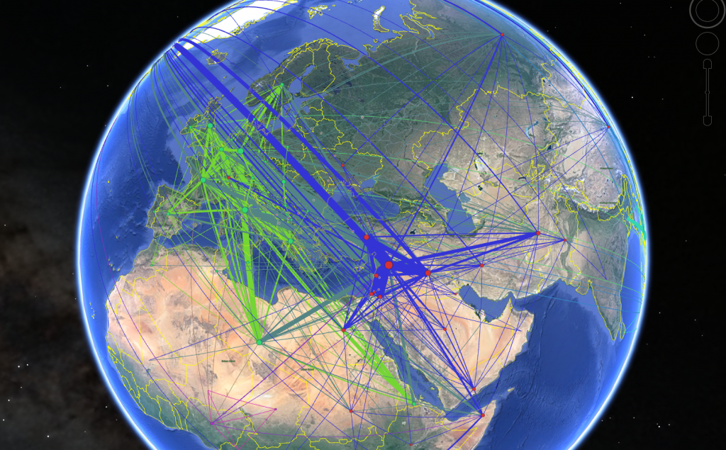
Finally, you can also view the network in Google Earth, though the edge colors will not match those above (right-click on the image below and download the KMZ file and then open in Google Earth).
Technical Details
There are several components to making the network visuals above. Before you begin, you will need to make sure you have the open-source Gephi network visualization package installed. As usual, we use the copy of GDELT GKG 2.0 housed in Google BigQuery and use the following query, adapted from our BigQuery + GDELT Samples, to select all of the articles published since February that mention the GDELT Theme "REFUGEE" at least three times in the article. The query goes further, parsing the contents of the V2Locations field, extracting the country code field of each country, and constructing a network diagram over which countries co-occur most frequently together:
SELECT a.name, b.name, COUNT(*) as count
FROM (FLATTEN(
SELECT GKGRECORDID, UNIQUE(REGEXP_EXTRACT(SPLIT(V2Locations,';'),r'^.*?#.*?#(.*?)#')) name
FROM [gdelt-bq:gdeltv2.gkg]
WHERE V2Themes like '%REFUGEE%REFUGEE%REFUGEE%'
,name)) a
JOIN EACH (
SELECT GKGRECORDID, UNIQUE(REGEXP_EXTRACT(SPLIT(V2Locations,';'),r'^.*?#.*?#(.*?)#')) name
FROM [gdelt-bq:gdeltv2.gkg]
WHERE V2Themes like '%REFUGEE%REFUGEE%REFUGEE%'
) b
ON a.GKGRECORDID=b.GKGRECORDID
WHERE a.name<b.name
GROUP EACH BY 1,2
ORDER BY 3 DESC
LIMIT 500
Save the results to your computer as a CSV file (call it "REFUGEES.CSV" for this example). Now, download the "COUNTRY-GEO-LOOKUP.TXT" lookup file and save to the same directory. This is a lookup file that maps country codes to their human labels and geographic centroids. Now, download the "parsebqcsvtogeogephi.pl" PERL script to the same directory. This script will rewrite our BigQuery results CSV file into a Geographic Gephi file (a .GEXF file with special geographic attributes). Run the PERL script via "./parsebqcsvtogeogephi.pl ./REFUGEES.CSV". A few seconds later you should have a new file "REFUGEES.CSV.GEXF" that is the resulting Geographic Gephi file.
Open this file in the latest version of Gephi. In "Overview", under "Layout", choose "Geo Layout", set "Projection" to "Mercator" and hit the Run button. A few seconds later all of the nodes should be positioned at their correct geographic location. Now choose "Partition > Nodes" and color by Modularity and "Ranking > Nodes > Degree" to size the nodes by degree (or use an alternative measure). Finally, under Preview, make sure that "Rescale weight" is checked under "Edges" and set "Thickness" to a number like 30, and click on the "…" button beside "Font" under "Node Labels" to set the font size to a desired size like 10. Finally, click on "Export: SVG/PDF/PNG" at the bottom left of the screen, chose PNG as the file type, and click on the "Options" button and set the dimensions to 4000 by 4000 pixels and make sure that "Transparent Background" is checked. Then save the PNG to your computer. Now, find an appropriate map in a Mercator or Web Mercator projection, load both the map and your PNG into Photoshop or a similar editing program, and overlay the PNG on top of the basemap. You will likely have to adjust the PNG slightly by resizing it to fit properly. Congratulations, you should now have a geographic network that looks like the one above!
Finally, if you have the "ExportToEarth" Gephi plugin installed you can choose "File > Export > Graph File" and then choose "KMZ" as the filetype – make sure to click the Options button to make sure the plugin has properly discovered the latitude and longitude columns.