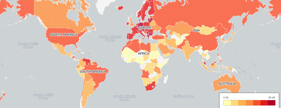
Today we unveil a map of the unfolding Greek crisis as seen through the eyes of the world's news media July 13 to July 18, 2015 (GMT timezone). Unlike our previous maps, which have displayed dots at each location mentioned in the context of a topic, regardless of where the underlying coverage originated from, this choropleth map does the inverse: each country is color-coded by the percentage of that country's own news coverage (news outlets based in that country) that focused on Greece, while clicking on a country will display a list of the first 50 articles from news outlets in that country discussing Greece. Only articles mentioning Greece at least three times were selected, thus in the map below you'll notice that only 29% of the total monitored news output of Greece is deemed to focus on Greece, since routine domestic coverage may only mention a location in Greece once or may discuss locations and events outside of Greece.
In other words, when you click on a country in the map below, you will see how the news outlets in that country covered Greece last week. Since Greece was such a popular topic, only the first 50 articles from each country are listed.
We're tremendously excited about this new mapping methodology for GDELT, as it opens all kinds of new possibilities for geographic access to the world's news!
Technical Details
Making the map above is actually simpler than making the city-level geographic focal maps we've used in the past. To start off with, we use the copy of GDELT GKG 2.0 housed in Google BigQuery and use the following query to return all of the articles published last week mentioning Greece at least three times in the article:
SELECT DocumentIdentifier, SourceCommonName, SharingImage FROM [gdeltv2.gkg] where V2Locations like '%Greece%Greece%Greece%' and DATE>20150713000000 and DATE<20150718999999 order by DATE asc
Save the results as their own CSV file on your computer (call it "GREECE.CSV" for this example). Since the total volume of daily news coverage varies so much by country, if we just mapped the raw number of mentions of a topic by country, we would always get a list that simply emphasized countries with the largest media systems. Thus, we are also going to run a second query that will count up the total number of articles by news outlet over the same time period across all topics (in other words we're going to drop the Greece part of the query, but leave the date part of the query intact):
SELECT SourceCommonName, count(1) FROM [gdeltv2.gkg] where DATE>20150713000000 and DATE<20150718999999 group by SourceCommonName
Save the results as their own CSV file on your computer (call it "GREECENORM.CSV" for this example).
Now, download the DOMAINSBYCOUNTRY-ALLLANGUAGES.TXT lookup file from our previous Multilingual Source-Country Crossreferencing Dataset post and save it to the same directory. Then, download the "parsebqcsvtogeojson_countrychoropleth.pl" PERL script to the same directory. Finally, run the PERL script via "./parsebqcsvtogeojson_countrychoropleth.pl ./GREECE.CSV ./GREECENORM.CSV". A few seconds later you should have a file called "GREECE.CSV.CARTODB.CSV". Upload this file to your CartoDB account. CartoDB should automatically georeference the country labels into their respective polygons and create a polygonal layer in the resulting map. Once the map has loaded into CartoDB, use the Wizard and set the map type to "Choropleth" and you should get a map that looks very much like the one above.
Note that you will invariably see errors in the map above, either from incorrect document extraction, translation errors, or errors in the estimation of the geographic location of a news outlet (which is an extraordinarily difficult task to perform at a global scale).
Congratulations! We can't wait to see what you're able to do with this new capability, perhaps blending with the city-level geographic contextualization maps. Happy Mapping!