Lying at the heart of our series this week exploring the visual landscape of television news across the world has been one central question: how do the universes of television news differ across the world? Perhaps the most existential and important question in the field of global media analysis is this question of how the media of each country contextualize, frame, portray and tell each day's stories and the degree to which the citizenry of each nation sees the same stories told in the same way. What would it look like to take a single day of television news and visualize the combined visual landscape of Chinese, Iranian and Russian coverage that day to examine just how much they overlap or differ?
To explore this question, we examined 24 hours of coverage from a single day (October 17, 2023 UTC time) from one channel each from three countries: China (CCTV-13), Iran (IRINN) and Russia (Russia 1). We examined one frame every four seconds from the entire day and used multimodal image embeddings to represent them in a combined unified visual semantic space, visualizing through two methods: PCA and t-SNE. In other words, each image was converted to a 1,408-dimension vector called an "embedding" that represents the topical and thematic focus of its contents. We then used two methods to spatially arrange the images in a 2D scatterplot based on how similar they are, with PCA better preserving their global-scale foci and t-SNE better capturing their micro-level patterns.
While the results below present a fairly unambiguous story of three parallel media universes, with minimal shared overlap between Iranian and Russian television and negligible overlap of either with Chinese television, there are many unknowns.
The first is to what degree these differences are due to the specific channels selected (CCTV-13, IRINN and Russia 1) and whether the results would be different with a different selection. The random seeds used for the PCA and t-SNE layouts could also play a role, as could the selection of those specific algorithms. Given that all major multimodal embedding models, whether hosted APIs like GCP's Vertex AI Multimodal Embedding model used here or freely available models like OpenAI's CLIP, perform implicit OCR, the disjoint languages of the three channels' onscreen text could have a major discriminating effect. In theory, the multilingual training data of these models should allow them to look across linguistic differences, but it is unclear just how well the models have learned language-agnostic textual relationships and thus it is possible that the models have latched onto the three languages as primary discriminators. At the same time, the greater overlap between Iranian and Russian television compared with Chinese television presents some amount of evidence against this in that the three channels not only use different languages but different scripts. Could it be that the chyrons and other textual presentations of Iranian and Russian television simply cover more similar topics?
It is also possible that technical differences, such as the density and positioning of onscreen text and the layout and use of split screen presentations are also major factors, though a closer look at the imagery suggests this is much less likely. The dominate color schemes and thematic styles of the three channels differ substantially, but visual presentation is a major factor of visual storytelling and narrative and thus differences driven by these dimensions would be methodologically important. Given the anecdotal evidence of yesterday's comparison of domestically and internationally-focused Iranian television news and their differing use of kinetic imagery of destruction versus the use of human narrators in the Hamas-Israel conflict, it could also simply be possible that the three channels are covering similar events through different kinds of visuals and storytelling methods and metaphors, which would be hugely important findings.
Most importantly, multimodal embeddings are trained on short descriptive textual descriptions of images, such as captioning data. The specific composition of the training data and its geographic, linguistic and cultural representativeness may also play a key role in how well they are able to look beyond constraints like linguistic and cultural differences or whether those are inadvertently major fault lines in their models' semantic representations of the world.
In the end, the results here present a strong and fairly unambiguous narrative of parallel media universes around the world, but further work will be required along each of the dimensions above to better understand these findings and the degree to which they reflect genuine differences versus artifacts of the AI world.
For those interested in the technical underpinnings and code, we used GCP's Vertex AI Multimodal Embedding model to compute the embeddings and you can download the Python notebooks for both single-broadcast and full-day visuals from our previous experiments. The code used here can be found at the end of this post.
PCA
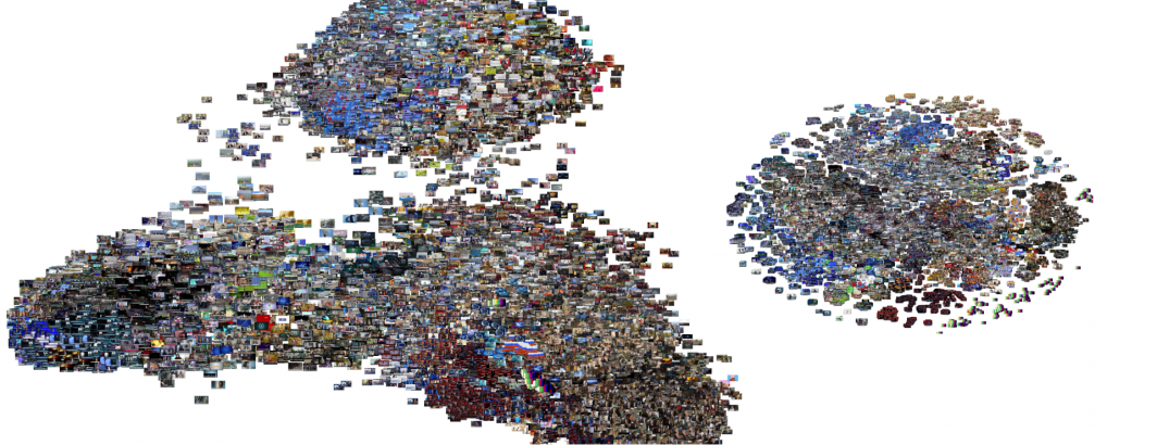
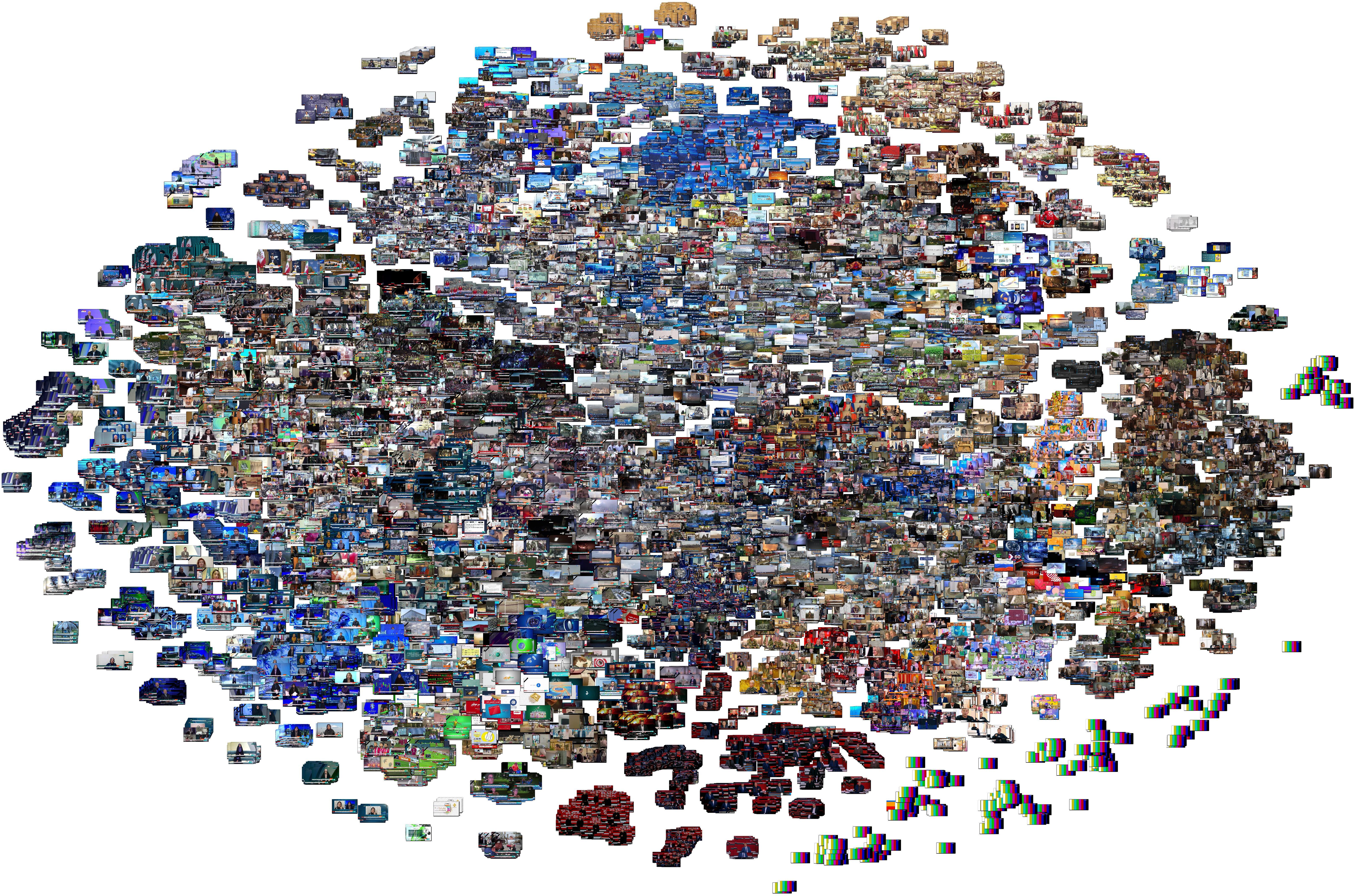
Let's start with the PCA layout, seen below. Immediately clear is that the three channels break into three entirely disjoint superclusters, with China at top, Russia at bottom right and Iran at bottom left. There is little overlap between China and the other two channels, though there appears to be some level of overlap between Iran and Russia.
The high density of the graph above makes it difficult to determine whether Iran and Russia share a highly similar diffuse overlap or whether the long tail connecting them is merely an artifact of the angle of the graph. To examine this further, the graph below represents a random subsample of 5,000 of the 66,590 images above. They are also colored by the HDBSCAN-assigned cluster for each. Here it is immediately clear that the apparent overlap above between Iran and Russia is merely an artifact and that in fact the three clusters are highly divergent, each capturing its own distinct narrative universe. Chinese coverage is more compact, while Iranian and Russian coverage is more diffuse. There is indeed some degree of overlap between Iran and Russia, far more than with China, but they are still highly divergent narrative environments.
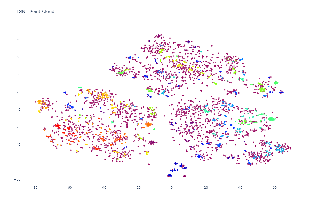
t-SNE
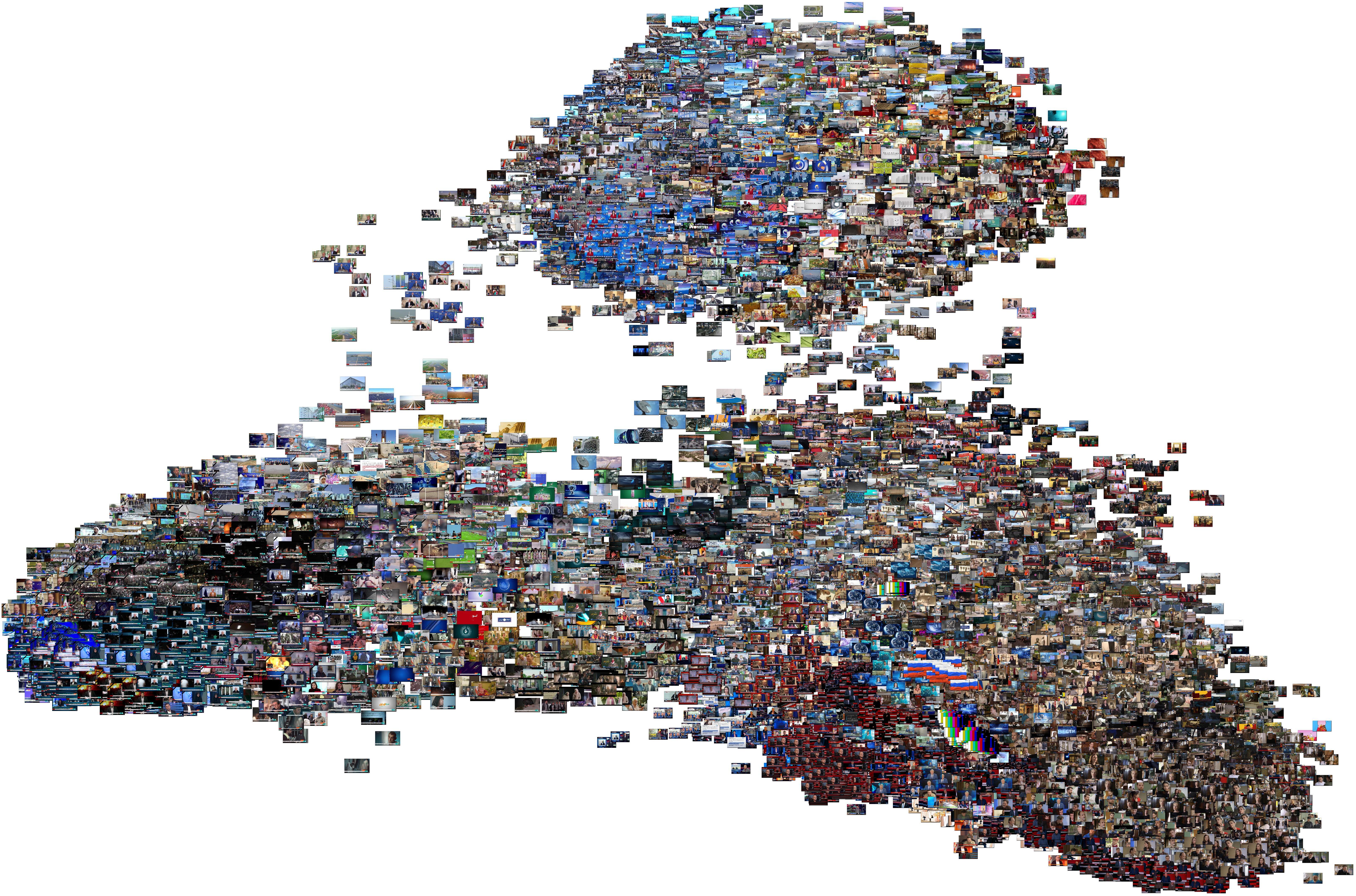
In contrast with PCA's global-scale structural examination, t-SNE tends to cluster into much smaller topically and thematically uniform clusters. Even here, the clusters still break by channel, with little cross-channel clustering even of highly similar visual and topical presentations. Look closely and you'll see three macro-level fracture lines through the graph dividing it into three equal thirds: a slight V-shaped line just above the middle and a vertical one from that line to the bottom angling to the left.
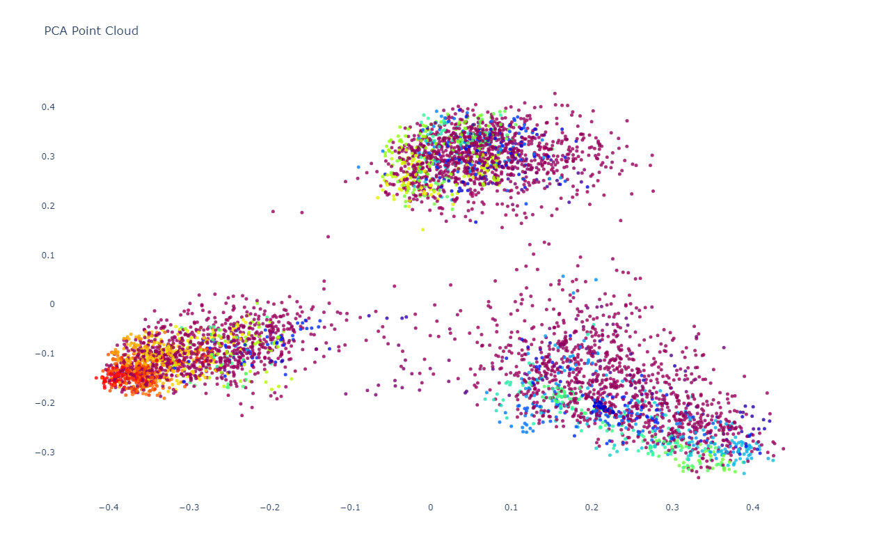
As before, let's visualize the same random subset of 5,000 images as a point cloud to make the structure more visible. Here we can see the macro fracture lines starkly clearly, with each of the channels forming its own disjoint superstructure of tight clusters with minimal overlap.
For those interested in the technical workflow, here is the combined China-Iran-Russia embedding file (1.2GB):
To generate the two image graphs, use the following Python script. Save to "run.py" and run as "python3 ./run.py". Note that due to high memory consumption, you'll likely need to run twice: once for the PCA and once for the t-SNE visualizations to generate them separately.
#########################
#LOAD THE EMBEDDINGS...

import numpy as np
import matplotlib.pyplot as plt
from PIL import Image
import jsonlines

# Load the JSON file containing embedding vectors
def load_json_embeddings(filename):
    embeddings = []
    image_filenames = []
    with jsonlines.open(filename) as reader:
        for line in reader:
            embeddings.append(line["embed"])
            image_filenames.append(line["imagefilename"])
    return np.array(embeddings), image_filenames

json_file = "RUSSIA1-IRINN-CCTV13-20231017-FULLDAY.embeds.json"
embeddings, image_filenames = load_json_embeddings(json_file)
#########################
#VISUALIZE THE EMBEDDINGS...

from sklearn.manifold import TSNE
from sklearn.decomposition import PCA
import matplotlib.pyplot as plt

def plotImageCloud(embeddings, image_filenames, title, algorithm, outfilename):
    if (algorithm == 'PCA'):
        tsne = PCA(n_components=2, random_state=42)
        embeds = tsne.fit_transform(embeddings)
    if (algorithm == 'TSNE'):
        tsne = TSNE(n_components=2, random_state=42)
        embeds = tsne.fit_transform(embeddings)
    if (algorithm == 'PCATSNE'):
        embeds = PCA(n_components=50, random_state=42).fit_transform(embeddings)
        embeds = TSNE(n_components=2, random_state=42).fit_transform(embeds)

    f = plt.figure(figsize=(90, 60))
    ax = plt.subplot(aspect='equal')
    sc = ax.scatter(embeds[:,0], embeds[:,1])
    _ = ax.axis('off')
    _ = ax.axis('tight')

    from matplotlib.offsetbox import OffsetImage, AnnotationBbox
    for i in range(len(image_filenames)):
        image = Image.open(image_filenames[i])
        im = OffsetImage(image, zoom=0.10)
        ab = AnnotationBbox(im, embeds[i], xycoords='data', pad=0.00)
        ax.add_artist(ab)

    #plt.title(title) #remove title to maximize pixel space...
    #plt.show()
    plt.savefig(outfilename)


#compare PCA and TSNE...
plotImageCloud(embeddings, image_filenames, 'PCA Clustering', 'PCA', './RUSSIA1-IRINN-CCTV13-20231017-FULLDAY-pca.jpg')
#plotImageCloud(embeddings, image_filenames, 'TSNE Clustering', 'TSNE', './RUSSIA1-IRINN-CCTV13-20231017-FULLDAY-tsne.jpg')
#########################
You can remove the surrounding whitespace using:
convert RUSSIA1-IRINN-CCTV13-20231017-FULLDAY-pca.jpg -trim RUSSIA1-IRINN-CCTV13-20231017-FULLDAY-pca-trim.jpg
convert RUSSIA1-IRINN-CCTV13-20231017-FULLDAY-tsne.jpg -trim RUSSIA1-IRINN-CCTV13-20231017-FULLDAY-tsne-trim.jpg
For the point cloud visualizations, we'll first generate our random sample:
shuf -n 5000 RUSSIA1-IRINN-CCTV13-20231017-FULLDAY.embeds.json > RUSSIA1-IRINN-CCTV13-20231017-FULLDAY.embeds.sample.json
Then we'll visualize using this Python notebook (you can run in the free version of Google's Colab environment):
!pip install jsonlines
import numpy as np
import matplotlib.pyplot as plt
from PIL import Image
import jsonlines

!wget "https://storage.googleapis.com/data.gdeltproject.org/blog/2023-multimodalembeddingexperiments/RUSSIA1-IRINN-CCTV13-20231017-FULLDAY.embeds.sample.json"

# Load the JSON file containing embedding vectors
def load_json_embeddings(filename):
    embeddings = []
    image_filenames = []
    with jsonlines.open(filename) as reader:
        for line in reader:
            embeddings.append(line["embed"])
            image_filenames.append(line["imagefilename"])
    return np.array(embeddings), image_filenames
embeddings, image_filenames = load_json_embeddings("RUSSIA1-IRINN-CCTV13-20231017-FULLDAY.embeds.sample.json")

#cluster using HDBSCAN...
!pip install hdbscan
import hdbscan
def cluster_embeddings(embeddings, min_cluster_size=5):
    clusterer = hdbscan.HDBSCAN(min_cluster_size=min_cluster_size)
    clusters = clusterer.fit_predict(embeddings)
    return clusters
clusters = cluster_embeddings(embeddings, 3)

#visualize as a point cloud colored by cluster...
from sklearn.manifold import TSNE
from sklearn.decomposition import PCA
import plotly.graph_objs as graph

def plotPointCloud(embeddings, clusters, image_filenames, title, algorithm):
    if (algorithm == 'PCA'):
      pca = PCA(n_components=2, random_state=42)
      embeds = pca.fit_transform(embeddings)
    if (algorithm == 'TSNE'):
      tsne = TSNE(n_components=2, random_state=42)
      embeds = tsne.fit_transform(embeddings)

    unique_clusters = np.unique(clusters)
    print("Clusters: " + str(unique_clusters))

    trace = graph.Scatter(
        x=embeds[:, 0],
        y=embeds[:, 1],
        marker=dict(
            size=5,
            #color=np.arange(len(embeds)), #color randomly
            color=clusters, #color via HDBSCAN clusters
            colorscale='Rainbow',
            opacity=0.8
        ),
        text = image_filenames,
        hoverinfo='text',
        #mode='markers+text',
        mode='markers',
        textposition='bottom right'
    )

    layout = graph.Layout(
        title=title,
        xaxis=dict(title=''),
        yaxis=dict(title=''),
        height=800,
        plot_bgcolor='rgba(0,0,0,0)',
        hovermode='closest',
        hoverlabel=dict(bgcolor="white", font_size=12)
    )

    fig = graph.Figure(data=[trace], layout=layout)
    fig.update_layout(autosize=True);
    fig.show()

    #override the max height of the cell to fully display the graph
    from IPython.display import Javascript
    display(Javascript('''google.colab.output.setIframeHeight(0, true, {maxHeight: 1000})'''))

#compare PCA and TSNE...
plotPointCloud(embeddings, clusters, image_filenames, 'PCA Point Cloud', 'PCA')
plotPointCloud(embeddings, clusters, image_filenames, 'TSNE Point Cloud', 'TSNE')
That's all there is to it!