In this era of ever-growing crises across the world, how might machines help journalists and scholars look across the landscape of domestic television news within countries like Russia to understand their visual narrative landscapes to understand how the nations of the world are visually telling the planet's biggest stories each day and the kinds of imagery, framing, metaphors, contextualizations and visual storytelling they are using? In other words, what stories are Russian media covering and what are they saying about them? As globe-spanning crises continue to multiply, it is imperative that journalists and scholars be able to better understand the visual public information environment driving the global citizenry in the same way that they today examine its spoken word and written coverage. How might the latest generation of multimodal image embedding models allow us to examine the visual storytelling of an entire television broadcast and semantically cluster, visualize and even search in ways that allow us to understand the deeper visual patterns underlying what it is covering and how?
For this exploration, we'll examine a 30 minute segment of Russia 1 that includes a complex blend of topics, color schemes, visual presentation styles and narrative methods and which covers several different major stories of the week, presenting an ideal test of visual landscape assessment. How might visual landscape analyses help us make sense of the visual dimensions of this broadcast?
To explore this question, we'll use what's known as a multimodal embedding. Such embedding models accept either an image or a short textual passage and generate a numeric vector representation. Critically, unlike text-only or image-only embeddings, multimodal embeddings use a combined semantic embedding space for both text and images, meaning the resulting embedding vectors can be used to textually search images through rich natural language descriptions.
Here we'll use GCP's Vertex AI Multimodal Embedding model. This model has several additional advantages for our use case in that it implicitly performs a kind of OCR on imagery such that an image depicting a cat will result in an embedding highly similar to an image that contains just the textual word "cat" spelled out in the image. This means that an image of an aircraft carrier will be grouped closely with an image with a chyron announcing "aircraft carriers heading to the gulf" and an image of President Biden will be grouped closely with a chyron-bearing image discussing "Biden gives address at White House" and so on. Operationally, as a hosted embedding API, we don't need a powerful GPU cluster, we can run on any ordinary computing hardware.
The first step is to create embedding representations for each of the one-every-four-seconds preview images of the broadcast. Given that the Multimodal Embedding model automatically resizes images down to 512×512 pixels, let's reduce total bandwidth and processing time and perform the resizing ourselves:
time find ./RUSSIA1_20231017_130000_Vesti/*.jpg | parallel --eta 'convert {} -resize 512x512\> {.}.resized.jpg'
Then we'll download our embedding script and run it across all of the images. Adjust the number of parallel jobs based on your quota (defaults to 120 per minute):
wget https://storage.googleapis.com/data.gdeltproject.org/blog/2023-multimodalembeddingexperiments/exp_makeimageembed_vertex.pl
chmod 755 *.pl
time find ./RUSSIA1_20231017_130000_Vesti/*.resized.jpg | parallel --eta -j 1 './exp_makeimageembed_vertex.pl {}'
At this point we have one embedding file per image, so we'll merge them together and at the same time reformat them slightly to make them quicker and easier to load into our notebook in a moment:
wget https://storage.googleapis.com/data.gdeltproject.org/blog/2023-multimodalembeddingexperiments/exp_makeimageembed_vertex_mergeembeddings.pl
chmod 755 *.pl
time ./exp_makeimageembed_vertex_mergeembeddings.pl ./RUSSIA1_20231017_130000_Vesti
wc -l RUSSIA1_20231017_130000_Vesti.embeds.json
For those that want to skip creating the embeddings themselves, we've made the final embeddings available for download below, showcasing what the results look like:
Now we're ready to visualize and analyze the results.
Create a new Colab Notebook. First we'll install several required libraries and load them:
#install required libraries...
!pip install jsonlines
!pip install hdbscan

#imports
import numpy as np
import matplotlib.pyplot as plt
from PIL import Image
import jsonlines
import hdbscan
Now we'll load our embeddings. We'll also experiment with clustering them into distinct groups of highly similar images using HDBSCAN:
# Load the JSON file containing embedding vectors
def load_json_embeddings(filename):
    embeddings = []
    image_filenames = []
    with jsonlines.open(filename) as reader:
        for line in reader:
            embeddings.append(line["embed"])
            image_filenames.append(line["imagefilename"])
    return np.array(embeddings), image_filenames

# Perform clustering using HDBSCAN
def cluster_embeddings(embeddings, min_cluster_size=5):
    clusterer = hdbscan.HDBSCAN(min_cluster_size=min_cluster_size)
    clusters = clusterer.fit_predict(embeddings)
    return clusters

if __name__ == "__main__":
    json_file = "RUSSIA1_20231017_130000_Vesti.embeds.json"
    min_cluster_size = 3
    embeddings, image_filenames = load_json_embeddings(json_file)
    clusters = cluster_embeddings(embeddings, min_cluster_size)
Now let's visualize the visual landscape of the broadcast. We'll make a 2D scatterplot graph of the images, using a dot to represent each image and coloring it by which cluster it belongs to. All dots of a similar color belong to the same cluster, as determined by HDBSCAN. The visual layout of the dots groups the images by how similar they are to each other, with images closer to one another being more "similar" according to their semantic meaning rather than just their visual look and feel. In other words, two images of a cat, one in bright light and one in dark lighting, should be grouped closer to one another than two images of a car in bright and dark lighting, since the embedding should reflect more of the item being depicted than the color scheme of the image.
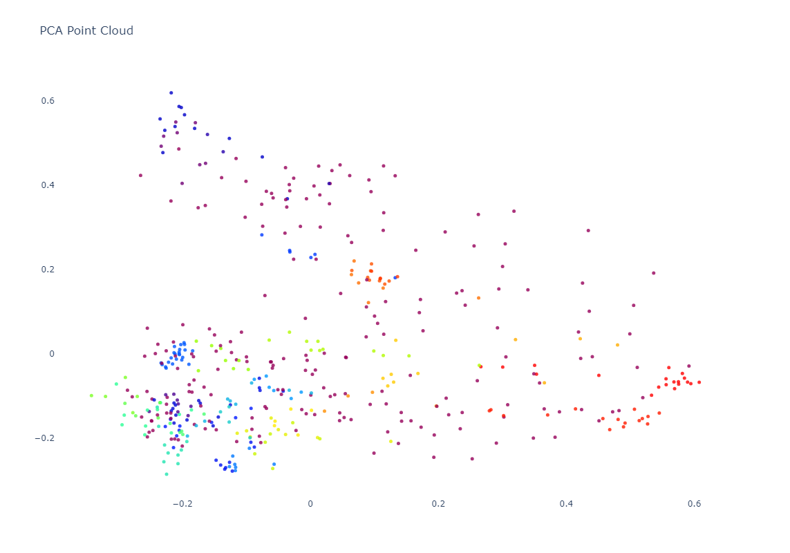
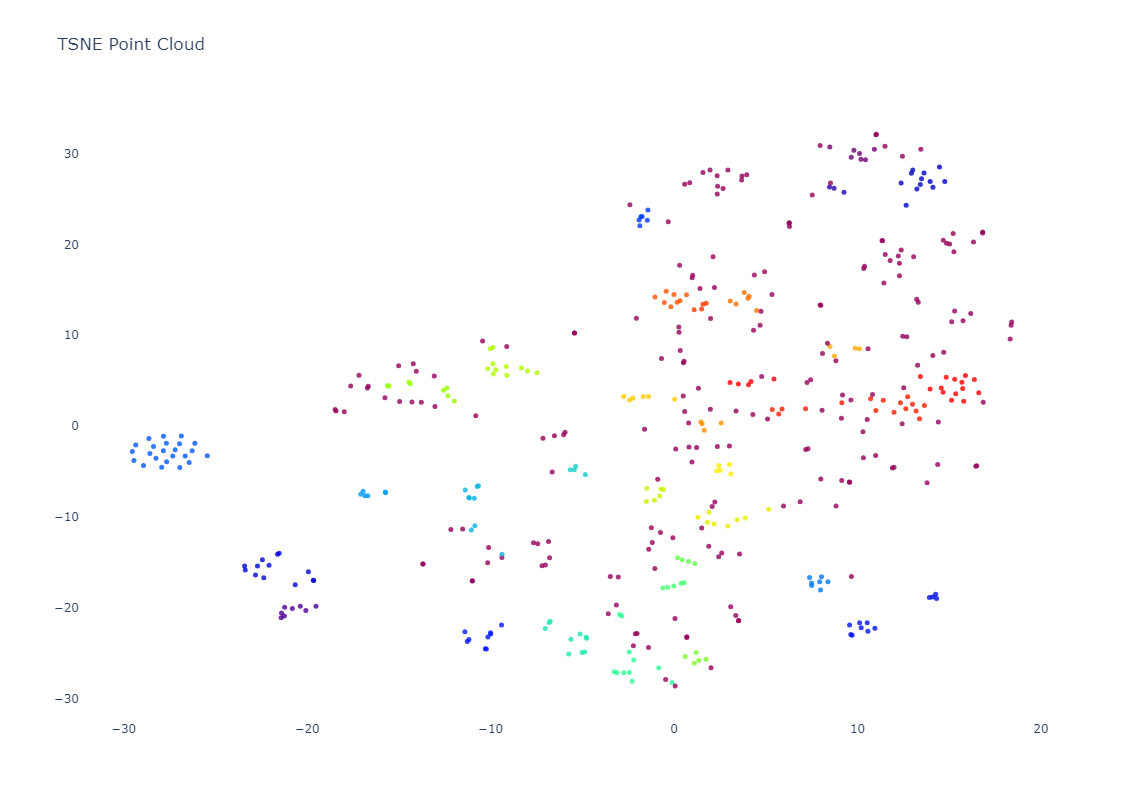
Of course, embeddings are high-dimensionality vectors. In this case, GCP's Vertex AI Multimodal Embeddings are 1,408-dimension vectors. To plot these in a 2D graph, we need to project them down from 1,408 dimensions to 2. Each projection algorithm has its own benefits and limitations. Here we'll explore two popular methods, PCA, which tends to preserve the macro global structure at the expense of micro clustering and t-SNE which emphasizes micro clustering over macro structure.
#visualize as a point cloud colored by cluster...
from sklearn.manifold import TSNE
from sklearn.decomposition import PCA
import plotly.graph_objs as graph

def plotPointCloud(embeddings, clusters, image_filenames, title, algorithm):
    if (algorithm == 'PCA'):
      pca = PCA(n_components=2, random_state=42)
      embeds = pca.fit_transform(embeddings)
    if (algorithm == 'TSNE'):
      tsne = TSNE(n_components=2, random_state=42)
      embeds = tsne.fit_transform(embeddings)

    unique_clusters = np.unique(clusters)
    print("Clusters: " + str(unique_clusters))

    trace = graph.Scatter(
        x=embeds[:, 0],
        y=embeds[:, 1],
        marker=dict(
            size=5,
            #color=np.arange(len(embeds)), #color randomly
            color=clusters, #color via HDBSCAN clusters
            colorscale='Rainbow',
            opacity=0.8
        ),
        text = image_filenames,
        hoverinfo='text',
        #mode='markers+text',
        mode='markers',
        textposition='bottom right'
    )

    layout = graph.Layout(
        title=title,
        xaxis=dict(title=''),
        yaxis=dict(title=''),
        height=800,
        plot_bgcolor='rgba(0,0,0,0)',
        hovermode='closest',
        hoverlabel=dict(bgcolor="white", font_size=12)
    )

    fig = graph.Figure(data=[trace], layout=layout)
    fig.update_layout(autosize=True);
    fig.show()

    #override the max height of the cell to fully display the graph
    from IPython.display import Javascript
    display(Javascript('''google.colab.output.setIframeHeight(0, true, {maxHeight: 1000})'''))

#compare PCA and TSNE...
plotPointCloud(embeddings, clusters, image_filenames, 'PCA Point Cloud', 'PCA')
plotPointCloud(embeddings, clusters, image_filenames, 'TSNE Point Cloud', 'TSNE')
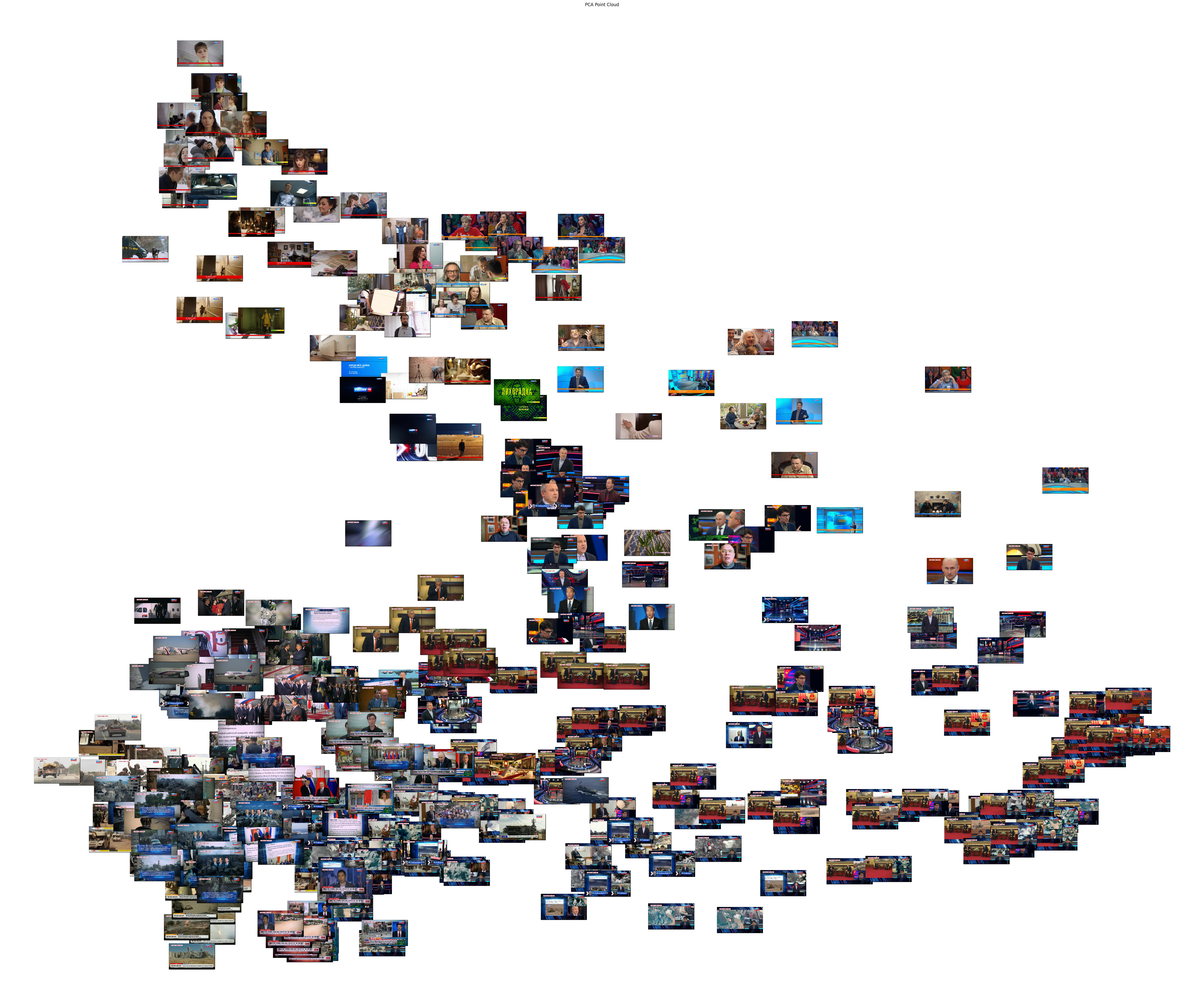
Below you can see the PCA-based clustering, representing the broadcast as a sort of sideways "V", with a dense cluster at lower-left, a long more homogenous arm at top-left and a diffuse connective cloud at right. The actual clusters themselves are fairly intermixed.
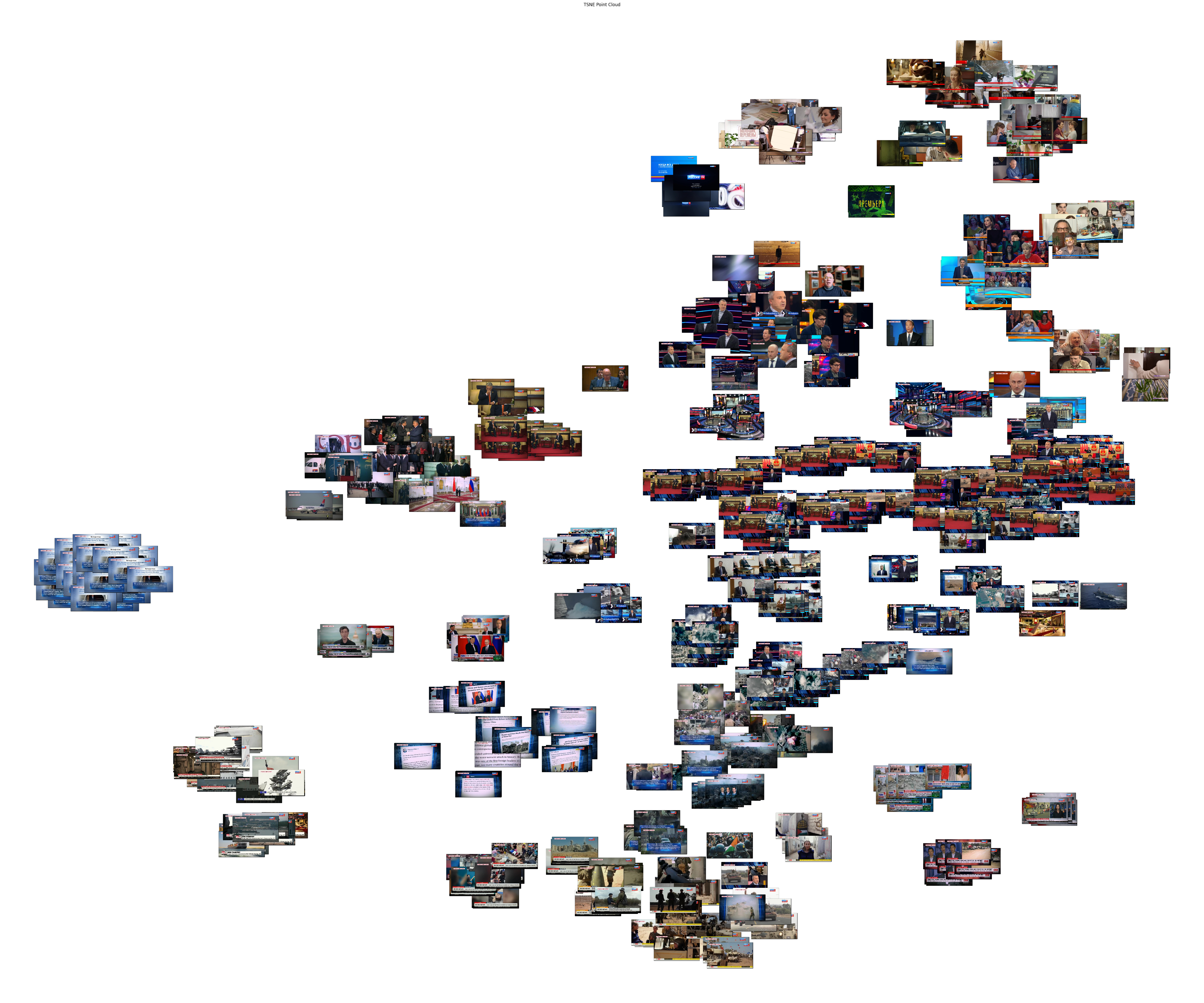
In contrast, t-SNE results in many small tight homogenous clusters scattered across the graph.
Of course, while these graphs are powerful, to truly understand what the clusters are telling us, we need to see the actual images themselves laid out in the same graph as an image cloud:
#visualize as an image cloud...
from sklearn.manifold import TSNE
from sklearn.decomposition import PCA
import plotly.graph_objs as graph

def plotImageCloud(embeddings, clusters, image_filenames, title, algorithm):
    if (algorithm == 'PCA'):
      pca = PCA(n_components=2, random_state=42)
      embeds = pca.fit_transform(embeddings)
    if (algorithm == 'TSNE'):
      tsne = TSNE(n_components=2, random_state=42)
      embeds = tsne.fit_transform(embeddings)

    f = plt.figure(figsize=(60, 50))
    ax = plt.subplot(aspect='equal')
    sc = ax.scatter(embeds[:,0], embeds[:,1])
    _ = ax.axis('off')
    _ = ax.axis('tight')

    from matplotlib.offsetbox import OffsetImage, AnnotationBbox
    for i in range(len(image_filenames)):
        image = Image.open(image_filenames[i])
        im = OffsetImage(image, zoom=0.20)
        ab = AnnotationBbox(im, embeds[i], xycoords='data', pad=0.00)
        ax.add_artist(ab)

    plt.title(title)
    plt.show()


#compare PCA and TSNE...
plotImageCloud(embeddings, clusters, image_filenames, 'PCA Point Cloud', 'PCA')
plotImageCloud(embeddings, clusters, image_filenames, 'TSNE Point Cloud', 'TSNE')
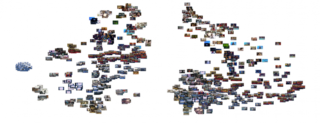
Below is the PCA layout with the images themselves instead of colored dots. The limitations of PCA visual clustering is clearly evident in that, while certain patterns are visible, it is difficult to discern an overall understanding of the broadcast from the image.
In contrast, the t-SNE clustering yields a much more readily-understand survey of the broadcast, breaking it into distinct topical and visual-thematic groupings.
What can we learn through some of the clusters assigned by HDBSCAN? Let's generate a sequence of image grids, one per cluster, that contains all of the images in that cluster:
from PIL import Image
import numpy as np
import os

def generateClustersGrid(image_filenames, clusters, output_dir):
    unique_clusters = set(clusters)

    #make output dir
    os.makedirs(output_dir, exist_ok=True)

    for cluster_id in unique_clusters:
        cluster_images = [img for img, cls in zip(image_filenames, clusters) if cls == cluster_id]

        num_images = len(cluster_images)
        grid_size = int(np.ceil(np.sqrt(num_images)))
        thumbnail_size = (250, 120)  # Adjust the size as needed

        #create blank output grid
        grid_image = Image.new('RGB', (grid_size * thumbnail_size[0], grid_size * thumbnail_size[1]))

        #loop through the images and add to grid
        for i, image_filename in enumerate(cluster_images):
            row = i // grid_size
            col = i % grid_size
            image = Image.open(image_filename)
            image.thumbnail(thumbnail_size)
            grid_image.paste(image, (col * thumbnail_size[0], row * thumbnail_size[1]))

        #write grid image to disk
        output_filename = os.path.join(output_dir, f'cluster_{cluster_id}_thumbnails.jpg')
        grid_image.save(output_filename, overwrite=True)

generateClustersGrid(image_filenames, clusters, 'thumbnail_grids')
We can optionally display them in sequence in our notebook:
#OPTIONALLY RUN THIS CELL TO DISPLAY ALL OF THE THUMBNAIL GRIDS IN SEQUENCE BELOW
from IPython.display import Image, display

def displayThumbGrid(image_filenames, clusters, output_dir):
    unique_clusters = set(clusters)

    for cluster_id in unique_clusters:
        output_filename = f'{output_dir}/cluster_{cluster_id}_thumbnails.jpg'
        print("Cluster: " + str(cluster_id))
        display(Image(filename=output_filename))
        print("")

displayThumbGrid(image_filenames, clusters, 'thumbnail_grids')
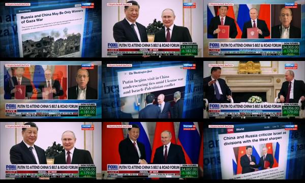
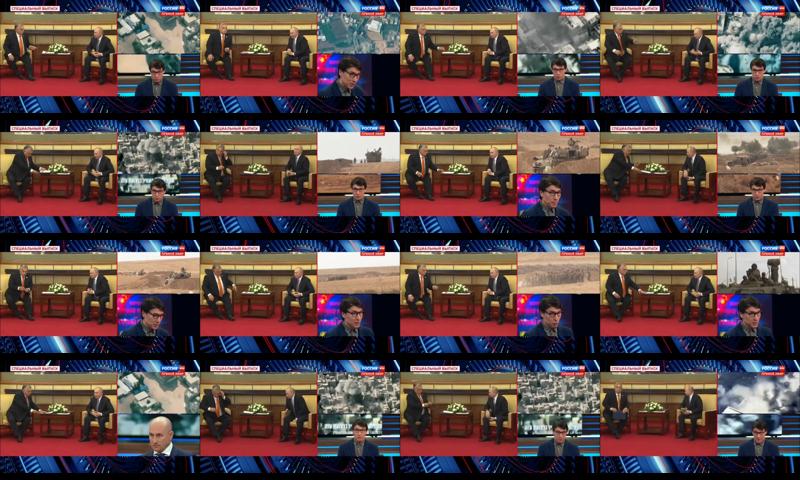
Here is an example of the power of combined OCR-visual assessment, with the first image being included in the sequence of Xi-Putin images because it mentions "Russia and China" in the text despite depicting visuals from Gaza:
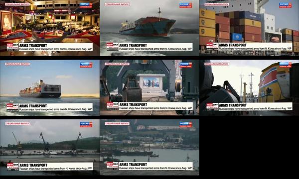
Here the textual influence is clearly visible as it groups a variety of container-related transportation imagery via the chyron.
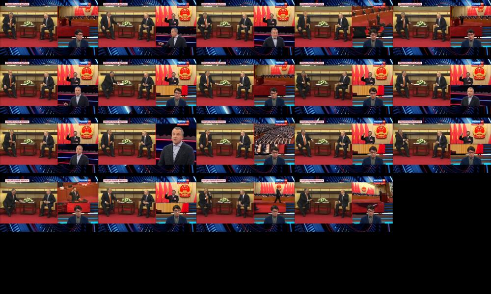
The following two clusters demonstrate the resolving power of the embeddings coupled with HDBSCAN in that they both depict the same meeting on the left and same presenter at bottom right in the tri-split screen, but in the first cluster the top-right image is of Xi while in the second set it features military imagery, showing the ability of the embeddings to resolve fine-grained details.
What if we want to make a single giant contact sheet of all of the clusters and the images within them as a single JPEG image?
from PIL import Image as PILImage, ImageDraw, ImageFont

def create_combined_thumbnail_grid(image_filenames, clusters, output_filename):
    # Create a dictionary to group images by cluster
    cluster_images = {}
    for image, cluster in zip(image_filenames, clusters):
        if cluster not in cluster_images:
            cluster_images[cluster] = []
        cluster_images[cluster].append(image)

    # Sort clusters by cluster ID in ascending order
    sorted_clusters = sorted(cluster_images.keys(), reverse=True)

    # Create a blank image for the combined grid
    thumbnail_size = (200, 120)  # Adjust the size as needed
    padding = 10
    font = ImageFont.load_default()

    total_height = 0
    max_width = 0
    images = []

    for cluster in sorted_clusters:
        images_in_cluster = cluster_images[cluster]
        total_height += font.getsize(f'Cluster: {cluster}')[1] + padding

        num_images = len(images_in_cluster)
        num_columns = 5
        num_rows = (num_images + num_columns - 1) // num_columns
        grid_width = num_columns * thumbnail_size[0]
        grid_height = num_rows * thumbnail_size[1]
        total_height += grid_height

        if grid_width > max_width:
            max_width = grid_width

        images.append((f'Cluster: {cluster}', images_in_cluster, num_images, num_rows, num_columns))

    combined_grid = PILImage.new('RGB', (max_width, total_height), color='white')
    draw = ImageDraw.Draw(combined_grid)
    current_height = 0

    for label, images_in_cluster, num_images, num_rows, num_columns in images:
        draw.text((10, current_height), label, fill='black', font=font)
        current_height += font.getsize(label)[1] + padding

        for i, image_filename in enumerate(images_in_cluster):
            row = i // num_columns
            col = i % num_columns
            x = col * thumbnail_size[0]
            y = current_height + row * thumbnail_size[1]

            img = PILImage.open(image_filename)
            img.thumbnail(thumbnail_size)
            combined_grid.paste(img, (x, y))

        current_height += num_rows * thumbnail_size[1] + padding

    combined_grid.save(output_filename, 'JPEG')

output_filename = 'combined_thumbnail_grid.jpg'
create_combined_thumbnail_grid(image_filenames, clusters, output_filename)
You can see the result below (click to see the full-res version):

What about visual search? Could we type a textual description in English of the kind of imagery we're looking for and find images that match? This code requires you to authenticate to Colab with your username to allow it to access the GCP Vertex AI APIs under your account to compute the embeddings for your search terms and then runs several searches. Note that you'll need to change "[YOURPROJECTID] to your GCP Project ID:
#OPTIONAL - perform keyword search - NOTE: requires GCP authentication
from google.colab import auth
auth.authenticate_user()
import numpy as np
import json
from PIL import Image as PILImage, ImageDraw, ImageFont
from IPython.display import Image, display
import os
from sklearn.metrics.pairwise import cosine_similarity
def searchImages(searchphrase, returncnt, outputfilename):
print("Search: " + searchphrase)
#get the embedding for the search phrase...
!rm cmd.json
!rm results.json
data = {"instances": [ {"text": searchphrase} ]}
with open("cmd.json", "w") as file: json.dump(data, file)
cmd = 'curl -s -X POST -H "Authorization: Bearer $(gcloud auth print-access-token)" -H "Content-Type: application/json; charset=utf-8" -d @cmd.json "https://us-central1-aiplatform.googleapis.com/v1/projects/[YOURPROJECTID]/locations/us-central1/publishers/google/models/multimodalembedding:predict" > results.json'
!{cmd}
with open('results.json', 'r') as f: data = json.load(f)
print(data)
embed_search = np.array(data['predictions'][0]['textEmbedding'])
#compute the similarity to all of the images...
similarities = cosine_similarity([embed_search], embeddings)
similarities = similarities[0]
sorted_indices = np.argsort(similarities)[::-1]
sorted_similarities = similarities[sorted_indices]
top_indices = sorted_indices[:returncnt]
top_image_filenames = [image_filenames[i] for i in top_indices]
top_image_similarities = [similarities[i] for i in top_indices]
print(top_image_filenames)
print(top_image_similarities)
#display the top results...
num_images = len(top_image_filenames)
grid_size = int(np.ceil(np.sqrt(num_images)))
thumbnail_size = (250, 250)
grid_image = PILImage.new('RGB', (grid_size * thumbnail_size[0], grid_size * thumbnail_size[1]))
for i, image_filename in enumerate(top_image_filenames):
row = i // grid_size
col = i % grid_size
image = PILImage.open(image_filename)
image.thumbnail(thumbnail_size)
#label each image with the sim score...
simlabel = f"Sim: {top_image_similarities[i]:.3f}"
draw = ImageDraw.Draw(image)
#bbox = draw.textbbox(xy=(0,0), text=simlabel)
draw.text((2,2), simlabel, fill="white", align="left")
grid_image.paste(image, (col * thumbnail_size[0], row * thumbnail_size[1]))
#write grid image to disk
output_filename = os.path.join('', outputfilename)
grid_image.save(output_filename, overwrite=True)
#and display...
display(Image(filename=outputfilename))
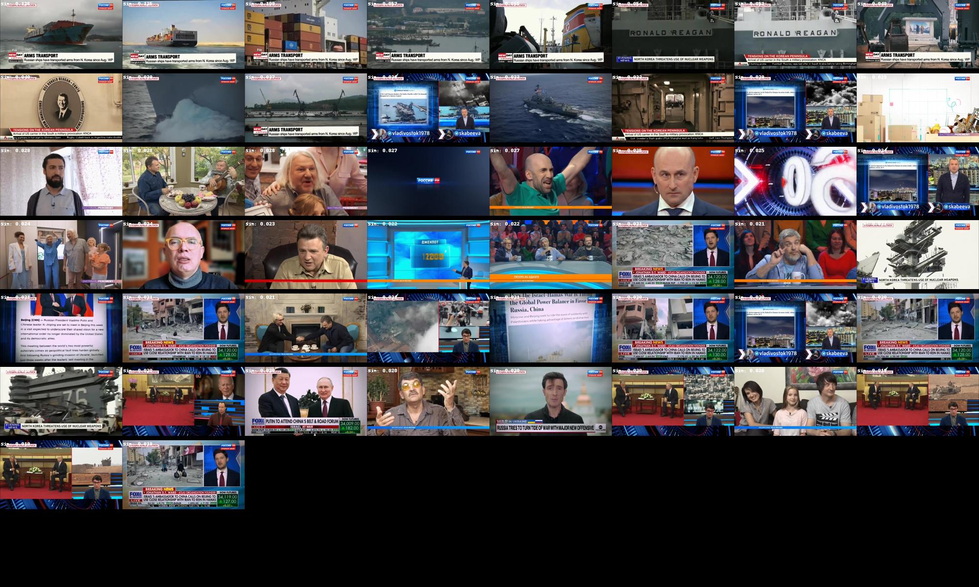
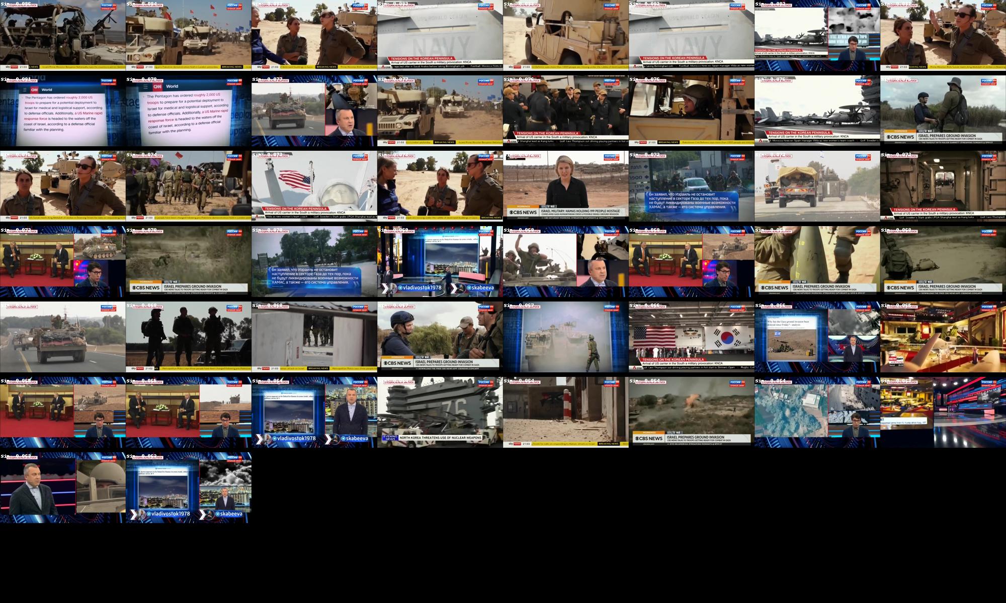
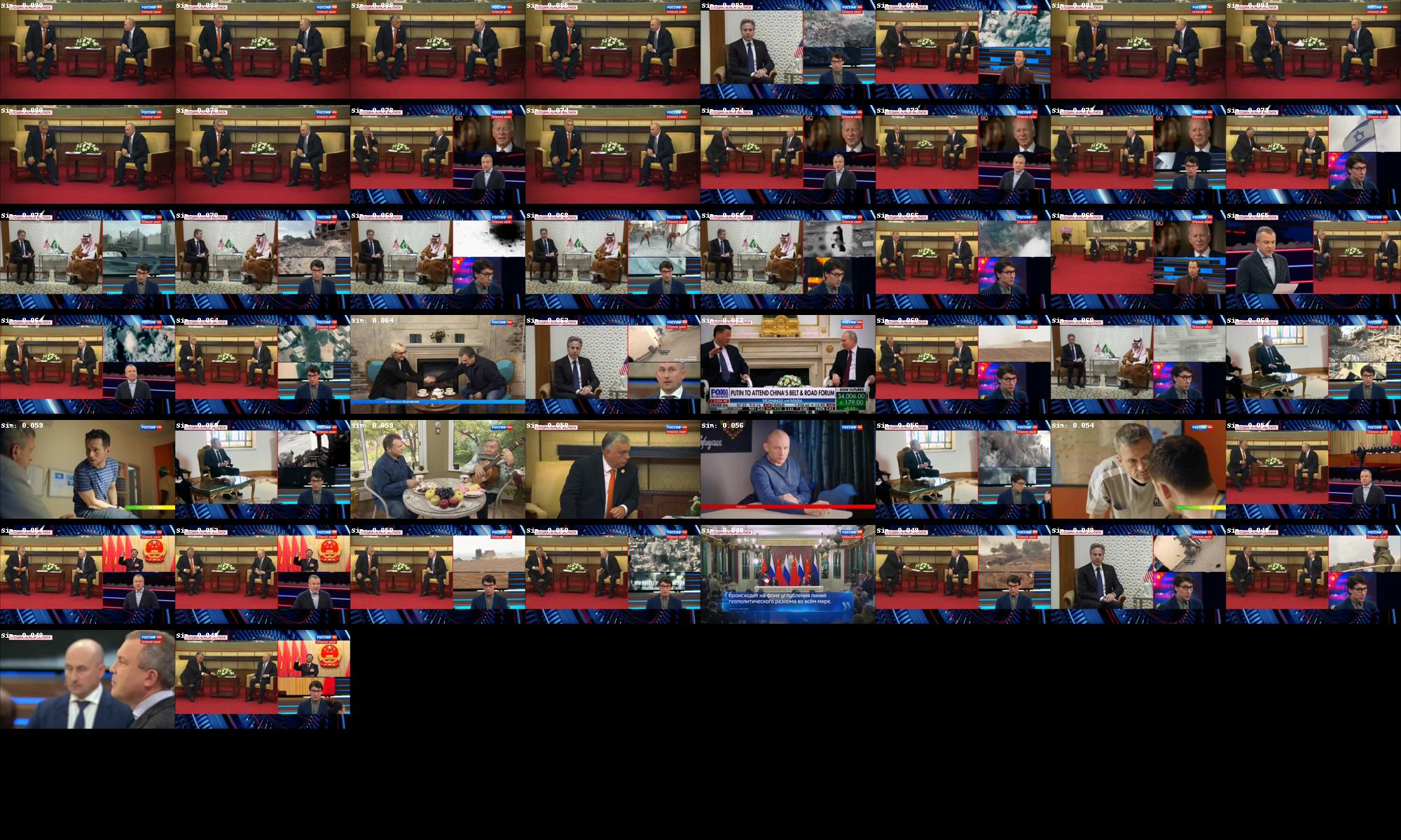
searchImages('military', 50, 'searchresults-military.jpg')
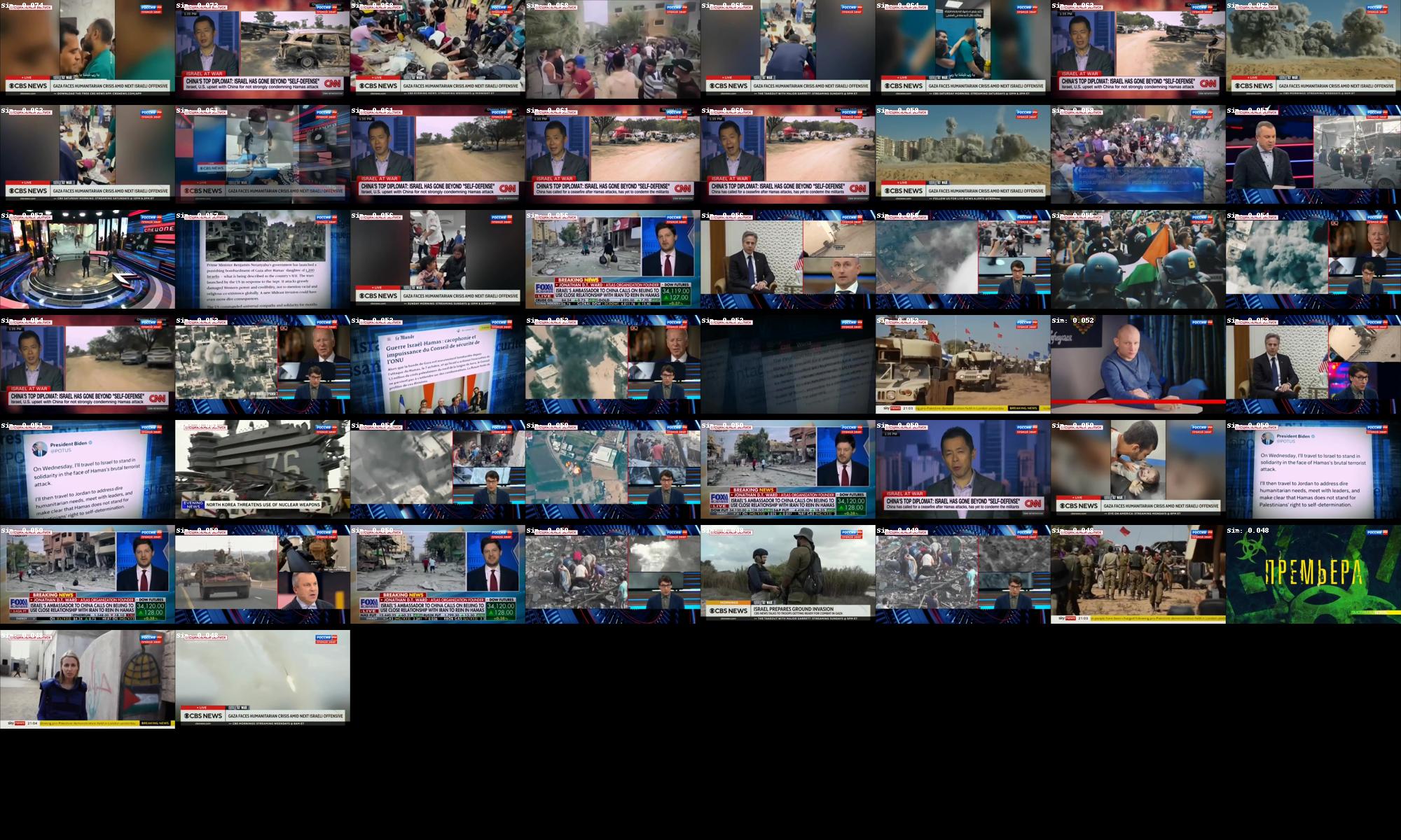
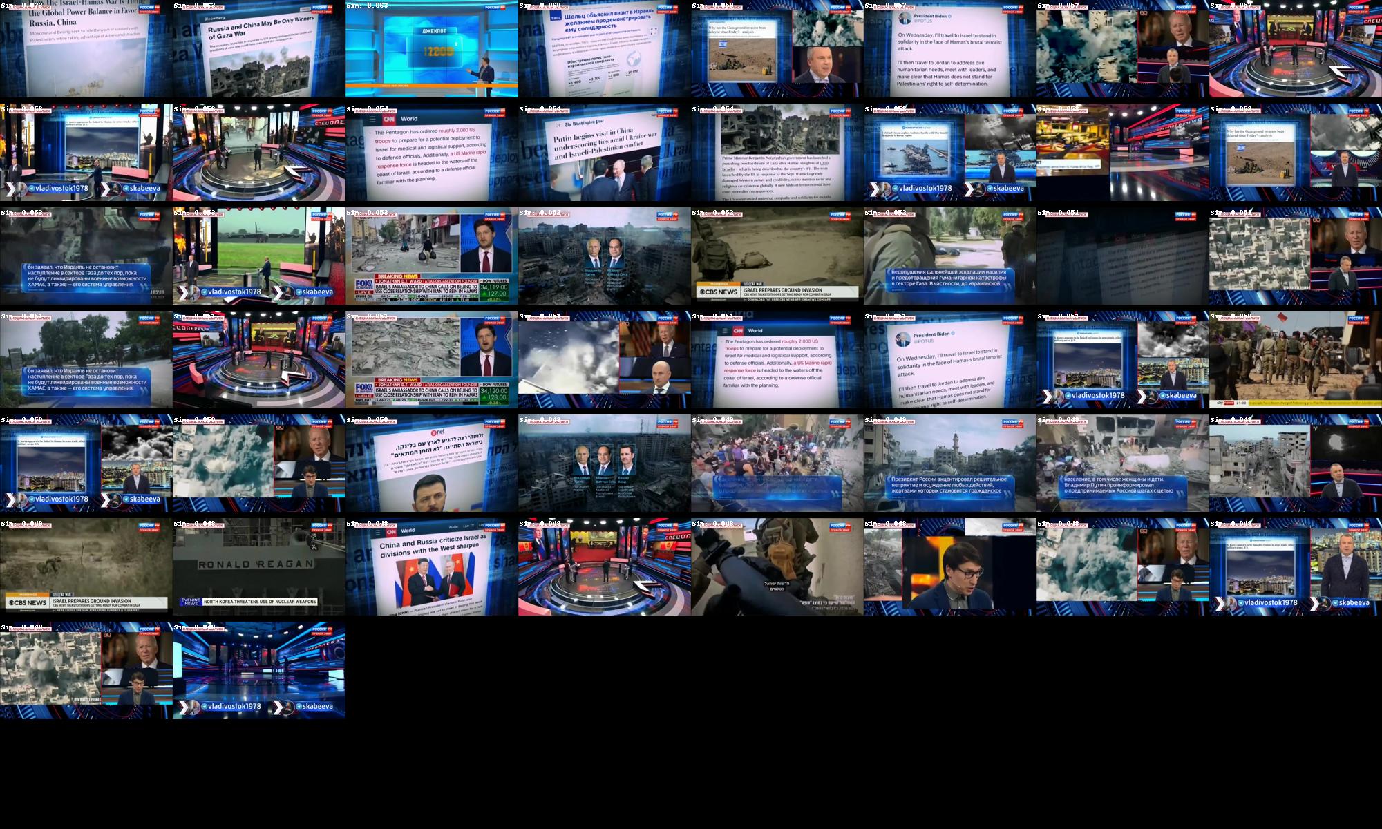
searchImages('violence', 50, 'searchresults-violence.jpg')
searchImages('two men sitting', 50, 'searchresults-twomensitting.jpg')
searchImages('computer display', 50, 'searchresults-computerdisplay.jpg')
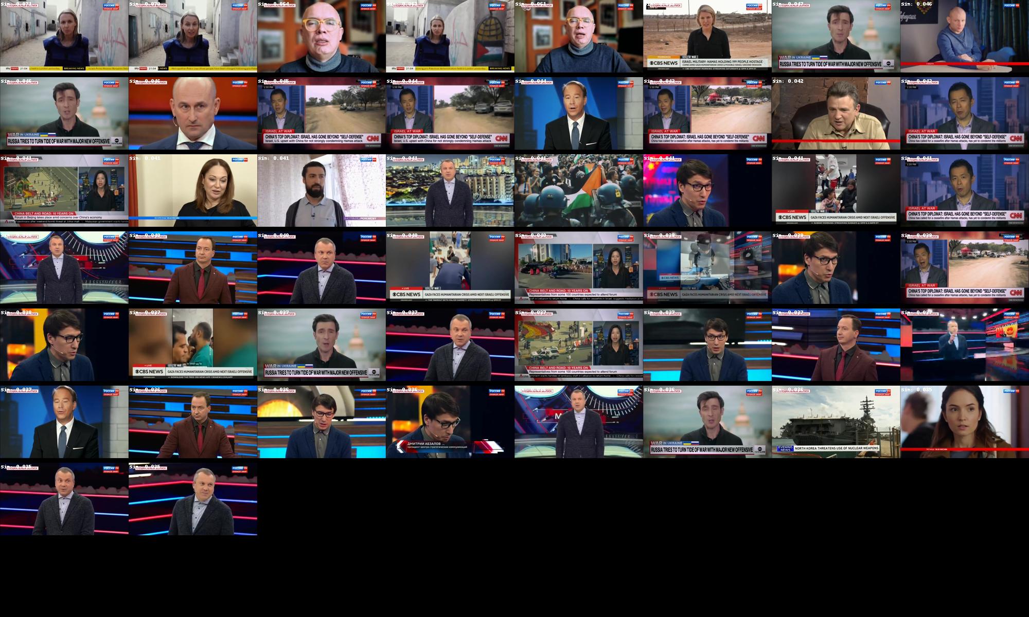
searchImages('person facing towards the camera', 50, 'searchresults-personfacingforward.jpg')
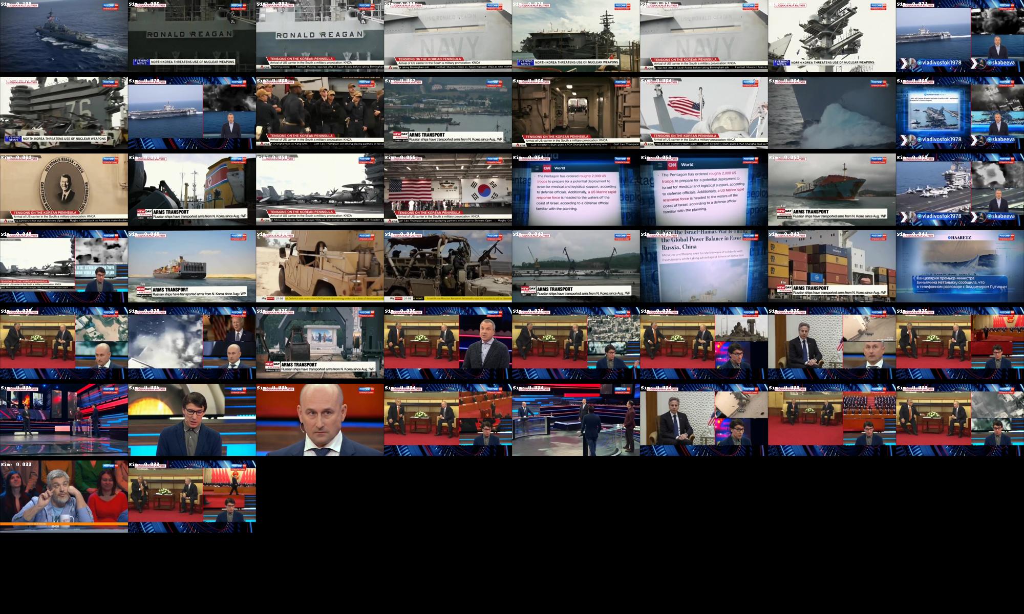
searchImages('navy boat', 50, 'searchresults-navyboat.jpg')
searchImages('container ship', 50, 'searchresults-containership.jpg')
Here you can see the top 50 images ranked most similar to each search query. Note that exactly 50 images are shown for each query regardless of similarity so that you can see how it ranks the images. If you open the fullres version of each results set you can see a white textual label at the top-left of each image that displays its similarity score to the query. You can see how the similarity score drops sharply after the last highly relevant image in some cases, while in others it is a more gradual decrease.
Military:
Violence:
Two Men Sitting
Computer Display
Person Facing Towards The Camera:
Navy Boat:
Container Ship: