In March 2019 we published an in-depth exploration of Twitter's evolution 2012-2018 and followed it up that November with a look at how Twitter changed in 2019, which we updated last August with a first glimpse at how Twitter was changing in 2020 as Covid-19 was sweeping the world. How as Twitter itself changed over the course of 2020 as the pandemic emerged and swept across the world, as populations emerged and reentered lockdowns and as pandemic fatigue set in? Did Twitter retain its massive growth from early in the pandemic or did its users leave as the pandemic wore on? As the pandemic has worn on and lockdowns and work-from-home have evolved from novelties to the "new normal," have initial patterns of use changed? How did Election 2020 impact the platform, especially the changes Twitter made to combat misinformation? Twitter itself acknowledged that some of these changes so profoundly changed fundamental platform behaviors that it reversed them within weeks, but were the impacts as significant as they suggest and did they have additional consequences beyond what might have been expected?
In order to understand the signals we receive from social media, we must understand the denominator beneath the findings we draw from these platforms. A greater understanding of evolving user behaviors in social platforms offers key insights into how societies are leveraging the web to communicate about the world and changing trends in information flows. Such data also offers critical insights into how the platforms themselves are silently adjusting our digital lives in realtime and the impacts those changes are having on societies.
To explore all of these questions, we've updated our Twitter analyses to cover the period Jan. 2012 through the first few days of Jan. 2021, capturing the impact of the first year of the pandemic and the 2020 election on Twitter and putting these changes in the context of its last nine years of existence.
The analyses provided here are based on the Twitter Spritzer/Sample stream that constitutes a random sample of 1% of tweets. In 2019 we showed that this 1% stream was perfectly correlated at the time with the complete firehose along the dimensions reported below and thus acted as a proxy for the macro-level structural characteristics of Twitter. However, it is possible that the numbers below could be impacted by systemic changes in the Spritzer stream's composition since that validation study. Brief holes in the graphs below represent missing data from technical collection error. For more detail on each metric and how it was calculated, since the original March 2019 analysis.
Executive Summary
How has the Twitterverse navigated the pandemic and the 2020 US election?
- Tweet Volume. Twitter started 2020 at around 400M tweets a day, quickly surging over March 12 to March 30 to a near-record 500M tweets and restoring it to its July 2013 high. However, daily tweets dropped 100M tweets a day to 400M daily tweets beginning October 20, coinciding with Twitter's rollout of a set of efforts to combat election misinformation that added "friction" to retweeting. Volume has begun to recover since Twitter reversed the change on December 16, but has still given up all of the growth it gained this past year.
- Verified Users. While representing just a fraction of Twitter users, tweets from verified users increased substantially in March as lockdowns spread, but did not result in an increase in retweets of these verified tweets, suggesting Twitter may not be the best platform for public health messaging amplification. Verified tweets also increased noticeably around the 2020 US election and were much more heavily retweeted, though it is unclear whether this was organic behavior or perhaps reflects efforts by Twitter to shape the public discourse around the election.
- Retweets. The impact of Twitter's change to its retweeting behavior is starkly visible, decreasing retweeting from 50% of all tweets to just 40% almost overnight. Interestingly, however, despite reverting to the previous behavior, retweeting has not immediately leapt back to its previous level, suggesting potentially lasting behavioral change.
- Replying. Replying increased noticeably at the start of global lockdowns in March and surged during the US election and remain elevated since.
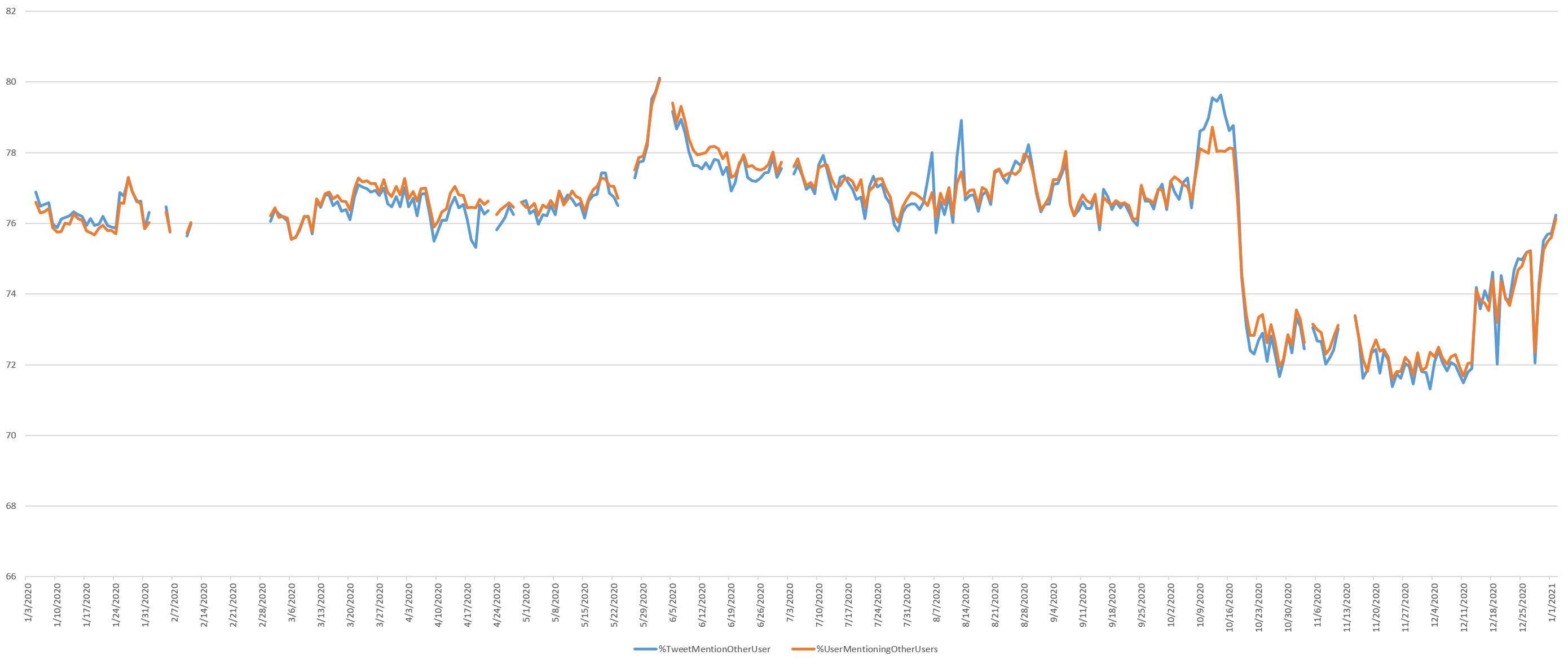
- User Mentions. Mentions of other users surged during the George Floyd protests and dropped vertically with Twitter's retweet changes, increasing once those changes were reverted.
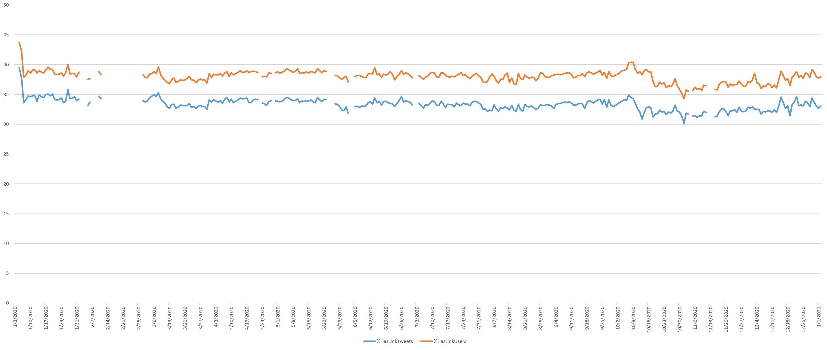
- Links. Links of all kinds (external sites, images and video files) decreased noticeably in the leadup to the election, but have since recovered.
- Hashtags. Hashtags changed little over the course of the year.
- Average Tweet Size. The average characters per tweet remains largely unchanged over the course of the year, while the average bytes per tweet dropped at the start of lockdowns in March, suggesting a decrease in multibyte characters like emojis. The coincidence of this with March lockdowns suggests a shift away from emojis during the pandemic, which is intriguing and deserves further research.
- Twitterverse Size. Removing retweets, usernames and hyperlinks, the total size of the Twitterverse increased with the elevated tweeting volume, decreased in June and dropped briefly around the election.
- English Twitter. English language tweets increased as a percentage of all tweets during the George Floyd protests and remain elevated since.
- Account Age. The average and media account ages decreased at the start of lockdowns as new users began tweeting, though rose around the election before declining again.
- Geography. Unsurprisingly, geotagged tweets collapsed during the pandemic as suddenly immobile users declined to share their precise locations from home.
Tweets Per Day
The pandemic sharply increased the number of daily posts on Twitter, rising from its November 2018 low point of just above 320M tweets a day to an almost all-time high of just shy of 500M tweets per day for much of the pandemic, placing it back on pair with its July 2013 peak. Interestingly, Twitter appears to have begun reversing its decline in January 2019 which is when Donald Trump began rapidly ramping up his use of Twitter. What might explain the sharp drop of 100M tweets a day in late 2020?
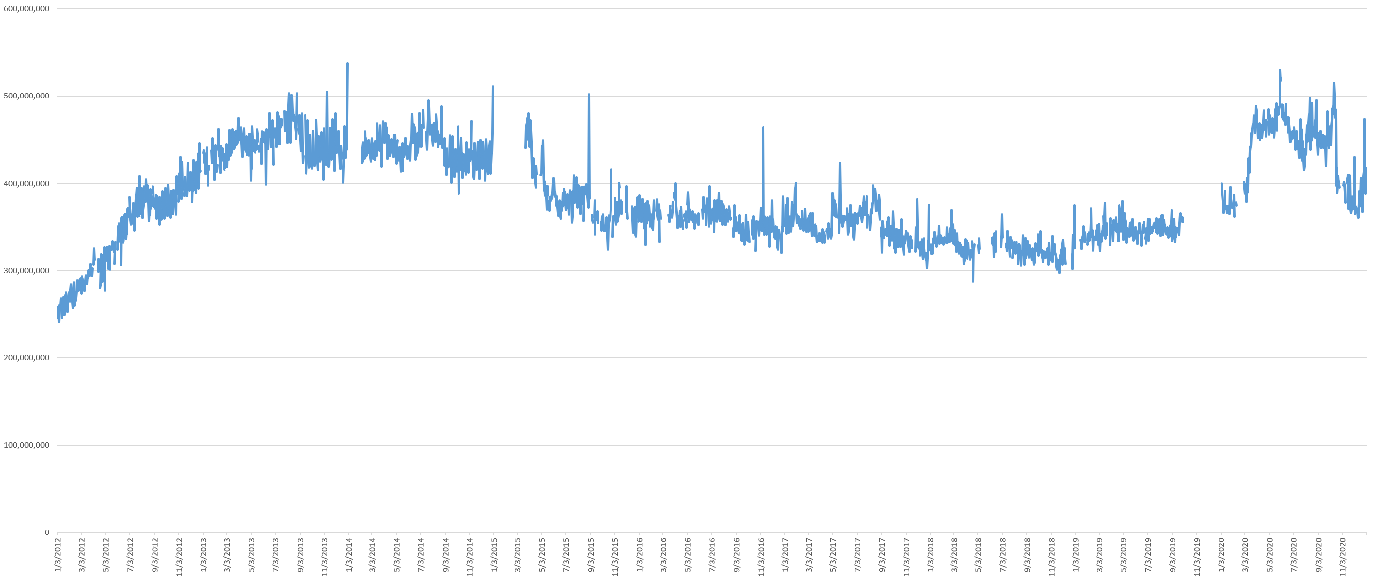
The timeline below zooms into the January 2020 to January 5, 2021 period, showing that Twitter experienced a massive growth period from March 12 through March 30, representing the period when countries around the world were ramping up their lockdowns and newly stuck-at-home citizens across the world turned to social media. This March 2020 increase coincides with Twitter's reporting of a surge in gaming-related tweets, significant increases in curated events usage and direct messaging and the tail-end of the surge in news coverage. A brief burst on May 31 coincided with the George Floyd protests, quickly ramping back down to its new high over the course of June to a low point on July 30, then ramping back up through August 13 and leveling off.
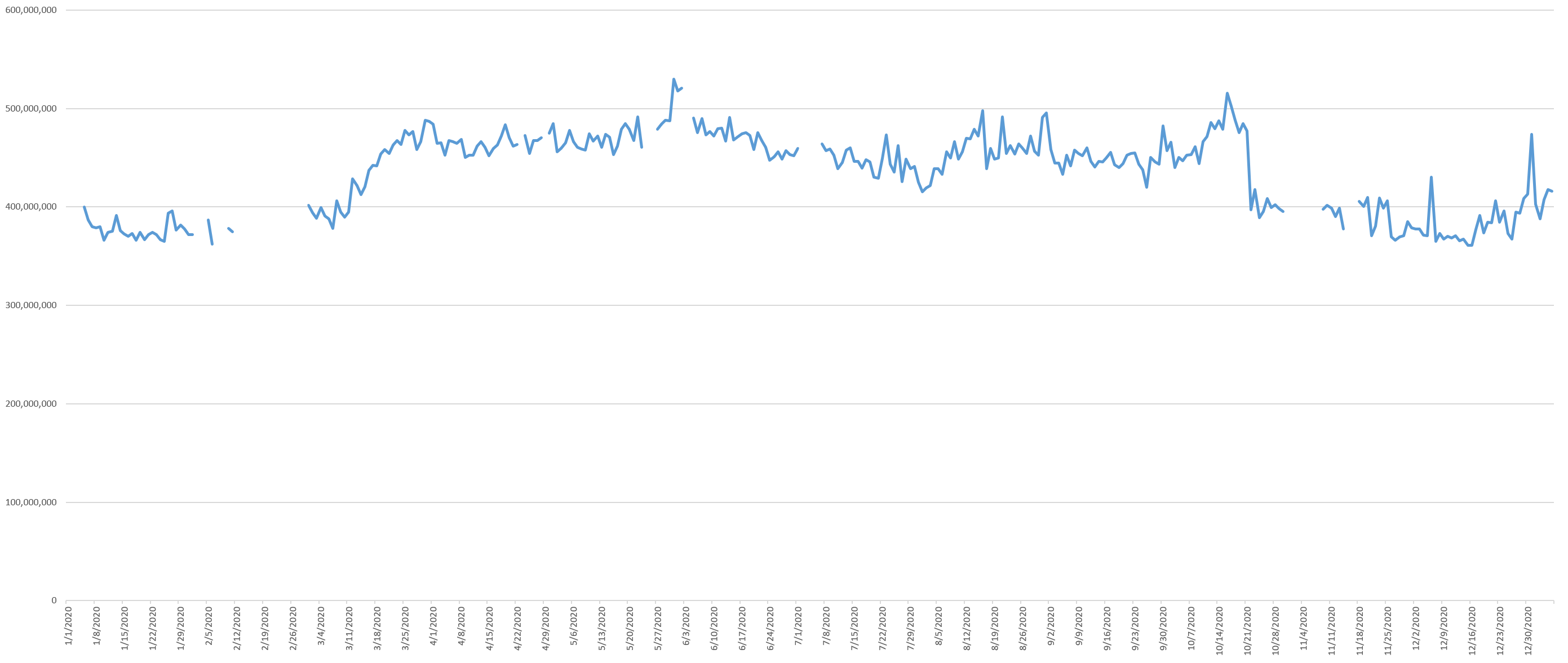
From around September 26, the volume of tweets began steadily increasing, reaching a new high in early October, then suddenly dropped off a cliff on October 22. You can see this more clearly on the October 1, 2020 to January 5, 2020 zoomed timeline below.
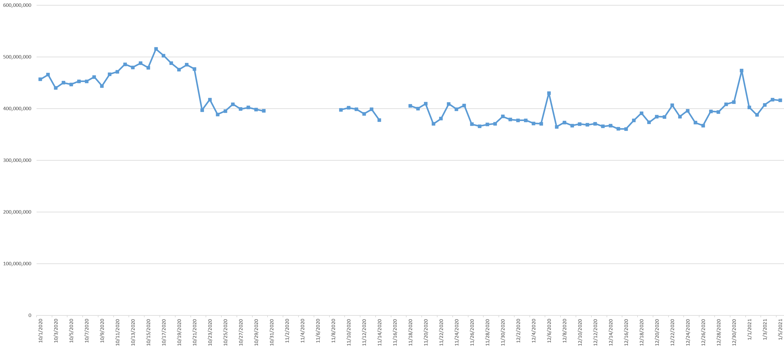
What might explain this massive anomaly? It turns out October 20 was the date Twitter rolled out a series of global changes to the core functioning of its platform to combat misinformation in the leadup to the 2020 US election. One of the most significant of these changes was the addition of "friction" to retweets:
First, we will encourage people to add their own commentary prior to amplifying content by prompting them to Quote Tweet instead of Retweet. People who go to Retweet will be brought to the Quote Tweet composer where they’ll be encouraged to comment before sending their Tweet. Though this adds some extra friction for those who simply want to Retweet, we hope it will encourage everyone to not only consider why they are amplifying a Tweet, but also increase the likelihood that people add their own thoughts, reactions and perspectives to the conversation. If people don’t add anything on the Quote Tweet composer, it will still appear as a Retweet.
The company also made changes the recommendations and trends:
Second, we will prevent “liked by” and “followed by” recommendations from people you don’t follow from showing up in your timeline and won’t send notifications for these Tweets. These recommendations can be a helpful way for people to see relevant conversations from outside of their network, but we are removing them because we don’t believe the “Like” button provides sufficient, thoughtful consideration prior to amplifying Tweets to people who don’t follow the author of the Tweet, or the relevant topic that the Tweet is about. This will likely slow down how quickly Tweets from accounts and topics you don’t follow can reach you, which we believe is a worthwhile sacrifice to encourage more thoughtful and explicit amplification.
Finally, we will only surface Trends in the “For You” tab in the United States that include additional context. That means there will be a description Tweet or article that represents or summarizes why that term is trending. We’ve been adding more context to Trends during the last few months, but this change will ensure that only Trends with added context show up in the “For You” tab in the United States, which is where the vast majority of people discover what’s trending. This will help people more quickly gain an informed understanding of the high volume public conversation in the US and also help reduce the potential for misleading information to spread.
The combination of these changes is immediately obvious in the graph above.
What explains the gradual rise of tweet volume beginning December 17? The day prior, on December 16, Twitter announced that it was reverting the October 20 changes, citing in particular that "on a net basis the overall number of Retweets and Quote Tweets combined decreased by 20%" and that "this change slowed the spread of misleading information by virtue of an overall reduction in the amount of sharing on the service." Looking more closely at the graph above, the difference between total tweet volume prior to October 20th and after correlates roughly to a drop of 20% of the total retweet volume, matching Twitter's statement.
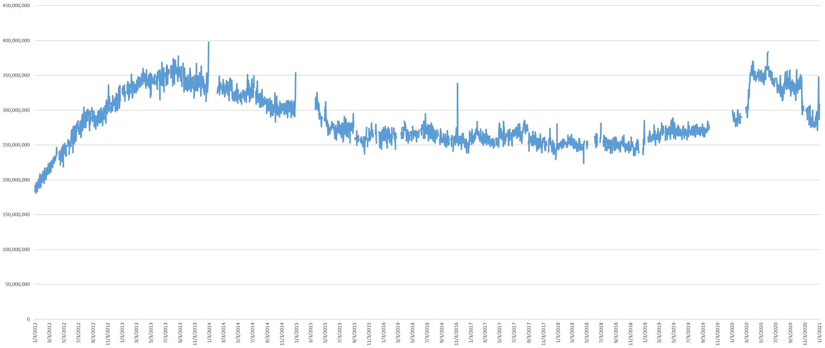
Tweeting Users
The graph below shows the total number of distinct users sending one or more tweets per day. Unlike other metrics commonly used to assess social platforms, the community of tweeting users is the most important, in that the content produced by these users is what draws the rest of users in. This is calculated by dividing the estimated total number of firehose tweets by the average number of tweets per user in the 1% stream. Note that these numbers differ from Twitter's own Active User counts because this graph counts only users who actively post content, rather than those who merely passively consume it.
Here there was a massive surge in new users at the start of the pandemic that slowly leveled off before plunging sharply prior to the election and has not recovered since.
Verified Users
What percent of all tweets and users sending those tweets are verified users? Verified users actually make up a smaller portion of all tweets, following their steady decline since late 2017, though with a slight uptick around the 2020 US election.
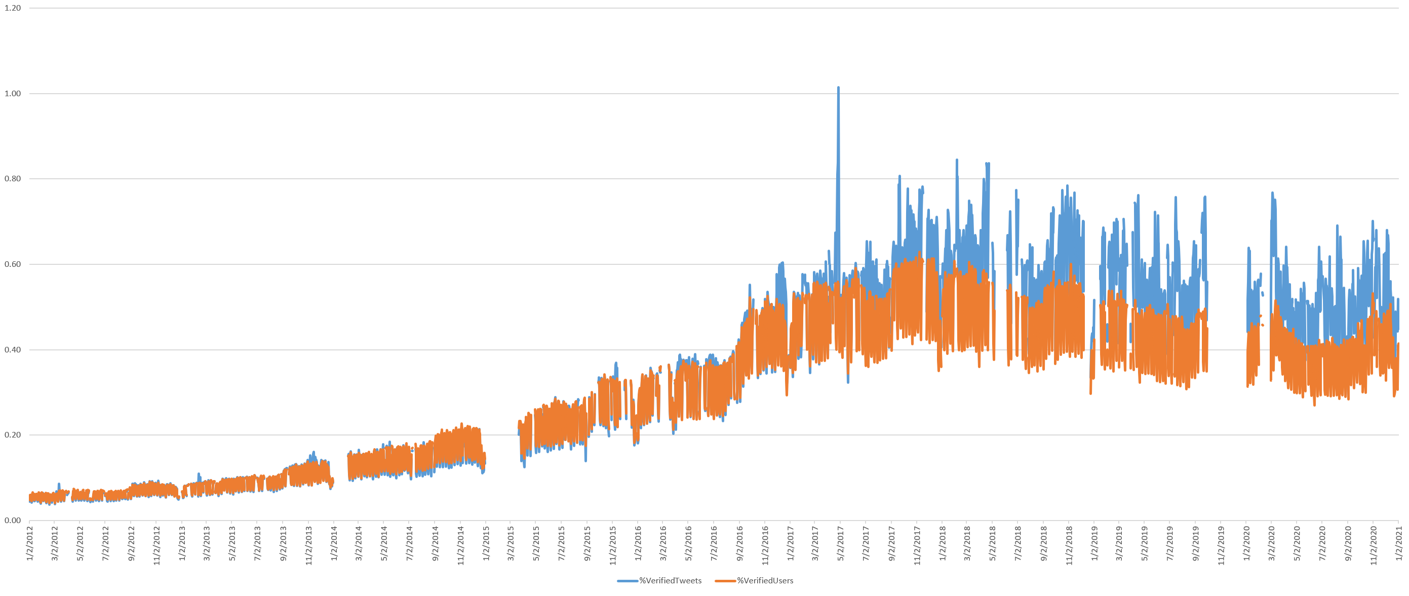
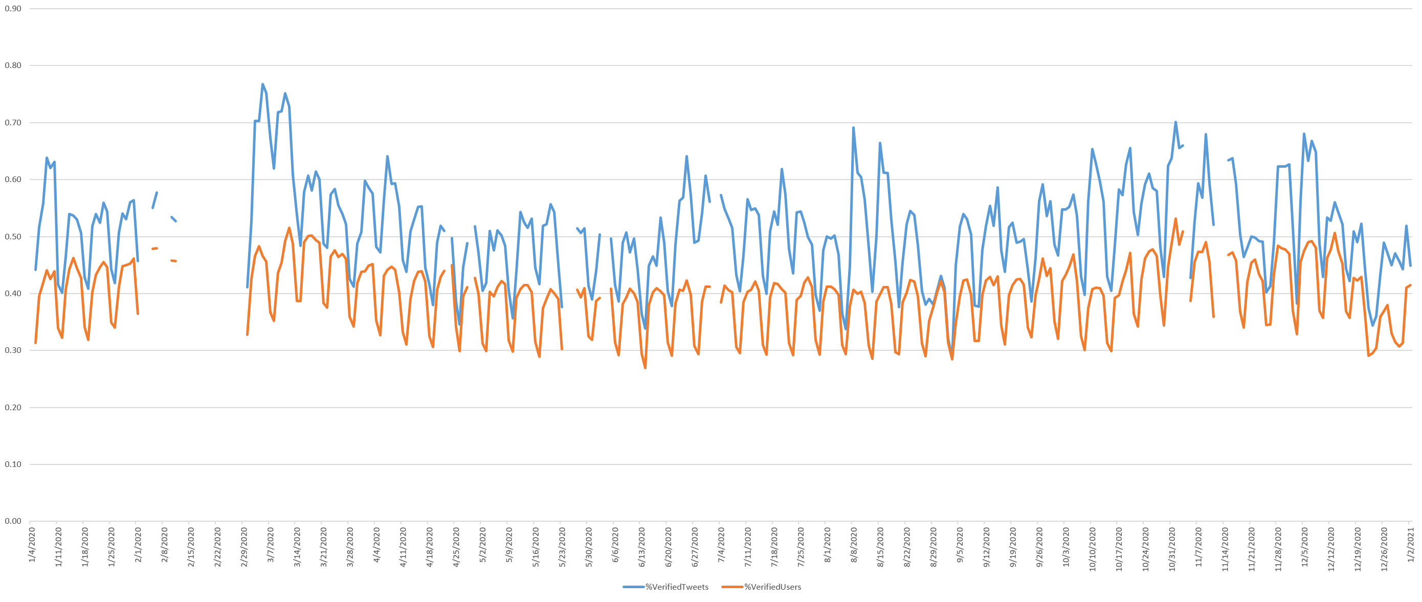
The timeline below zooms into the January 1, 2020 through January 5, 2021 portion of the graph. The strong cyclic nature of the graph below reflects that tweets by verified accounts appear to be highest on Mondays and decline through Thursdays. Interestingly there is a surge in verified tweets at the beginning of the pandemic as government agencies and elected officials issued orders, statements and commentary on the emerging pandemic. Verified tweets also increased noticeably as a percentage of all tweets from around October 20 through December 16, exactly mirroring the period of Twitter's retweet changes.
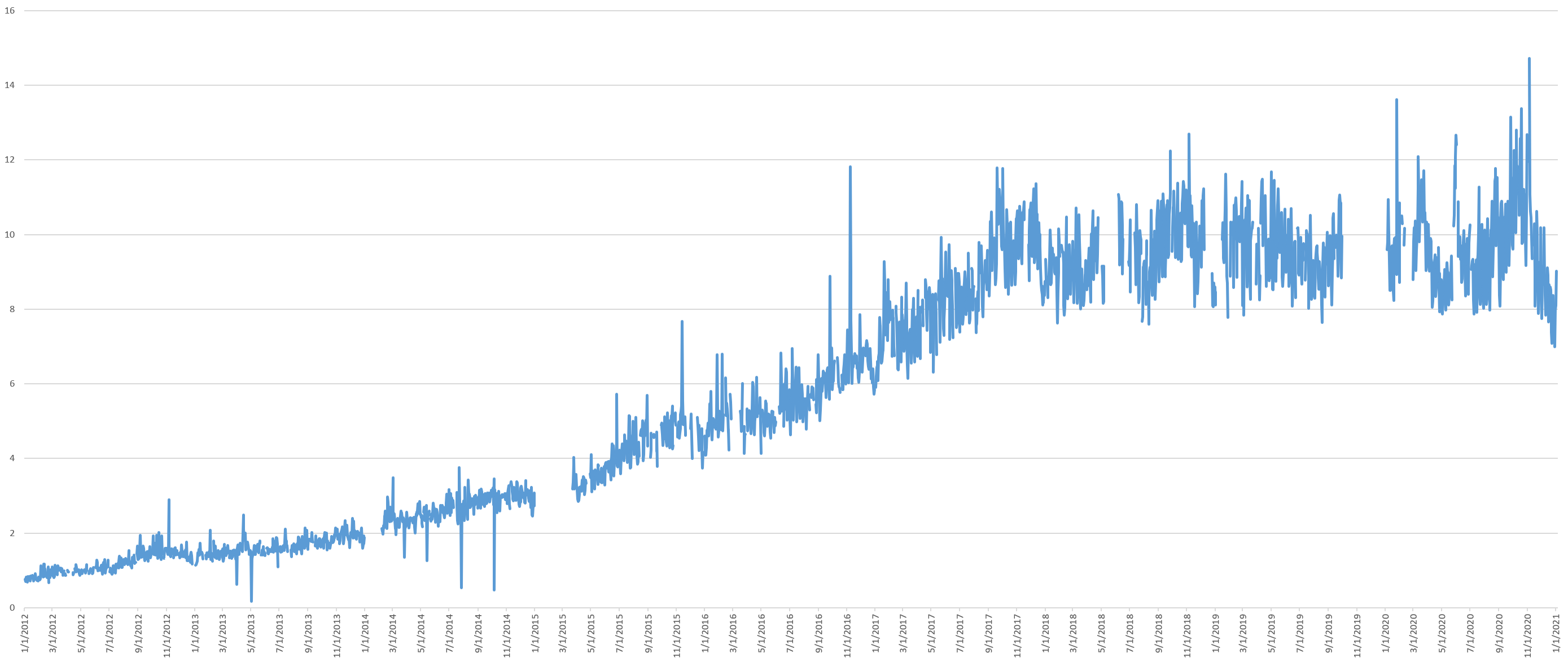
Of course, Twitter largely paused its verified users program in November 2017, which can be clearly seen above. More to the point, given their exceptional rarity on Twitter, it would not be expected that they would account for an outsized percentage of total tweet volume. Instead, a better metric to assess their influence over the Twittersphere would be to measure the combined volume of original tweets sent by verified users and all retweets of those tweets by ordinary users.
This yields the timeline below, showing that a steady 10% of total Twitter volume are either produced by a verified user or are an ordinary user's retweet of a verified user's tweet. Noticeably, there appears to have been a substantial increase and decrease over the past year.
The timeline below zooms into the January 1, 2020 through January 5, 2021 portion of the graph, showing little increase during the start of the pandemic, suggesting that while governments were issuing official statements, those were not the tweets being amplified by the public. This suggests that Twitter may not be the best place to amplify public health messaging during emergency situations.
In contrast, there does appear to be a 2% increase in total verified + retweets of verified tweets beginning the first few days of September, collapsing through November 8, which coincidently is when the strange volume anomaly disappears. This raises the question of whether Twitter may have adjusted its algorithms to boost verified voices.

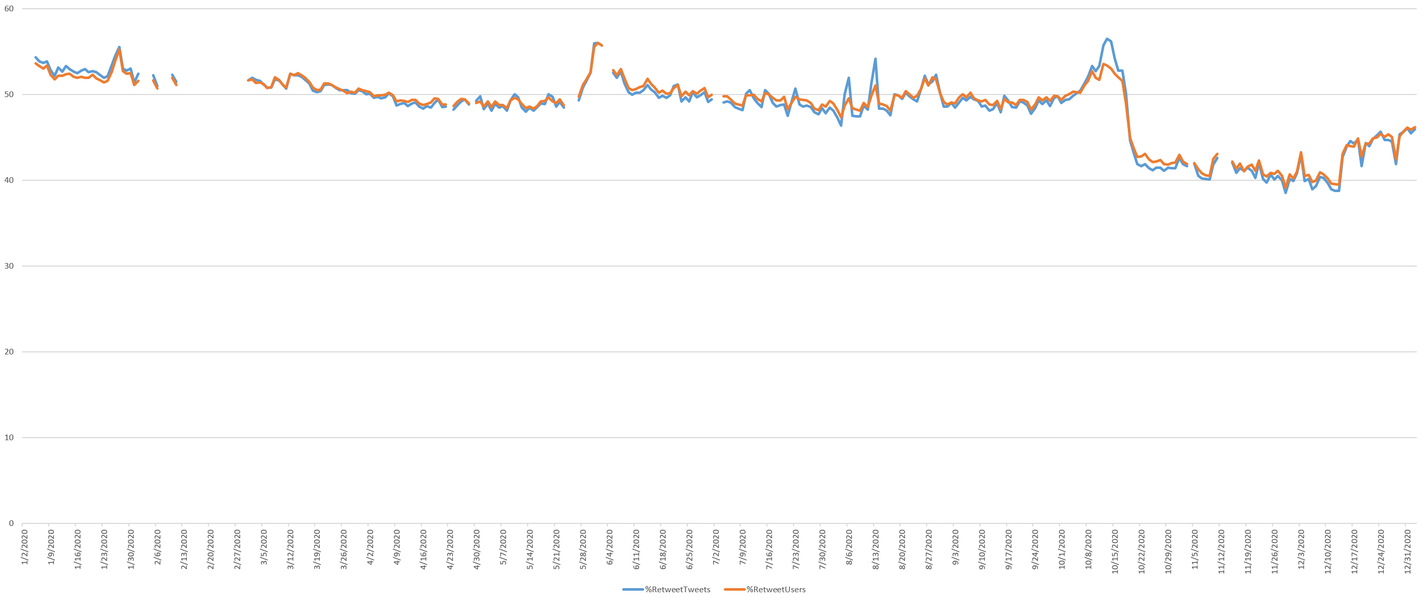
Retweets
What percentage of the total daily tweet volume are retweets? It turns out more than half of all tweets are retweets, though this largely leveled off since March 2018. This appears to have dropped off a cliff leading up to the 2020 election and, while increasing, has yet to recover.
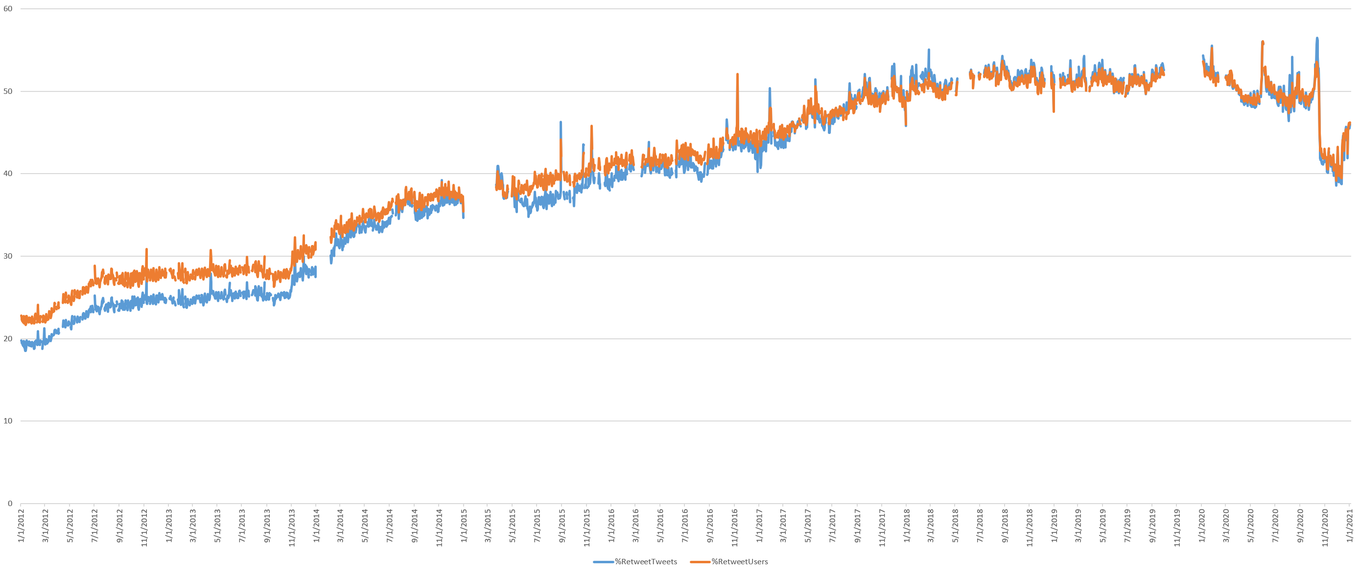
The timeline below zooms into the January 1, 2020 through January 5, 2021 portion of the graph, showing a surge in retweeting during the Summer 2020 George Floyd protests, showing their impact on the Twitterverse.
Starkly visible is the impact of Twitter's change to retweeting behavior, which decreased retweets from 50% of all tweets down to just 40% and falling. This abruptly began reversing itself after Twitter reverted back to the previous retweet behavior.
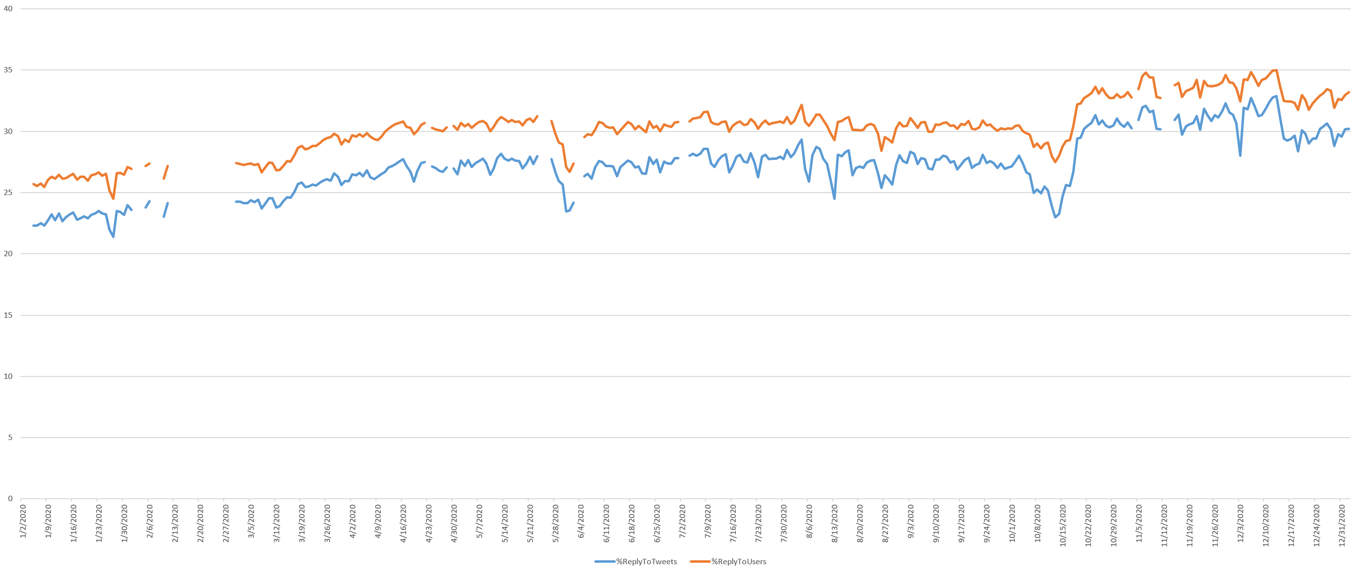
Replying To Other Users
How often are tweets a reply to another user, suggesting a conversation? This steadily decreased from 2012 through a low point in early 2017 and has steadily increased ever since other than a period in late 2019 and during the 2020 election.
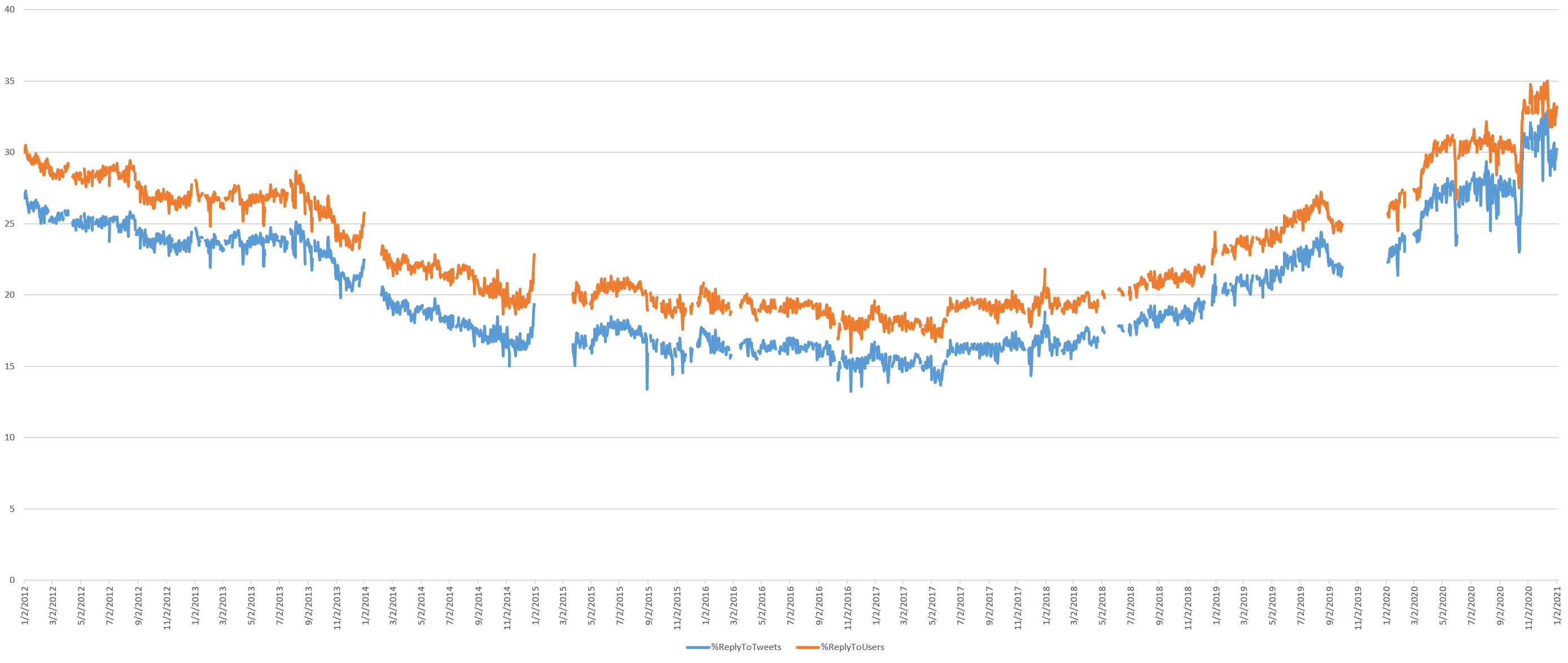
The timeline below zooms into the January 1, 2020 through January 5, 2021 portion of the graph, showing a sharp decrease in user mentions during the George Floyd protests and from October 4 through October 18. Interestingly, beginning October 20, with Twitter's changed retweeting behavior, replies increase around 3-4% and decrease December 15 as Twitter restored its previous retweeting behavior. This suggests that its retweeting changes had effects beyond retweets to other behaviors.
Tweets Mentioning Other Users
What percentage of all tweets mention another Twitter user in any way? This continues to rise steadily from early 2017, suggesting more and more Twitter is about targeted discussion with users attempting to reach specific other users with their tweets, rather than generalized broadcasts to the world. Yet it appears to have abruptly reversed itself around the time of the 2020 US election. It is remarkable

The timeline below zooms into the January 1, 2020 through January 5, 2021 portion of the graph, showing how tweets mentioning other users drops vertically beginning October 18 and returns December 14, again coinciding with Twitter's retweet changes. From its restoration December 14 it was increasingly sharply. Interestingly, from October 8 through the 18th there was a surge in user mentions. The George Floyd protests are also clearly visible.
Tweeting Links
What percentage of daily tweets contain a URL of any kind? This includes both links to external sites and embedded media like images and videos. Links increased steadily from the start of the data through a peak in mid-2017 and have decreased steadily since, though with a noticeable change around the 2020 US election.
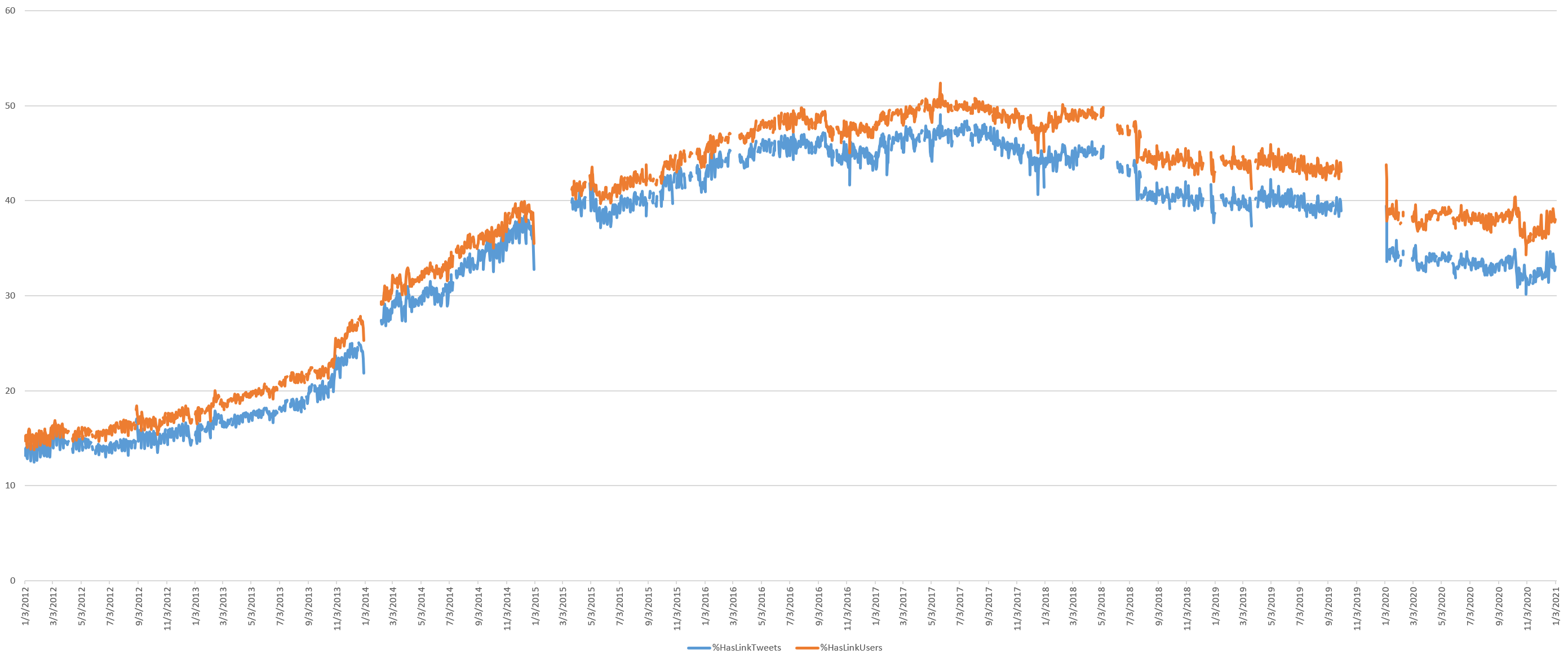
The timeline below zooms into the January 1, 2020 through January 5, 2021 portion of the graph, showing how link sharing was fairly steady all year until around October 10, when tweets sharing links dropped by 5%, declining to a low on November 1 and slowly increasing since.
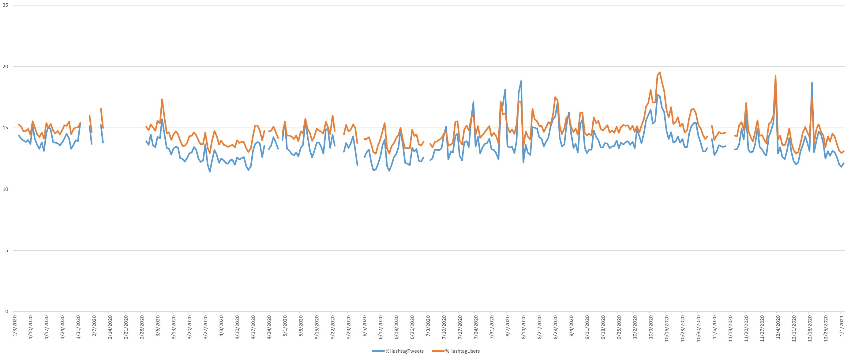
Hashtag Use
What percent of tweets contain a hashtag? Hashtag use was relatively stable through late 2013, then increased through a peak in late 2015 and has decreased steadily since late 2017, leveling off since late 2018.
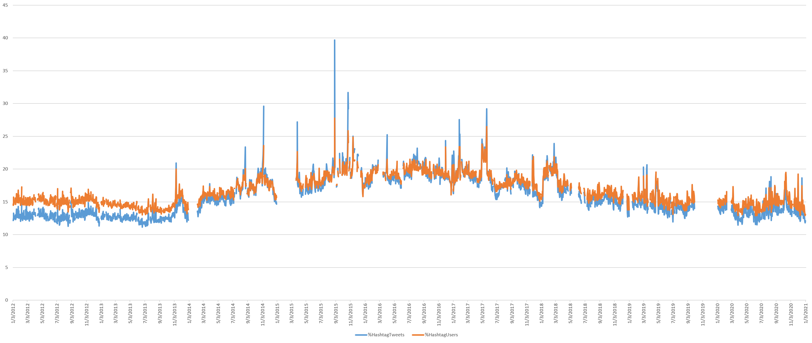
The timeline below zooms into the January 1, 2020 through January 5, 2021 portion of the graph, showing there has been little major change over the past year, other than an increase from October 6 through a peak on October 13, decreasing through November
The Total Daily Size Of The Twitterverse In Characters & Bytes
Just how big is the Twitterverse?
The size of the average tweet in terms of characters and bytes (in the case of multibyte charactersets) after removing retweets, username references and hyperlinks has remained relatively stable over time. Though interestingly, the average tweet size has decreased steadily since late 2016, suggesting tweets are increasingly short messages. Interestingly, during the pandemic, the average length of tweets in bytes has fallen sharply, while character length has fallen more modestly. This could suggest reduced tweeting in multibyte languages and/or a reduction in multibyte characters like emojis.
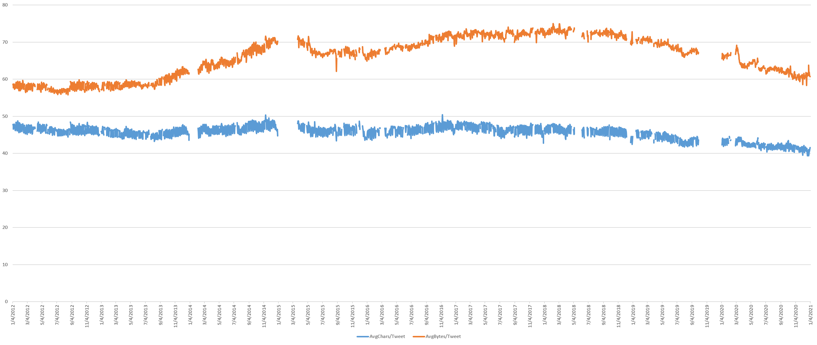
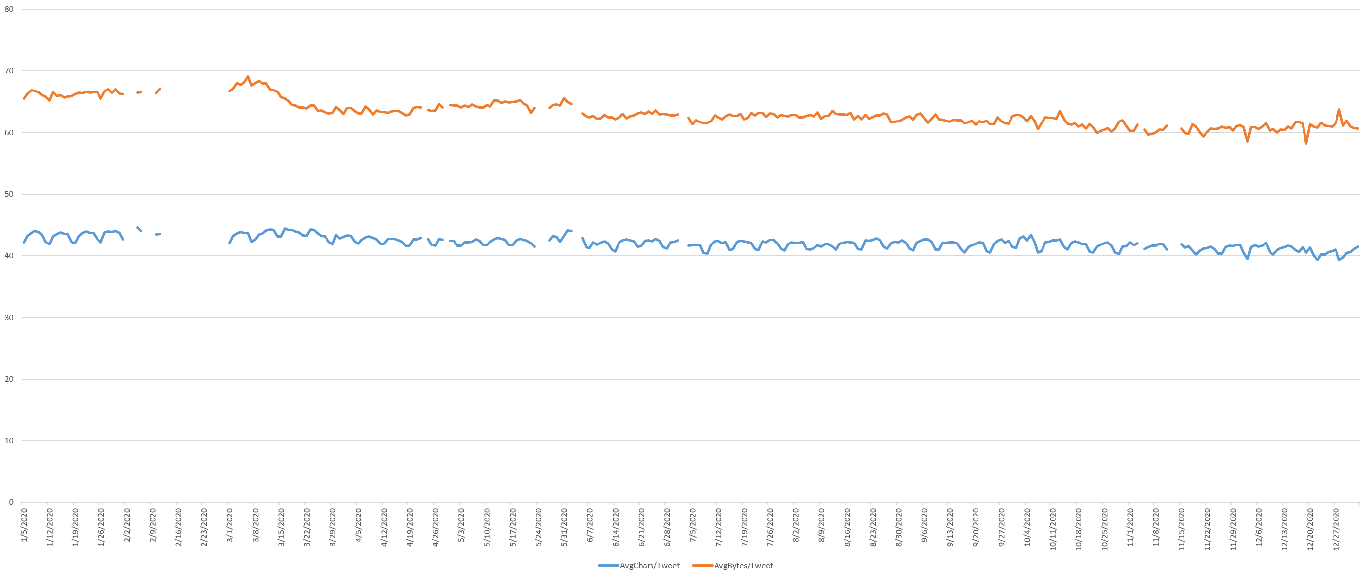
The timeline below zooms into the January 1, 2020 through January 5, 2021 portion of the graph, showing that an increase in the average byte size of tweets in the early days of the pandemic decreased sharply in early March as the world locked up and has decreased slowly and steadily over the course of the year. There appears to be no major change around the 2020 US election.
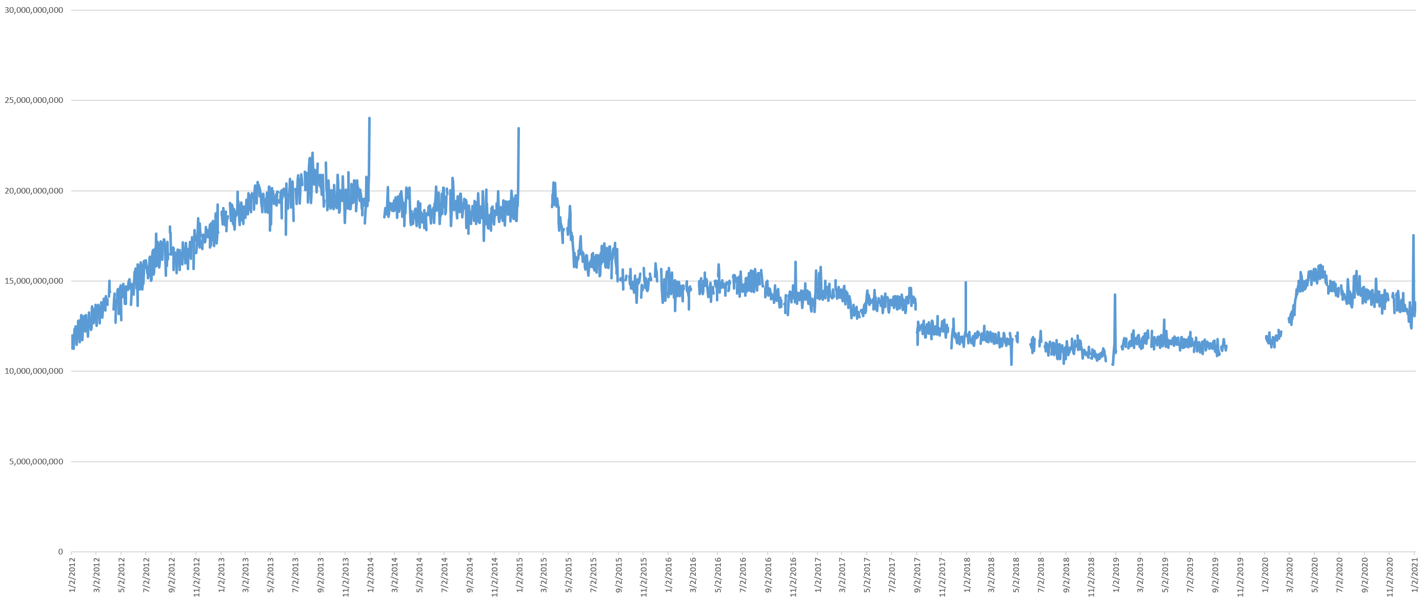
What about the sum total of the entire Twitterverse?
The timeline below shows the total number of bytes of content posted to Twitter each day after removing retweets, username references and hyperlinks, showing that on a typical day in 2019 just 11GB of text is posted to Twitter – slightly less than was posted on a typical day seven years ago in January 2012. Even with the record-high number of tweets during the pandemic, the platform is hovering around just 15GB of novel content per day, around its November 2015 levels, suggesting the surge in pandemic tweeting is centered on shorter tweets.
Notably, while the total number of daily tweets recovered at the start of the pandemic to their mid-2013 levels, the total volume of novel tweeted content each day is far lower than it was in 2013. This is because retweets constitute a far higher portion of Twitter's daily volume than they did at its previous peak.
The timeline below zooms into the January 1, 2020 through January 5, 2021 portion of the graph. Since retweets are excluded here, the changed retweeting behavior does not appear, but the total volume of novel tweet content can be seen to be slowly decreasing over the course of 2020 since early May.

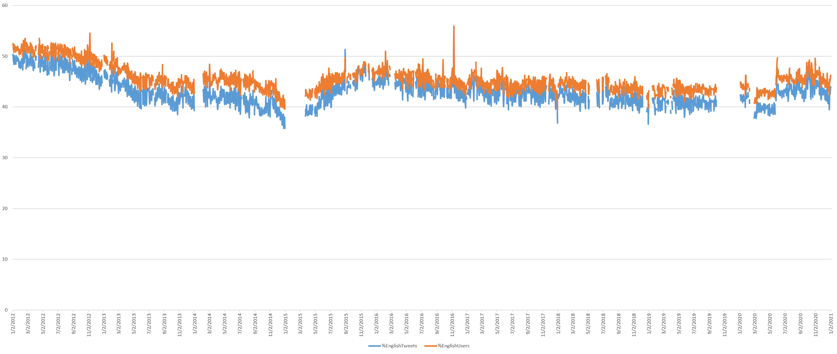
The Dominance Of English Twitter
What percentage of all tweets are in English? There was a sharp decline from 2012 through early 2015, a reassurance through early 2016 and then a stable and very slow decrease over time ever since, with around 40% of tweets today being in English. The pandemic appears to have led to a noticeable surge in English tweets, though even this increase places it only back early 2017 levels. Note that these results were computed using CLD2 and exclude cases where no language could be determined (such as a tweet that contains only a hyperlink).
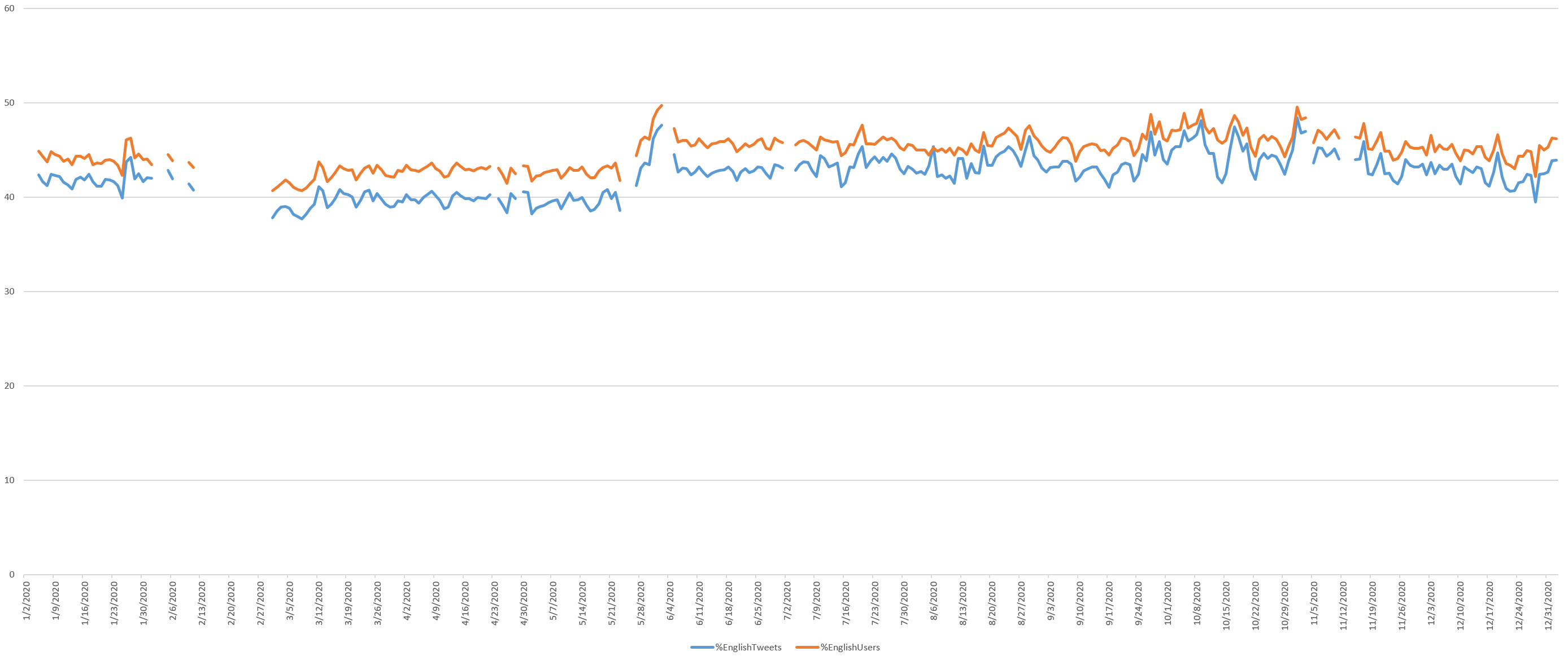
The timeline below zooms into the January 1, 2020 through January 5, 2021 portion of the graph, showing a sharp change during the George Floyd protests that appears to have endured, raising the proportion of the Twitterverse that is English by as much as 4-5% ever since, through the US election. From November 4, the density of English tweets decreases slightly through the end of the year.
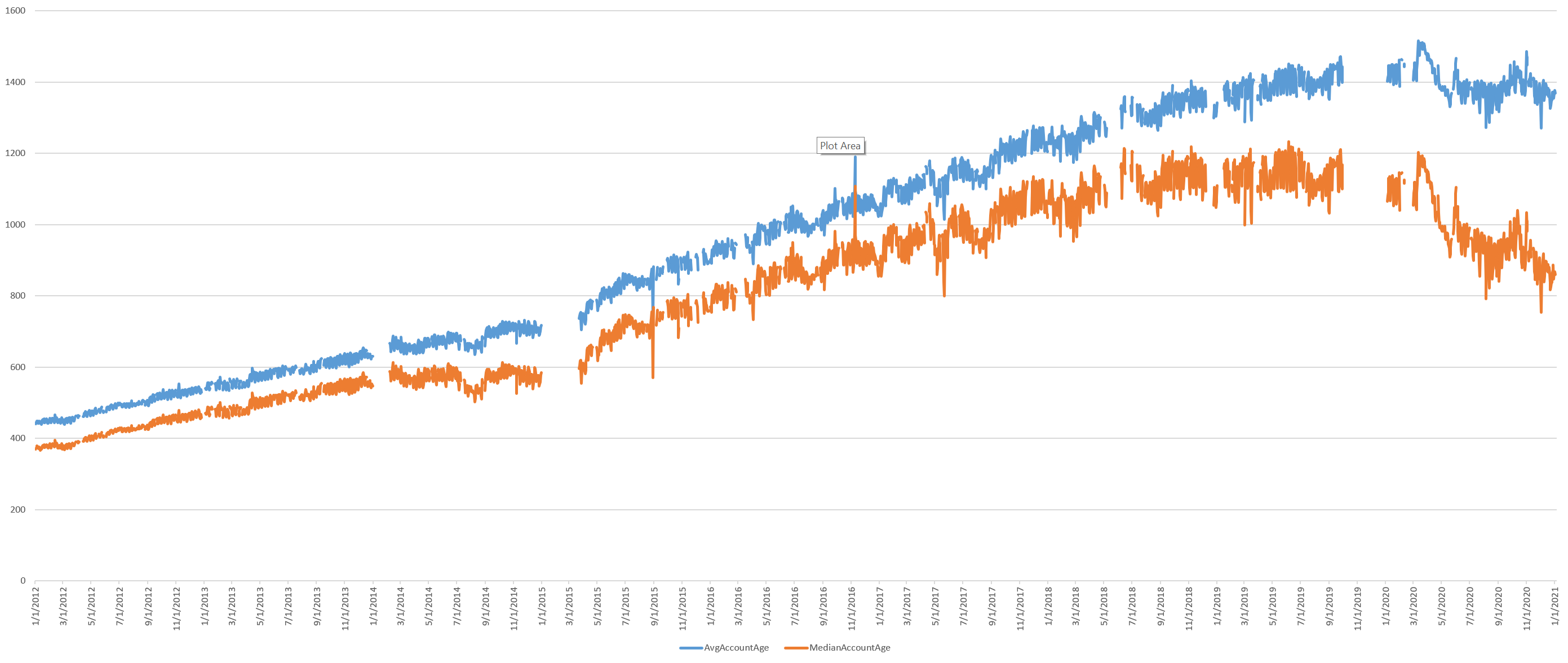
Average Age Of Twitter's User Accounts
Given that Twitter is not growing, its fixed user volume could be explained either by little change in its user base from its early days or by rapid churn in which every user is replaced by another user. The timeline below shows that the average tweeting account age continues to grow linearly, but the median leveled off in mid-2018, suggesting there has been an influx of new users since then. The pandemic era shows a sharp decline in average user age, suggesting a much larger number of newer users have been tweeting.
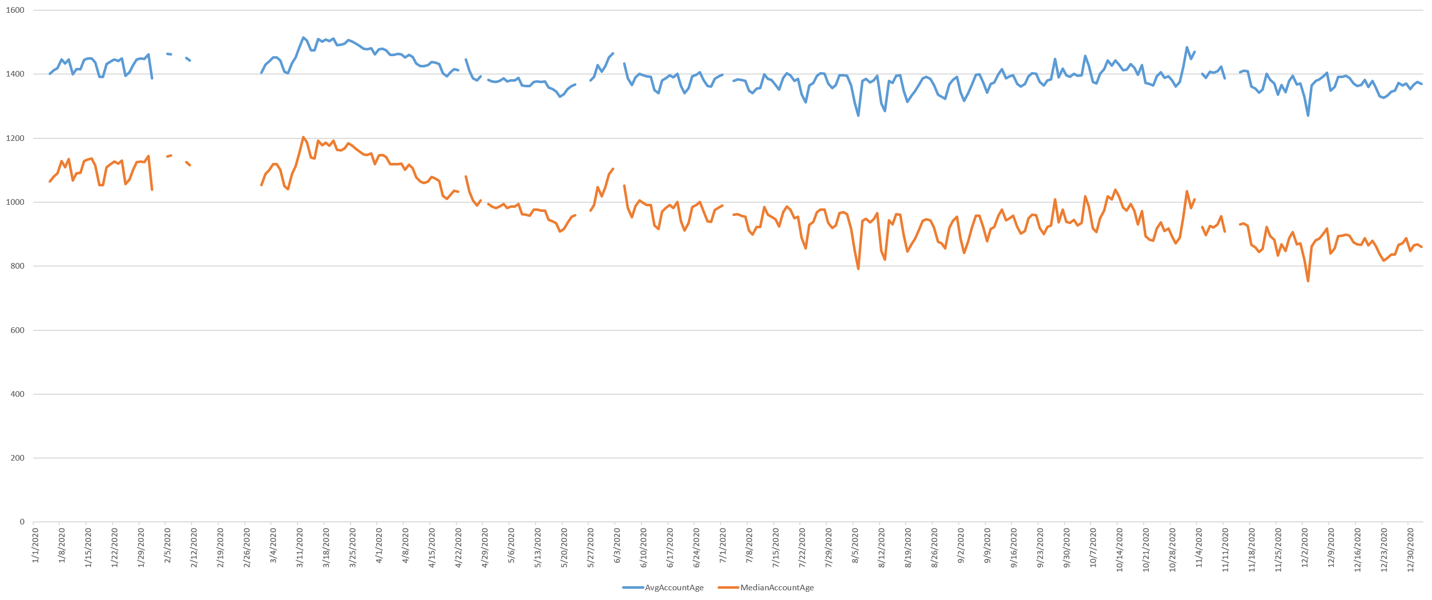
The timeline below zooms into the January 1, 2020 through January 5, 2021 portion of the graph, showing how in mid-March there was a brief period where the average and media account ages increased substantially, likely due to long-running governmental and elite accounts tweeting more often, though this sharply decreased through May 20, surging through the George Floyd protests. From October 14 through November 17, the median age fell while average age remained similar, suggesting more newer accounts were tweeting (affecting the median) while the older accounts were old enough to balance the average.
What about the median account creation year over time? Again, these numbers suggest a newer cohort of users have begun tweeting more heavily during the pandemic.
The Geography Of Twitter
Finally, what about the geography of Twitter?
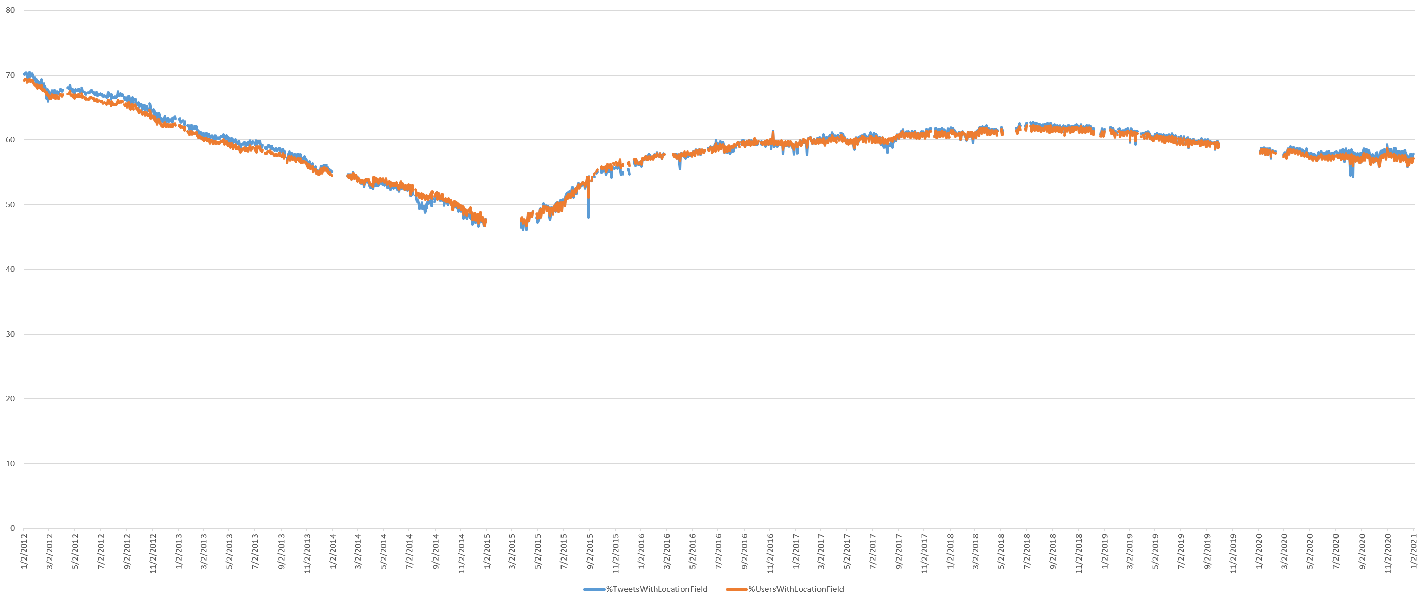
What percentage of all tweets and Twitter users provide a non-null "Location" field? This number continues its decline since mid-2018.
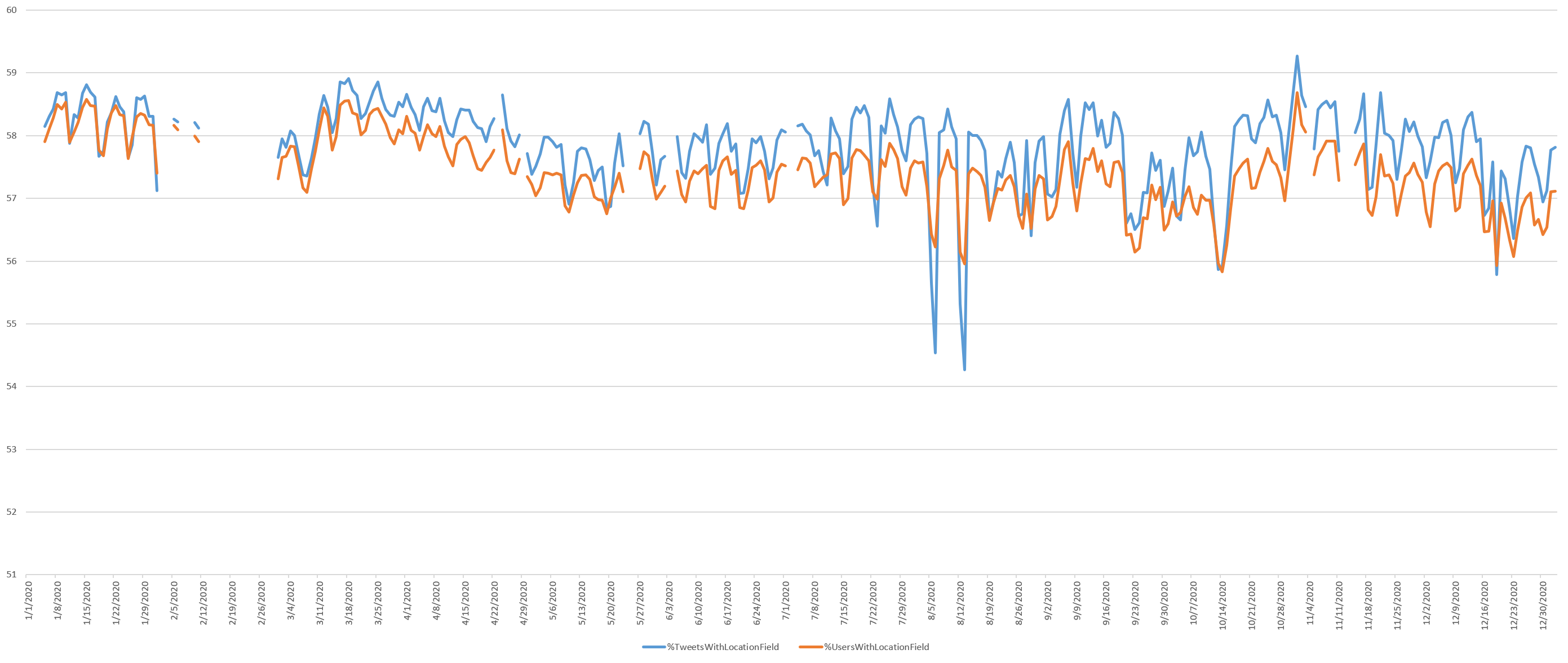
The timeline below zooms into the January 1, 2020 through January 5, 2021 portion of the graph, showing that tweeting users with non-blank location fields decreased steadily from mid-March through early May.
What percentage of all tweets were geocoded with either a GPS coordinate, Place location or GPS coordinates in the Location field and thus precisely mappable using verified coordinates? (Geocoding the user-provided Location field increases the number of mappable tweets, but since this textual location is user-definable is it not sensor-verified. Twitter itself cautioned in 2009 that “since anything can be written in this field, it’s interesting but not very dependable.”) The percentage continues to collapse, suggesting that the era of "Mappable Twitter" is closing.
The density of such coordinates has fallen especially sharply during the pandemic, dropping more than a full percentage point since the start of lockdowns. This suggests users are disabling location tracking when tweeting from home.
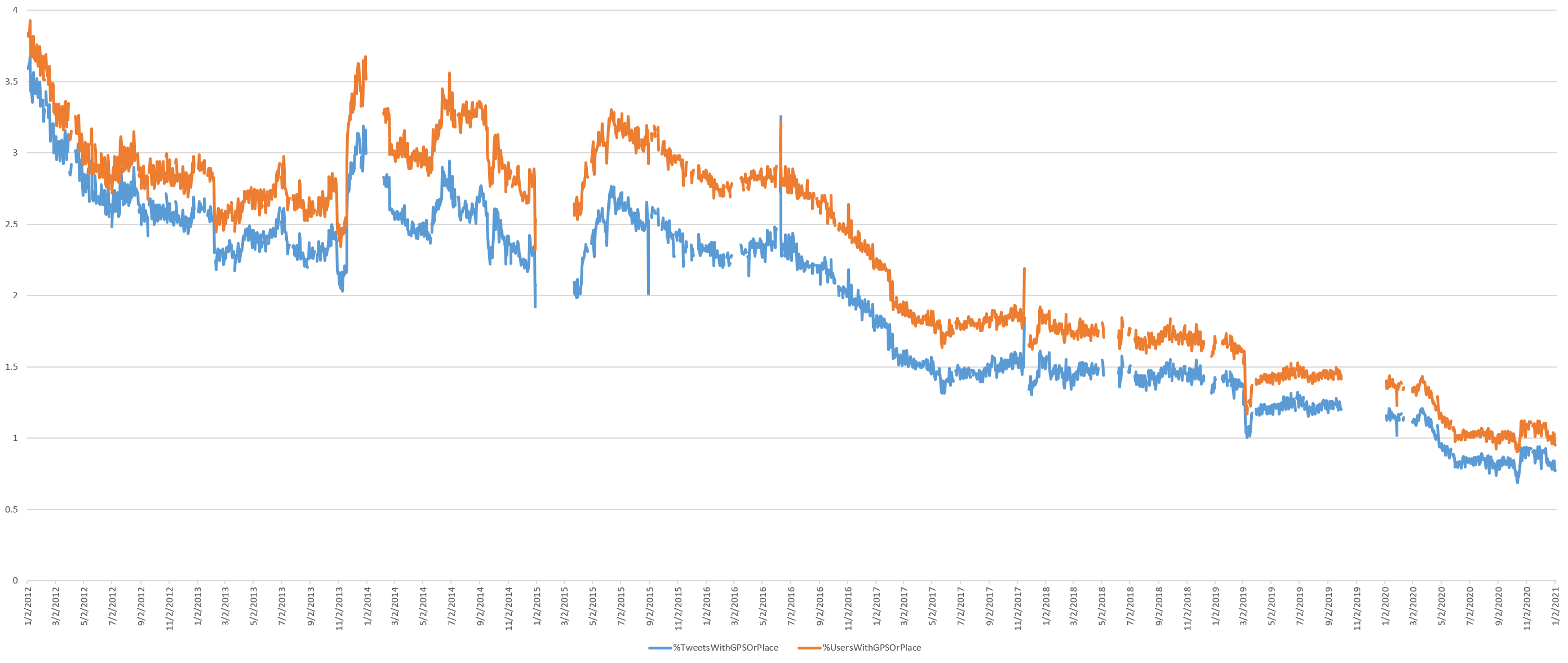
The timeline below zooms into the January 1, 2020 through January 5, 2021 portion of the graph, showing how tweets containing either place or GPS coordinates began sharply declining from March 23, reaching a low point on June 1. Increasingly, they began sharply decreasing again from October 7, reaching a low point on October 13 and hitting a high point on October 21 as Twitter's new retweet rules went into effect. Noticeably they decreased sharply since December 13.
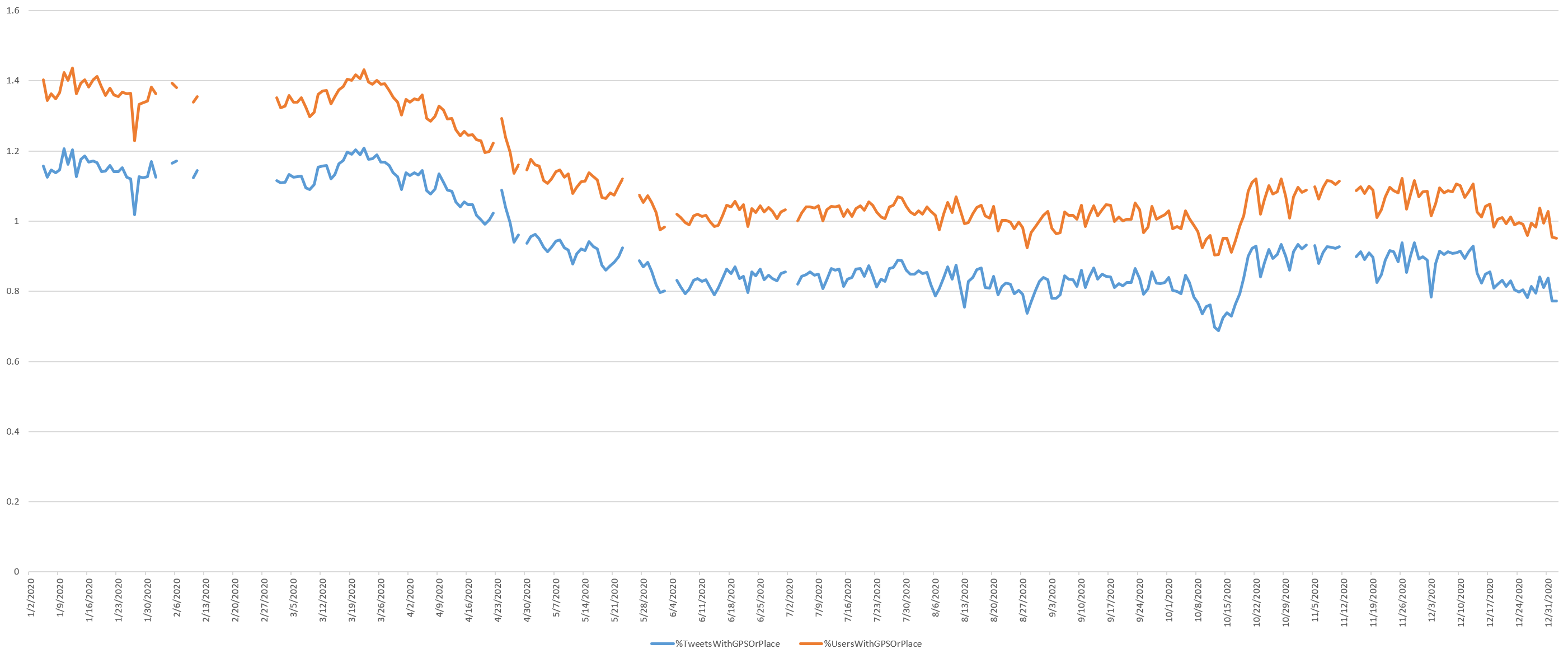
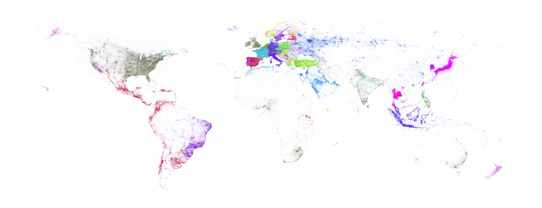
The numbers above reflect both tweets with precise GPS coordinates that yield the beautiful and intricate maps we've come to associate with Twitter, tracing transportation corridors and city life, and city-centroid-level "Place" locations that merely report the fixed centroid of an entire city. Billions of tweets that all report the same coordinate of the centroid of New York City renders mapping attempts futile.
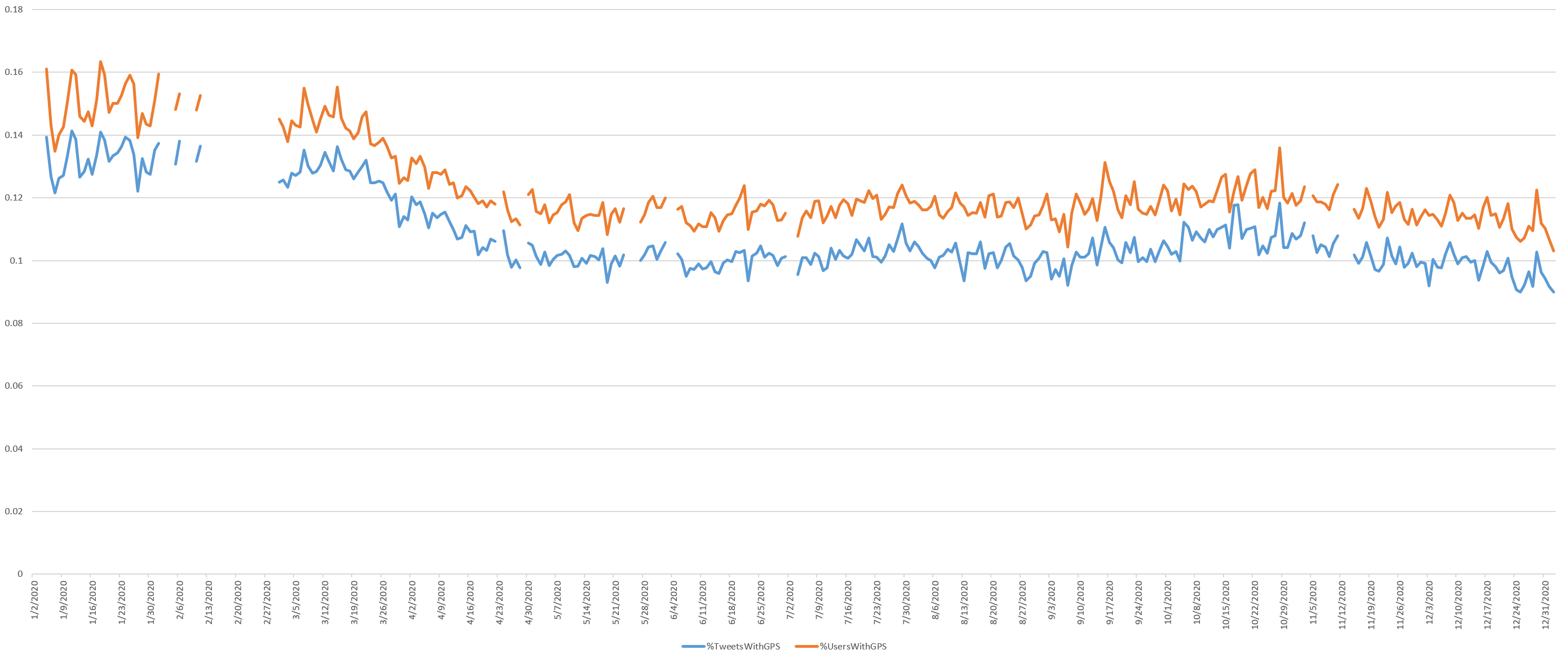
The timeline below shows the percentage of tweets that have precise GPS coordinates, showing that by and large, the era of precision Twitter mapping has come to an end. Today less than 0.1% of tweets have GPS coordinates and there is a visible dropoff as the lockdowns began.

The timeline below zooms into the January 1, 2020 through January 5, 2021 portion of the graph, showing how the small remaining percentage of GPS tweets fell sharply from March 16, reaching a low point on April 8 from which it has yet to recover. There was a slow but steady increase through October 28, dropping back to the previous levels shortly thereafter. Overall GPS-tagged tweets dropped from around 0.13-0.14% of tweets at the start of the year to a new low of around 0.1% of tweets, reflecting the scarcity of such high resolution tweets now.
Conclusion
For more detail on the methodology and an explanation of the implications of each of the graphs above, see the original study from March 2019: Visualizing Seven Years Of Twitter's Evolution: 2012-2018.