Last March we published an in-depth exploration of Twitter's evolution 2012-2018 and followed it up this past November with a look at how Twitter changed in 2019. As public health researchers increasingly turn to social media to explore societal-scale reactions to the COVID-19 pandemic, their results hinge on fundamental questions about how usage of Twitter has changed over the course of the pandemic. With most of the planet stuck at home, has Twitter reversed its years of declining use as the world's citizenry crave the social connection and sense of community it can provide? Given the outsized importance of geography to public health findings derived from Twitter, are there any systematic differences in geographic sharing when people are tweeting from home rather than on-the-go? Has Twitter's shift towards retweets, link sharing and a centralization around verified users accelerated during the pandemic? Are verified accounts driving the discussion or is the COVID-19 era largely similar to seven months ago?
To explore all of these questions, we've updated our Twitter analyses to include January to June 2020, capturing the impact of the first six months of the pandemic on Twitter and putting these changes in the context of its last nine years of existence.
The analyses provided here are based on the Twitter Spritzer/Sample stream that constitutes a random sample of 1% of tweets. Last year we showed that this 1% stream is perfectly correlated with the complete firehose along the dimensions reported below and thus acts as a proxy for the macro-level structural characteristics of Twitter, though the numbers below could be impacted by systemic changes in the Spritzer stream's composition since that validation study. Brief holes in the graphs below represent missing data from technical collection error. For more detail on each metric and how it was calculated, since the original March 2019 analysis.
Executive Summary
The COVID-19 pandemic and accompanying societal mitigation strategies like lockdowns led to a surge in tweeting from March 12 to March 30, reaching some of the highest daily tweet volume levels of the platform’s existence and restoring its usage to its July 2013 high. This increase has been remarkably stable for more than three months, suggesting Twitter is playing an elevated role in the societal conversation as nations and their citizenry navigate these unprecedented times.
Daily tweets per user are increasing, while the number of active tweeting users has also sharply increased. Despite the desperate need for reliable information from the verified accounts of public health authorities, tweets by verified users have actually decreased as a percentage of the total Twitter volume during the pandemic. Counting both tweets by verified users and retweets by any user of a verified user’s tweets, around 10% of the total Twitterverse is dictated by verified users – a level unchanged since mid-2017.
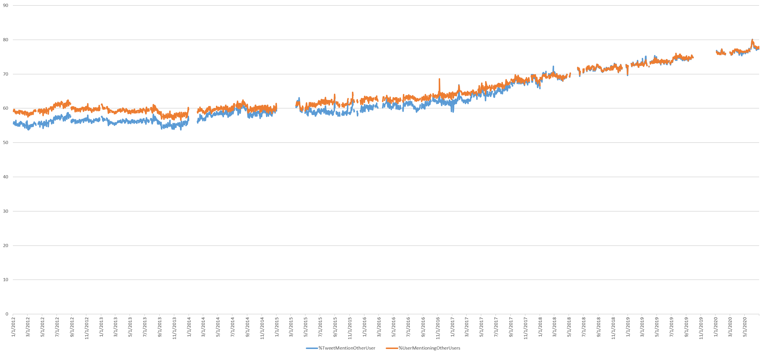
Retweets seem to have leveled off at 50% of all tweets, while replies to other users have continued their sharp upward swing since mid-2017 to around 27%. Tweets mentioning other users have similarly continued their upward ascent, totaling 78% and climbing.
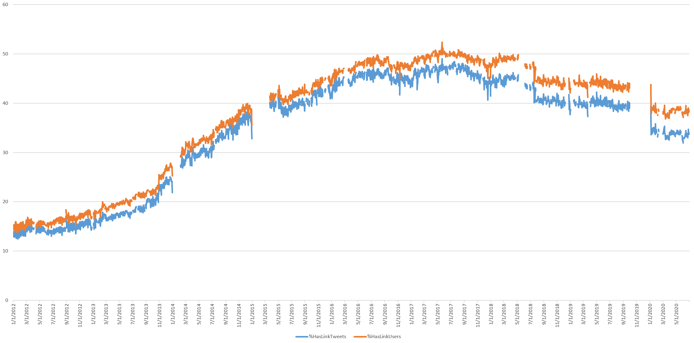
Link sharing has continued its descent, though it has temporarily leveled off during the pandemic. The absence of a sharp increase in link sharing during the pandemic suggests users are tweeting information, experiences and beliefs directly rather than sharing links to external information sources like news and public health websites.
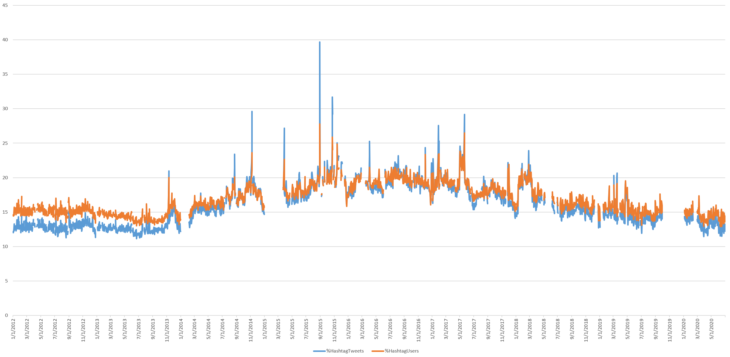
Hashtag use also continues to decline, reinforcing the limitations of using hashtags for search, despite their convenience and programmatic ease-of-use.
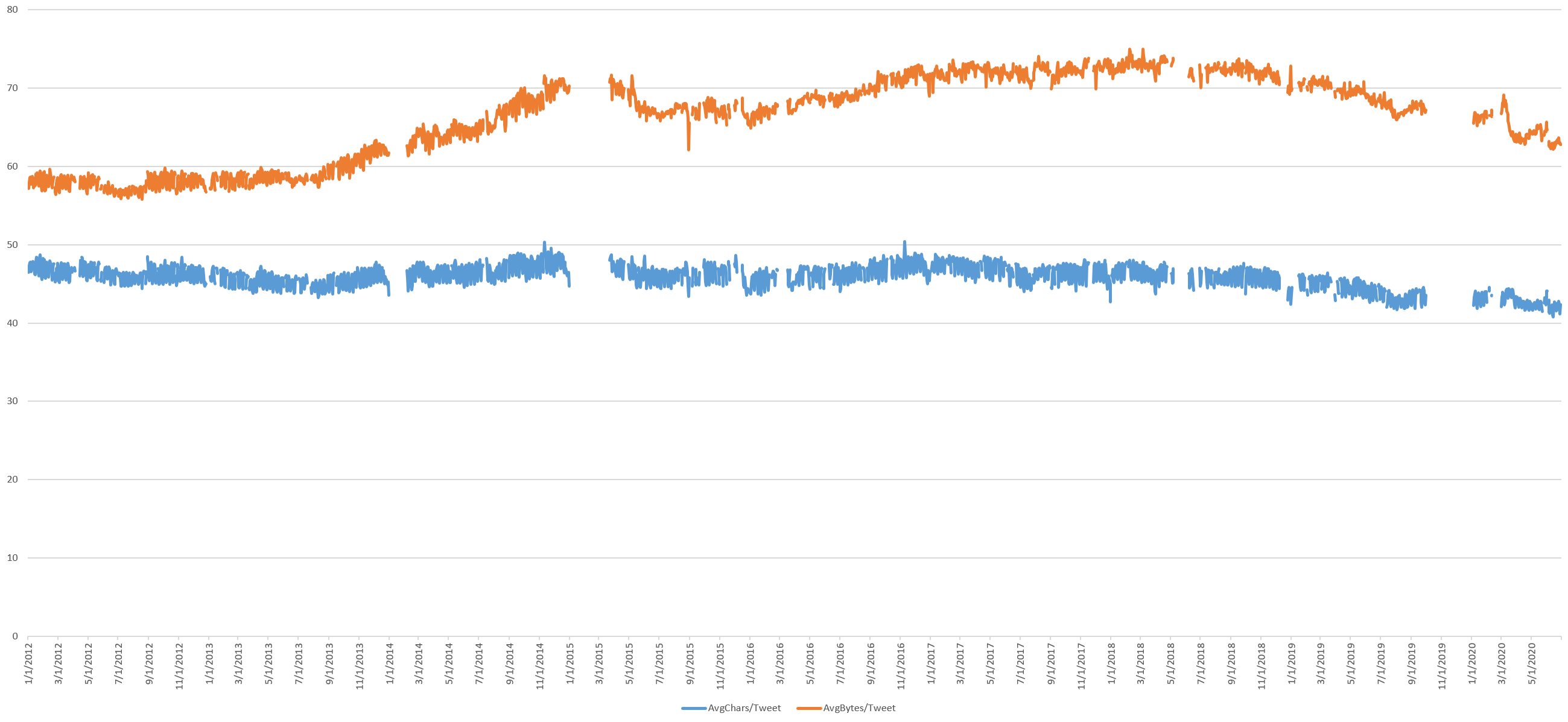
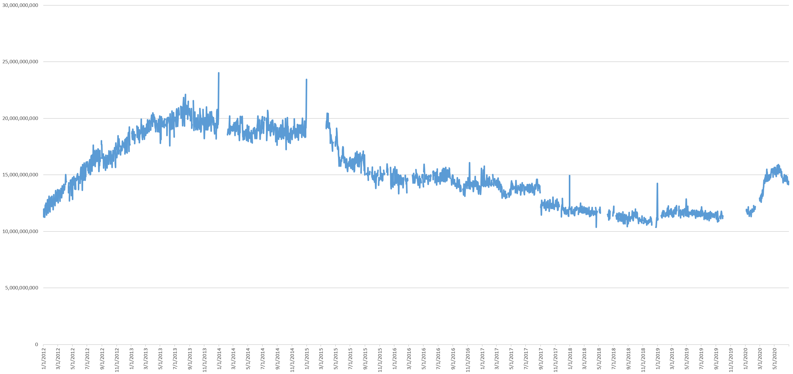
The huge increase in tweets has come with a decrease in average tweet size in both byes and characters, though more noticeably in bytes, suggesting a reduction in multibyte characters. The total volume of novel textual content posted to Twitter as a whole each day has increased from around 11GB of text per day to around 15GB per day, but the shift towards shorter tweets means even with the nearly record tweeting levels, the shorter tweets means there is less overall content for data mining and analysis for public health understanding.
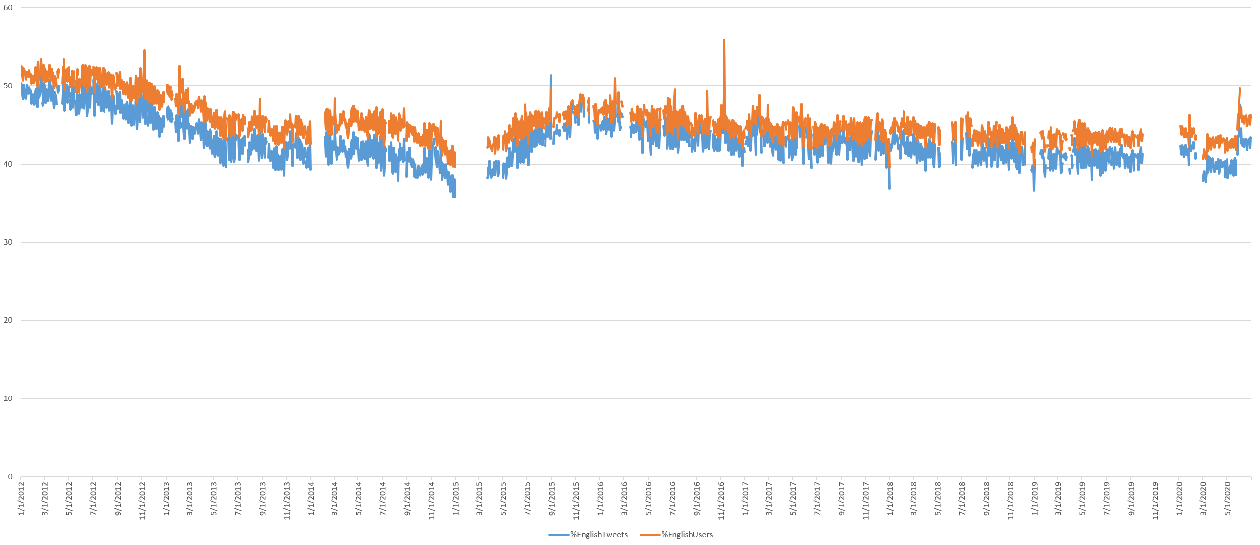
English is still the dominate language on Twitter, accounting for nearly half of all tweets. The pandemic has reversed the steady decline in English dominance, but it has not risen above its early 2017 levels.
The average and median age of actively posting Twitter accounts has fallen sharply during the pandemic, suggesting a surge in newer user accounts is accounting for the increase in posting activity, rather than existing accounts simply tweeting more. This means there are more voices contributing to the Twitter conversation during the pandemic.
Unfortunately, while public health researchers have turned heavily to GPS-tagged tweets to map COVID-19 narratives, it appears that the long decline in geotagged tweets has accelerated sharply during the pandemic, with the percentage of tweets with recoverable geographic information hitting all-time lows.
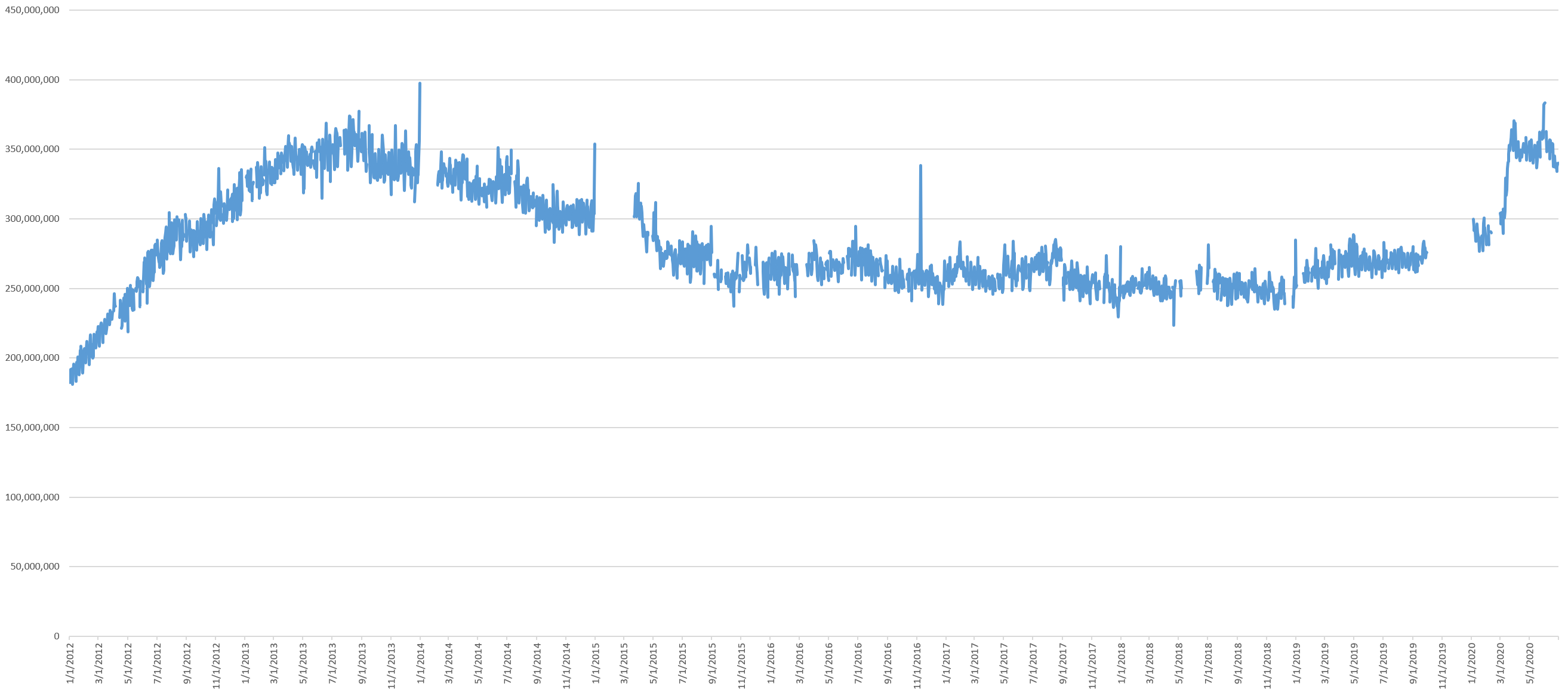
Tweets Per Day
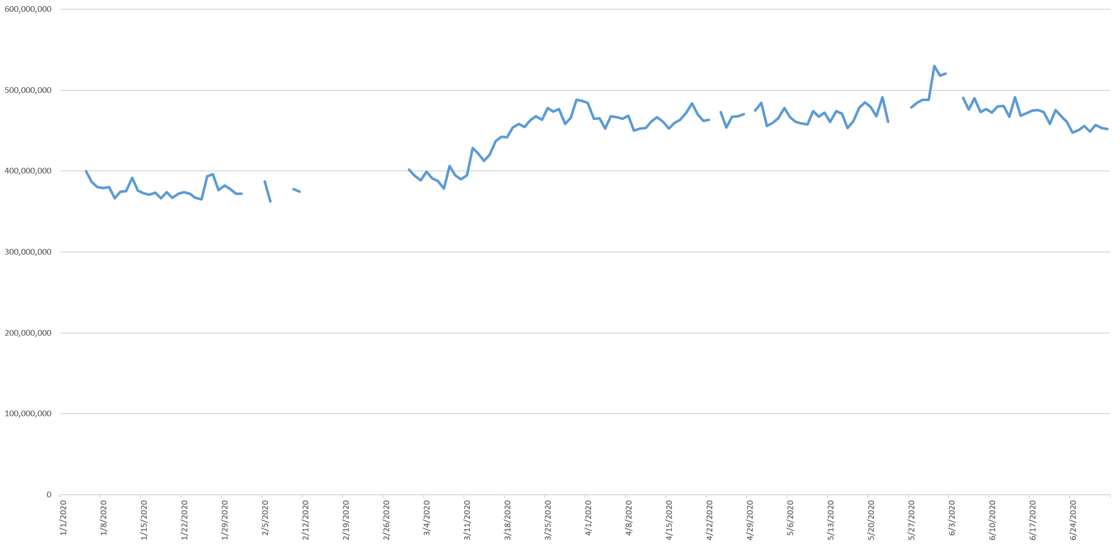
The pandemic has sharply increased the number of daily posts on Twitter, rising from its November 2018 low point just above 320M tweets a day to an almost all-time high of just shy of 500M tweets per day. Twitter is now back to its July 2013 peak. While there appears to have been a decrease over the end of June, this increase has been remarkably stable over nearly three months.
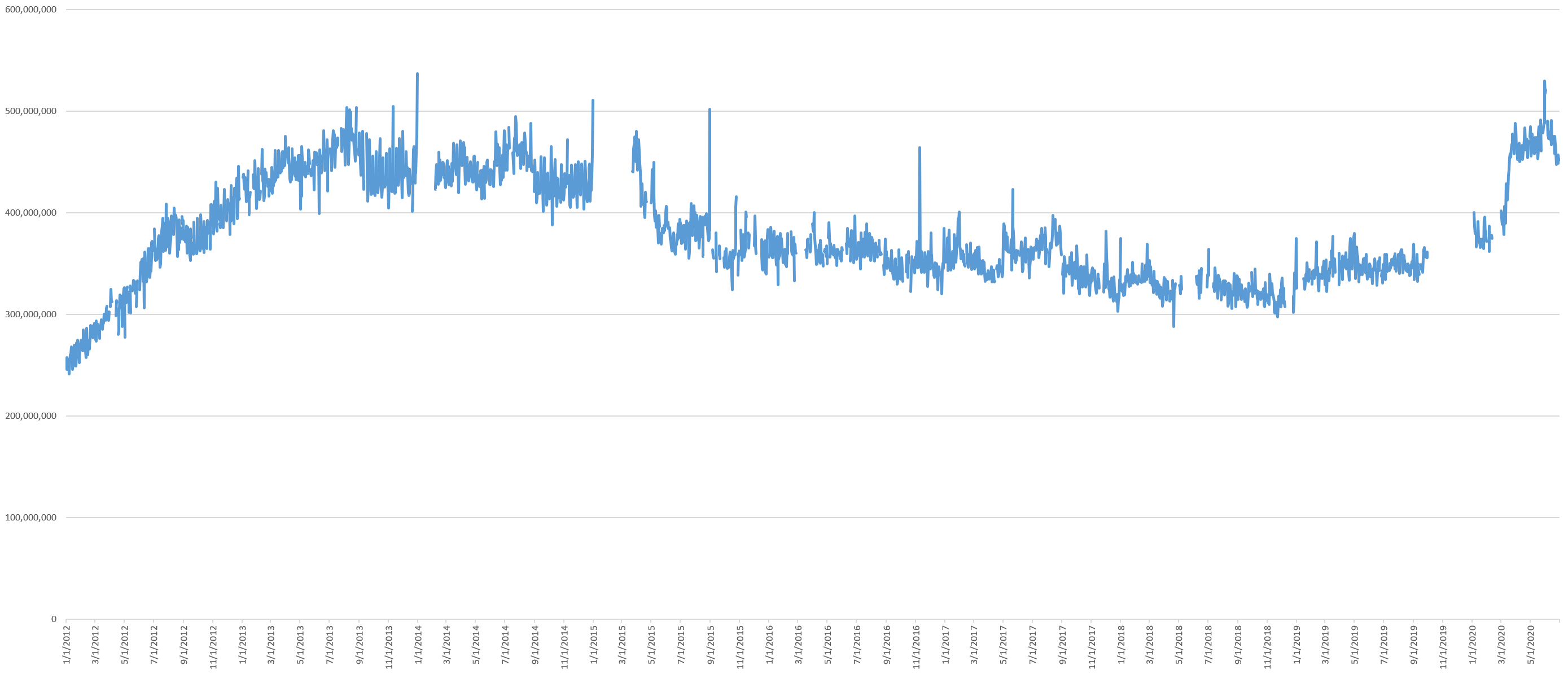
The timeline below zooms into the January 2020 to June 2020 period, showing that this growth period began March 12 and peaked March 30, representing the period when countries around the world were ramping up their lockdowns. Usage remains relatively stable at this new elevated level other than a brief burst on May 31 with the George Floyd protests, quickly ramping back down to its new high over the course of June.
This March 2020 increase coincides with Twitter's reporting of a surge in gaming-related tweets, significant increases in curated events usage and direct messaging and the tail-end of the surge in news coverage.
Tweeting Users
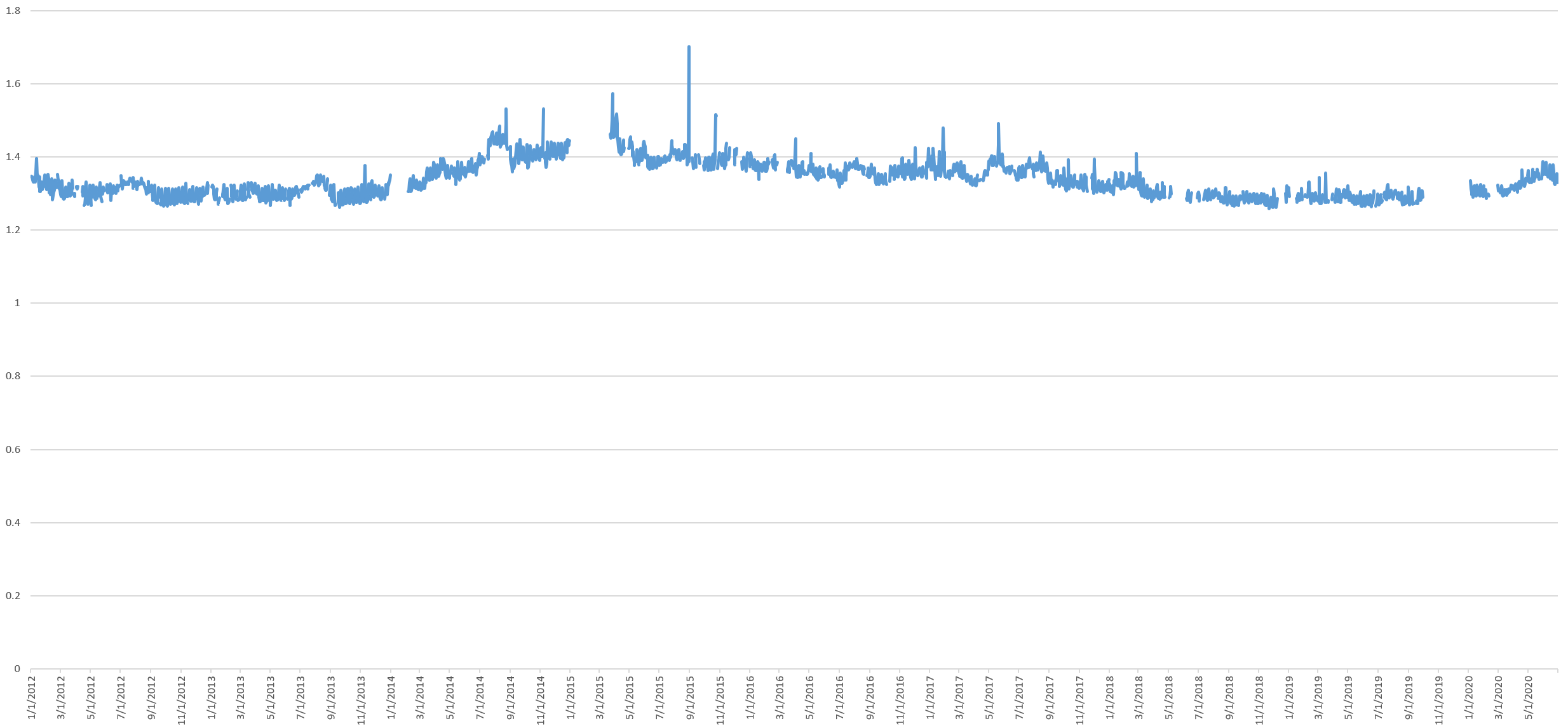
Looking to the users sending all of those tweets, the graph below shows the average number of tweets per user over the time period, calculated by dividing the total number of tweets each day by the total number of distinct usernames sending one or more tweets that day. This appears to be increasing noticeably during the pandemic.
The graph below shows the total number of distinct users sending one or more tweets per day. Unlike other metrics commonly used to assess social platforms, the community of tweeting users is the most important, in that the content produced by these users is what draws the rest of users in. This is calculated by dividing the estimated total number of firehose tweets by the average number of tweets per user in the 1% stream. Note that these numbers differ from Twitter's own Active User counts because this graph counts only users who actively post content, rather than those who merely passively consume it.
Verified Users
What percent of all tweets and users sending those tweets are verified users? Verified users actually make up a smaller portion of all tweets, following their steady decline since late 2017.
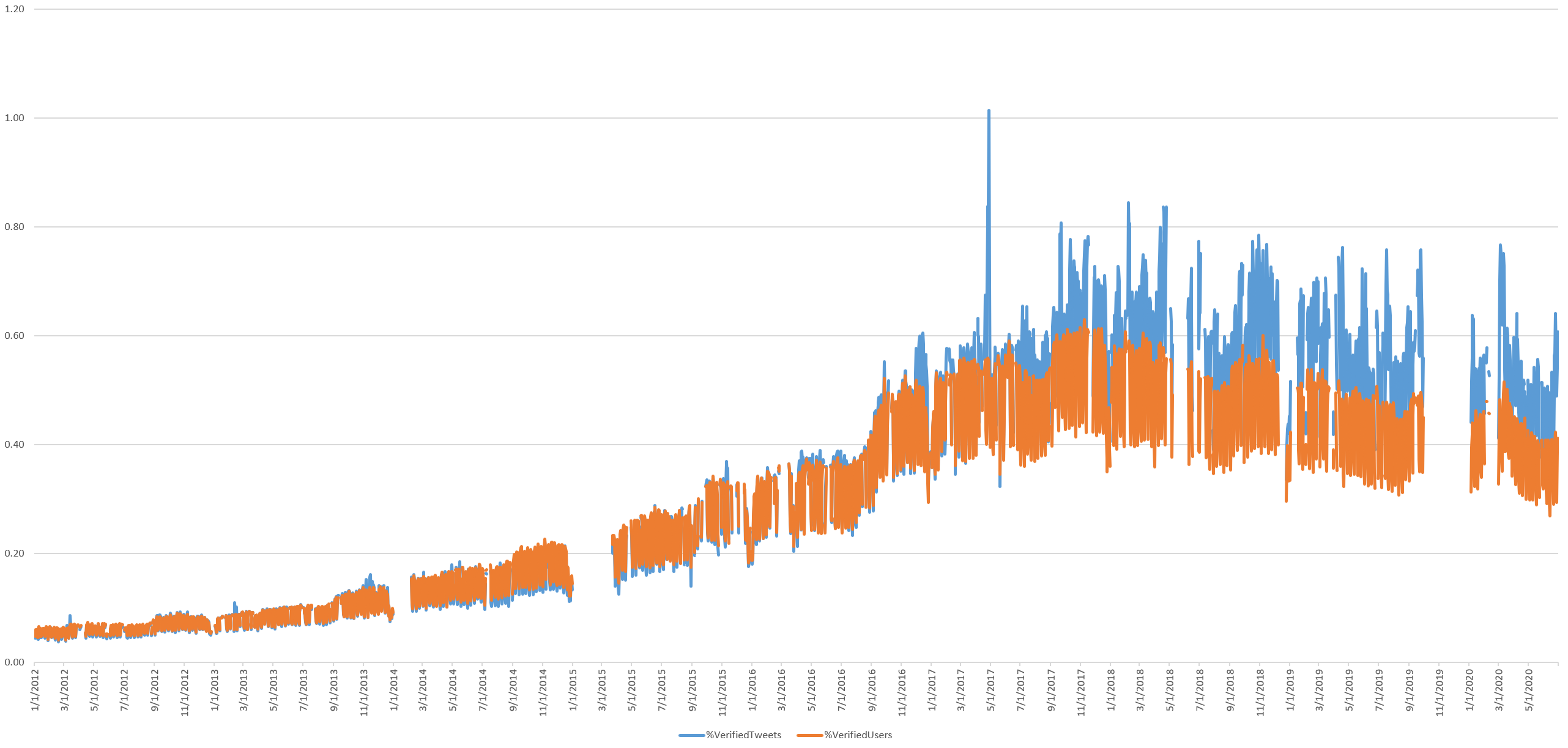
Of course, Twitter largely paused its verified users program in November 2017, which can be clearly seen above. More to the point, given their exceptional rarity on Twitter, it would not be expected that they would account for an outsized percentage of total tweet volume. Instead, a better metric to assess their influence over the Twittersphere would be to measure the combined volume of original tweets sent by verified users and all retweets of those tweets.
This yields the timeline below, showing that a steady 10% of total Twitter volume are either produced by a verified user or are an ordinary user's retweet of a verified user's tweet.
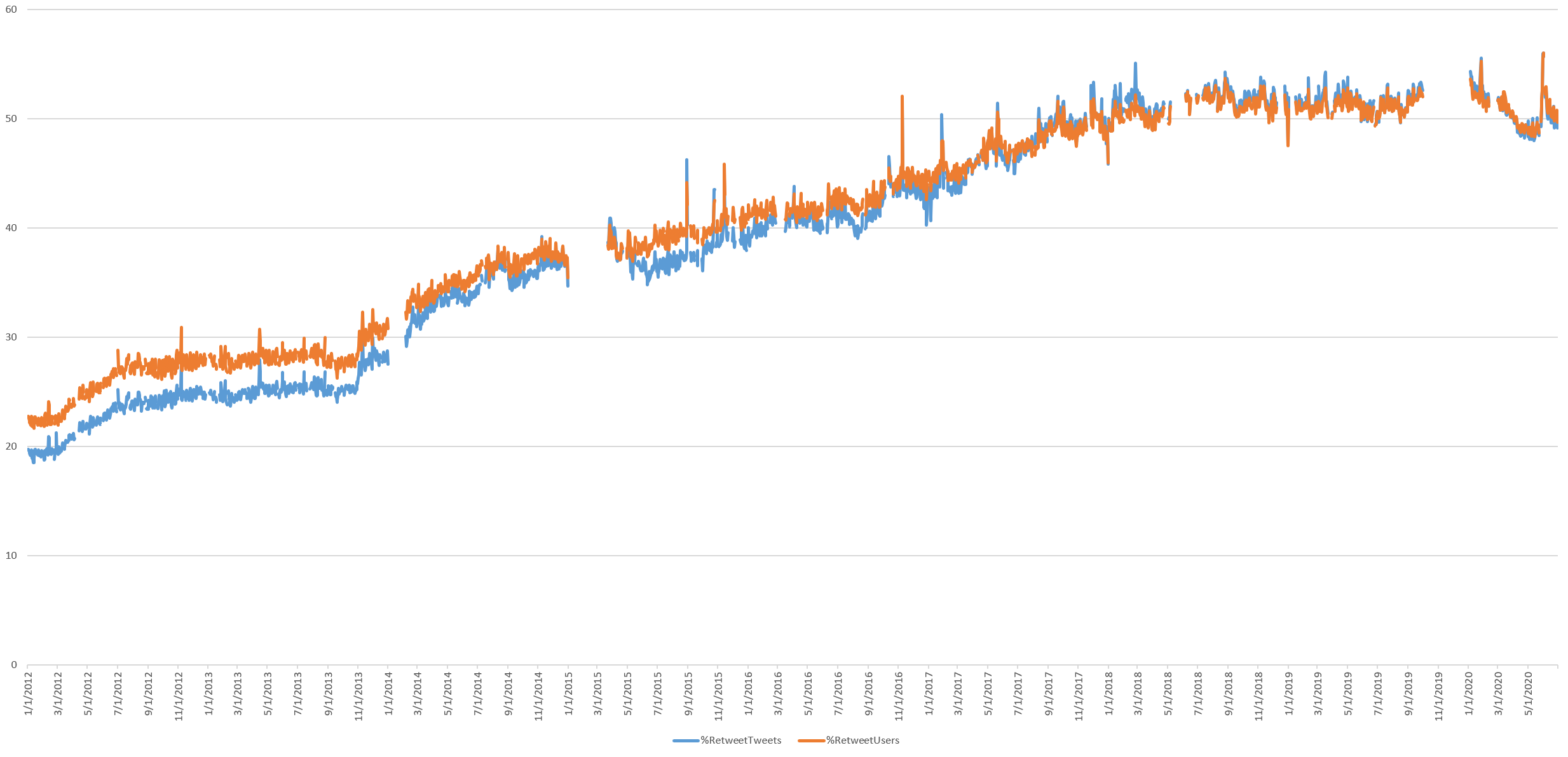
Retweets
What percentage of the total daily tweet volume are retweets? It turns out more than half of all tweets are retweets, though this largely leveled off since March 2018. While this has adjusted slightly during the pandemic, it has not systematically changed.
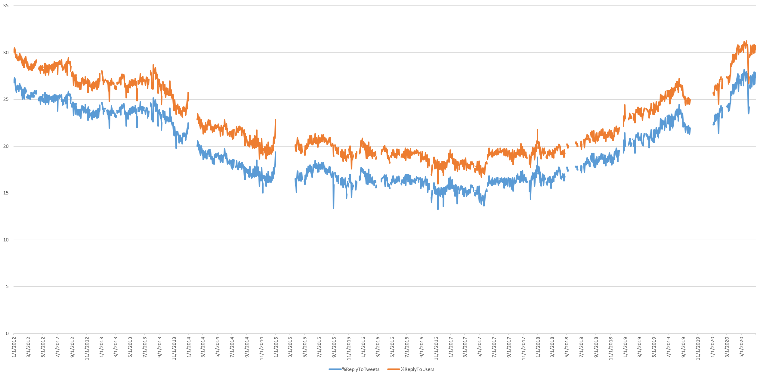
Replying To Other Users
How often are tweets a reply to another user, suggesting a conversation?
Tweets Mentioning Other Users
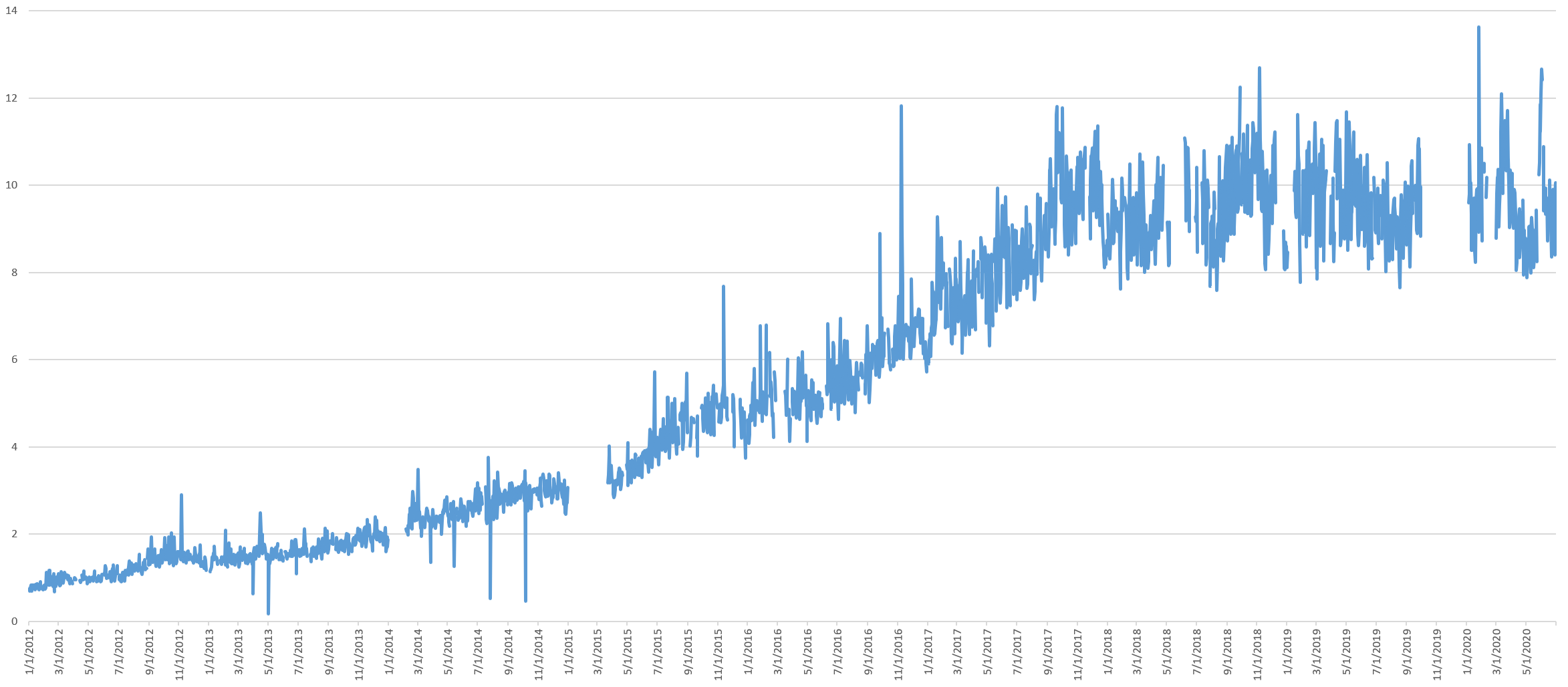
What percentage of all tweets mention another Twitter user in any way? This continues to rise steadily from early 2017, suggesting more and more Twitter is about targeted discussion with users attempting to reach specific other users with their tweets, rather than generalized broadcasts to the world.
Tweeting Links
What percentage of daily tweets contain a URL of any kind?
Hashtag Use
What percent of tweets contain a hashtag?
The Total Daily Size Of The Twitterverse In Characters & Bytes
Just how big is the Twitterverse?
The size of the average tweet in terms of characters and bytes (in the case of multibyte charactersets) after removing retweets, username references and hyperlinks has remained relatively stable over time. Though interestingly, the average tweet size has decreased steadily since late 2016, suggesting tweets are increasingly short messages. Interestingly, during the pandemic, the average length of tweets in bytes has fallen sharply, while character length has fallen more modestly. This could suggest reduced tweeting in multibyte languages and/or a reduction in multibyte characters like emojis.
What about the sum total of the entire Twitterverse?
The timeline below shows the total number of bytes of content posted to Twitter each day after removing retweets, username references and hyperlinks, showing that on a typical day in 2019 just 11GB of text is posted to Twitter – slightly less than was posted on a typical day seven years ago in January 2012. Even with the record-high number of tweets during the pandemic, the platform is hovering around just 15GB of novel content per day, around its November 2015 levels, suggesting the surge in pandemic tweeting is centered on shorter tweets.
The Dominance Of English Twitter
What percentage of all tweets are in English? There was a sharp decline from 2012 through early 2015, a reassurance through early 2016 and then a stable and very slow decrease over time ever since, with around 40% of tweets today being in English. The pandemic appears to have led to a noticeable surge in English tweets, though even this increase places it only back early 2017 levels. Note that these results were computed using CLD2 and exclude cases where no language could be determined (such as a tweet that contains only a hyperlink).
Average Age Of Twitter's User Accounts
Given that Twitter is not growing, its fixed user volume could be explained either by little change in its user base from its early days or by rapid churn in which every user is replaced by another user. The timeline below shows that the average tweeting account age continues to grow linearly, but the median leveled off in mid-2018, suggesting there has been an influx of new users since then. The pandemic era shows a sharp decline in average user age, suggesting a much larger number of newer users have been tweeting.
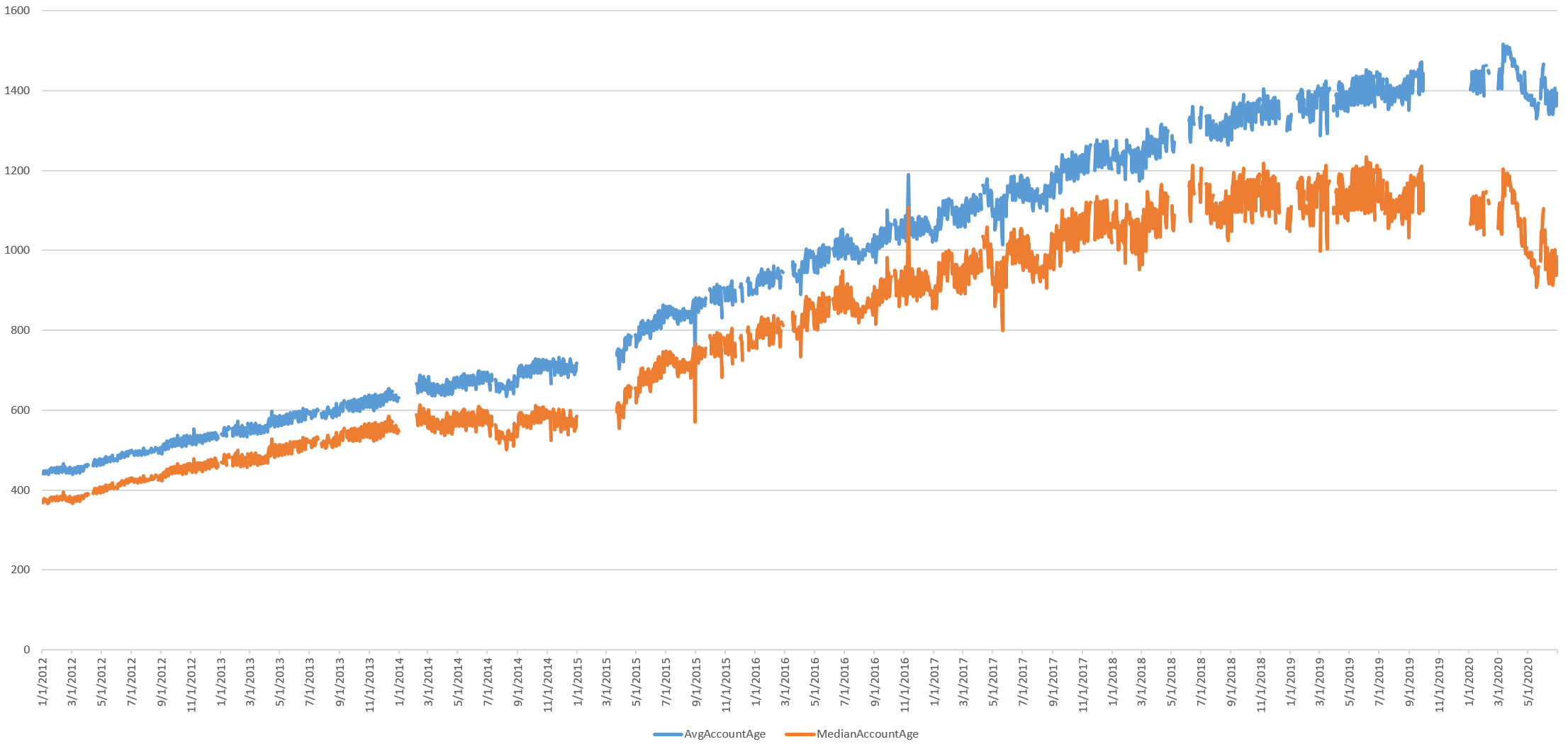
What about the median account creation year over time? Again, these numbers suggest a newer cohort of users have begun tweeting more heavily during the pandemic.
The Geography Of Twitter
Finally, what about the geography of Twitter?
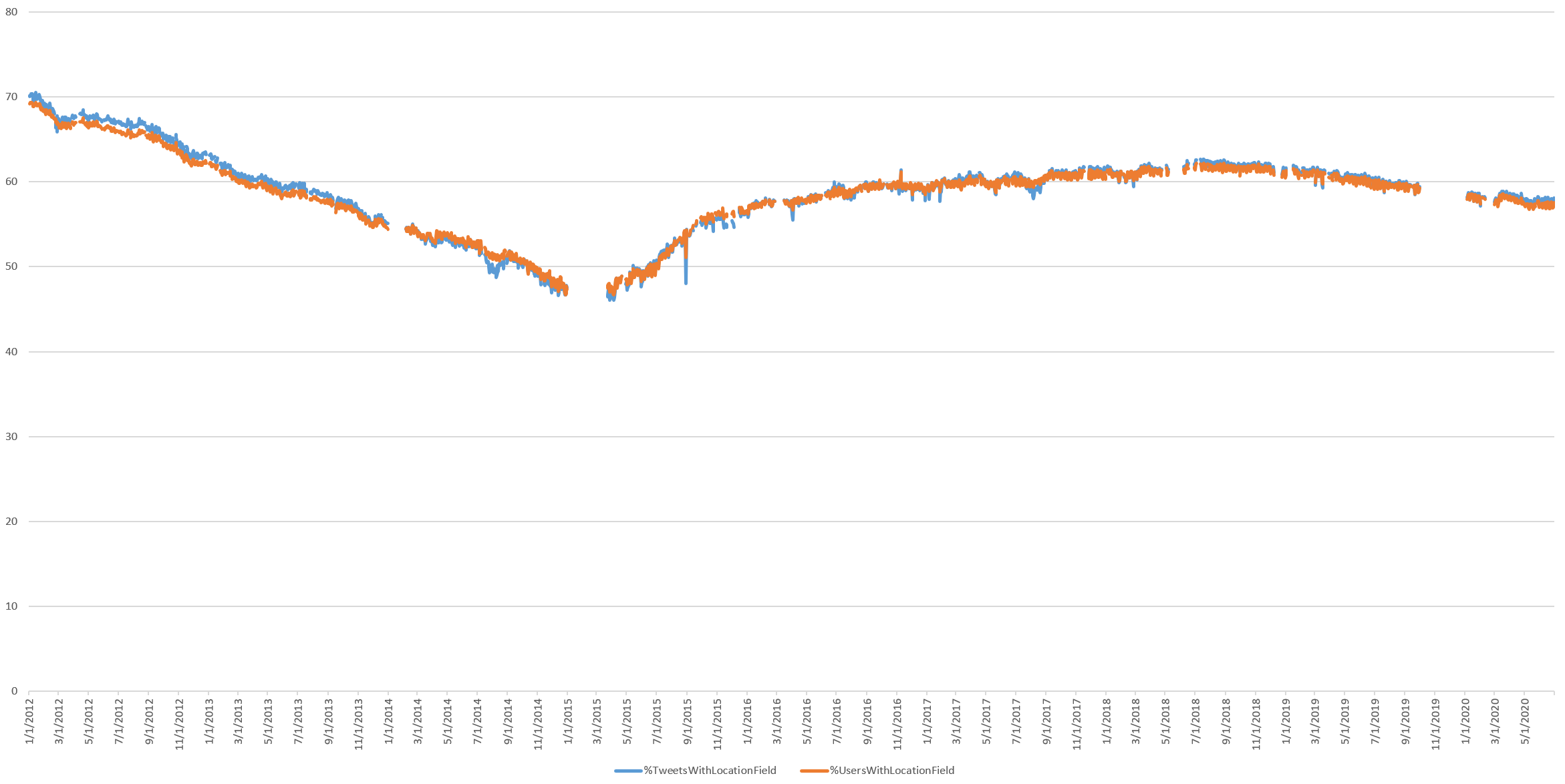
What percentage of all tweets and Twitter users provide a non-null "Location" field? This number continues its decline since mid-2018.
What percentage of all tweets were geocoded with either a GPS coordinate, Place location or GPS coordinates in the Location field and thus precisely mappable using verified coordinates? (Geocoding the user-provided Location field increases the number of mappable tweets, but since this textual location is user-definable is it not sensor-verified. Twitter itself cautioned in 2009 that “since anything can be written in this field, it’s interesting but not very dependable.”) The percentage continues to collapse, suggesting that the era of "Mappable Twitter" is closing.
The density of such coordinates has fallen especially sharply during the pandemic, dropping more than a full percentage point since the start of lockdowns. This suggests users are disabling location tracking when tweeting from home.
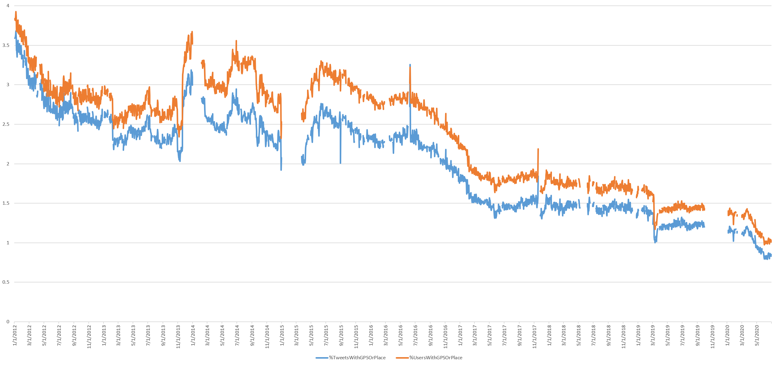
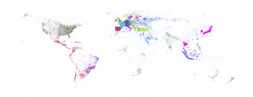
The numbers above reflect both tweets with precise GPS coordinates that yield the beautiful and intricate maps we've come to associate with Twitter, tracing transportation corridors and city life, and city-centroid-level "Place" locations that merely report the fixed centroid of an entire city. Billions of tweets that all report the same coordinate of the centroid of New York City renders mapping attempts futile.
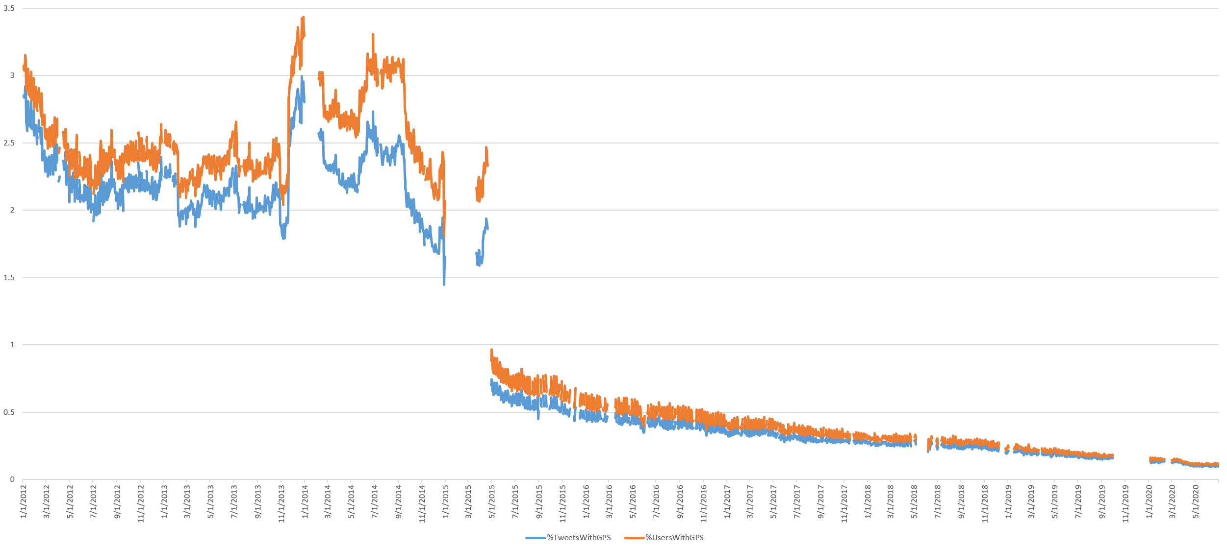
The timeline below shows the percentage of tweets that have precise GPS coordinates, showing that by and large, the era of precision Twitter mapping has come to an end. Today less than 0.1% of tweets have GPS coordinates and there is a visible dropoff as the lockdowns began.
Conclusion
For more detail on the methodology and an explanation of the implications of each of the graphs above, see the original study from March 2019: Visualizing Seven Years Of Twitter's Evolution: 2012-2018.