Each year we publish a "State of the Twitterverse" that looks back at how Twitter has evolved since the start of 2012 (when we first began analyzing Twitter in-depth). Last year's analysis examined the impacts of Covid-19 and the 2020 US presidential election on Twitter's growth, while earlier this year we looked at the first month of Elon Musk's proposed ownership of the platform. In a major milestone, this year marks one full decade of Twitter's evolution in our graphs, showing how the platform has existentially changed over the past 10 years, especially how it has transformed in the years since its growth leveled off in 2013 and the lasting impact of Twitter's brief 2020 election "friction" misinformation experiment, which appears to have nearly reversed its pandemic gains, but also ushered in several new trends in how the platform is used, which have continued over the subsequent two years.
Despite all of the speculation of a mass Twitter exodus since Elon Musk's purchase of the platform, no such exodus is visible in the data, which shows a remarkably stable platform, though with characteristics trending ever more heavily towards an echo chamber. In short, much as happened earlier this year, there is much noise about the world leaving Twitter en-mass and a few notable departures, but at the platform level these departures are not even registerable, with the platform humming along as it always as in terms of volume of usage, offering a critical reminder of its central place as the global public square.
For more detail on the methodology and an explanation of the implications of each of the graphs here, see the original study from March 2019: Visualizing Seven Years Of Twitter's Evolution: 2012-2018. All measures are extrapolated from the Twitter Spritzer stream, which is very highly correlated with the firehose for these measures.
Most graphs run from January 1, 2012 through 11:59:59PM UTC on November 8, 2022, though where noted some graphs run through the end of November 12th UTC.
Tweets Per Day
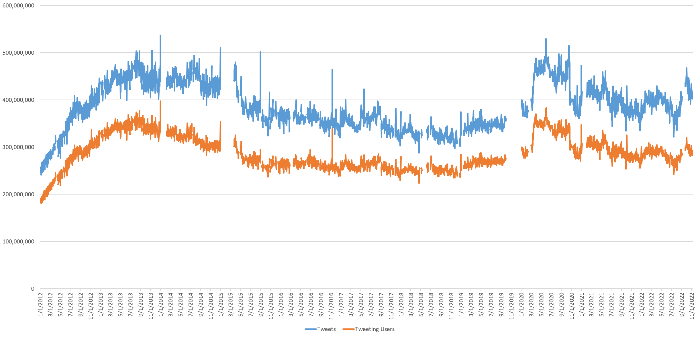
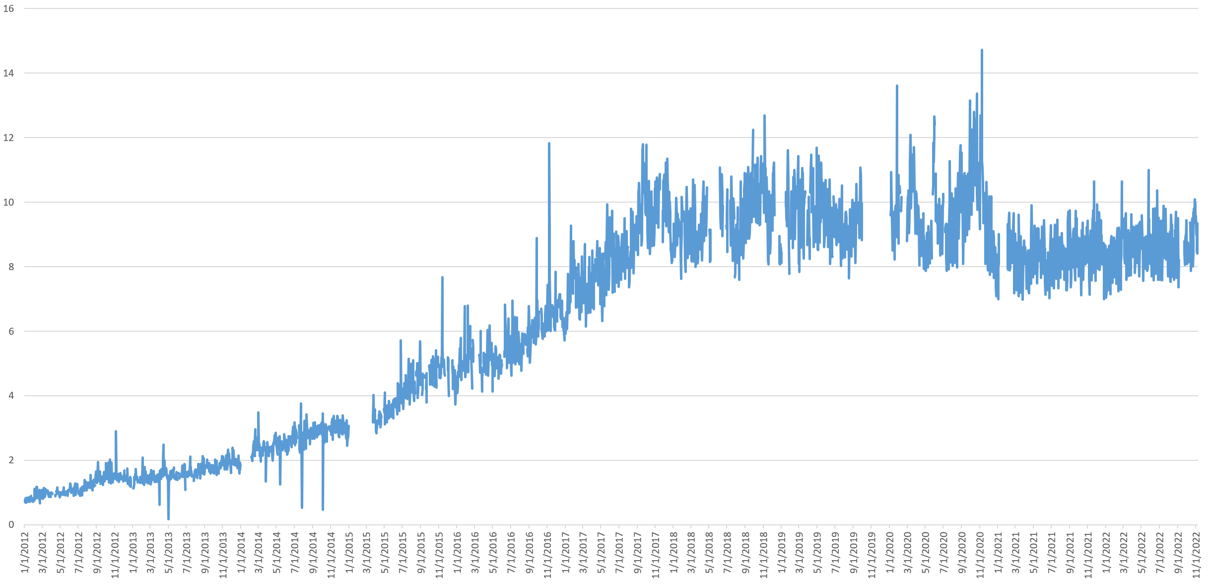
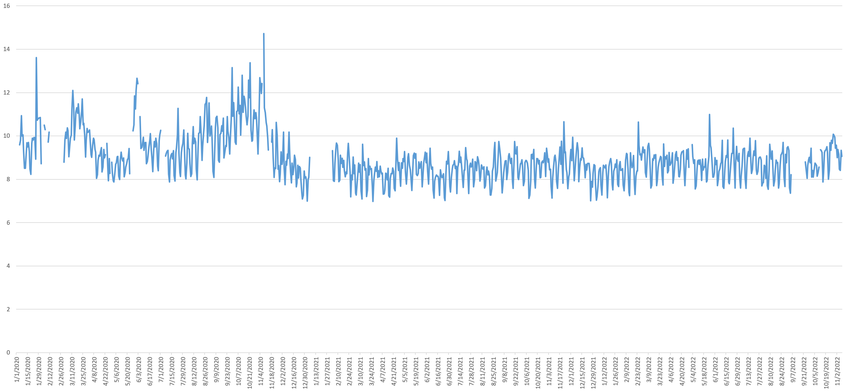
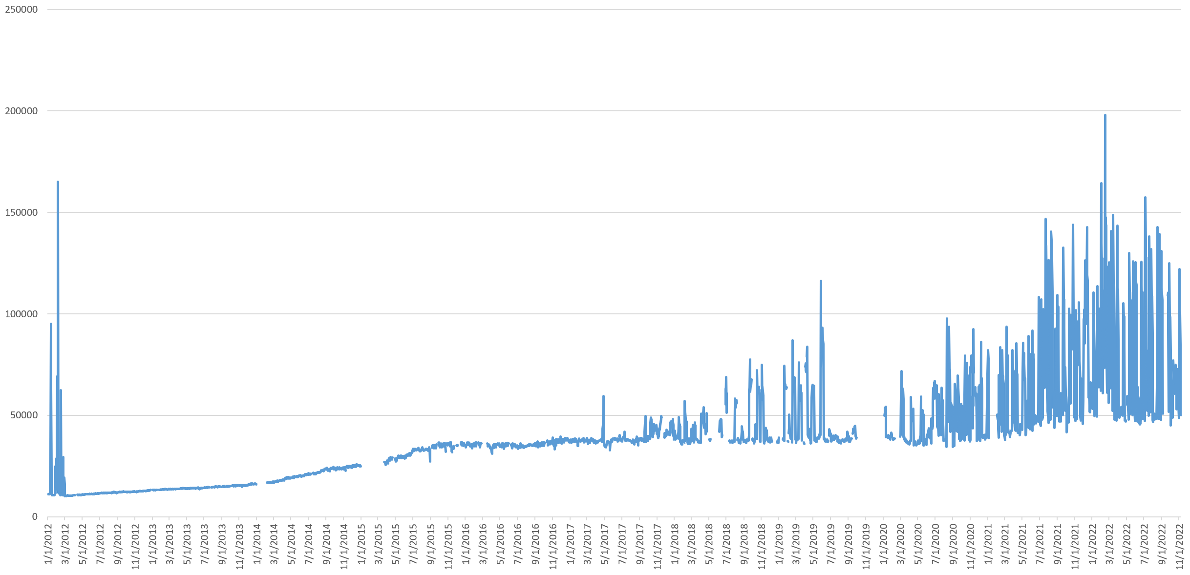
Twitter's growth leveled off in mid-2013, then entered a period of slow decline, before reversing in early 2019. The early pandemic lockdowns yielded explosive growth for Twitter almost overnight in March 2020, as daily tweet volume rose almost to its July 2013 peak, just short of 500 million tweets a day. All of this growth collapsed in a single day, October 22, 2020, coinciding with Twitter's rollout of added "friction" to retweeting, part of the company's efforts to combat election misinformation. While tweet volume has since recovered slightly, it has never recovered to its pandemic highs, suggesting the change, while rolled back on December 16, 2020, permanently damaged Twitter's pandemic-fueled resurgent growth.
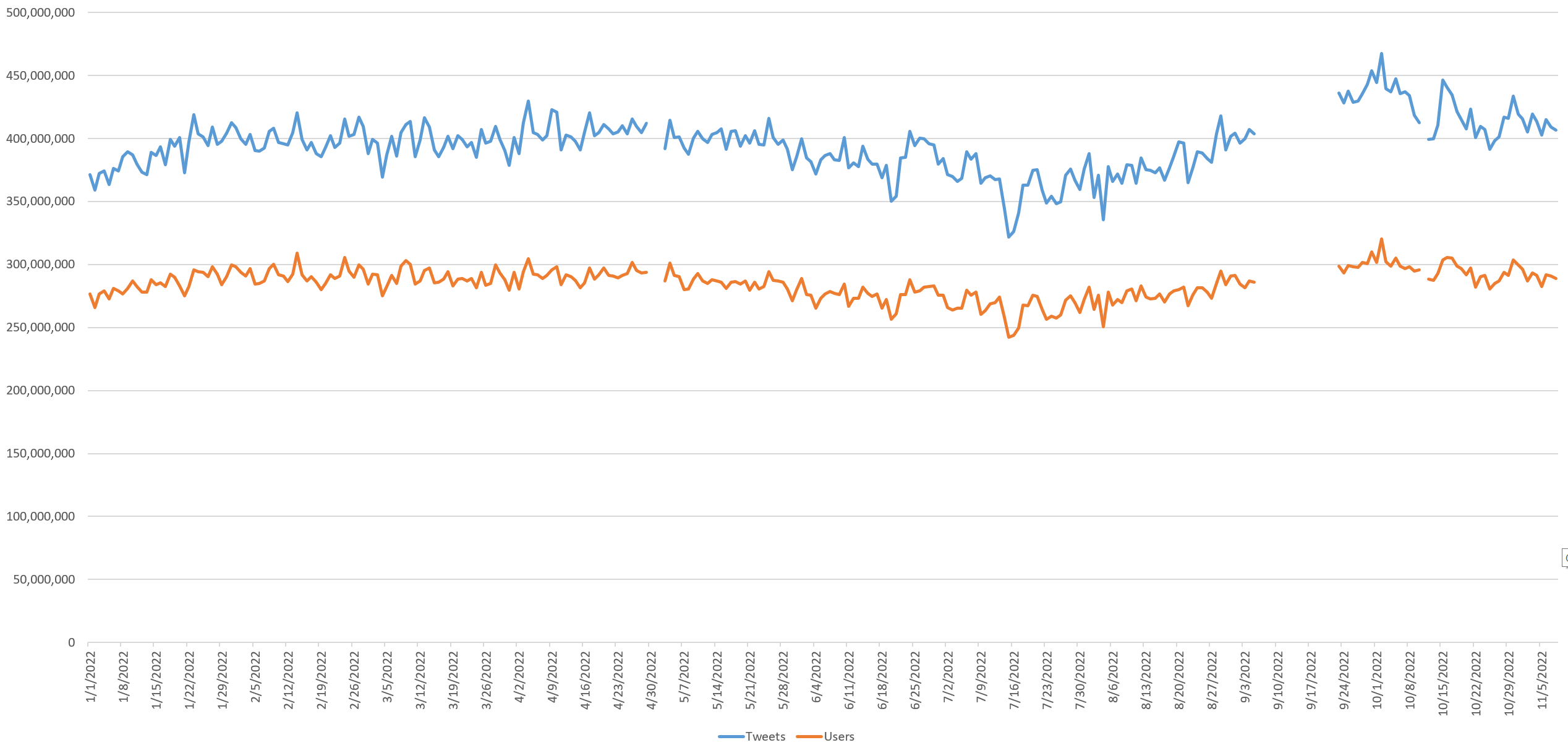
Twitter's daily volume continued to decline through early August, but since mid-August, growth in both daily tweets and the number of unique users sending tweets each day surged through a peak in early October, declined slightly through mid-October and has remained stable in the month since. On a typical day today, around 290 million distinct users send around 410 million tweets.
Remarkably, after Twitter gave up all of its pandemic gains in the aftermath of its October 2020 election misinformation effort, the platform has recovered to where it was in March of this year, which is roughly where it was in April 2015, nearly a decade ago. While far short of its pandemic peak, the platform has actually stabilized in the second half of this year as Elon Musk's ownership became more likely.
Looking at the average number of tweets sent per tweeting user each day, the overall contours show some interesting patterns, with a steady rise over the past three years towards a higher number of tweets per user.
Zooming to the period from January 2020 to November 2022, the pandemic rise and election 2020 fall of Twitter's tweet volume can be seen clearly. Its recovery from mid-August 2022 to early October 2022 and stabilization since mid-October is equally stark.
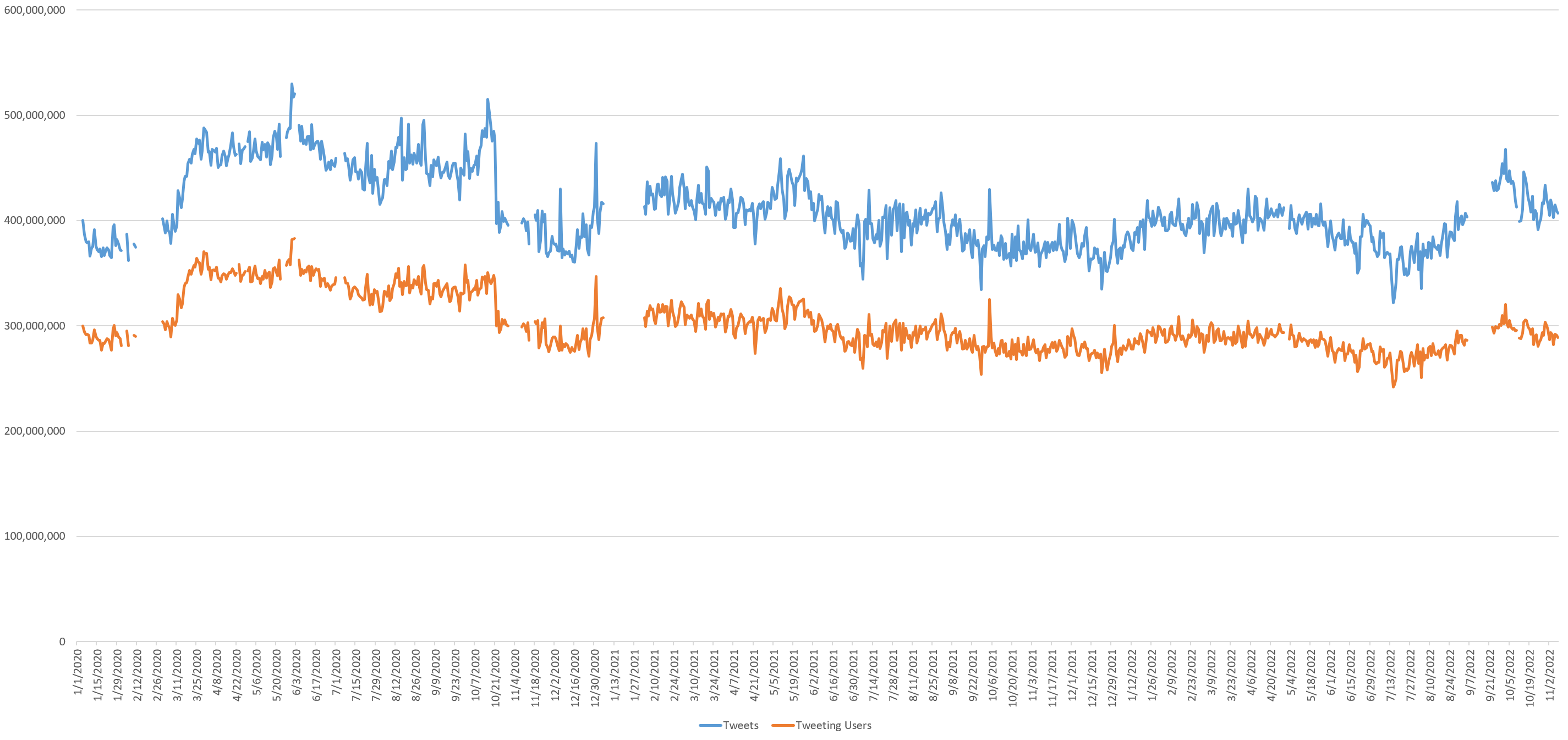
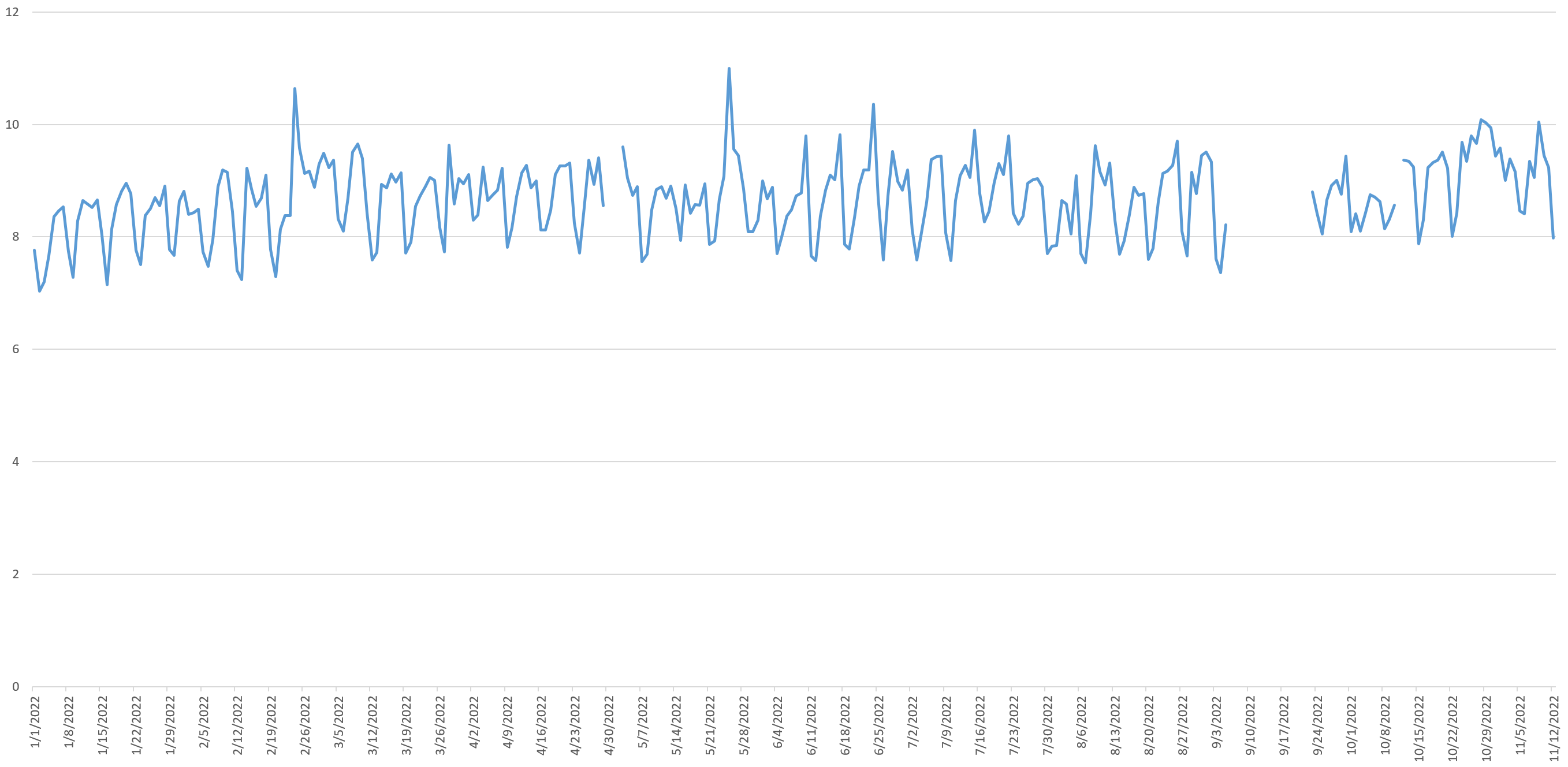
Zooming even further to just since the start of this year, despite widespread media coverage of a growing exodus of users from Twitter, this does not appear to be reflected in the data, with the daily number of tweets and tweeting users remaining remarkably stable since Musk's October 27th completion of his purchase. While the day of his purchase yielded a momentary surge in volume, the days since have been relatively stable, with no massive day-over-day decline. This suggests that, far from the floodgates of a mass exodus opening, few users are actually leaving at this time, or those leaving are among the less prolific users of the platform.
Verified Users
Historically, only a very small fraction of Twitter users have the coveted "verified" blue checkmark beside their name and they collectively account for just a fraction of a percent of all tweets sent each day. The graph below runs through November 8th, the day before Twitter permitted purchasing of verified status.
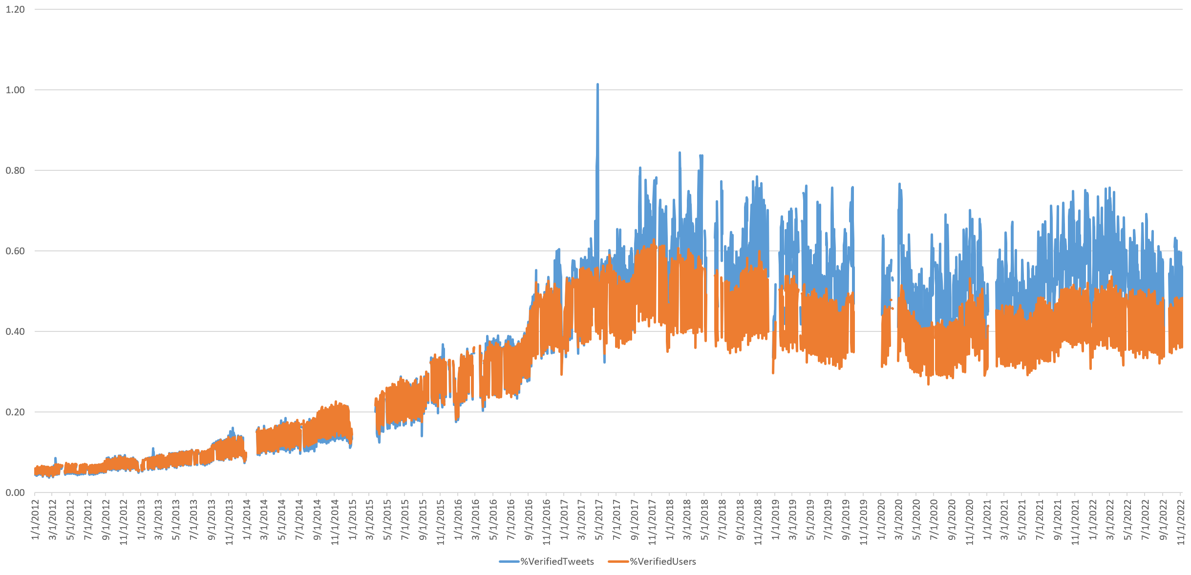
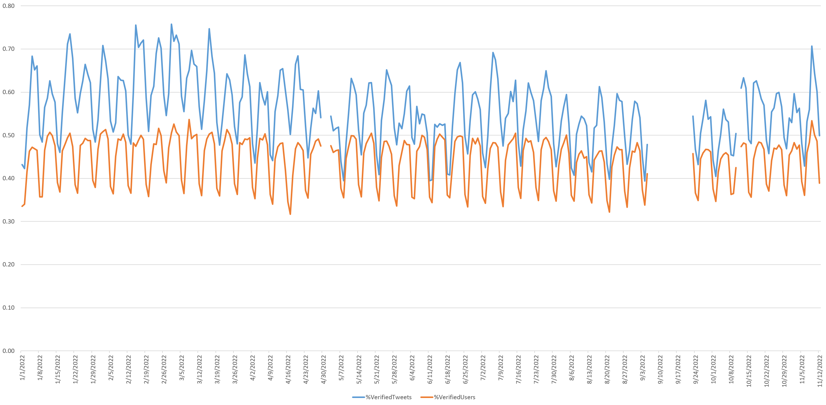
Notably, when zooming into just this year through the end of November 12th, there has been little change in the percentage of Twitter that is posted by verified users since Musk made his offer to purchase Twitter. This suggests that verified users who have left the platform since Musk's purchase were not prolific users of the platform. Looking at the period from November 9th (the beginning of paid verification) and November 11, there is a one-day surge on the 9th as users purchase the coveted Blue Check, but contrary to breathless media coverage, it is clear that the platform did not suddenly become awash with verified users. Indeed, as a percentage of tweeting users, the 9th was not even this year's peak, and in terms in total Twitter volume, the day was well below Q1 of this year.
In short, while high-profile incidents of impersonation yielded widespread media coverage of the dangers of purchased verification, it is clear that Twitter's hundreds of millions of users did not all rush out on November 9th to purchase verified accounts.
While verified users themselves account for a very small portion of all tweets, the story changes dramatically when retweets of those verified users' tweets by ordinary users are included. If both tweets by verified users and all retweets by ordinary users of those verified tweets are included, the combined total is around 8-10% of the entire daily tweet volume, despite verified users making up less than 0.4% of all Twitter users. This shows the outsized impact this tiny group of users has on the overall Twitter discourse.
Notably, there has been a permanent decline in the reach of verified users, from around 10% of all daily tweets towards the end of 2020 to around 8-9% since late 2020.
Zooming into the period from 2020 to present, the combined percentage of the Twitterverse that was either a tweet by a verified user or a retweet of a verified tweet by an ordinary user, collapsed in the aftermath of the 2020 election. On November 9, 2020, two days after Biden was called as the winner of the presidential election, retweeting of verified users collapsed, continuing to decline through November 14th. Retweeting of verified users never recovered and has remained remarkably stable in the year and a half since – the most stable it has been in the past decade.
Looking just since the start of this year through November 11th, the influence of verified users has increased slightly in the last few weeks since Musk's purchase, but is within its historic bounds of the past year.
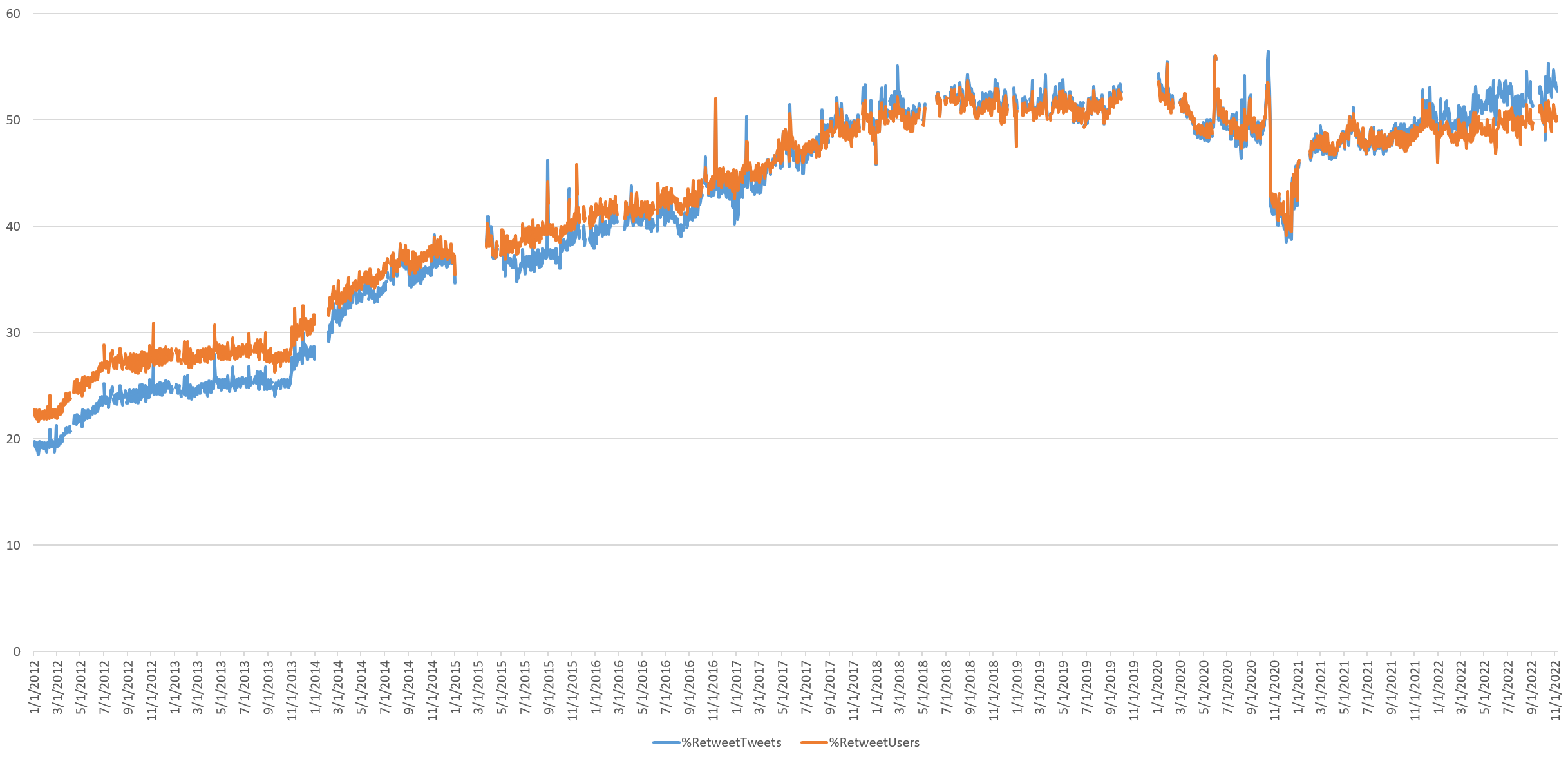
Retweets
A decade ago, Twitter was a place to hear from users themselves, with just 20% of daily tweets being retweets. By late 2018, more than half of all tweets were retweets, as Twitter became an echo chamber of amplification. The impact of Twitter's "added friction" experiment is starkly visible, though retweet volume has increased steadily since the start of this year to its highest sustained levels of the past decade. Twitter's role as echo chamber is on the rise.
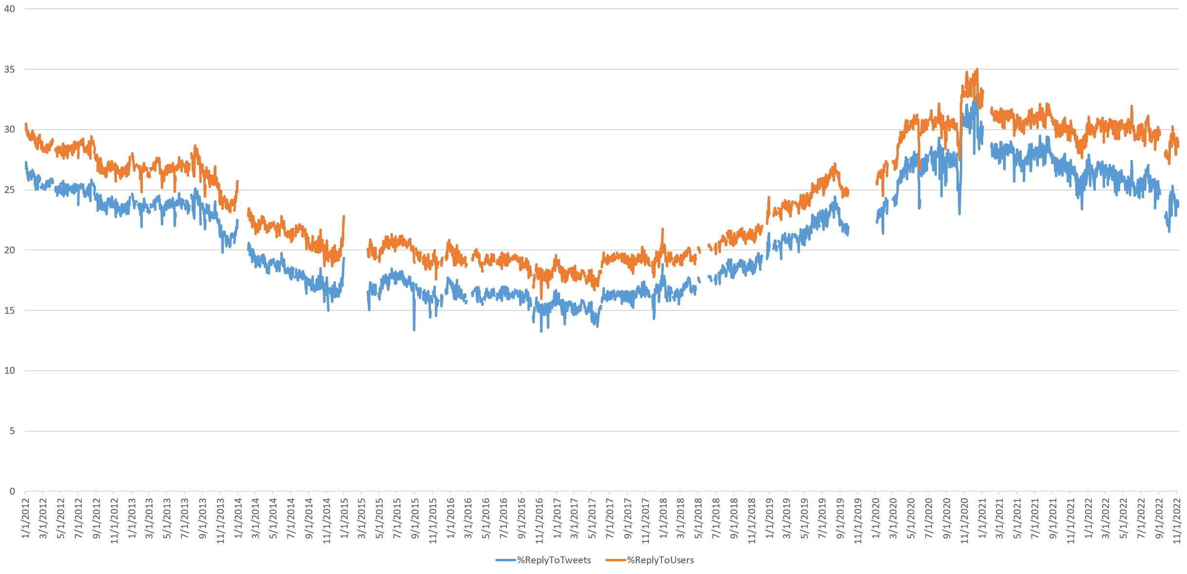
Replying To Other Users
How often are tweets a reply to another user, suggesting a conversation? Replies decreased from just over a quarter of all tweets in 2012 to a low point of around 15% in 2017, back to a record high in 2020 and back to its level from a decade ago by the start of this year. Still, on a given day this year, just over a quarter of tweets are replies, suggesting that nearly three quarters of tweets are simply users shouting into the fray, rather than engaging in conversations. Worse, replies appear to have steadily decreased over the past year, suggesting a long-term shift away from from conversation and towards shouting.
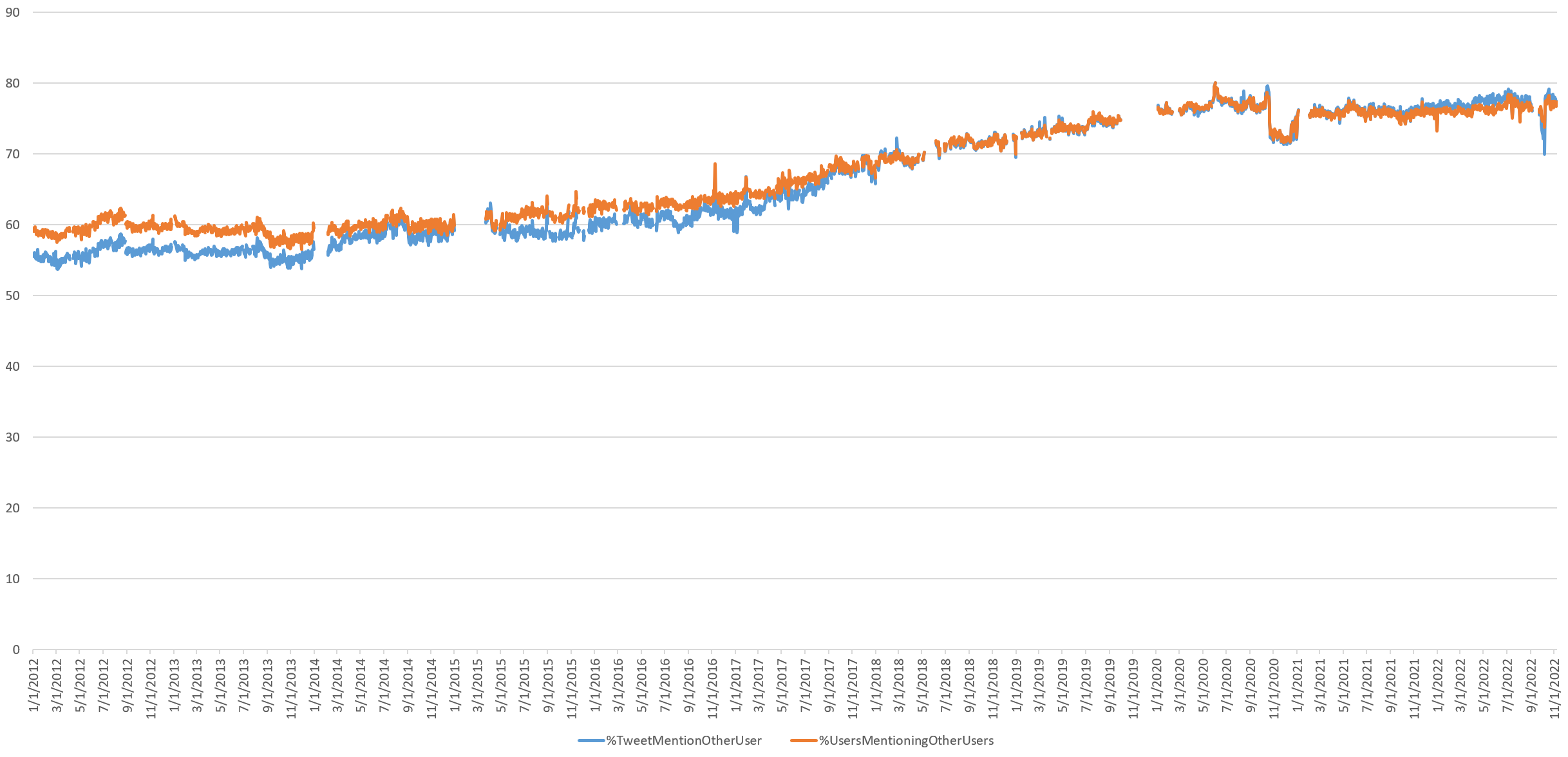
Tweets Mentioning Other Users
What percentage of all tweets mention another Twitter user in any way? From around 55% of all tweets in 2012, mentions steadily increased until 2017, when they accelerated rapidly until the start of the pandemic, where they leveled off. Mentions collapsed with Twitter's added retweet "friction" but have steadily increased since the start of last year, reaching just short of 80% today. Given that replies account for just over 25% of all tweets, this suggests that the majority of tweets mentioning another user are the Twitterverse equivalent of shouting another person's name in the hopes they hear you, rather than a dialogue between users.
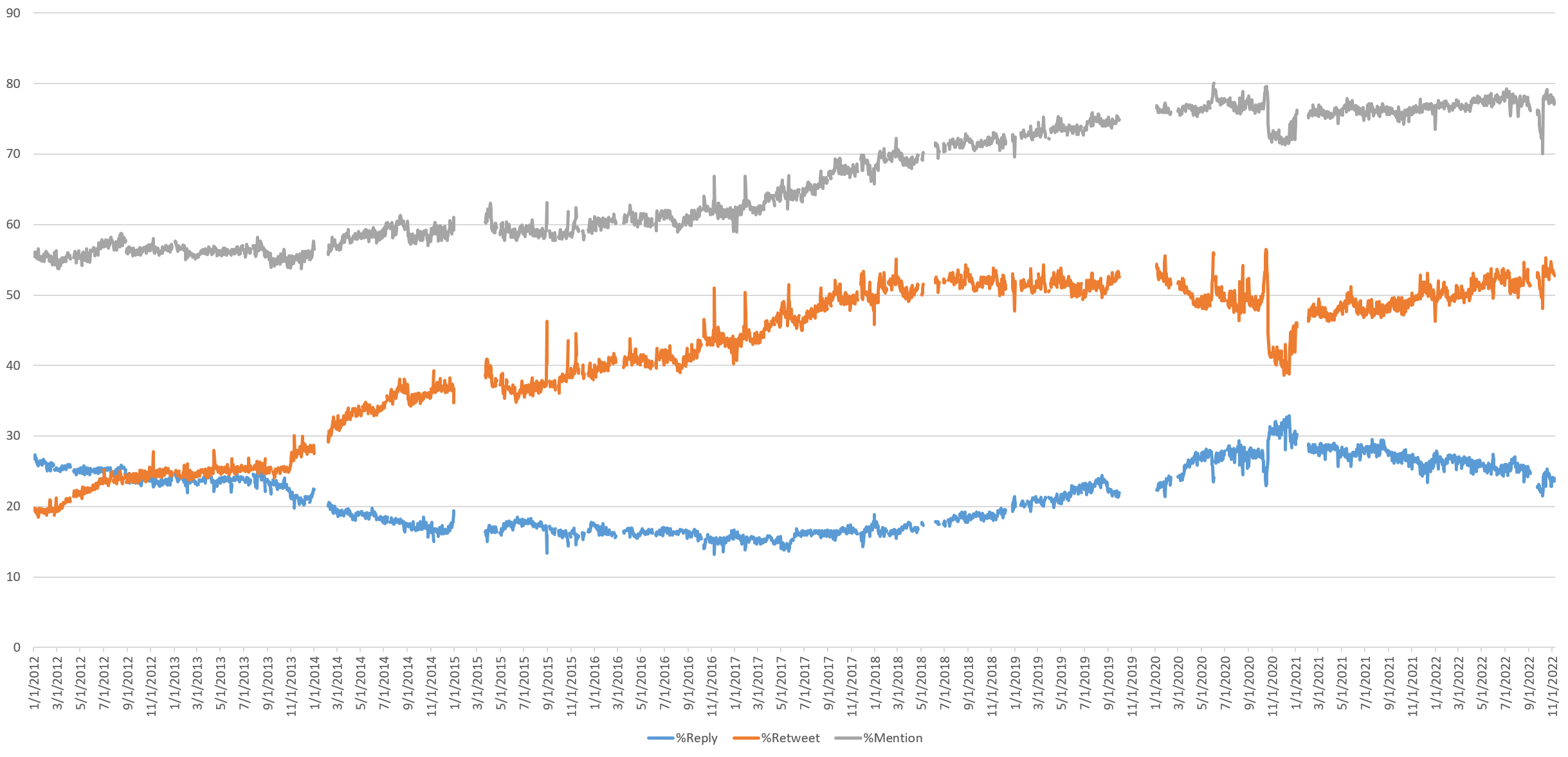
Comparing Retweets, Mentions And Replies
The graph below overlays the three, showing their convergent and divergent trajectories. Mentions and retweets have increased steadily since the start of 2021, while replies have been on an equally steady decline, offering a nearly textbook picture of a platform steadily becoming ever more of an echo chamber.
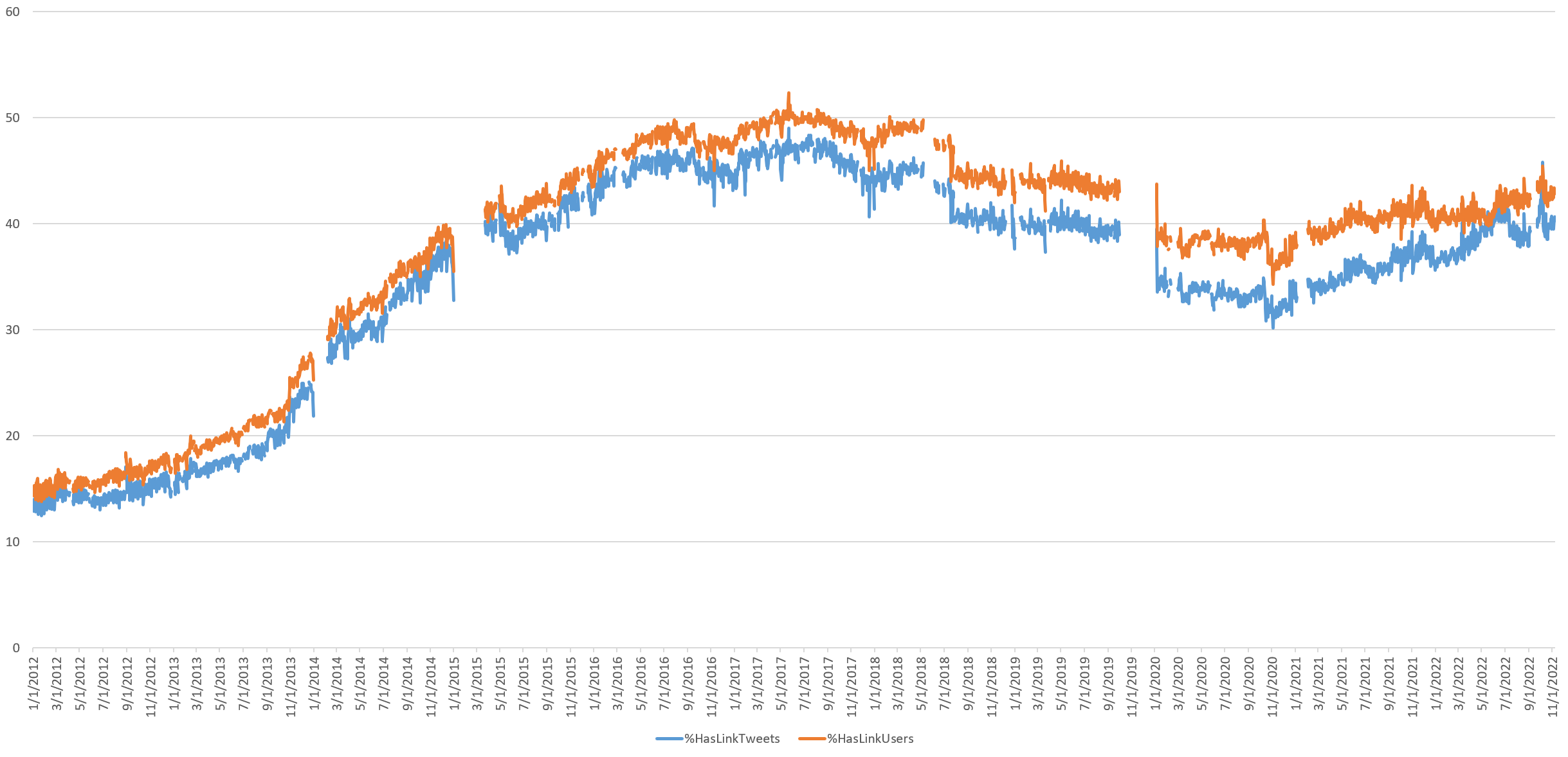
Tweeting Of Links
Twitter quickly rose to prominence as a major way to draw attention to information published elsewhere, through the sharing of links. Link-sharing peaked in 2017, then entered a period of decline through late 2020, before recovering through late 2021 and leveling off since at around 40% of all daily tweets. This suggests that a majority of daily tweets are self-contained, communicating their intended message without requiring the user to visit an external site.
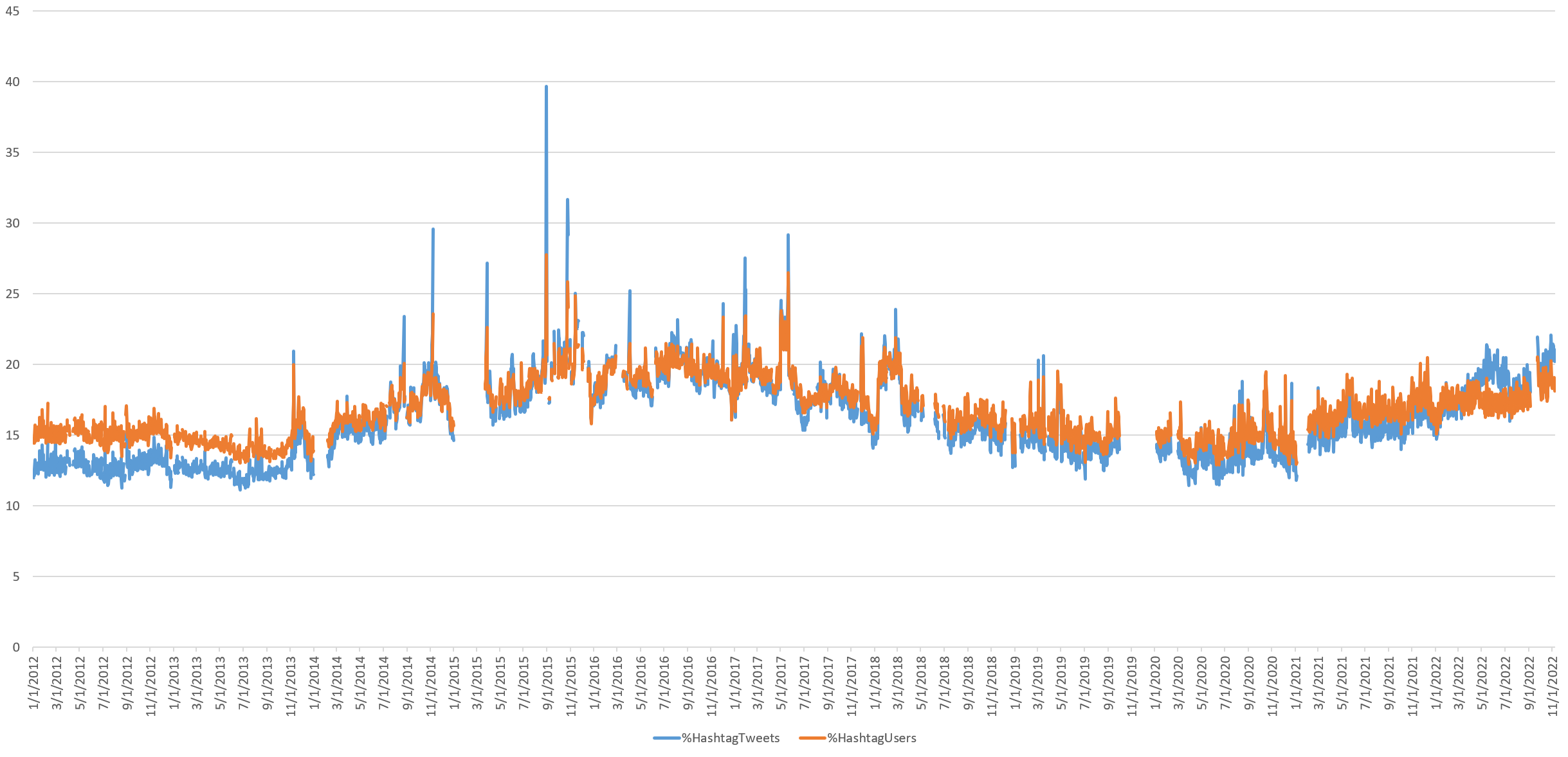
Hashtag Use
Hashtags were once heralded as the soon-to-be ubiquitous way the digital world would be organized. While popular on other platforms, they never took off on Twitter, accounting for just over 20% of all tweets today, though they do appear on an upward trajectory over the second half of this year.
The Total Daily Size Of The Twitterverse In Characters & Bytes
Just how big is the Twitterverse?
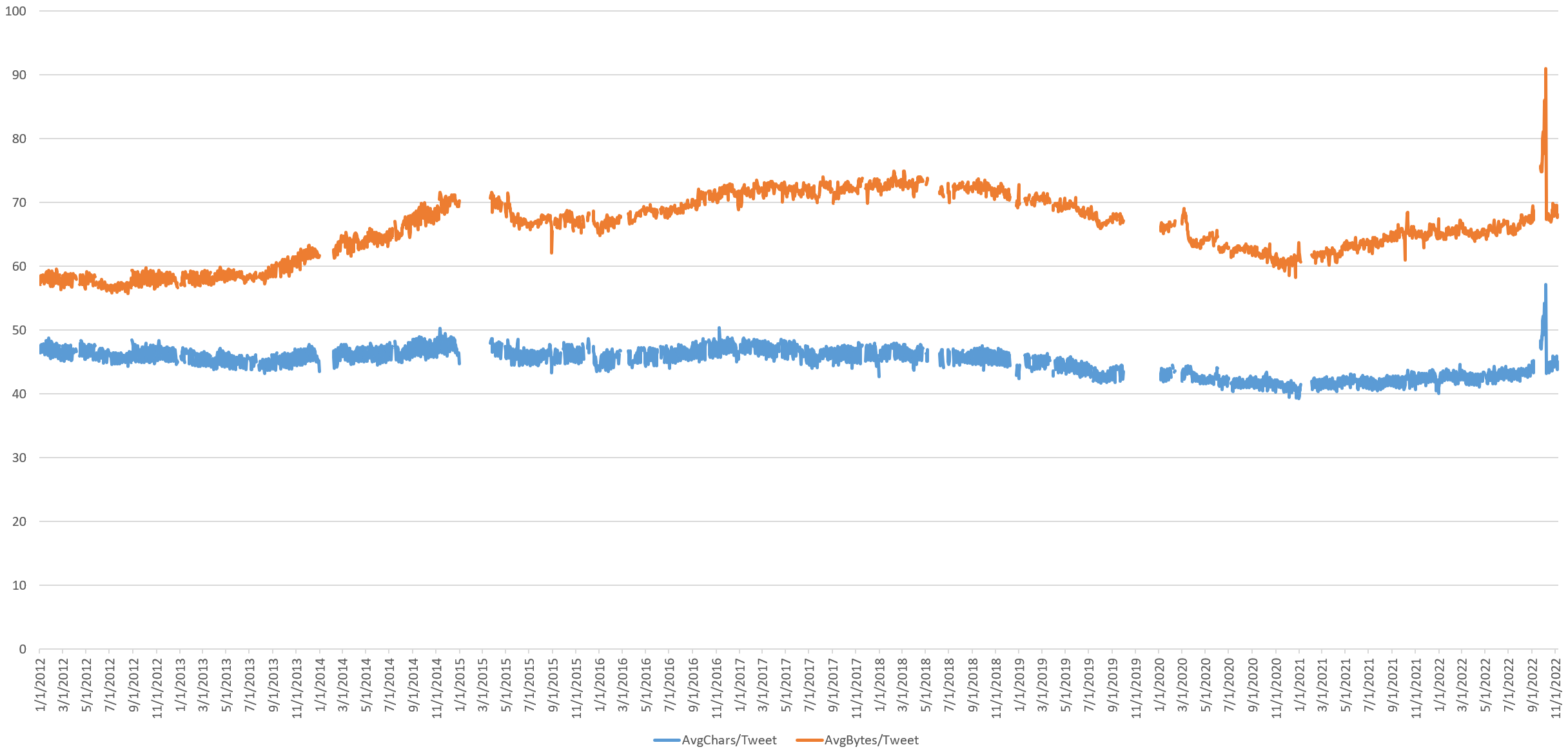
The size of the average tweet in terms of characters and bytes (in the case of multibyte charactersets) after removing retweets, username references and hyperlinks has remained relatively stable over time, though has been increasing over the last two years. From late 2018 through late 2020, the average bytes per tweet dropped sharply, alongside a drop in average character length, suggesting tweets were becoming smaller, but also a shift away from multibyte emoji, which represent a single character, but multiple bytes. Since late 2020, both average character size and average byte size have increased, with byte size increasingly dramatically, suggesting either increased tweeting in multibyte languages or increased used of multibyte characters like emoji.
There is a sharp exponential surge in average tweet length from September 1 to October 7 of this year, collapsing again the following day. It is unclear what this period might reflect, though August 30 was when Musk added Peiter Zatko's accusations to his suit, September saw the Delaware court fast-tracking the legal proceedings of Musk's purchase and October 6 was the date on which the judge gave Musk until October 28 to complete his purchase, suggesting this unique period may correspond to that final stretch of Musk's Twitter takeover.
What about the sum total of the entire Twitterverse?
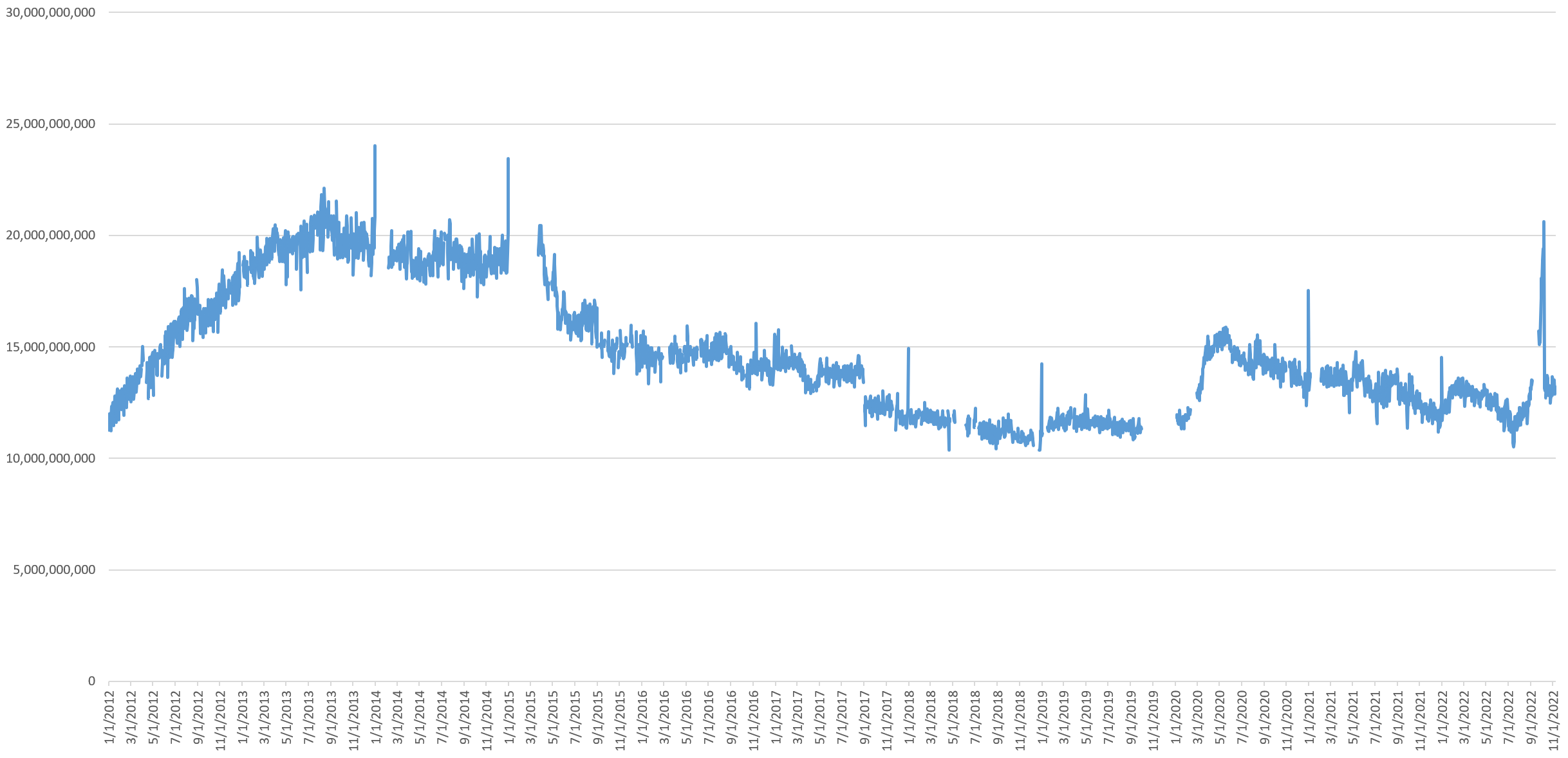
The timeline below shows the total number of bytes of content posted to Twitter each day after removing retweets, username references and hyperlinks, showing that on a typical day in the past month just 13.1GB of text is posted to Twitter – around the same as it was just over a decade ago in early 2012. Even with the record-high number of tweets during the pandemic, the platform hovered at just over 15GB of novel content per day, around its November 2015 levels, far removed from its mid-2013 peak and suggesting that pandemic-era tweets were shorter and consisted more of retweets, user mentions and hyperlinks.
Notably, while the total number of daily tweets recovered at the start of the pandemic to their mid-2013 levels, the total volume of tweeted content each day is far lower than it was in 2013. This is because retweets constitute a far higher portion of Twitter's daily volume than they did at its previous peak.
Importantly, while Twitter is often held up as a quintessential "big data" dataset, the total volume of novel text published on it each day is relatively small compared with other textual datasets.
The Dominance Of English Twitter
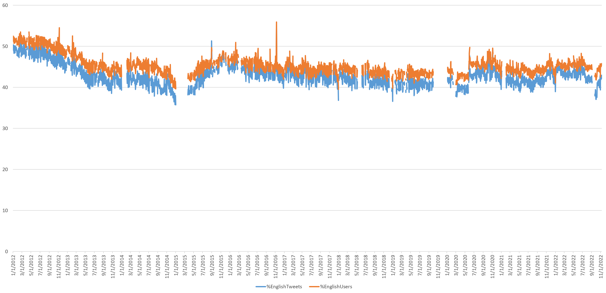
What percentage of all tweets are in English? There was a sharp decline from 2012 through early 2015, a resurgence through early 2016 and then a stable and very slow decrease through 2018, stabilizing, then surging in mid-2020 and and increasing over early 2021 to a new stable point of around 45% of tweets today being in English. The pandemic appears to have led to a noticeable increase in English tweets, though even this increase places it only back early 2017 levels. Note that these results were computed using the CLD2 language detector and exclude cases where no language could be determined (such as a tweet that contains only a hyperlink).
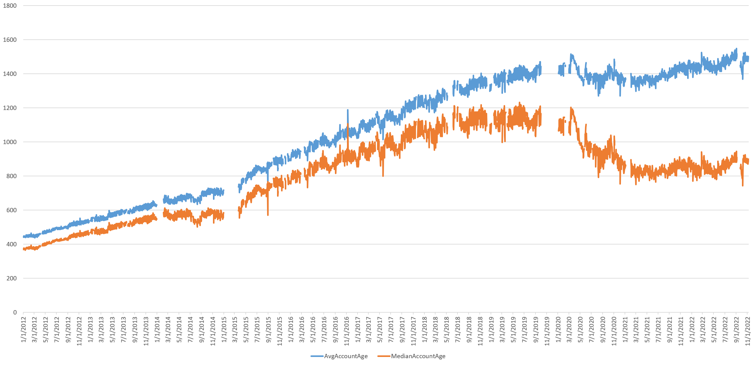
Average Age Of Twitter's User Accounts
Given that Twitter is not growing in terms of increasing tweet volume or tweeting user base, its relatively stable number of tweeting users could be explained either by little change in its user base from its early days or by rapid churn in which older users are constantly replaced by newer users. The timeline below shows that the average tweeting account age continued to grow linearly through mid-2018, but leveled off through 2020, suggesting there was an influx of new users over that period. The pandemic era shows a sharp decline in average user age, suggesting a much larger number of newer users have been tweeting.
Median account age has remained stable since the start of 2021, suggesting a steady replacement rate of new users.
Putting this in simpler terms, the graph below takes all of the user accounts that tweeted on a given day and measures how "old" each account is in terms of the number of days that have passed since the account was first created. Blue gives the average/mean age of all accounts that tweeted on a given day, while orange gives the median. Average account age is skewed by older accounts that have been around since the early days of Twitter, while orange more accurately reflects the mix of new and old accounts. The average (blue) age grows over time, meaning there is steady daily tweeting by the platform's older accounts, while the fact that the median (orange) age remains stable since 2020 means there is a steady replacement rate of new users coming and going. This suggests a stagnating platform dominated by older accounts and high churn, rather than one that is healthy and growing.
What about the median account creation year over time? Again, these numbers suggest a newer cohort of users were tweeting more heavily during the early stages of the pandemic, with growing slowly substantially over 2021 and growing again in the second half of this year.
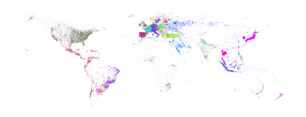
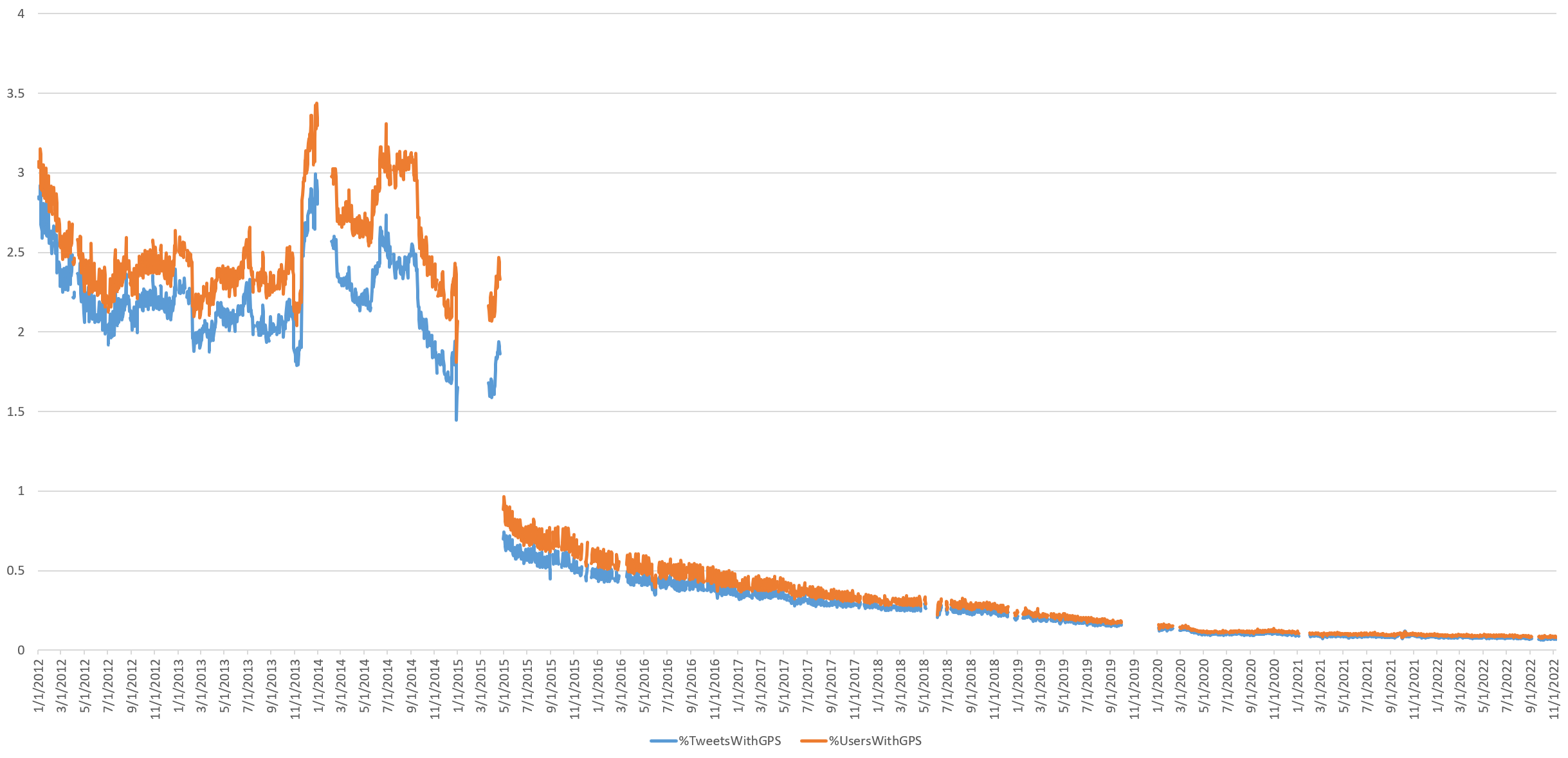
The Geography Of Twitter
Finally, what about the geography of Twitter?
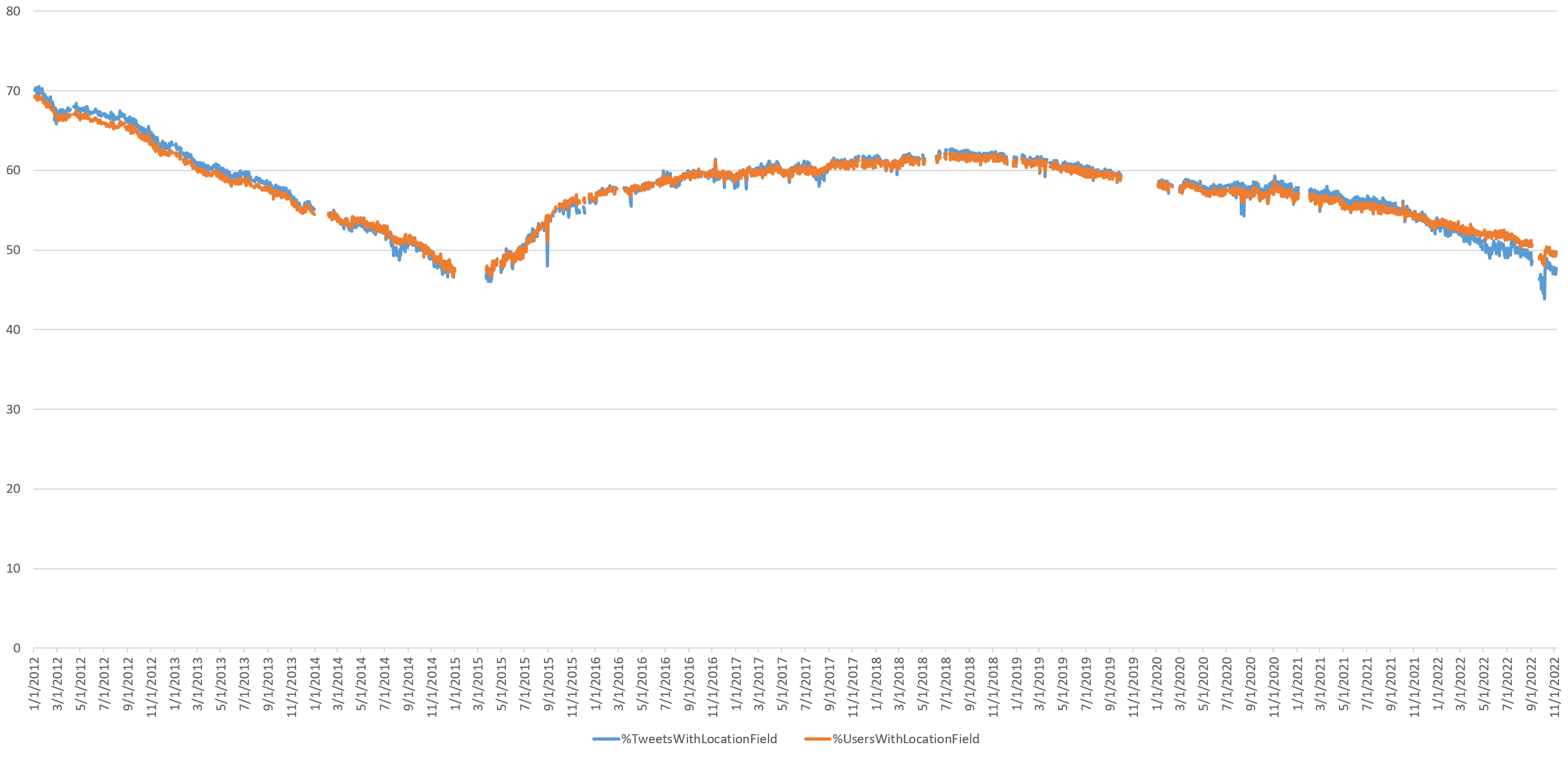
What percentage of all tweets and Twitter users provide a non-null "Location" field? This number continues its decline since mid-2018, to 48% from around 70% in 2012 and just over 60% in 2018. Given that the location field is simply a user-provided textual entry box that is not validated and can contain any value, including fictional locations like Rivendell, it suggests that Twitter's user base believes that location plays less and less of a role in their communication.
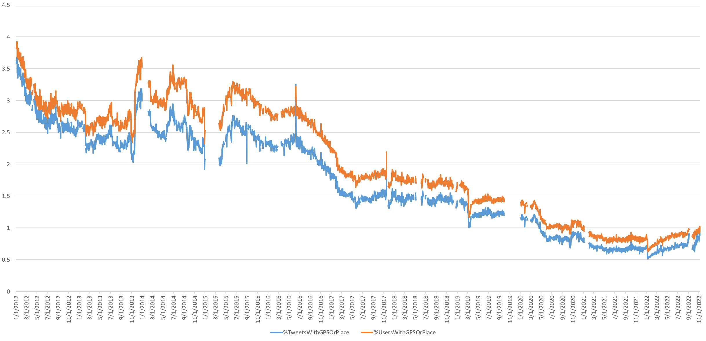
What percentage of all tweets were geocoded with either a GPS coordinate, Place location, or GPS coordinates in the Location field and thus precisely mappable using verified coordinates? (Geocoding the user-provided Location field increases the number of mappable tweets, but since this textual location is user-definable is it not sensor-verified. Twitter itself cautioned in 2009 that “since anything can be written in this field, it’s interesting but not very dependable.”) The percentage has collapsed over the past decade, suggesting that the era of "Mappable Twitter" has largely closed, though intriguingly, it is increasing once again.
The density of such coordinates fell especially sharply during the pandemic, dropping more than a full percentage point since the start of lockdowns. This suggests users disabled location tracking when tweeting from home. The percentage of tweets that are directly mappable dropped sharply from around 0.66% to just 0.51% in the first few days of January 2022, but have increased steadily over the course of this year to their pre-pandemic level of around 0.91% today, suggesting that as societies around the world continue to reemerge, they are showing new-found interest in broadcasting their locations to the world.
The numbers above reflect a combination of centroid and GPS-tagged tweets. Centroid-level "Place" locations merely report the fixed centroid of an entire city. Thus, every tweet labeled as "New York City" will be assigned the same centroid coordinate. Yet, billions of tweets that all report the same coordinate of the centroid of New York City render mapping attempts futile. In contrast, precise GPS coordinates yield the beautiful and intricate maps we've come to associate with Twitter, tracing transportation corridors and city life.
What percentage of tweets have included GPS coordinates over time? By and large, the era of precision Twitter mapping has come to an end. Today around 0.07% of tweets have GPS coordinates, with a visible dropoff as Covid-19 lockdowns began. Such tweets continue to slowly and steadily decline as a percentage of the Twitterverse, suggesting that precision Twitter maps become less and less populated each day. In notable contrast to the resurgence in Place-based geotagging, GPS-based geotagging continues to decline, suggesting a permanent and long-term shift towards privacy-minded location sharing.
The fact that Place (city/landmark) geotagged tweets are increasing, while GPS geotagged tweets continue their decline means there is resurgent interest in location on Twitter, but in the more privacy-preserving confines of city-level aggregated tagging, rather than the precision of GPS.
Statuses
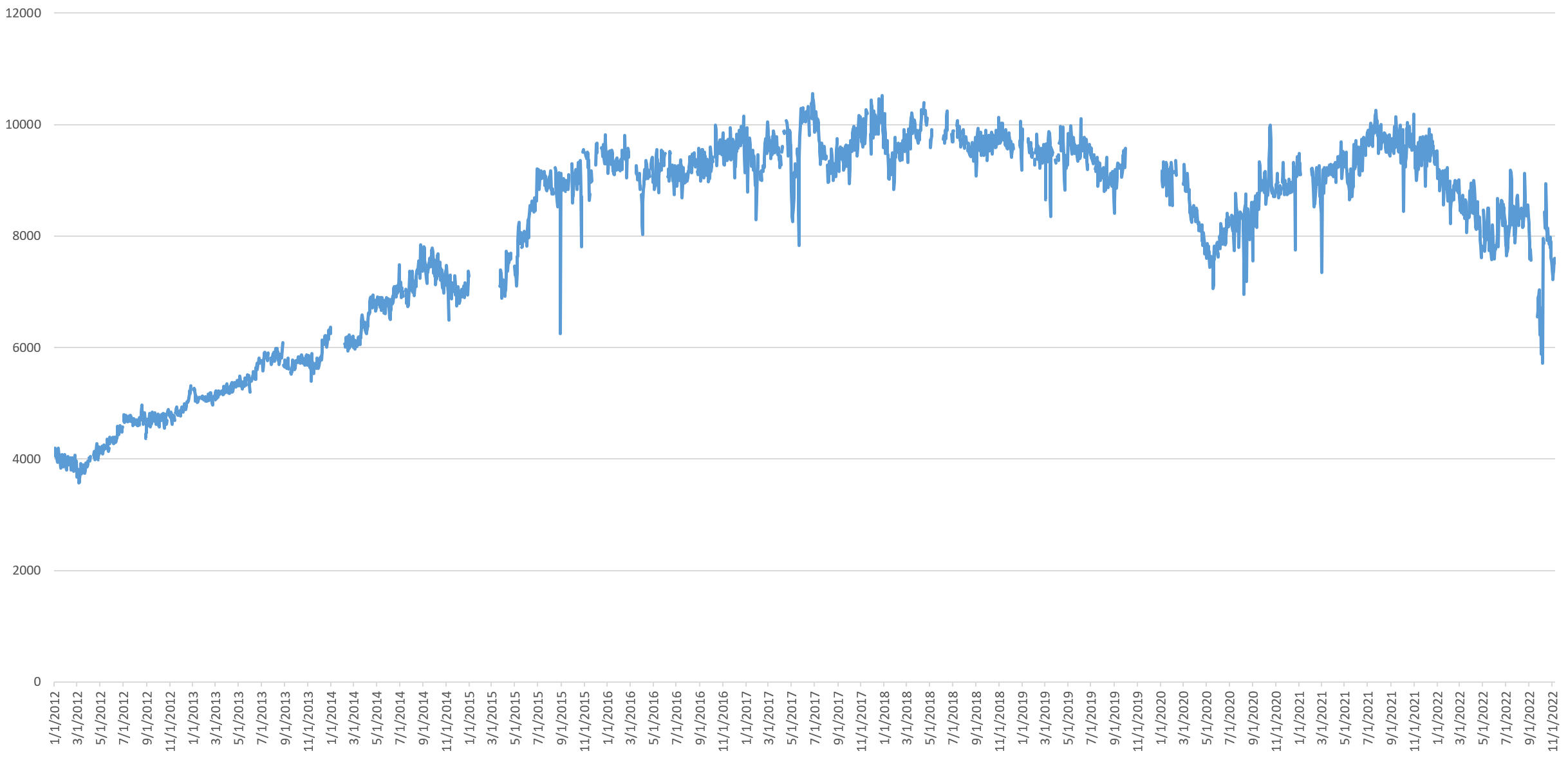
Every time a user tweets, the total number of posts ("statuses") they have sent up until that point is recorded. This offers a glimpse at the "prolificness" of users over time. Looking at the daily mean status count of users tweeting each day, it levels off in late 2015, then begins to become more variable and bursty from late 2017.
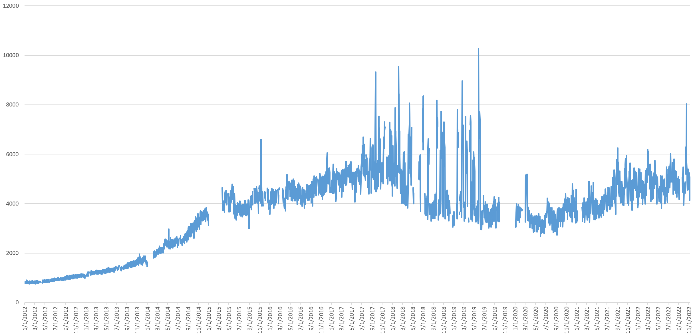
Mean status counts will be overwhelmed by highly prolific users, so the median offers a better understanding of the user-scale trends. This shows a rise through mid-2017, a decline from late 2019 that turns into a collapse from March 2020 through mid-May 2020, then rising through mid-2021 and declining since the start 2022, stabilizing since.
There is a sharp collapse in median status count from September 1 to October 7 of this year, bouncing back the following day. The median decreases sharply again from October 28th, the day Musk purchased Twitter, running through November 3rd and increasing again. This suggests an influx of new accounts heavily tweeting.
Coupled with the median account age graph above, this could also suggest in some cases the reactivation of dormant accounts, where a user creates an account and then rarely uses it, only to return to it later on, yielding a high-age low-statuses account.
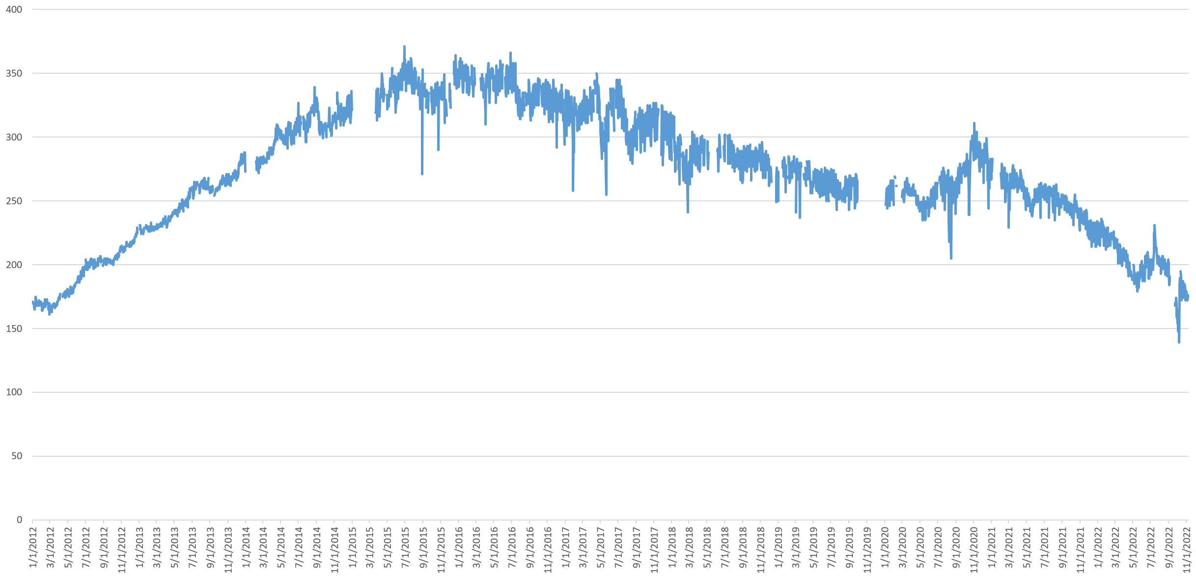
Followers
Looking at the average daily follower count of all users tweeting each day, it rises through late 2017, then declines through late 2020 and then rises to stabilize in mid-2021.
Since mean follower counts will be overwhelmed by highly-followed users, the median daily follower count shows an increase through mid-2015, then a decline through mid-2020, a rise through late 2020 and a decline through present. This suggests that more and more of the daily Twitter volume is made up of less Twitter-famous users.
Coupled with the stability of reach of verified accounts (verified tweets plus retweets of those verified tweets), this steady decrease in median follower accounts across the platform suggests that Twitter is increasingly becoming an elite echo chamber with ordinary users having less and less reach.