Twitter has grown significantly more popular since mid-March of this year as quarantined populations across the world turned to social media for the socializing and community they no longer had in person. How has this shift affected the geography of Twitter? Given the influx of new users and surge in activity, has Twitter finally overcome its historically limited geographic reach when it comes to geotagged tweets?
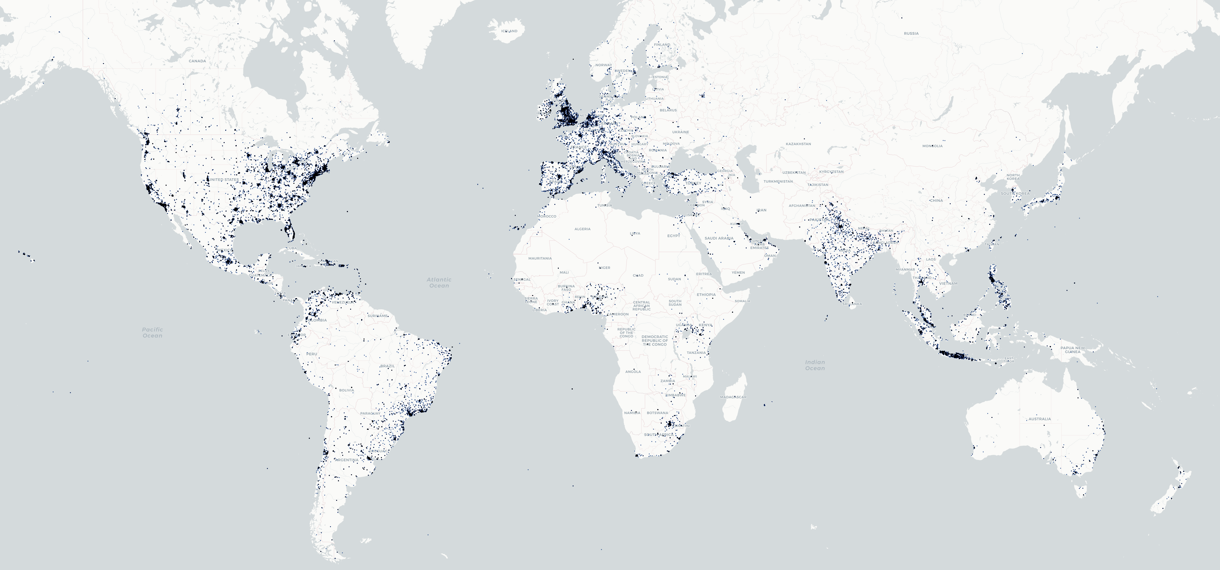
To explore these questions, all geotagged tweets in the Twitter 1% stream from January – June 2019 and from January – June 2020 were aggregated into a 0.01 degree grid (~0.6 miles). Cells containing less than 6 tweets (corresponding to 3 tweets a day in a half mile by half mile grid cell) were excluded to remove areas with only sporadic or rare tweeting, concentrating on those areas with more frequent Twitter activity that would provide the kind of normative baseline required for analytic analysis. Locations where tweets were sent from in 2019 are colored blue, while locations tweeting in 2020 are colored blue and locations with both are black. The final map was created using Carto's online mapping platform.
Readily discernible is that across the two years, geotagged Twitter activity was largely confined to a small number of regions on earth and that there was little difference between the two years (most locations are black indicating equal Twitter activity between the two years).
In fact, the two periods are correlated at r=0.9876, showing just how little Twitter's geography has changed in the COVID-19 era.
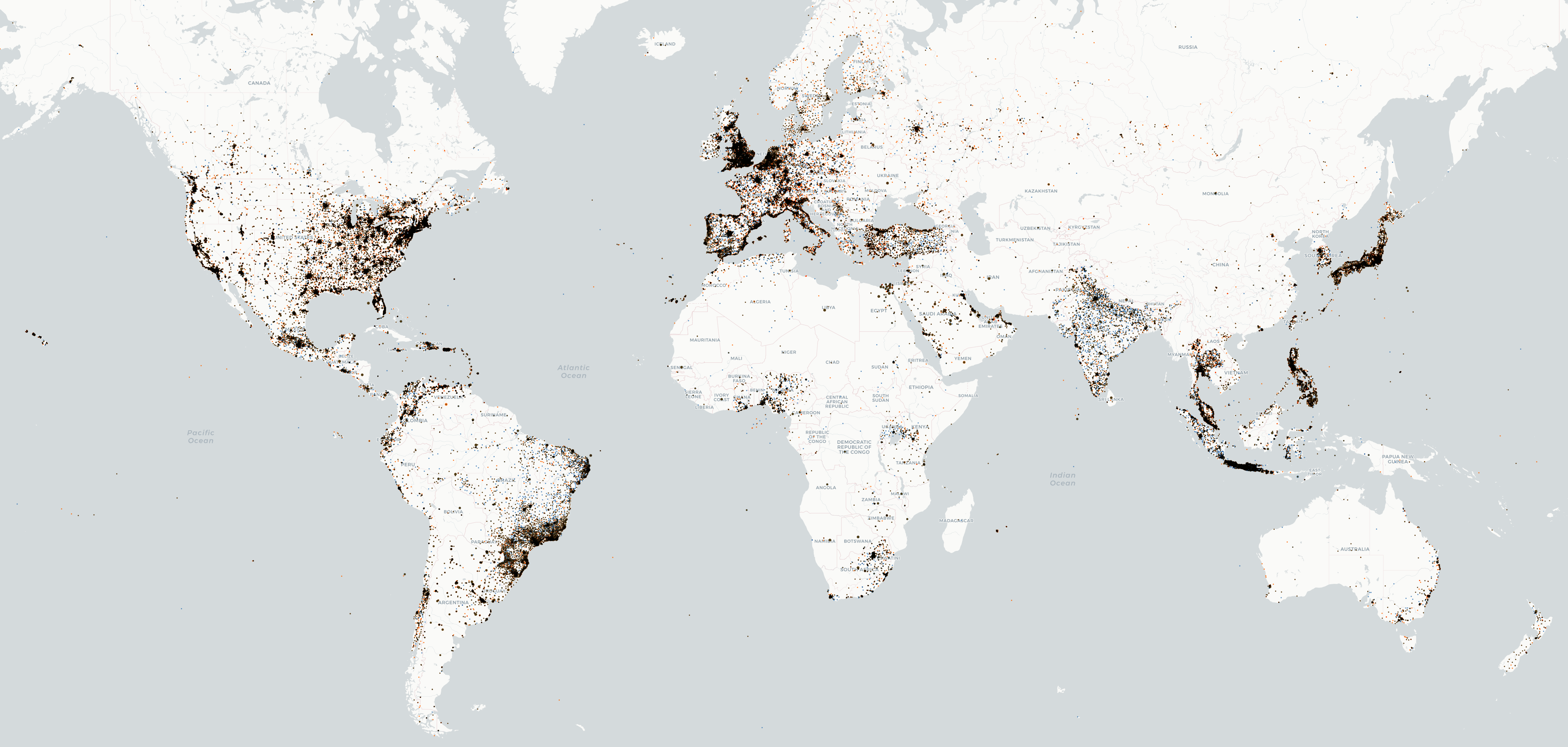
What about COVID-19-related tweets themselves? The map below shows all geotagged tweets in the Twitter 1% stream matching our COVID-19 criteria gridded up into a 0.01 degree grid. Overall their geography is extremely similar to the map above, reminding us that Twitter's lens onto the pandemic is limited by its overall limited geotagged geographic reach.
Despite their vast size differences (90,034 geotagged COVID-19 tweets versus 7,579,325 for the January – June 2020 baseline), the COVID-19 tweets are correlated at r=0.71 with the overall 1% Twitter sample from January – June 2020 and 0.70 with the January – June 2019 sample, showing the high similarity even with these extreme volume differences and the 0.01 degree grid resolution.
In short, analyses using geotagged tweets to divine insights into the pandemic must acknowledge that their geographies are largely a product of the Twitter baseline rather than distinct to COVID-19.