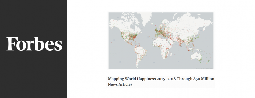
What might it look like to literally “map world happiness” over the past four years and how can the cloud turn nearly a billion news articles into data and then with a single line of SQL turn those trillions of datapoints into a glimpse into the soul of global human society?