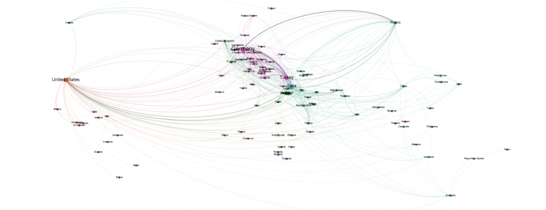
In 2015 we created a network visualization of the countries mentioned most commonly together in news coverage about the refugee crisis. This original process required a number of steps and external lookup files and scripts. Using the new workflow we unveiled earlier today, you can now visualize this network using just two BigQuery queries and import their results directly into Gephi without any additional steps!
The final result of visualizing the top 500 pairs of countries that co-occur the most frequently in coverage mentioning refugees ("WHERE V2Themes like '%REFUGEE%REFUGEE%REFUGEE%'") can be seen below.
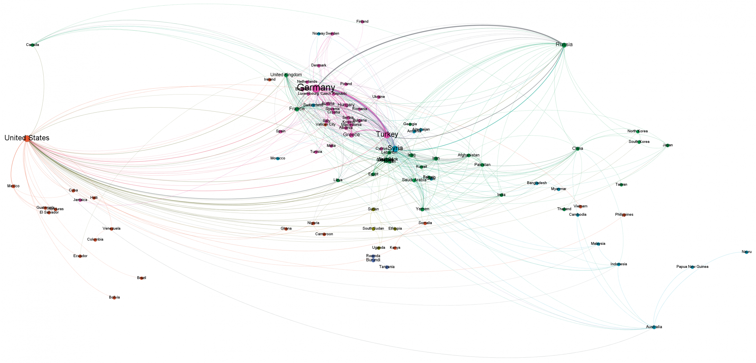
The same network, but with the top 1,500 strongest edges instead of the top 500 can be seen below.
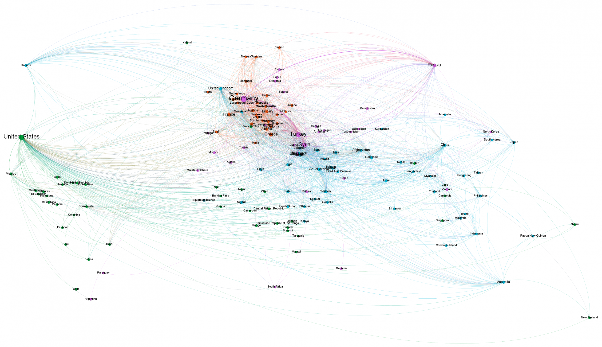
Remember that each of these graphs took just two SQL queries in BigQuery and just around 5 minutes total for the two queries combined, yielding a node list file and an edge list file that were then imported into Gephi and visualized in less than a minute! See the full tutorial for more details.
Happy visualizing!