When it debuted in 2013, the Global Twitter Heartbeat was the first in-depth look at the geography of social media, pioneering the workflows that now power most social mapping.
At the time, the journal it was published in did not support the filesizes of its (what were then) very large and high resolution figures, so they were hosted on external websites that have since faded away. Given the number of republication requests we get for these figures, we've provided a download mirror of the original high resolution maps below to make it easier. Feel free to republish any of these maps with credit to "Kalev Leetaru" and a link if possible back to the Global Twitter Heartbeat article they come from.
- Figure 3: All Place coordinates in the Twitter Decahose 23 October 2012 to 30 November 2012. [PNG] [PNG 16000 x 8000]
- Figure 4: All Exact Location coordinates in the Twitter Decahose 23 October 2012 to 30 November 2012. [PNG] [PNG 16000 x 8000]
- Figure 5: Comparison of georeferenced tweets from the Twitter Decahose 23 October 2012 to 30 November 2012 with NASA Visible Earth imagery (red areas overemphasize tweeting/blue underemphasize). [PNG]
- Figure 7: Twitter Decahose georeferenced tweets 23 October 2012 to 30 November 2012 colored by language (color scale from Fischer, 2011). [PNG] [PNG 16000 x 8000]
- Figure 8: Twitter Decahose English–language georeferenced tweets 23 October 2012 to 30 November 2012. [PNG]
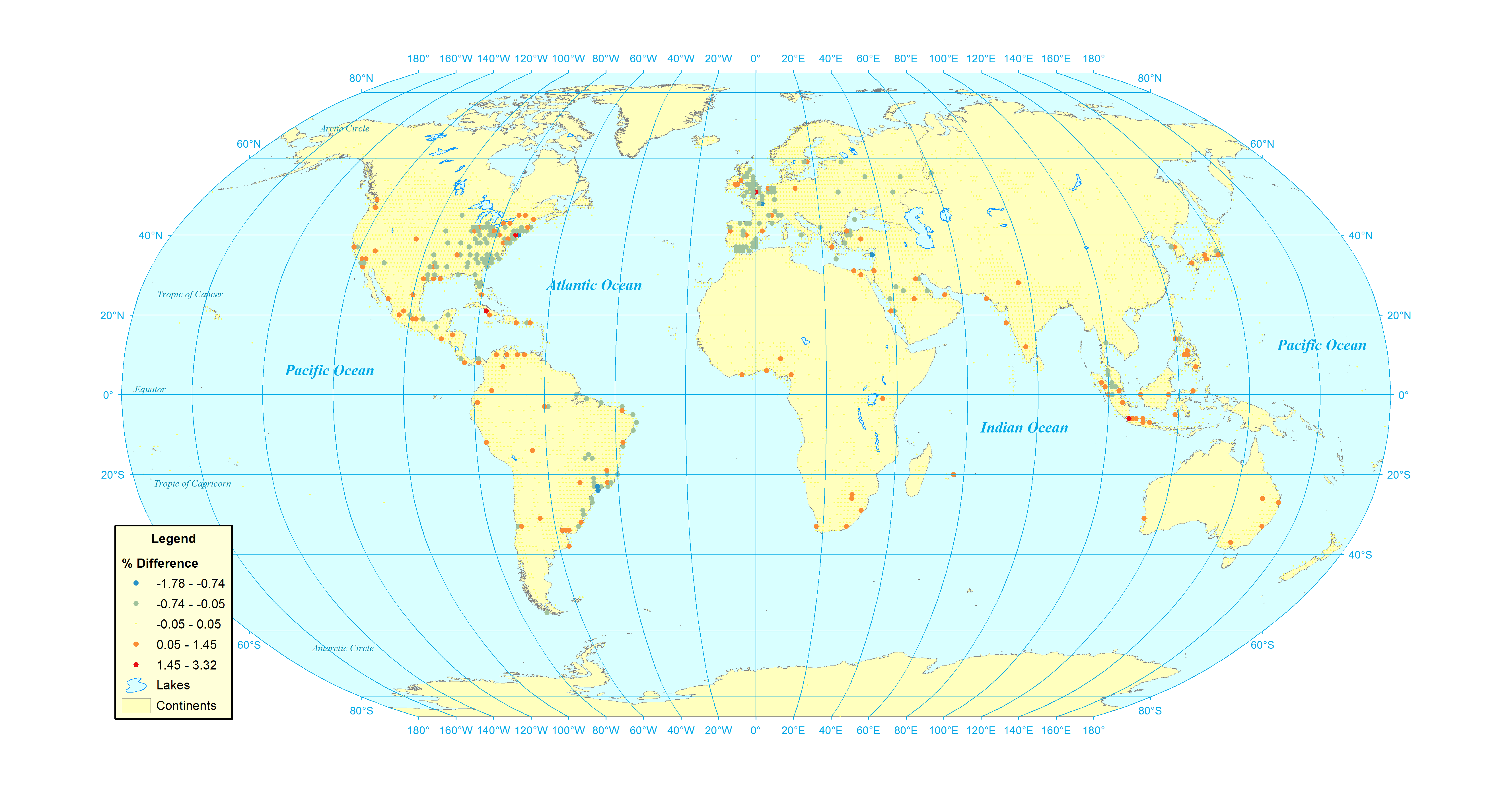
- Figure 9: Percent difference between georeferenced and geocoded Twitter Decahose tweets 23 October 2012 to 30 November 2012. [PNG]
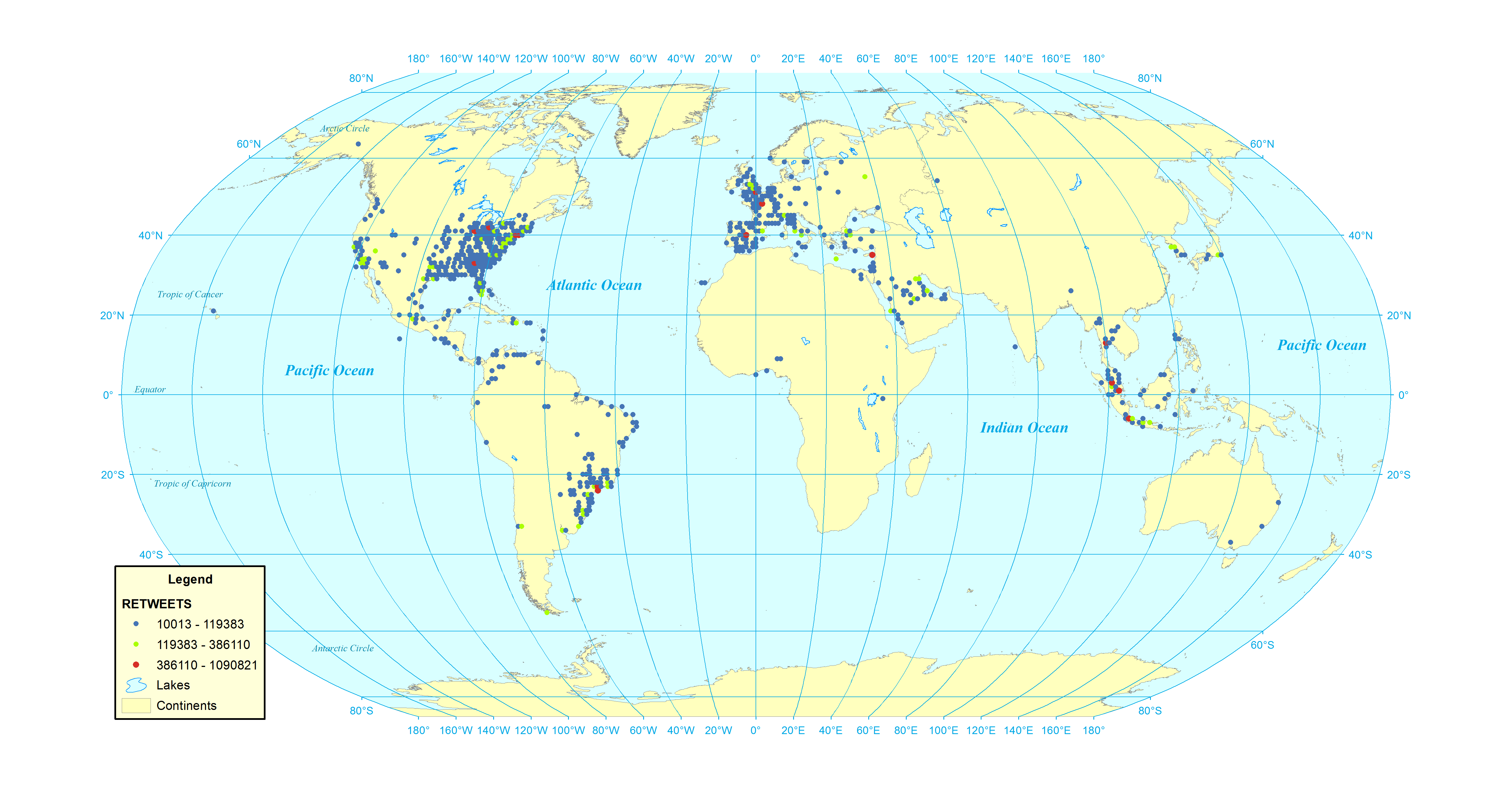
- Figure 11: Most retweeted cities (georeferenced Twitter Decahose tweets 23 October 2012 to 30 November 2012). [PNG]
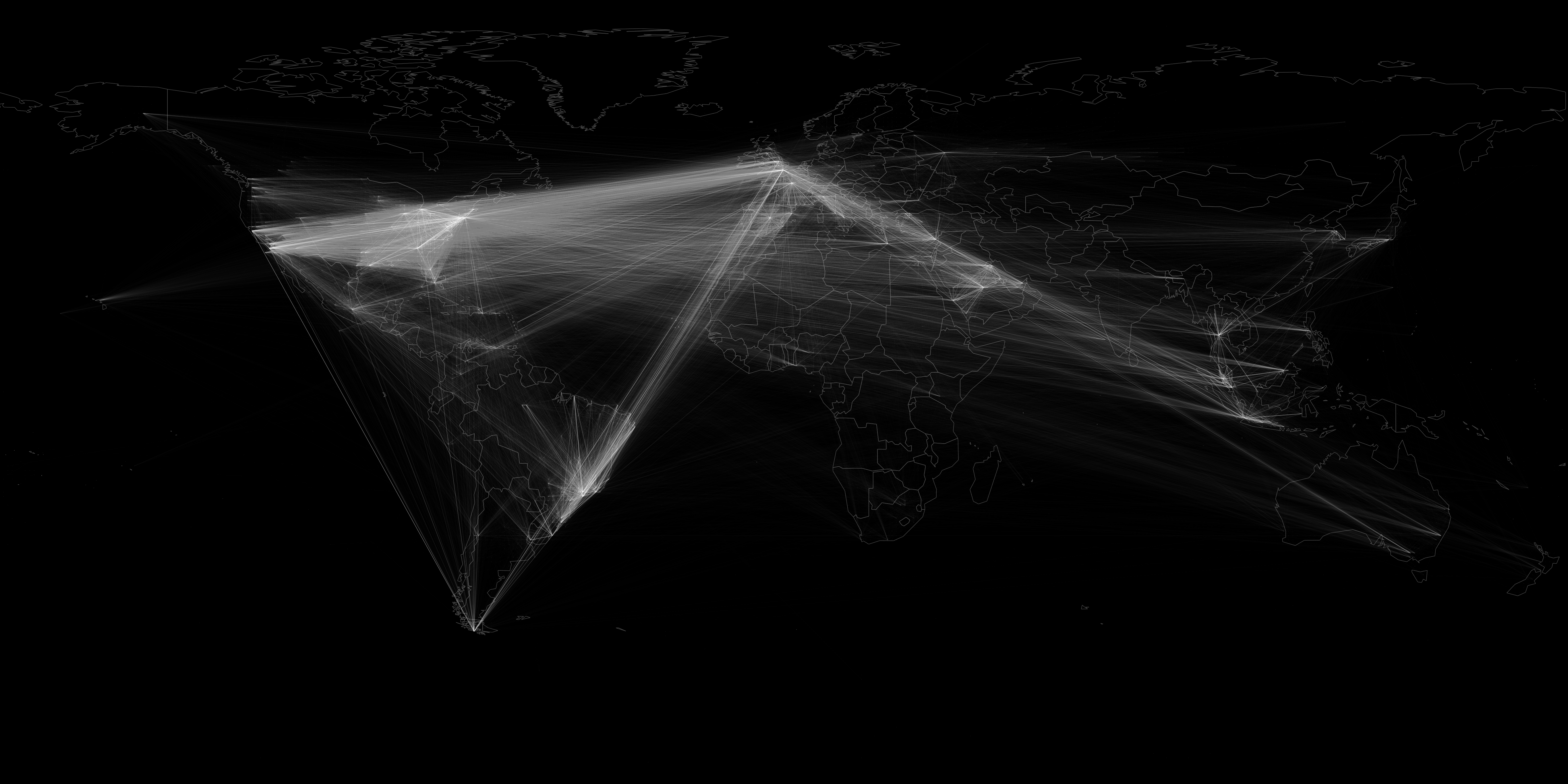
- Figure 13: Network map showing locations of users retweeting other users (georeferenced Twitter Decahose tweets 23 October 2012 to 30 November 2012). [PNG]
- Figure 14: Network map showing locations of users retweeting other users (geocoded Twitter Decahose tweets 23 October 2012 to 30 November 2012). [PNG]
- Figure 16: All locations mentioned in articles found in the English–language Google News RSS stream 23 October 2012 to 30 November 2012. [PNG]
- Figure 17: Comparison of georeferenced Twitter Decahose (blue) and English Google News (red) geographic coverage 23 October 2012 to 30 November 2012. [PNG]
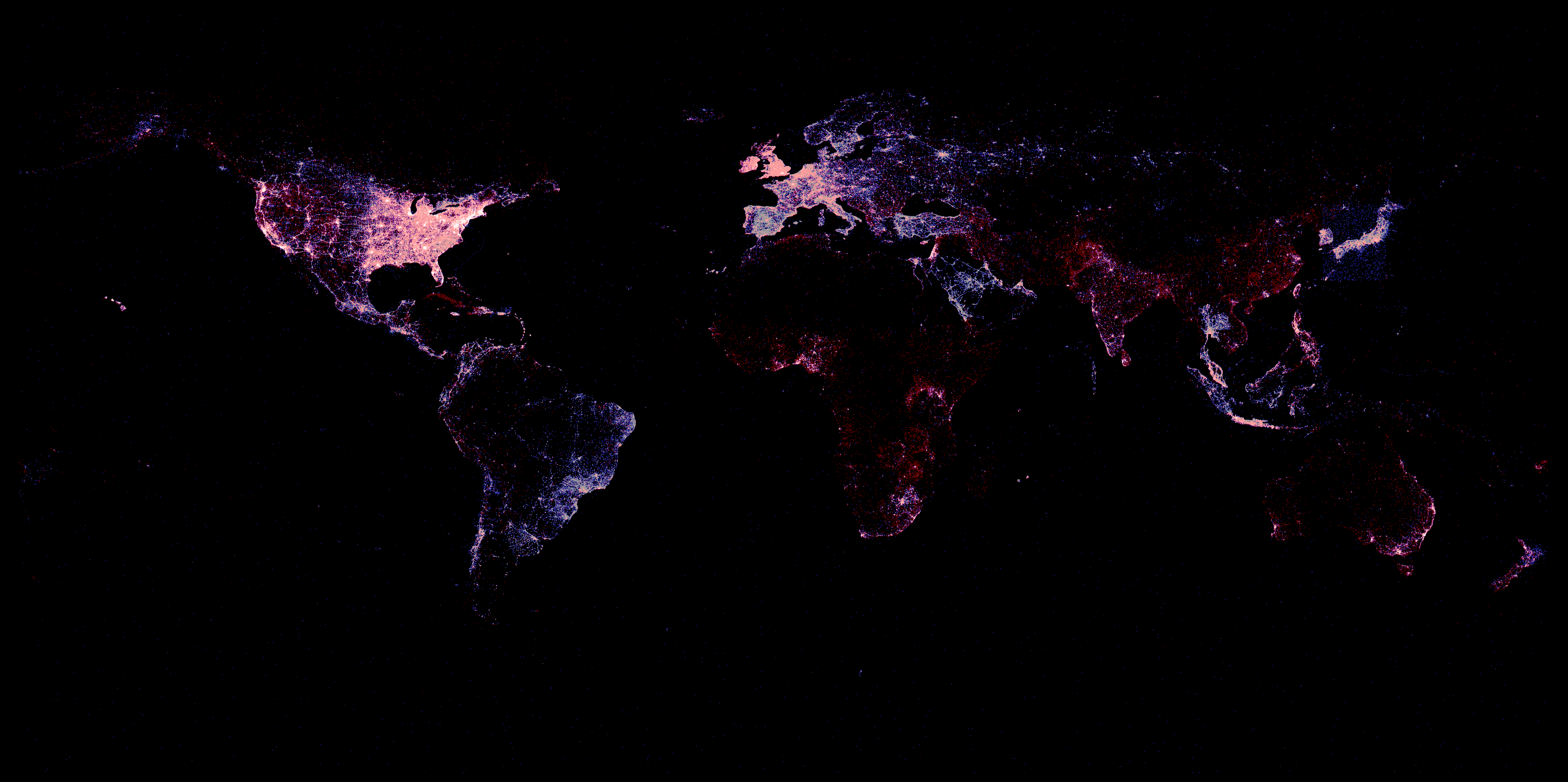
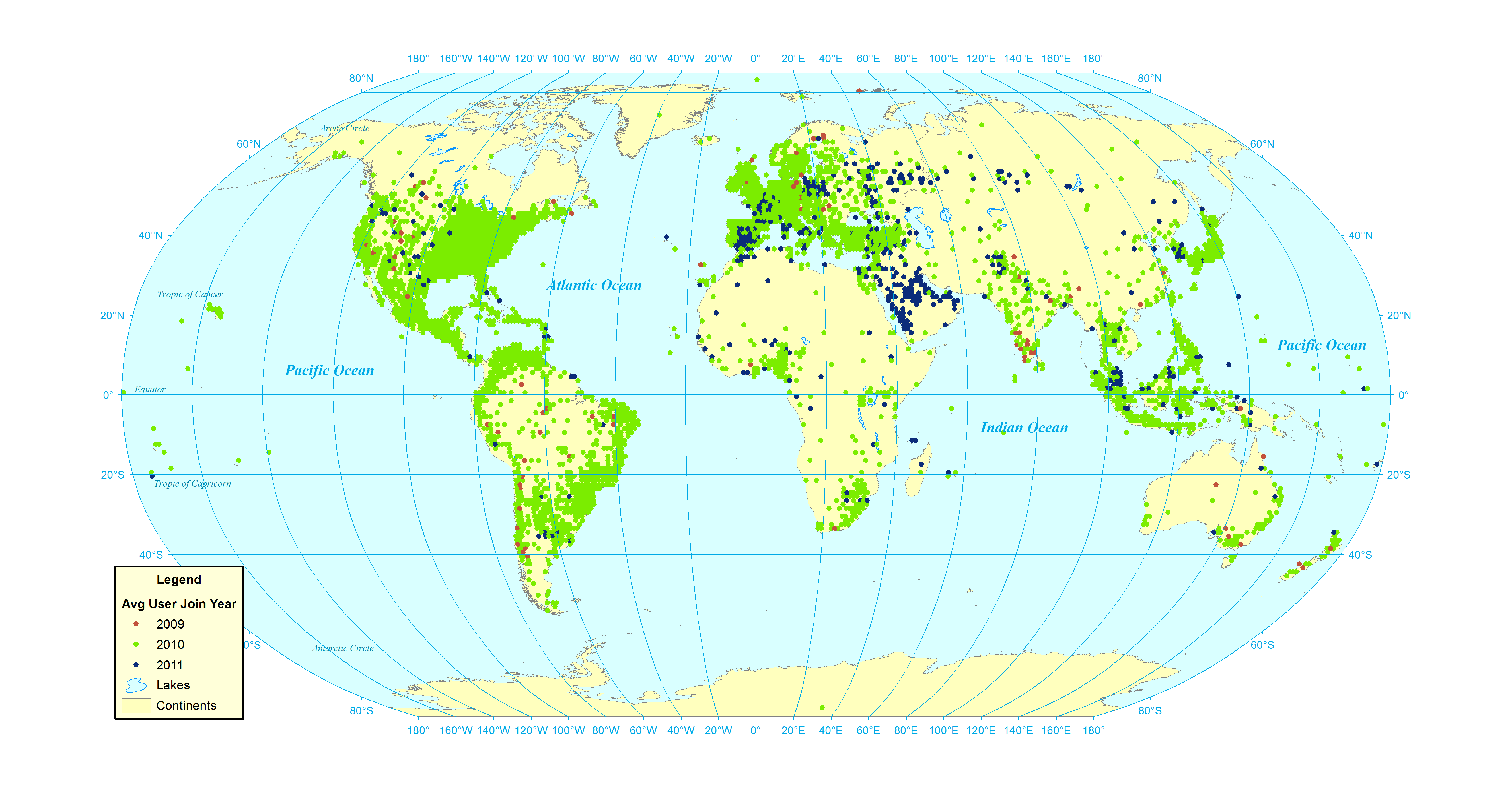
- Figure 18: Average year user joined Twitter (all georeferenced users posting a tweet in the Twitter Decahose 23 October 2012 to 30 November 2012). [PNG]
- Figure 19: Average followers (all georeferenced users posting a tweet in the Twitter Decahose 23 October 2012 to 30 November 2012). [PNG]
- Figure 20: Average “Klout” score (all georeferenced users posting a tweet in the Twitter Decahose 23 October 2012 to 30 November 2012). [PNG]