When it debuted in 2011, Culturomics 2.0 profoundly reshaped how we think of conflict analysis and forecasting, garnering international fame, appearances in the presses of more than 100 nations and selection by The Economist as one of the top five science stories of 2011.
At the time, the journal it was published in did not support the filesizes of its (what were then) very large and high resolution figures, so they were hosted on external websites that have since faded away. Given the number of republication requests we get for these figures, we've provided a download mirror of the original high resolution images below to make it easier. Feel free to republish any of these images with credit to "Kalev Leetaru" and a link if possible back to the Culturomics 2.0 article they come from.
- Figure 1: Percent of Summary of World Broadcasts content sourced from the Internet January 1994–July 2010. [PNG]
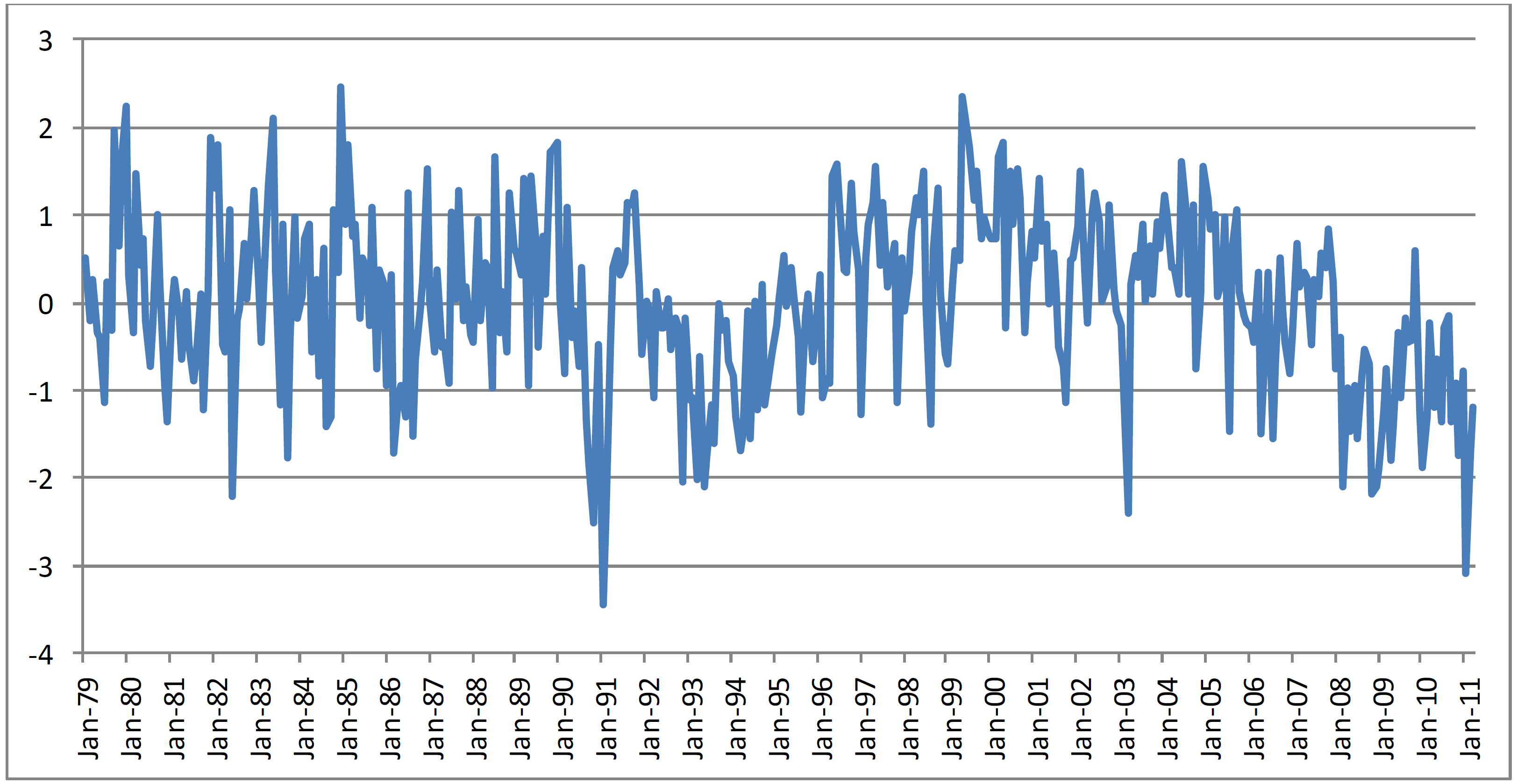
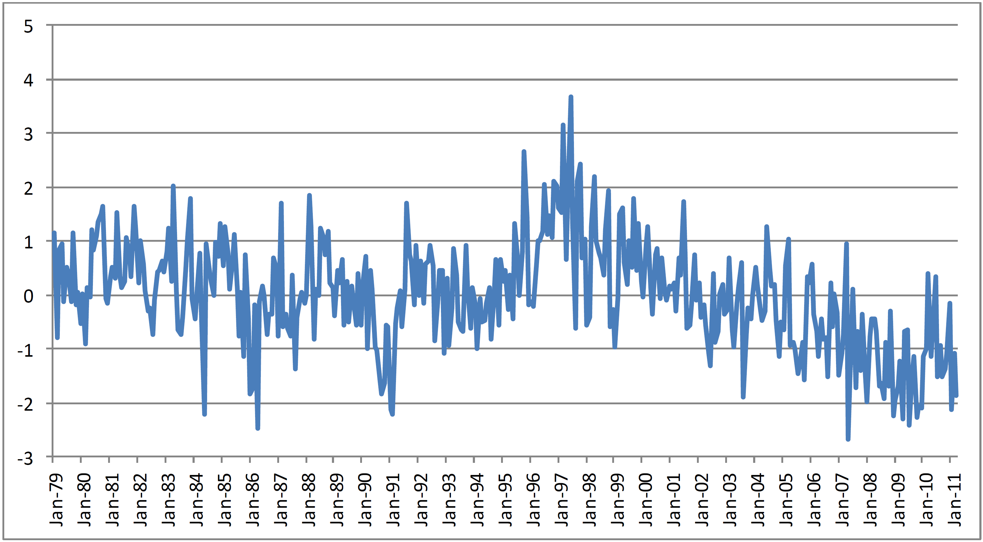
- Figure 2: Tone of coverage mentioning Egypt, Summary of World Broadcasts January 1979–March 2011 (January 2011 is 1–24 January). Y axis is Z–scores (standard deviations from mean). [PNG]
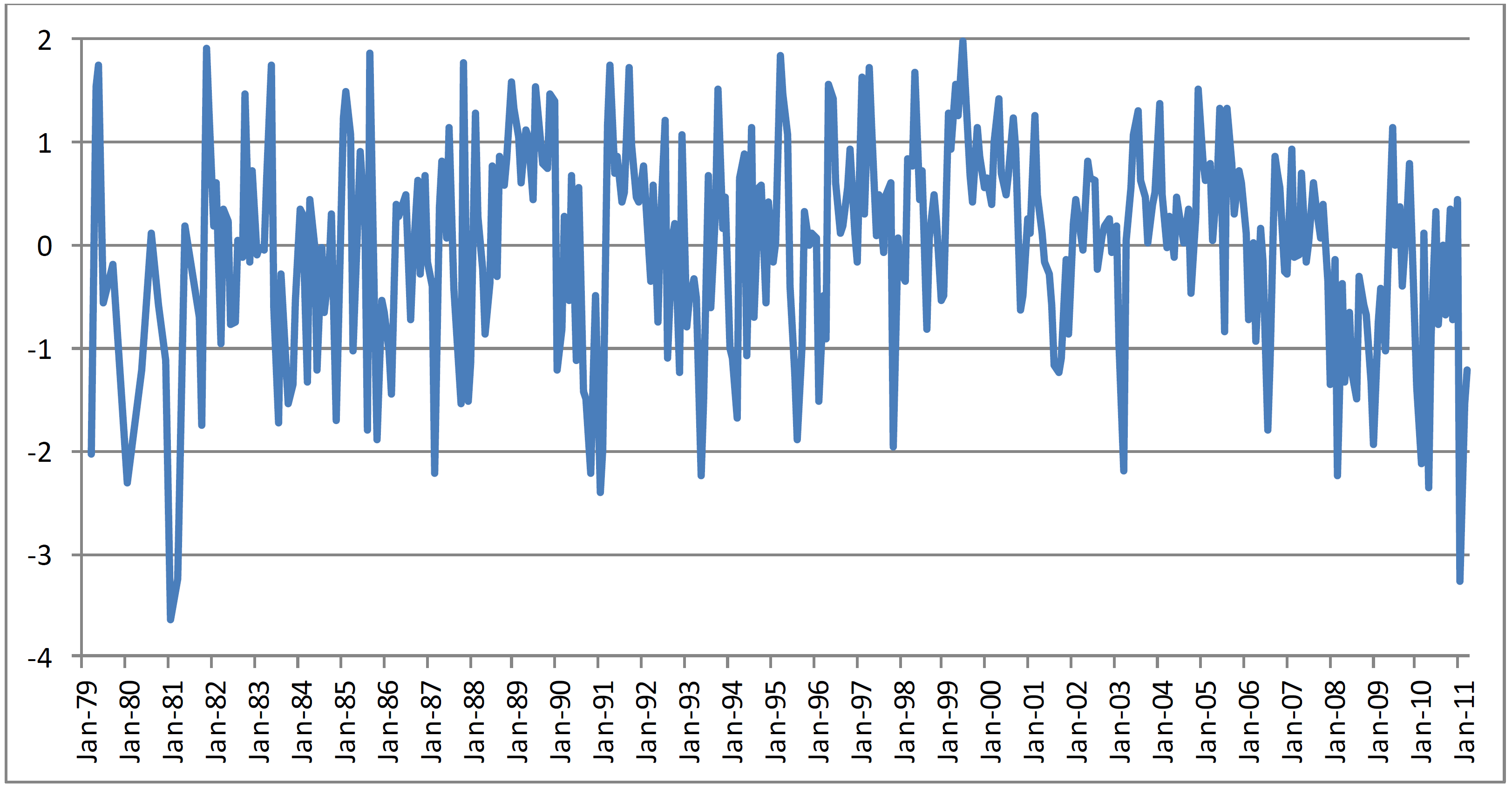
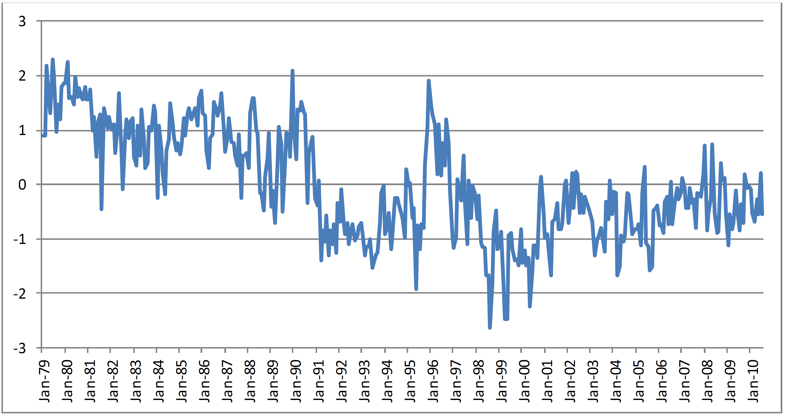
- Figure 3: Tone of coverage mentioning Egyptian President Hosni Mubarak, Summary of World Broadcasts January 1979–March 2011 (January 2011 is 1–24 January). Y–axis is Z–scores (standard deviations from mean) [PNG]
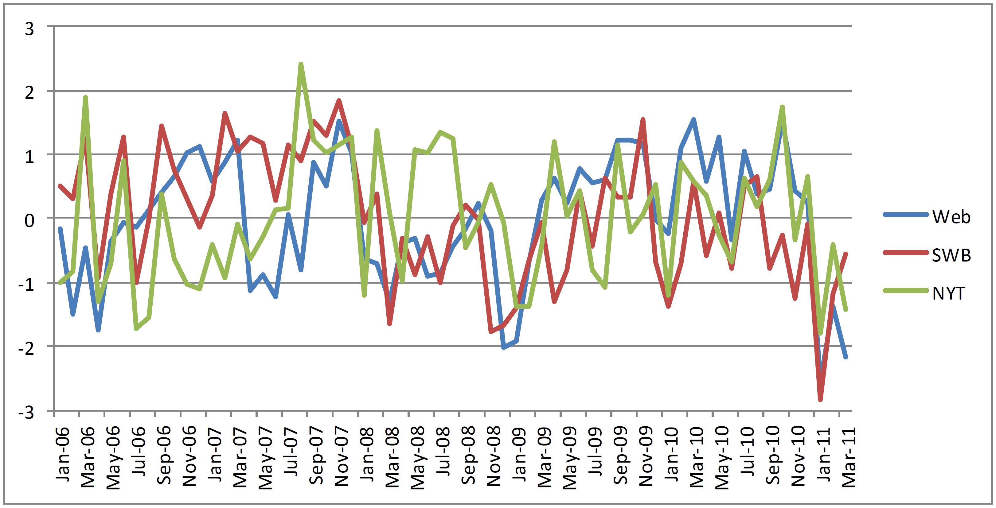
- Figure 4: Tone of coverage mentioning Egypt, January 2006–March 2011 for Web, Summary of World Broadcasts, and New York Times (January 2011 is 1–24 January). Y–axis is Z–scores (standard deviations from mean). [PNG]
- Figure 5: Tone of country–level coverage mentioning Tunisia, Summary of World Broadcasts, January 1979–March 2011 (December 2010 is 1–17 December). Y–axis is Z–scores (standard deviations from mean). [PNG]
- Figure 6: Tone of coverage mentioning Libya, Summary of World Broadcasts, January 1979–March 2011 (February 2011 is 1–15 February). Y–axis is Z–scores (standard deviations from mean). [PNG]
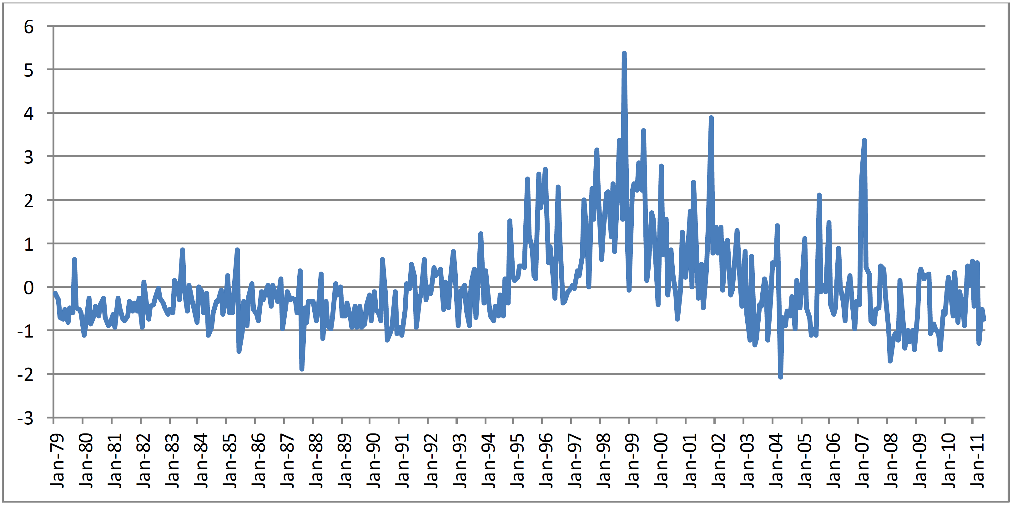
- Figure 7: Tone of coverage mentioning Serbia, Summary of World Broadcasts, January 1979–March 2011. Y–axis is Z–scores (standard deviations from mean). [PNG]
- Figure 8: Percent of articles mentioning Serbia that also reference a Balkan ethnic group, Summary of World Broadcasts, January 1979–March 2011. [PNG]
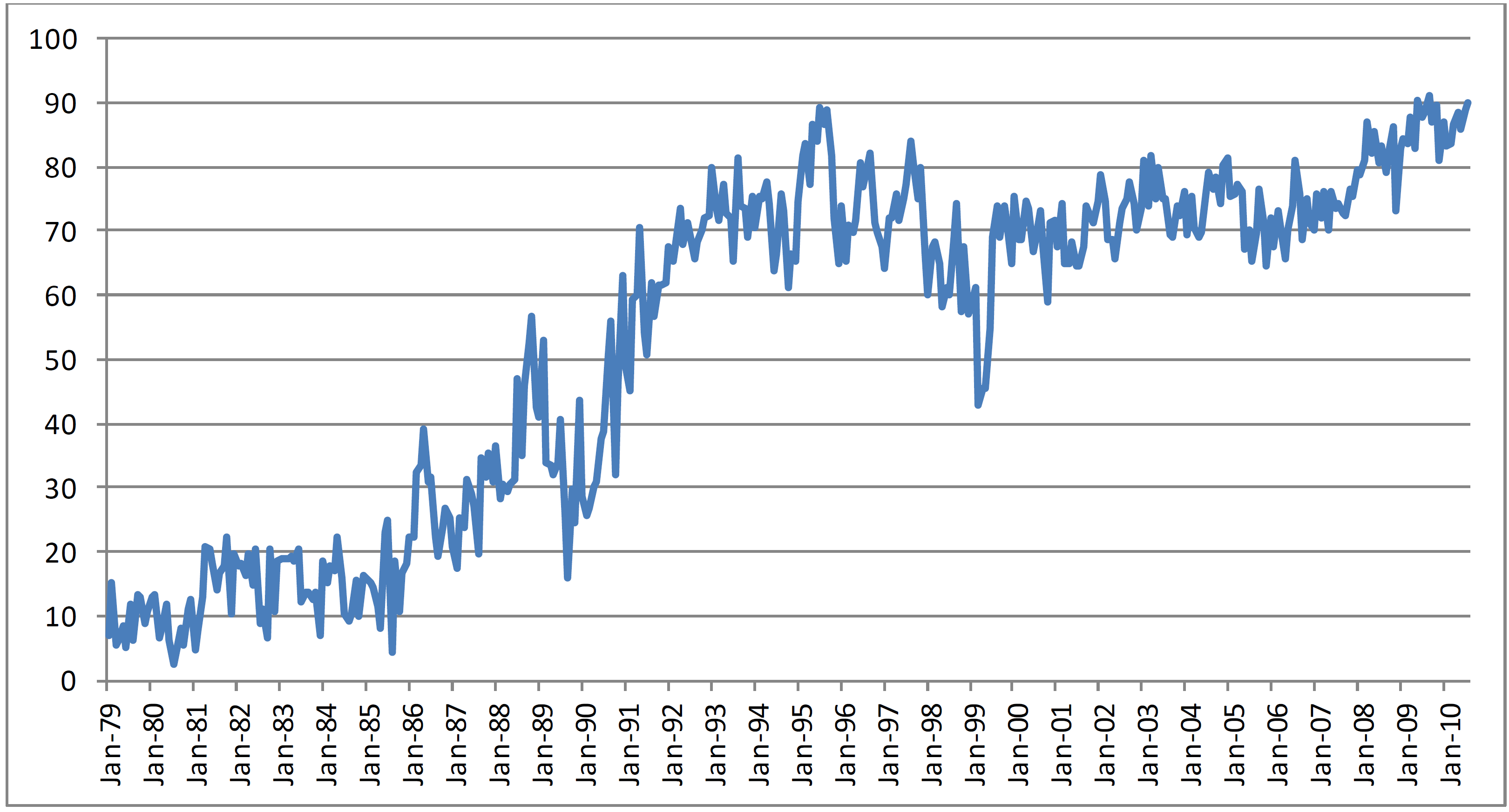
- Figure 9: Tone of coverage mentioning Saudi Arabia, Summary of World Broadcasts, January 1979–May 2011. Y–axis is Z–scores (standard deviations from mean). [PNG]
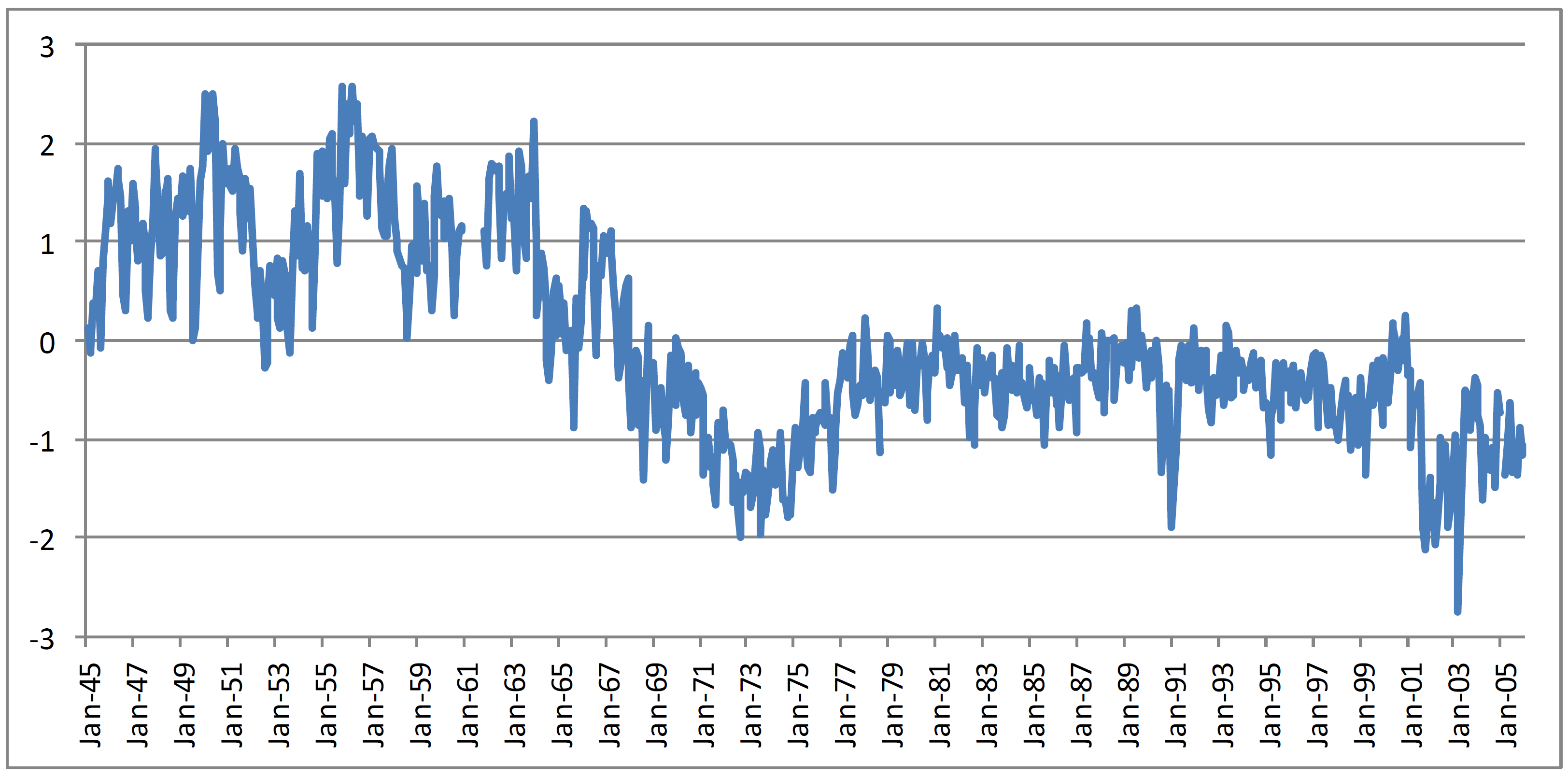
- Figure 10: Average monthly tone of New York Times news content 1945–2005 (Y–axis are standard deviations from mean). [PNG]
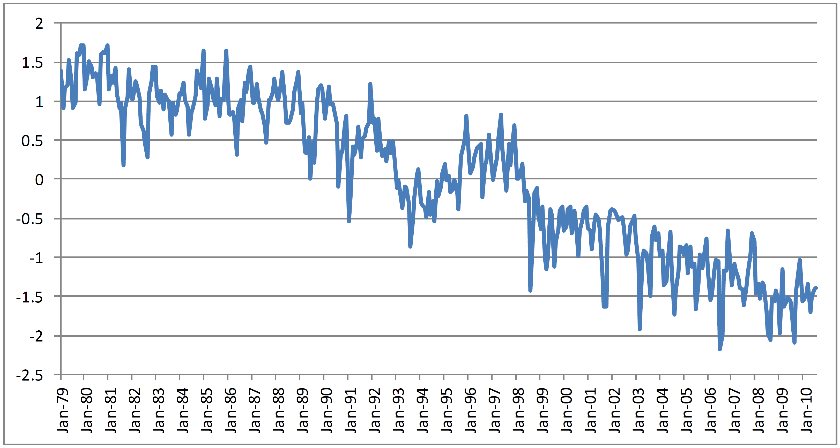
- Figure 11: Average monthly tone of Summary of World Broadcasts news content, January 1979–July 2010 (Y–axis are standard deviations from mean). [PNG]
- Figure 12: Global geocoded tone of all New York Times content, 2005. [ANIMATED GIF 1000 x 1000] [ANIMATED GIF 2000 x 2000]
- Figure 13: Global geocoded tone of all Summary of World Broadcasts content, 2005. [ANIMATED GIF 1000 x 1000] [ANIMATED GIF 2000 x 2000]
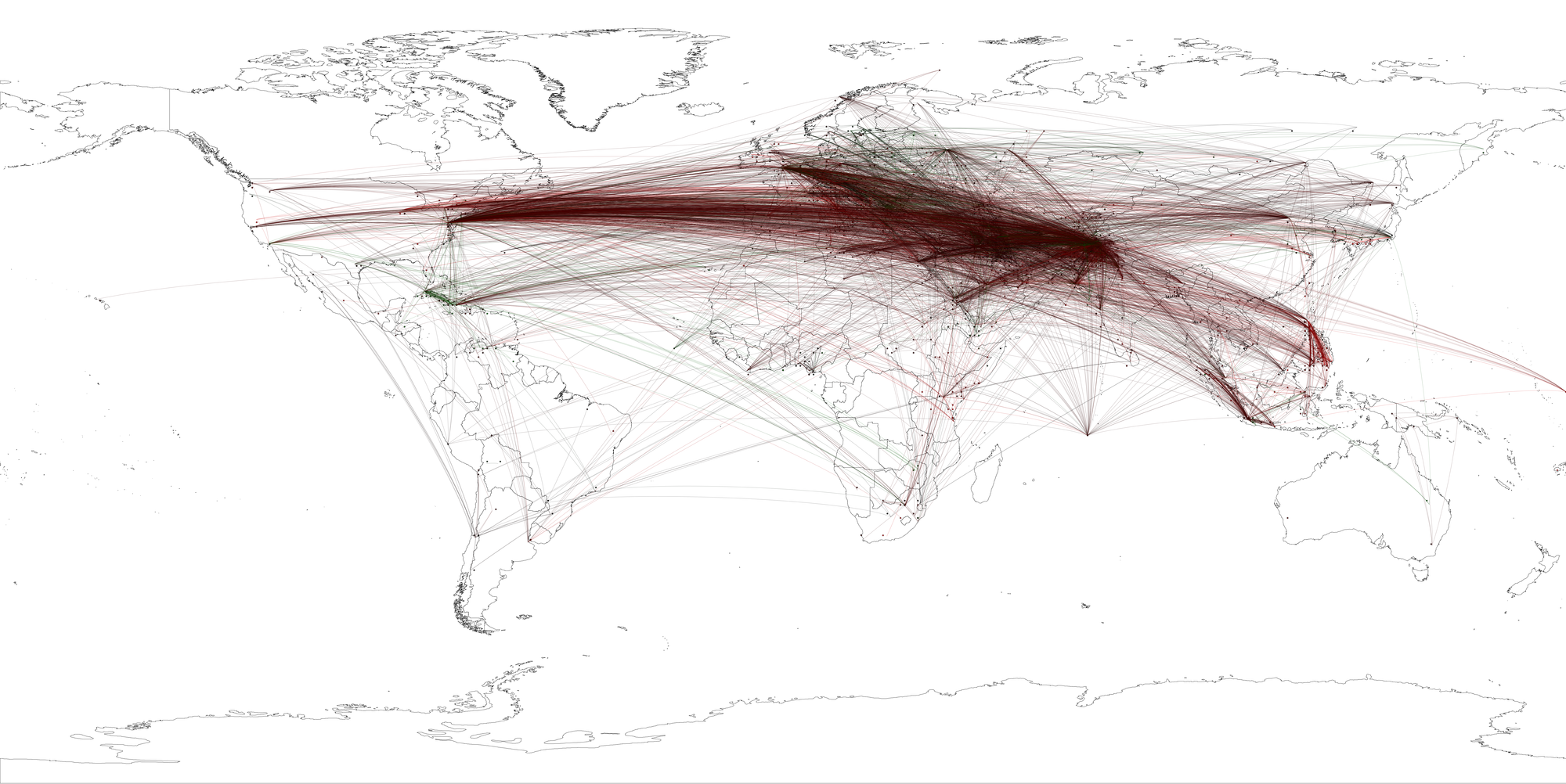
- Figure 14: Global geocoded tone of all Summary of World Broadcasts content, January 1979–April 2011 mentioning “bin Laden”. [PNG]
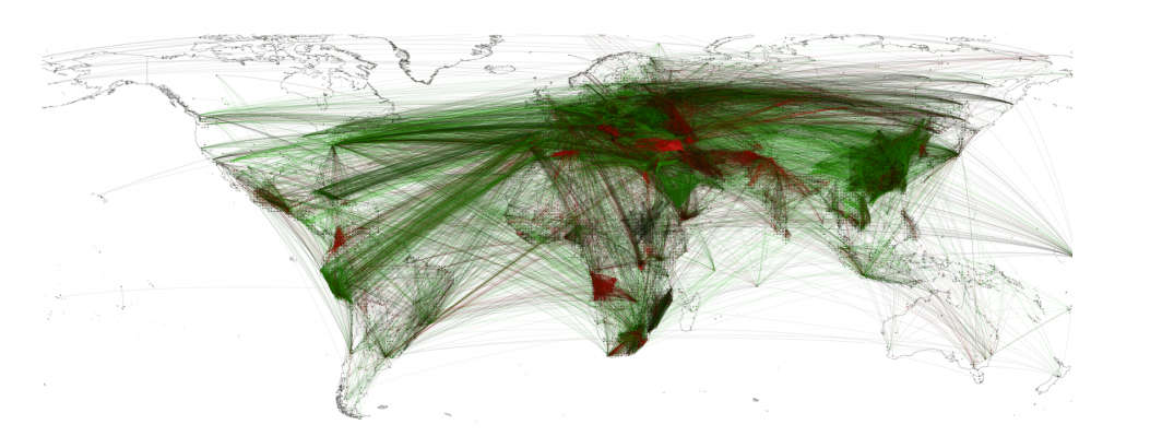
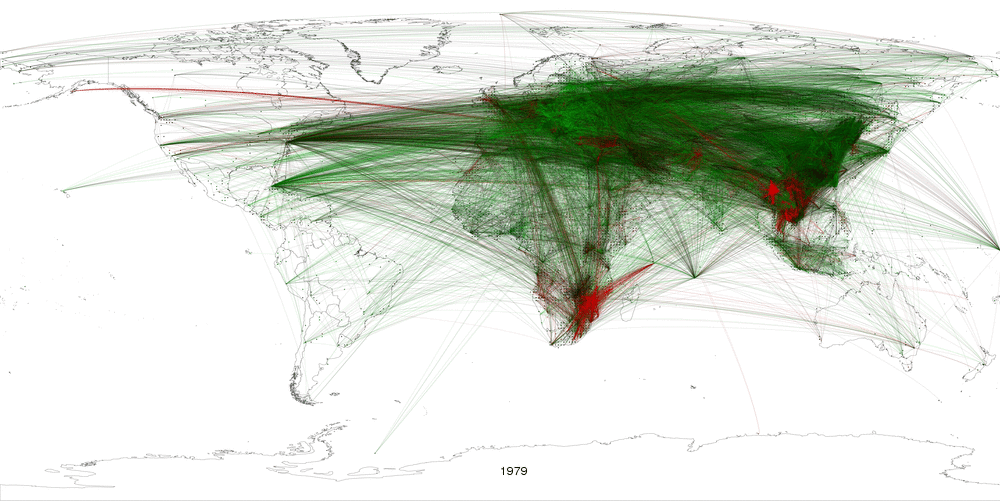
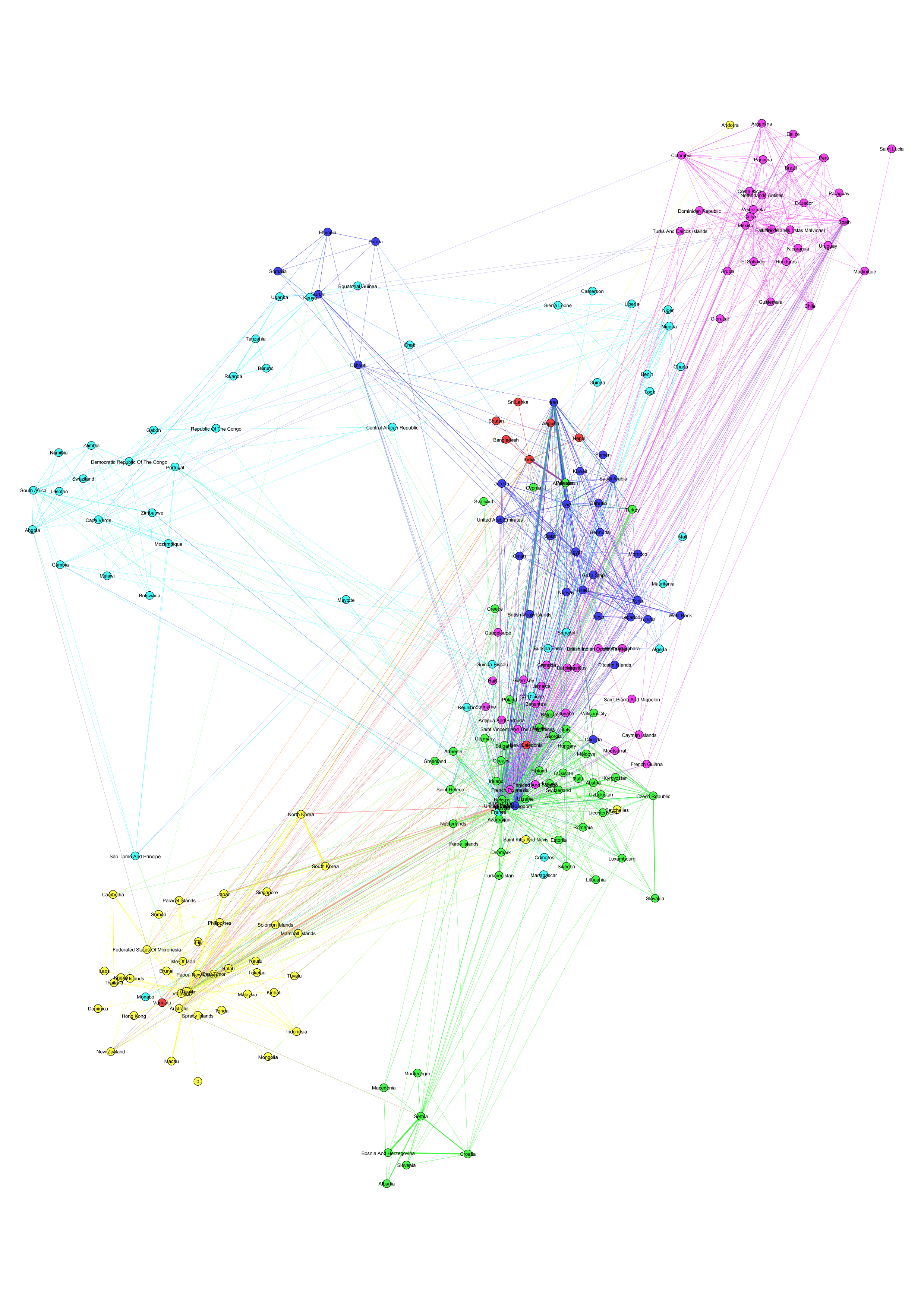
- Figure 15: Network – World “civilizations” according to SWB, 1979–2009. [PNG] [PDF]
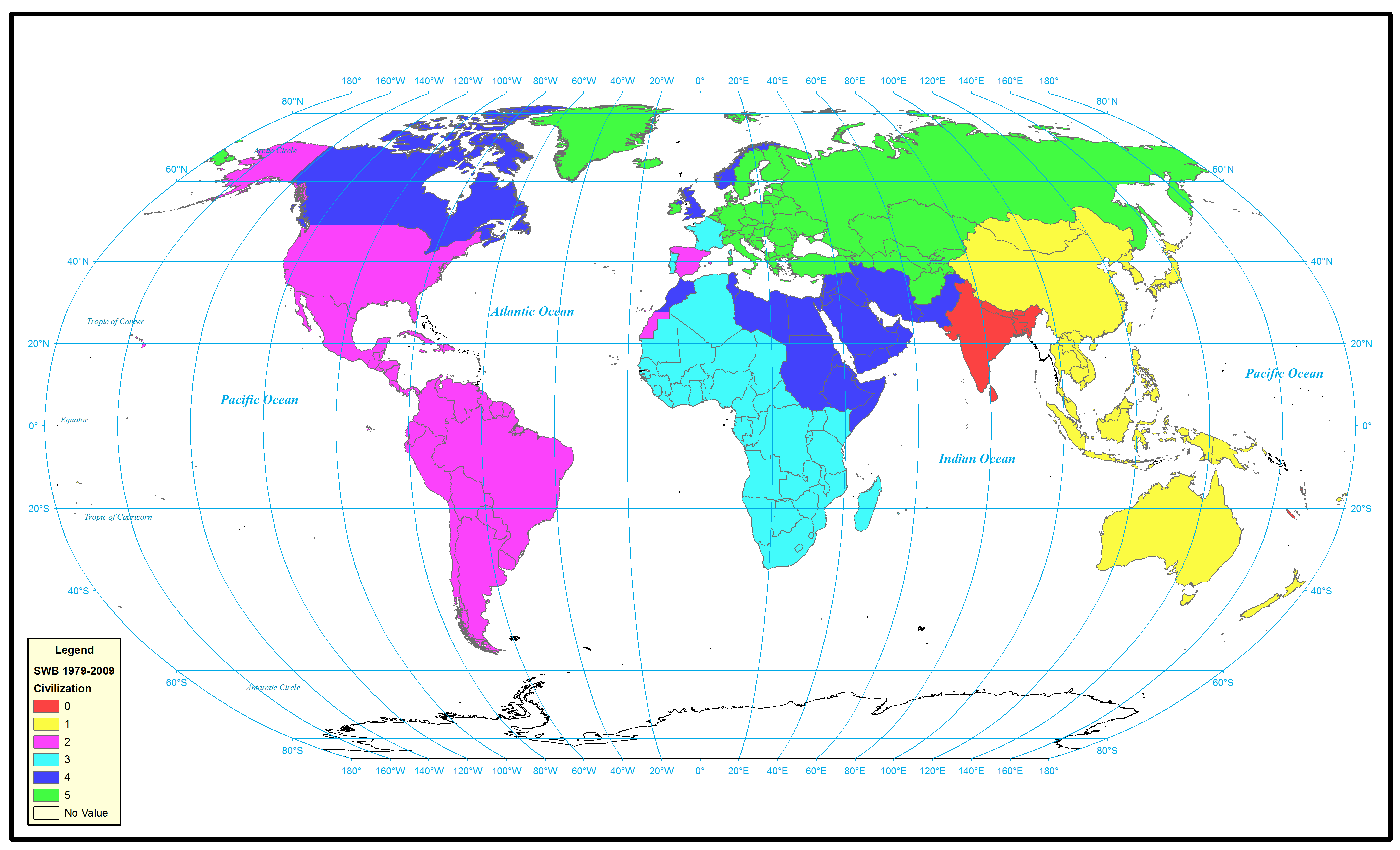
- Figure 16: Map – World “civilizations” according to SWB, 1979–2009. [PNG]
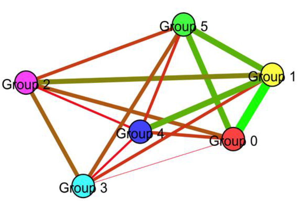
- Figure 17: Average tone of links between world “civilizations” according to SWB, 1979–2009. [PNG]
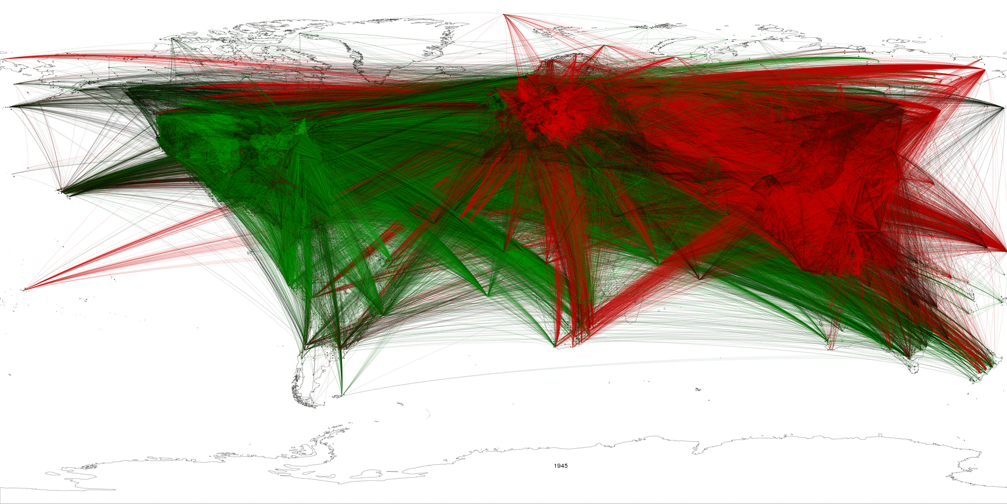
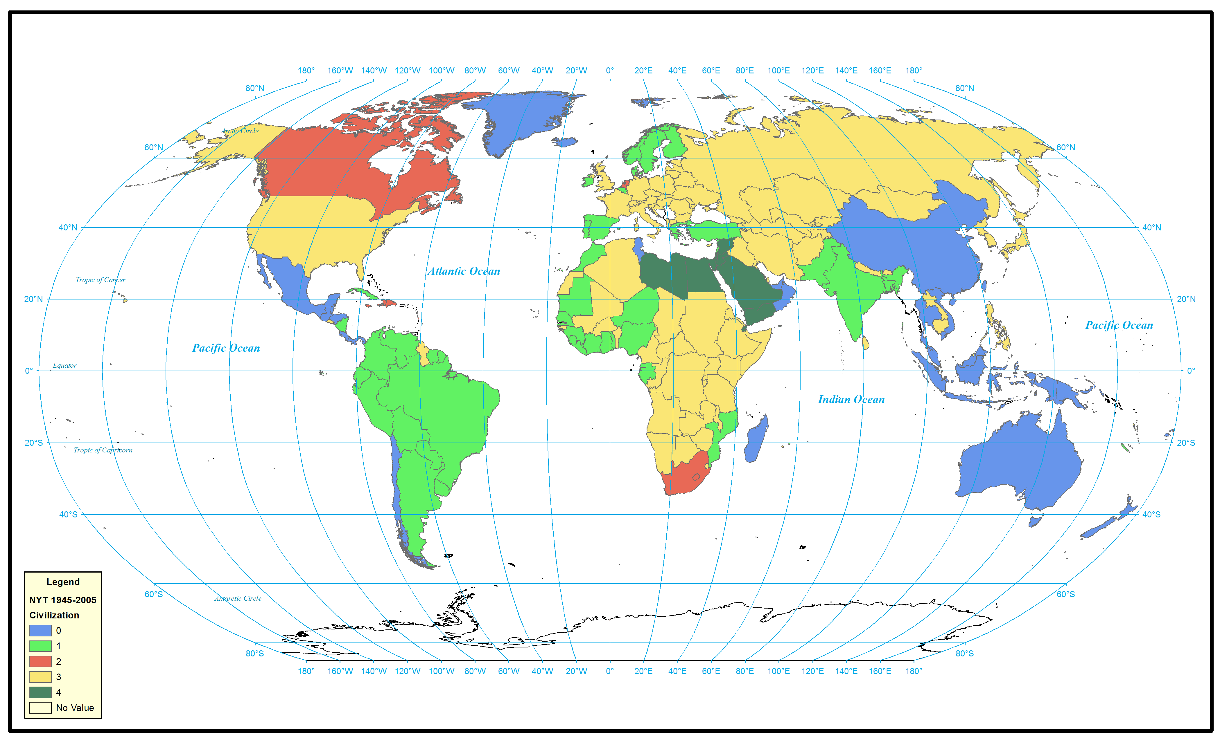
- Figure 18: World “civilizations” according to NYT, 1945–2005. [PNG]