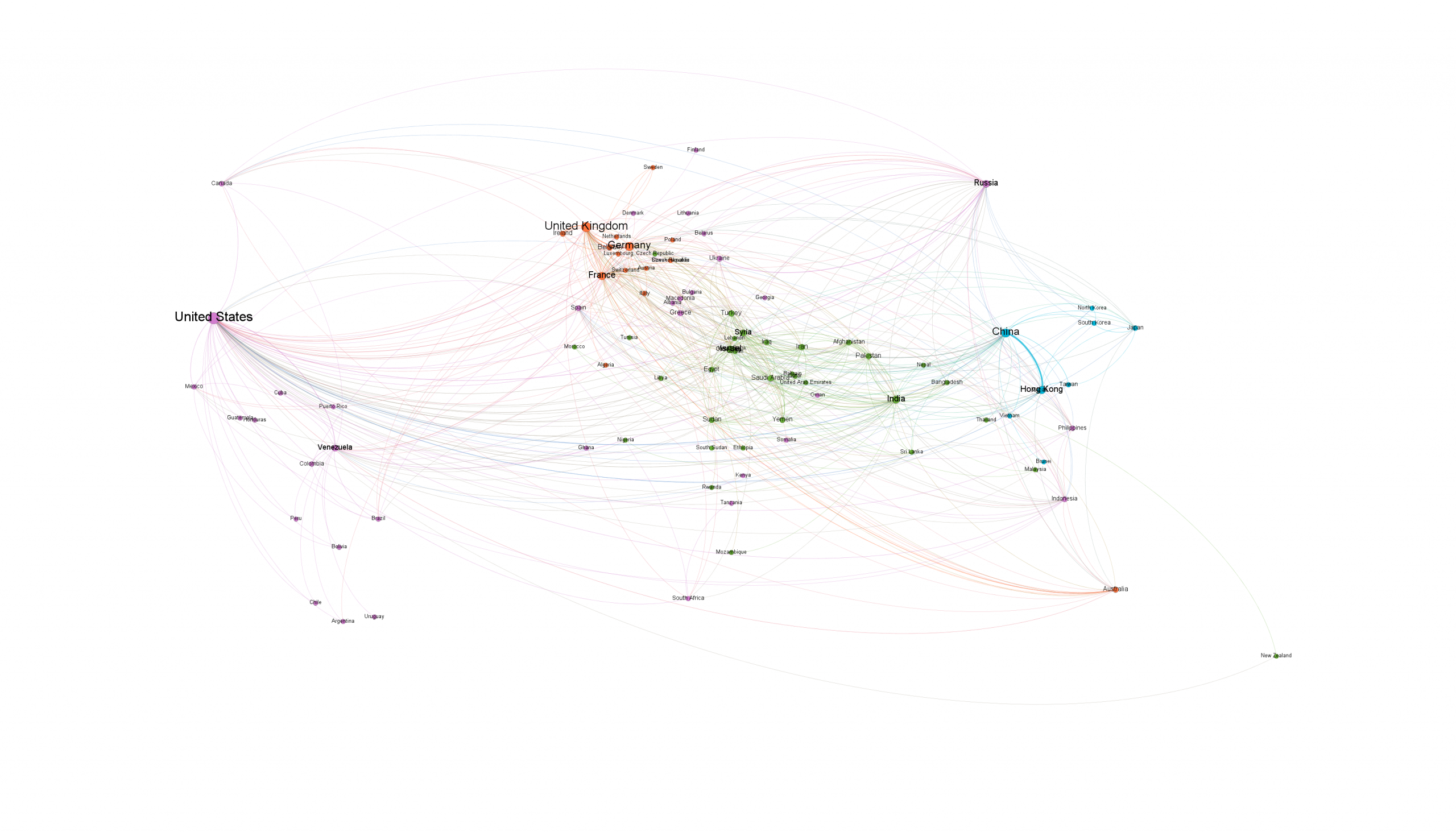
What would it look like to take just over one billion worldwide news articles in 65 languages and visualize the countries that are mentioned together in that coverage? The end result would be a network diagram of country co-occurrence related to protest activity, capturing how the world's media is contextualizing protest.
Using the BigQuery workflow we released earlier this week, we used the query "V2Themes like '%PROTEST%PROTEST%PROTEST%'" to yield the final visualization below of the top 500 most commonly co-occurring countries in protest coverage 2015-2019.
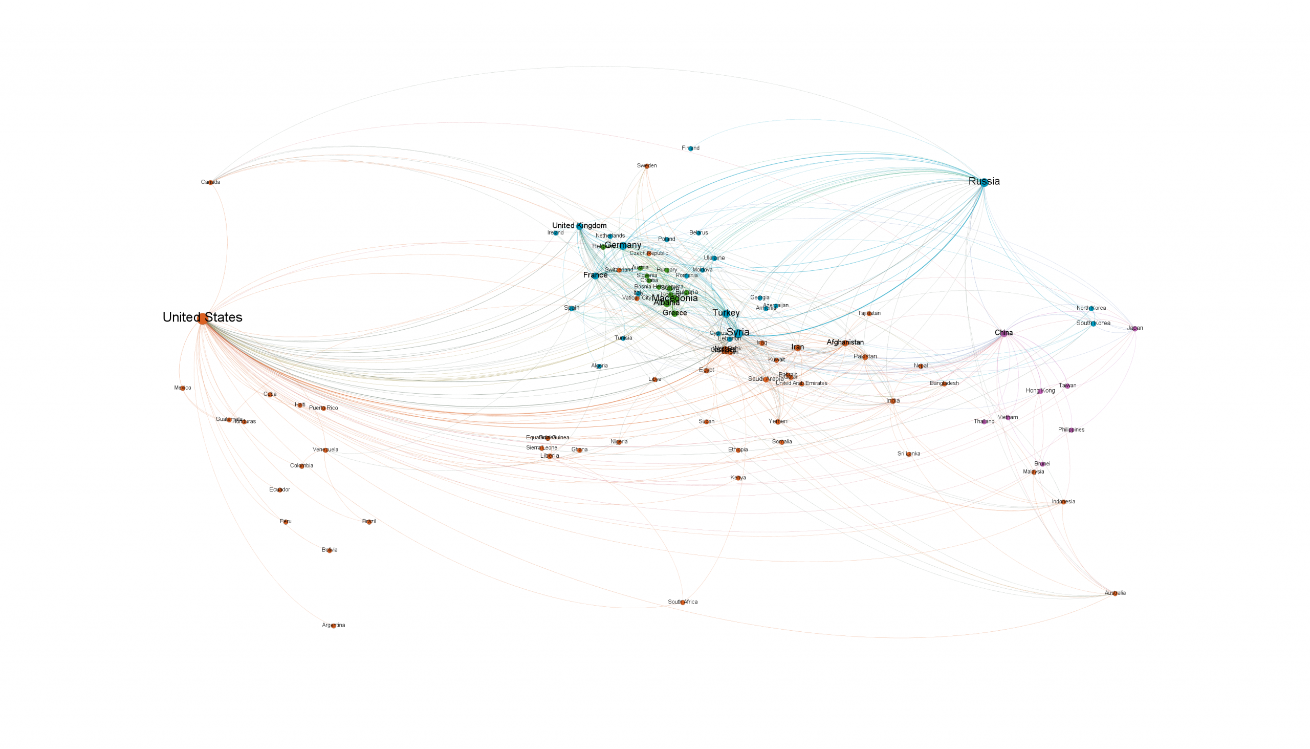
Given the global upheaval thus far in 2019, what would this year's visualization look like? The image below repeats the process, but adds "AND DATE>=20190101000000" to the query to limit to just this year's coverage, yielding the final image below.