There's an old adage in journalism that "all news is local" – meaning that reporters filter and narrate the news to maximize its interest and connection to their local audience. In this way, as each country reports on a catastrophic earthquake in Nepal, they do so through the lens of their domestic populations, focusing on the earthquake's impact to their own citizens visting Nepal over the domestic population and ignoring thousands dying from Ebola until the first Westerners become infected. Reading only English-language Western sources, in turn, offers a potentially highly skewed view of global terrorism and misses an enormous amount of the news in countries like Yemen.
This got us really interested in what the linguistic geography of the world's news really looks like. In other words, for every location on earth, what is the language of the news coverage discussing that location throughout the day? If you stacked up all of the coverage mentioning Cairo in a given day, would it be primarily in Arabic, while coverage of Paris would primarily be in French? What about beyond international cities towards the myriad small local cities, towns, villages, and hilltops throughout the world? In essence, if you wanted to learn about a given location on earth, what is the language you would need to turn to?
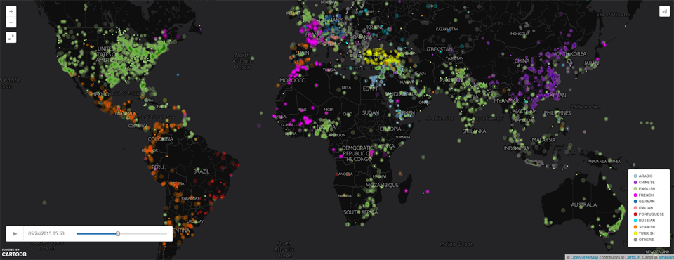
To answer this question, we created the animated zoomable map below, which color codes each location on earth by the language of the first article from anywhere in the world that GDELT monitored mentioning that article in a given 15 minute interval. To reiterate, each dot represents the language of the first mention of that article from a news article somewhere in the world in a given 15 minute interval throughout the day, rather than the language of news outlets at that location. (In other words, this is a map of the language of the news ABOUT each location, rather than the news AT that location – though obviously the two are highly related.) This can yield fascinating findings, such as when a terror attack or natural disaster in a location where English is not the primary language prompts a sudden wave of coverage from across the world's languages.
Ten common languages are each given their own color (see the legend in the bottom right of the map), while the remainder of the 65 languages translated by GDELT are displayed in dark grey. Note that locations with large amounts of coverage across many languages may not always be in precise chronological ordering and ordering is dependent on when GDELT discovered the article, which may not be precisely when it was published. However, in the general case a location with appears primarily with one color is indicative of a location that is primarily focused on by that language over others. It is important to note that this map is generated entirely by computer algorithms that are attempting to process a large cross-section of the entire world's journalistic output in realtime, including the world's largest deployments of streaming machine translation and multilingual geocoding of the news. Operating at this scale pushes to the very edge of the current state of the art and means that there will always be a degree of error in this map, but overall the map should reflect a reasonably accurate snapshot of linguistic geography of the world's news media.
The map below is updated every hour and reflects approximately the last 12-24 hours in 15 minute increments (the goal is 24 hours, but that can be reduced down to the last 12 hours if the total database size powering the map grows too large). The map is most exciting when you zoom into it. Try zooming into Europe and watch the waves of coverage. Look for locations that stay largely the same color versus those that are constantly changing color (attracting attention from across the world's languages). Look for countries or corners of countries with very different languages from those around them (hint: look for Portuguese coverage of Angola or French coverage of Burkina Faso). To make it easier to see the map, try clicking on the small button at top right that has the diagonal arrows – this will open the map full screen on your computer. It can be quite mesmerizing to watch the map – it almost looks like a night sky with twinkling stars, sudden bursts of color, and waves of coverage. Enjoy!
(NOTE: this map contains a large amount of data and may take a few seconds to load. When zooming or panning, on occasion the map may suddenly go blank – if this happens, refresh your browser to reload the page and the map should return to normal.)