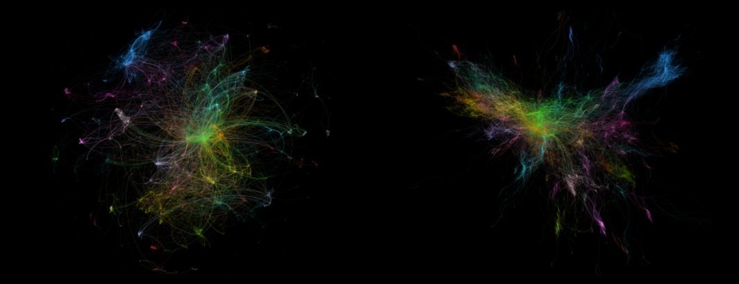
The series of visualizations we've created of the GKG Outlink Graph remind us how much of an impact our data filtering and algorithmic decisions have on the final visual rendering of our large network datasets and on our understanding of their structure.
- Visualizing The GKG Outlink Graph: Random 10K Graph
- Visualizing The GKG Outlink Graph: Reciprocal 30K Graph
- Visualizing The GKG Outlink Graph: Top 5 By Outlet + 50K Strongest
- Visualizing The GKG Outlink Graph: Google News + Top 5 By Outlet + 50K Strongest
- Visualizing The GKG Outlink Graph: Google News + Top 5 By Outlet + 10K Strongest
- Visualizing The GKG Outlink Graph: US Outlets + Top 10 Reciprocal + 30K Strongest With Edge Weights
- Visualizing The GKG Outlink Graph: Google News + Top 5 Reciprocal + 10K Strongest With Edge Weights
- Visualizing The GKG Outlink Graph: Google News + US Only + Top 5 Reciprocal + 10K Strongest With Edge Weights
- Visualizing The GKG Outlink Graph: Google News