
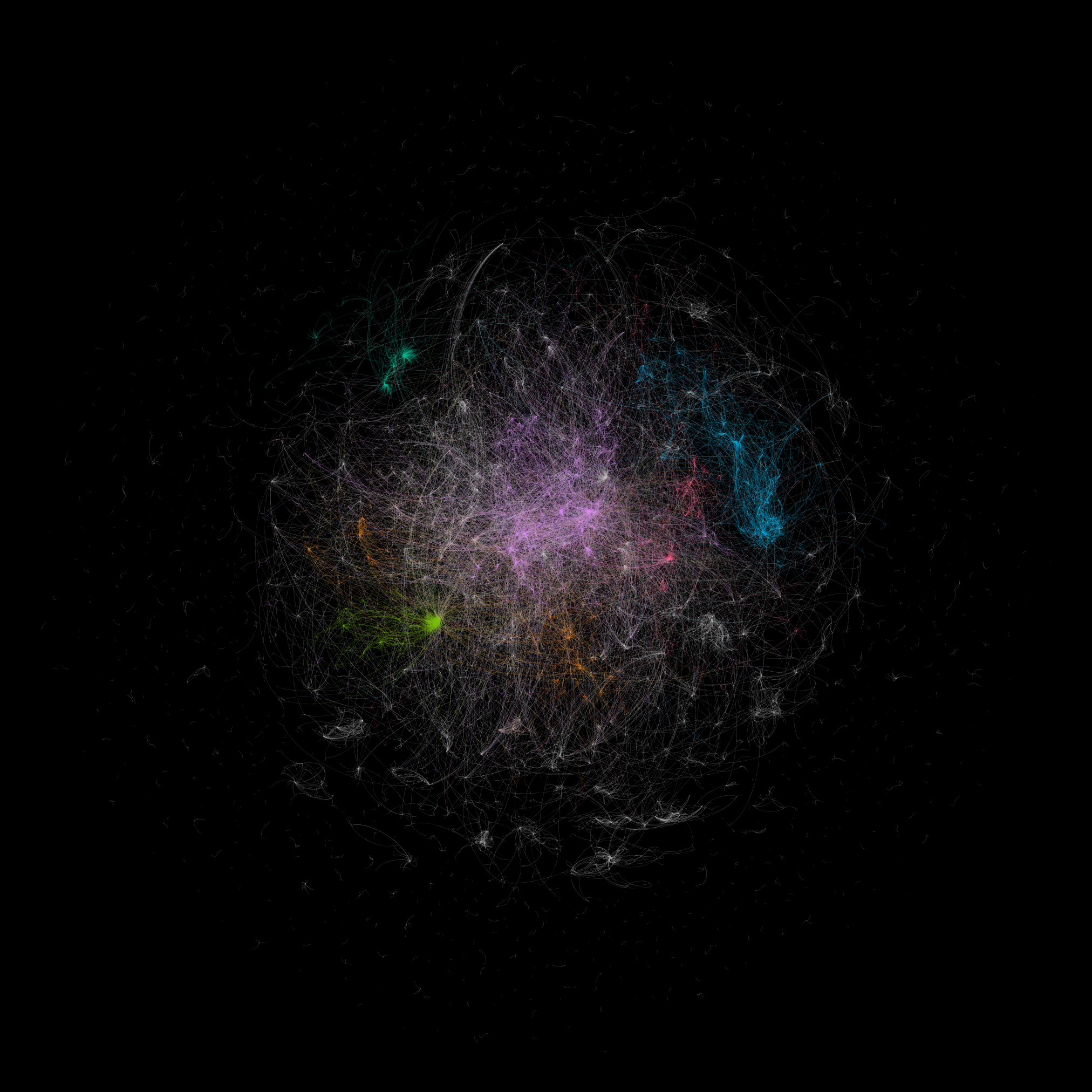
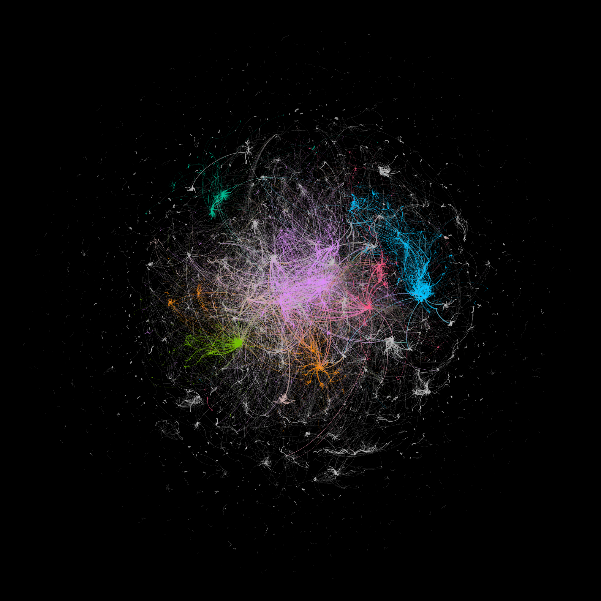
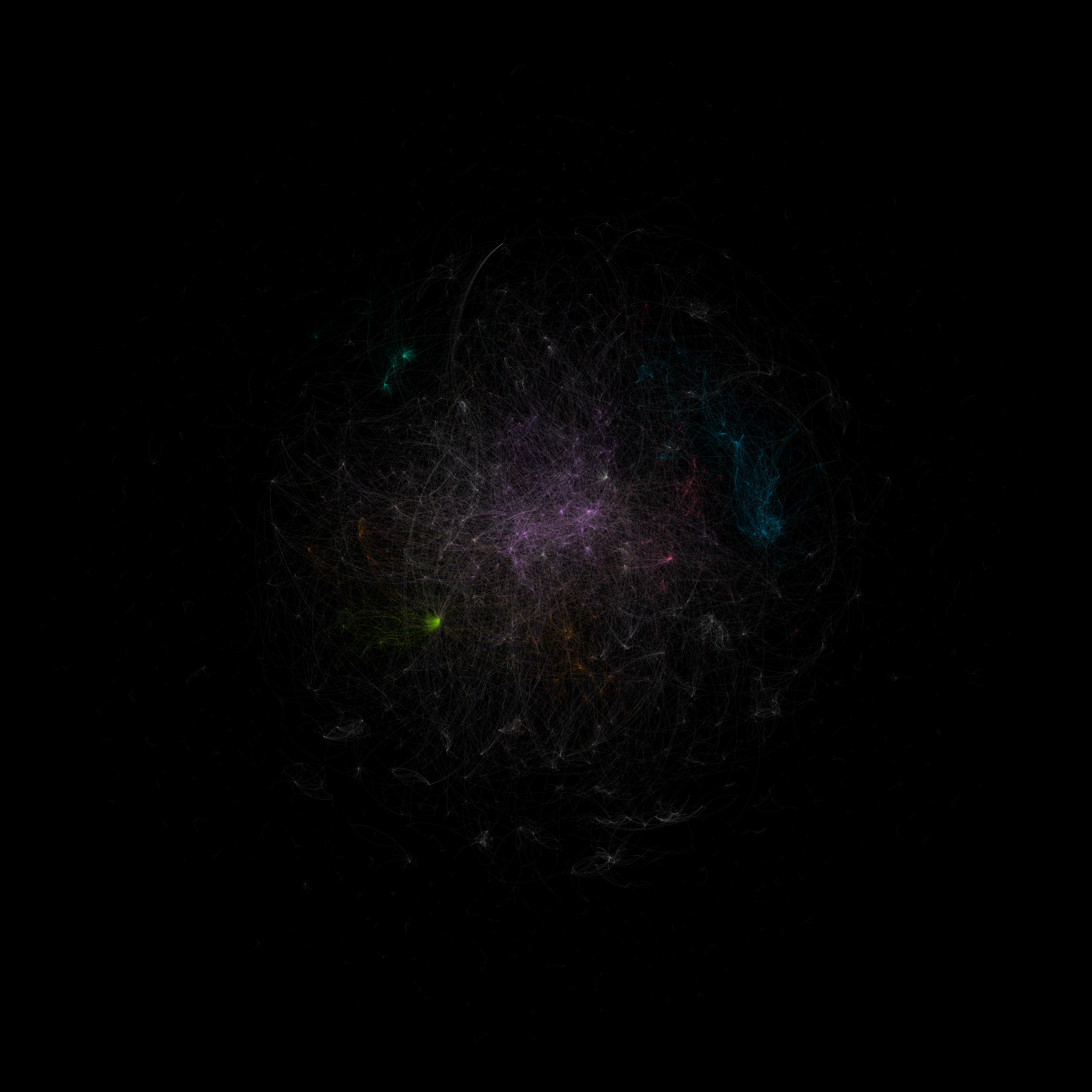
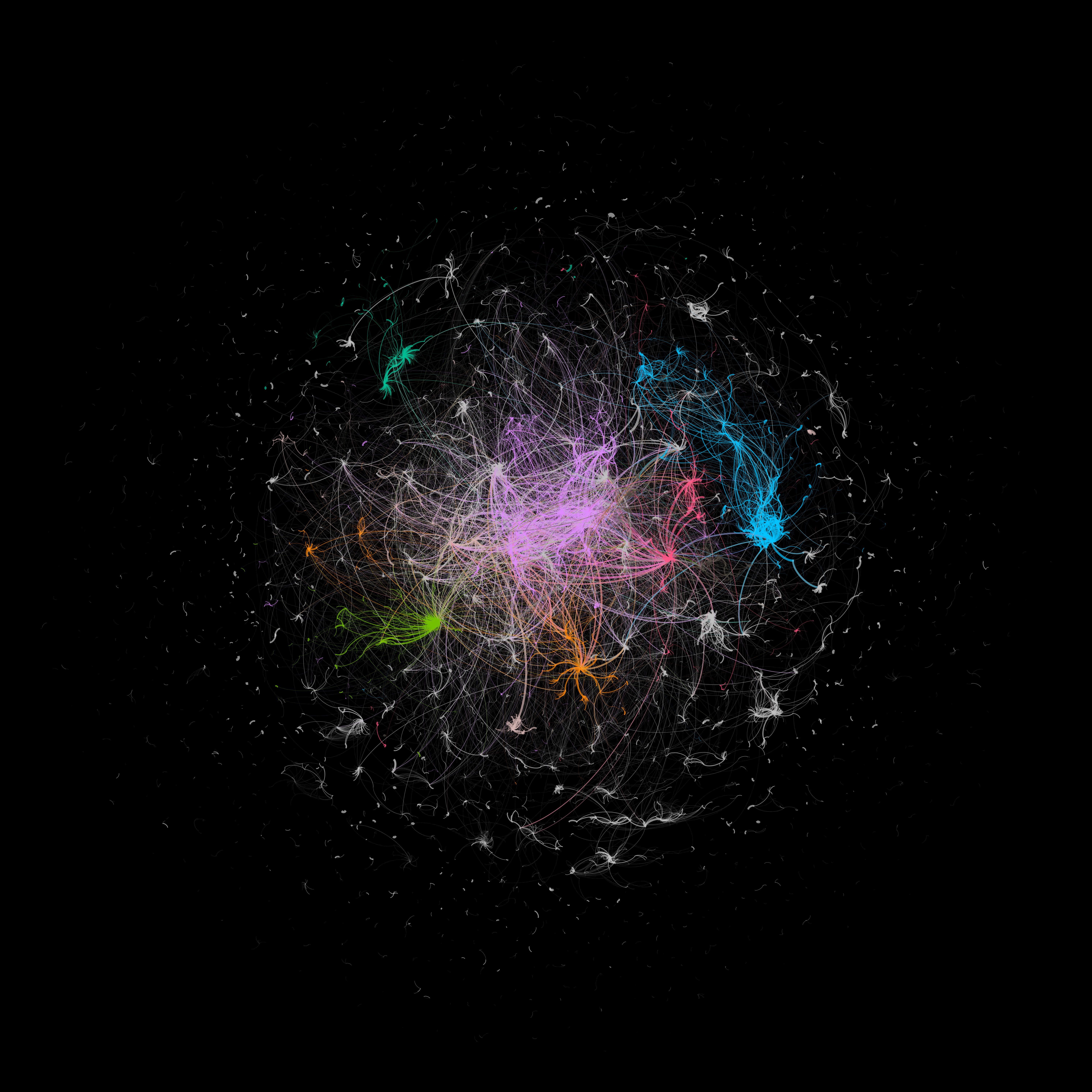
Since our new 2016-2018 GKG outlink dataset is a graph, we thought we'd visualize it using Gephi. There are many ways the data can be visualized. For this initial graph, we computed the top 30 inlink domains for each news outlet identical to this morning's summary dataset (though filtered to only retain edges of 30 days or longer) and then wrote a random set of 10,000 edges to the final file. The final layout was rendered using OpenOrd (Force Layout 2 exhibited poor behavior on the graph's high density), with node sizing via PageRank and coloration via modularity.
While this is just one of many possible visualizations of the graph, it offers a glimpse at the incredibly intricate complexity of today's global news landscape!
