How might we visualize the narrative clusters of a given topic using the new Global Similarity Graph Document Embeddings dataset? Let's say we are interested in vaccination-related coverage from August 4, 2021. We can query the GKG 2.0 for related coverage using the V2Themes field, searching for "%VACCIN%VACCIN%" to return articles that mention vaccination twice as a simple relevancy filter, then use this list of URLs to filter the GSG embedding dataset to just vaccine-related coverage on that day. We can then use a CROSS JOIN in BigQuery to fold this dataset onto itself and compute pairwise cosine similarity across the entire dataset. Of the 19,598 matching articles, this means we have to compute 384 million pairwise similarity comparisons, which BigQuery is able to do in just 2 minutes 1 second and output the top most similar results. Since the browser-based BigQuery UI limits us to just 16,000 rows, we'll limit our output to the top 16K most similar article pairs. We'll also use an "order by rand() limit 20000" to limit ourselves to a random sample of up to 20,000 matching articles. In this case there are only 19,598 matching results, but for larger queries this gives us a safety threshold. Finally, we format the output results in Gephi's native edge format so we can load the resulting CSV file directly into Gephi for visualization.
This entire workflow is encapsulated in the following query that takes just 2 minutes 1 second to compute all 384 million pairwise similarity comparisons:
CREATE TEMPORARY FUNCTION cossim(a ARRAY<FLOAT64>, b ARRAY<FLOAT64>)
RETURNS FLOAT64 LANGUAGE js AS '''
var sumt=0, suma=0, sumb=0;
for(i=0;i<a.length;i++) {
sumt += (a[i]*b[i]);
suma += (a[i]*a[i]);
sumb += (b[i]*b[i]);
}
suma = Math.sqrt(suma);
sumb = Math.sqrt(sumb);
return sumt/(suma*sumb);
''';

WITH data AS (
SELECT ANY_VALUE(url) url, ANY_VALUE(lang) lang, title, ANY_VALUE(docembed) docembed FROM `gdelt-bq.gdeltv2.gsg_docembed` WHERE DATE(date) = "2021-08-04" and url in
(SELECT DocumentIdentifier FROM `gdelt-bq.gdeltv2.gkg_partitioned` WHERE DATE(_PARTITIONTIME) = "2021-08-04" and V2Themes like '%VACCIN%VACCIN%')
group by title order by rand() limit 20000
)
select a.title Source, b.title Target, "Undirected" Type, cossim(a.docembed, b.docembed) Weight from data a cross join data b where a.url != b.url and a.title != b.title and cossim(a.docembed, b.docembed) > 0.6 and cossim(a.docembed, b.docembed) < 0.99 order by Weight desc limit 16000
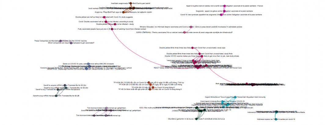
We then bring this into Gephi to visualize using OpenOrd. You can download the final results as a zoomable PDF (you'll likely have to zoom in to 3,000%+ zoom to see readable text):
Immediately clear is that the dataset is clustered into myriad tiny isolate clusters. As a graph visualization platform, Gephi only knows about the explicit links between each article and thus clusters are not positioned based on similarity. You can see a preview version of the zoomable PDF file below. While the contents of each cluster are interesting, it is clear that representing the pairwise article similarities as a graph and visualizing in Gephi will yield limited results, which is why embeddings are typically visualized through other techniques like UMAP or t-SNE.
