What would it look like to visualize a day of worldwide online news coverage about a given topic, using document-level semantic embeddings to cluster coverage in a 2D or 3D visualization, with articles being drawn closer to articles they are more similar with? The end result would essentially be a narrative map of the world's media landscape of coverage of that topic.
To demonstrate how to create such maps, we compiled a list of news coverage in 65 languages about Covid-19 vaccination from August 4, 2021 and used the TensorFlow Embedding Projector service to create a live interactive visualization of how the resulting articles cluster together:
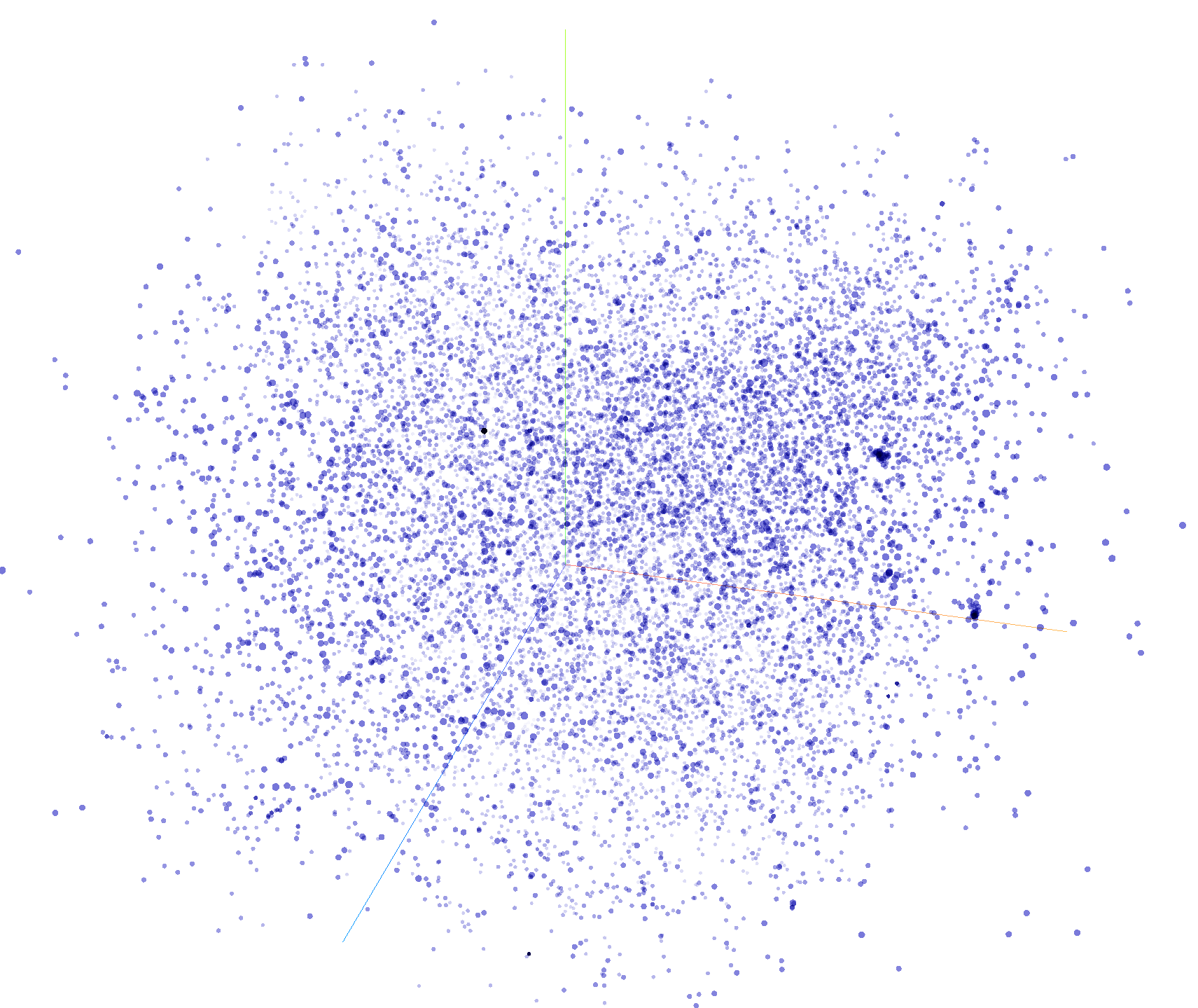
The visualization above runs entirely in your web browser so may not run in older browsers or on all mobile devices. By default you will see the articles positioned using PCA (Principle Component Analysis), which will result in just a starfield of points with no discernable pattern:
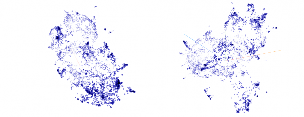
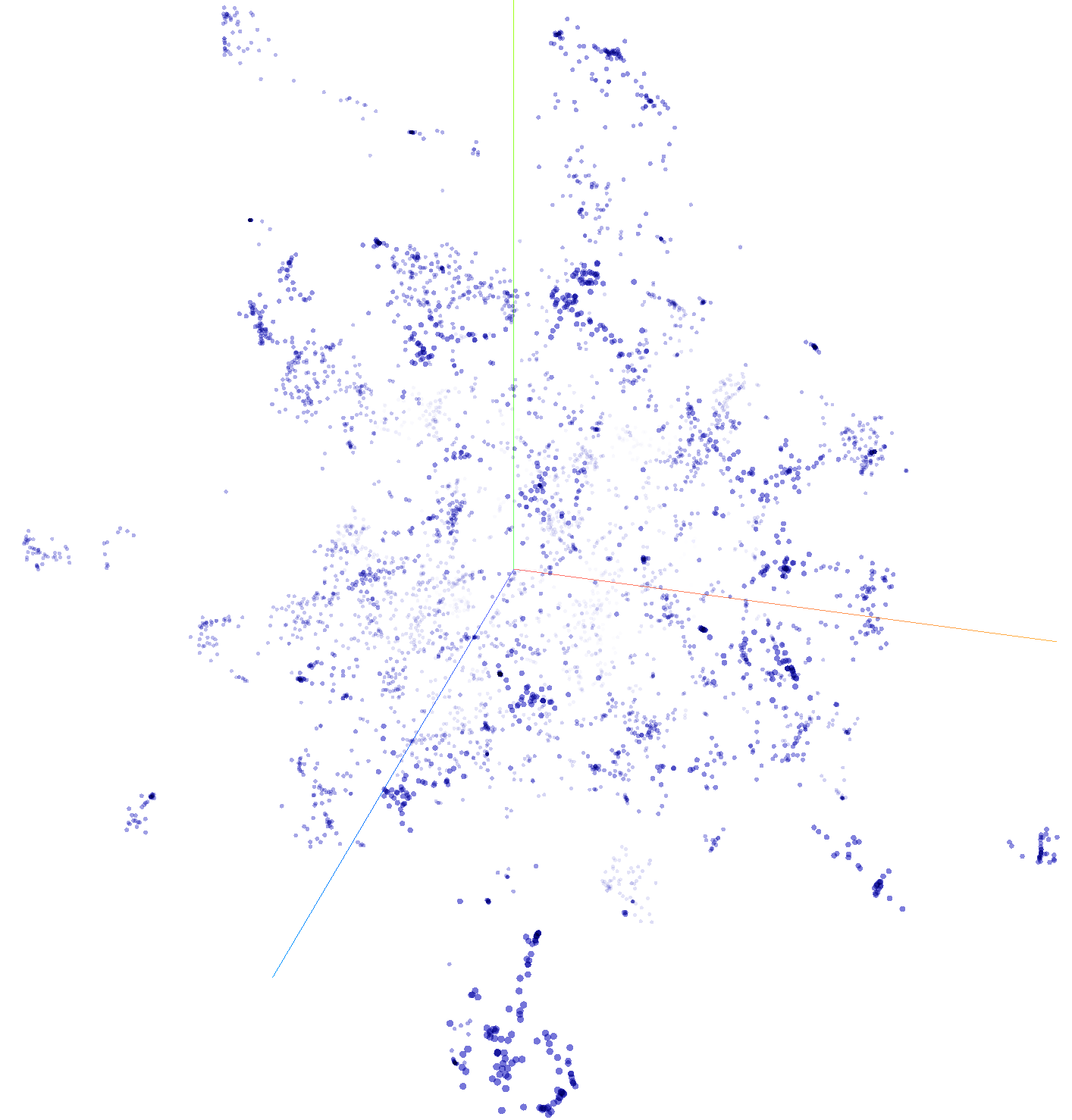
Now, let's try UMAP (Uniform Manifold Approximation And Projection), which is a different algorithm for dimensionality reduction. Click on the greyed-out word "UMAP" towards the bottom of the left-hand navigation bar. After a few seconds or tens of seconds, depending on the speed of your computer, you should see a visualization that looks more like the following, with strong spatial clustering and readily discernable grouping.
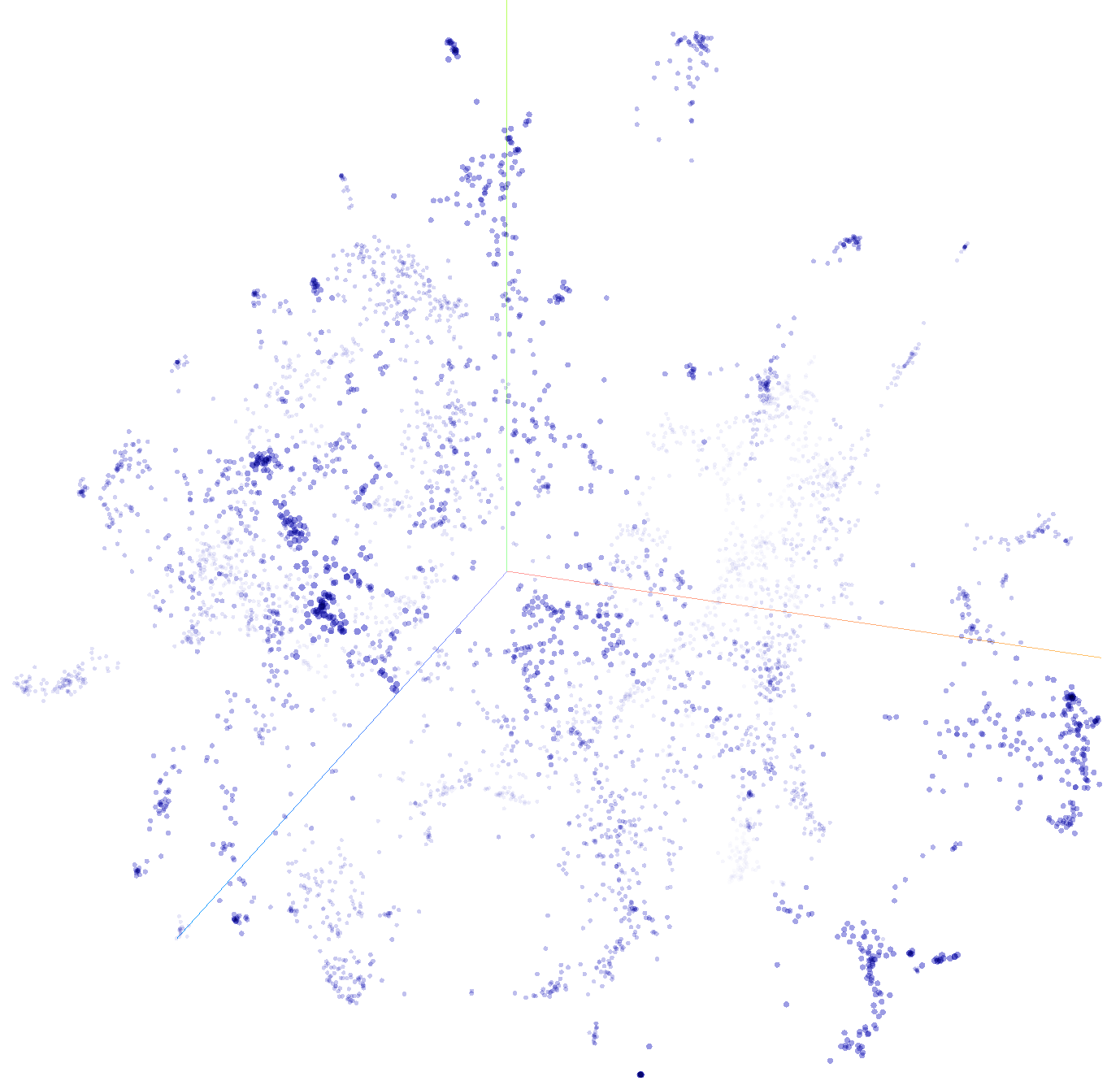
Now try clicking on the greyed-out word "T-SNE" next to UMAP to switch to T-Distributed Stochastic Neighbor Embedding. This is an iterative algorithm that will continually adjust the visualization in realtime many times a second. Click on the "Stop" button at the bottom of the left-hand navigation bar when the visualization looks reasonable.
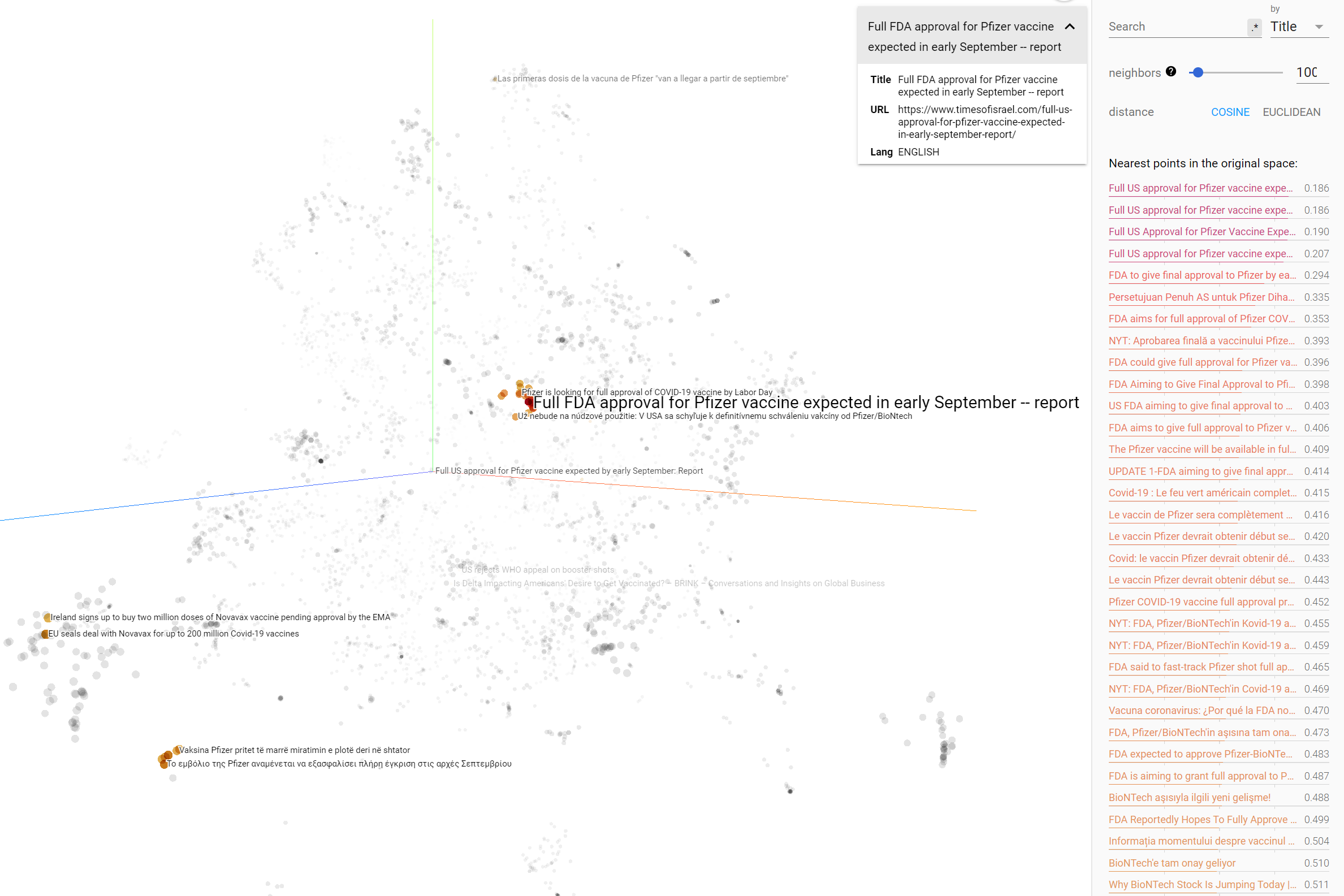
You can also click on any point to see its information in a popup information box at top right. In addition, a right-hand navigation bar will open displaying a list of the articles most similar to the selected article and top articles will be highlighted along with their titles in the main visualization. You can click anywhere in the background of the visualization to reset the display. You can also click on the house-shaped "home" icon at top-right of the display to reset it and see the display slowly spin.
So how did we create this visualization? We used BigQuery to combine the GKG 2.0 and GSG Document Embedding datasets, then a PERL script to convert the results into a pair of TSV files that are then displayed using the TensorFlow Embedding Projector. While there are a number of steps in this workflow, the result is an interactive powerful visualization of the narrative landscape around your topic!
First, we will search the Global Knowledge Graph 2.0 to identify vaccine-related coverage from August 4, 2021 in the 65 live-translated languages covered by the GKG, using the V2Themes field to limit our results to just articles that mention vaccination two or more times (requiring at least two mentions in the article should limit us to more relevant coverage and avoid spurious one-off mentions). We will use these results to filter the new Global Similarity Graph Document Embeddings dataset to extract the document-level Universal Sentence Encoder v4 embeddings for each of the matching articles:
SELECT ANY_VALUE(url) url, ANY_VALUE(lang) lang, title, ANY_VALUE(docembed) docembed FROM `gdelt-bq.gdeltv2.gsg_docembed` WHERE DATE(date) = "2021-08-04" and url in
   (SELECT DocumentIdentifier FROM `gdelt-bq.gdeltv2.gkg_partitioned` WHERE DATE(_PARTITIONTIME) = "2021-08-04" and V2Themes like '%VACCIN%VACCIN%')
group by title
The inner query returns the URLs of all GKG 2.0 records from August 4, 2021 that mentioned vaccination at least twice in the V2Themes field and then extracts the GSG embedding records for those URLs. We further collapse by title to eliminate wire stories that were widely republished, keeping just one copy of each article even if it was published across many outlets.
Download these results as a JSON file to your local computer. Given the large filesize of the results, BigQuery may require you to first export the results to a temporary GCS bucket or Google Drive file and then download from there to your local computer (make sure to remember to delete the temporary GCS or Google Drive file when you're done).
Then download the following PERL script to the same directory you saved the JSON results from BigQuery:
Now you'll run this script over the BigQuery results to convert them to the format needed by the TensorFlow Embedding Projector. Run the script like:
./convertto_tfprojector.pl ./bigqueryresults.json
The script will take a few seconds or longer to run (depending on the size of your results) and will generate two new files (taking your results filename and adding ".vecs.tsv" and ".meta.tsv" to the end):
bigqueryresults.json.vecs.tsv
bigqueryresults.json.meta.tsv
The first file contains a tab-delimited version of the raw 512-dimension embedding for each article, one per row, while the second contains some basic metadata about each article, including its title, URL and original publication language.
Now open the TensorFlow Embedding Projector in your browser and click on the "Load" button towards the top of the left-hand navigation bar. This will ask you to upload two files from your computer – the first is the ".vecs.tsv" file and the second is the ".meta.tsv" file. Once you have uploaded both, click anywhere in your browser outside the popup and within a few seconds or tends of seconds you'll see the visualized version of your embeddings!
By default, the dataset will be clustered using PCA, but you can click on "UMAP" or "T-SNE" buttons at the bottom of the left-hand navigation bar to cluster using either of those techniques. Both typically yield more visually representative clusters for news coverage. Both will take upwards of 10 seconds or even several tens of seconds to complete, so remember that they are not instantaneous. UMAP will return a final visualization, whereas T-SNE will iterate continuously and you will see the visualization change second by second in your browser – just click the "Stop" button at bottom left of the page in the left-hand navigation bar when it looks reasonable to you.
Alternatively, you can upload the two TSV files (the ".vecs.tsv" and ".meta.tsv" files) to any public web serving host like GitHub that has CORS settings to permit embedding of the files in any website. Then create a file called "bqqueryresults.tfprojectorconfig.json" and fill it in as follows:
{
  "embeddings": [
    {
      "tensorName": "Vaccine News 8/4/2021",
      "tensorShape": [
        13496,
        512
      ],
      "tensorPath": "http://data.gdeltproject.org/blog/2021-gsg-tfprojector/2021-gsgdocembed-vaccines-8-4-2021.vecs.tsv",
      "metadataPath": "http://data.gdeltproject.org/blog/2021-gsg-tfprojector/2021-gsgdocembed-vaccines-8-4-2021.meta.tsv"
    }
  ]
}
Change "tensorName" to the title you'd like displayed for your visualization and adjust the first number under "tensorShape" (13496) to the number of rows in your ".vecs.txt" file (note that the ".meta.tsv" will have one extra row that is its header row so you need to use the row count of the ".vecs.txt" file). Change the "tensorPath" and "metadataPath" to the public URLs of the two files you uploaded and upload this file to a public directory. Then hand people the public URL "https://projector.tensorflow.org/?config=https://yoursite.com/bqqueryresults.tfprojectorconfig.json" and that's it!
Once again, you can see the final live visualization:
We hope this inspires you to create your own narrative landscape visualizations using the new GSG!