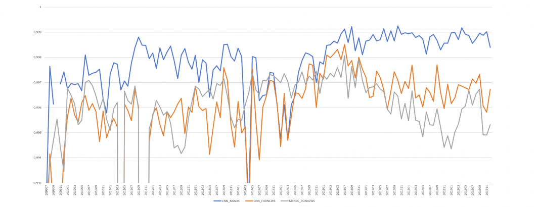
What would it look like to use the closed captioning of CNN, MSNBC and Fox News to compare every word spoken on the three channels over the past decade and examine how similar their word usage has been month by month over that time? The end result is the graph below, showing that in a typical month, even limiting to just words spoken more than 10 times on one of the stations in that month, the typical Pearson correlation is higher than r=0.99, meaning the differences in their correlations are minuscule, ranging from around r=0.994 to just over r=0.999.
While differences in Pearson correlations this small are typically not meaningful, the fact that Fox News diverges from CNN and MSNBC in January 2017, exactly like it does in the entity graph, supports the argument that this represents a genuine systematic fracture, rather than an artifact of the deep learning process, such as training data more attuned to post-2017 events.
TECHNICAL DETAILS
The BigQuery query used to create this graph:
WITH sheet AS (
select DATE, WORD, SUM(CNN) CNN, SUM(MSNBC) MSNBC, SUM(FOXNEWS) FOXNEWS from (
(SELECT SUBSTR(CAST(DATE AS STRING),0,6) DATE, WORD, COUNT CNN, 0 MSNBC, 0 FOXNEWS FROM `gdelt-bq.gdeltv2.iatv_1grams` WHERE STATION='CNN')
UNION ALL
(SELECT SUBSTR(CAST(DATE AS STRING),0,6) DATE, WORD, 0 CNN, COUNT MSNBC, 0 FOXNEWS FROM `gdelt-bq.gdeltv2.iatv_1grams` WHERE STATION='MSNBC')
UNION ALL
(SELECT SUBSTR(CAST(DATE AS STRING),0,6) DATE, WORD, 0 CNN, 0 MSNBC, COUNT FOXNEWS FROM `gdelt-bq.gdeltv2.iatv_1grams` WHERE STATION='FOXNEWS')
) GROUP BY WORD, DATE
)
SELECT a.DATE,
CORR(a.CNN, b.MSNBC) CNN_MSNBC,
CORR(a.CNN, b.FOXNEWS) CNN_FOXNEWS,
CORR(a.MSNBC, b.FOXNEWS) MSNBC_FOXNEWS
FROM sheet a
JOIN sheet b
ON a.WORD=b.WORD
WHERE a.DATE=b.DATE AND (a.CNN > 10 OR a.MSNBC > 10 OR a.FOXNEWS > 10)
GROUP BY a.DATE, b.DATE order by DATE