One of the first requests from early previews of the Timeline Visualization tool was the ability to plot countries and themes in a similar way, to make it possible to observe temporal correlations. Countries often exhibit complex temporal interplays in which events or views in one country spill over into neighboring or culturally proximate countries. These spillovers are often highly non-linear and can resist traditional lagged time series analysis. The ability to visualize every country at once and spot complex interdependencies and relationships over time is a capability that we heard from you loud and clear. Thus, we are excited to debut the Global Knowledge Graph Country Timeline and Thematic Timeline tools.
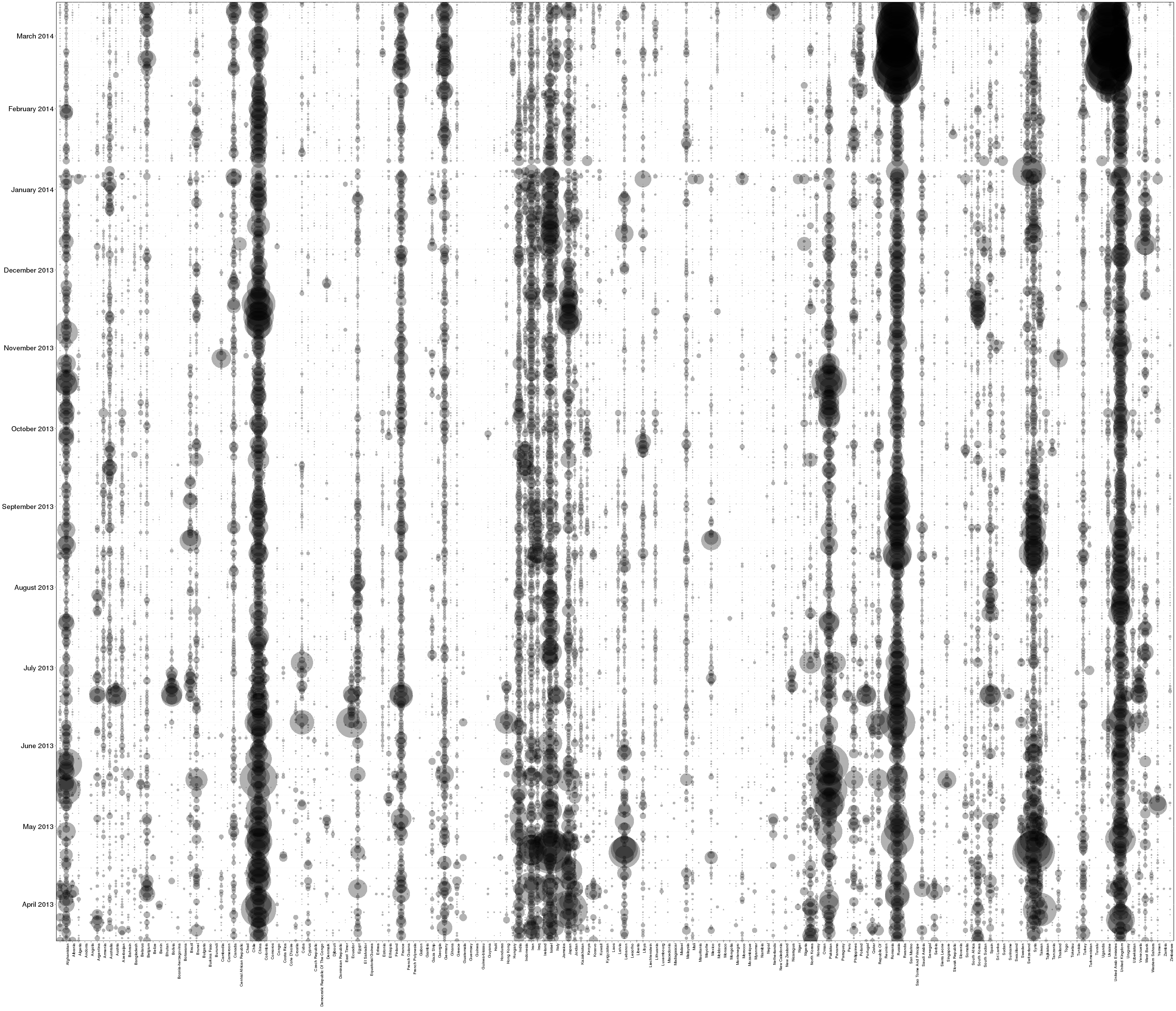
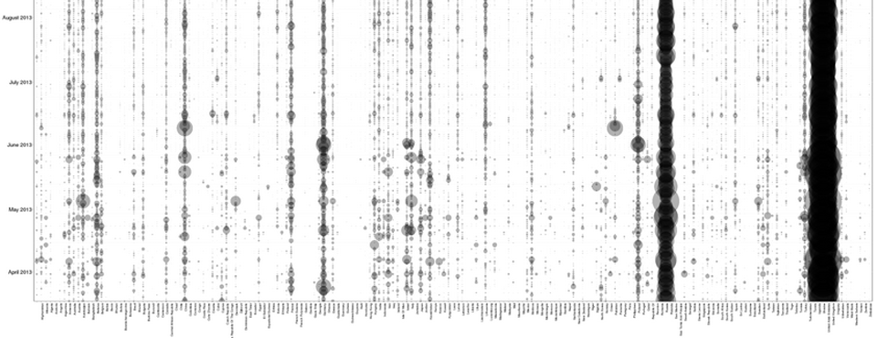
The image above shows an example of the Country Timeline for all mentions of the Global Knowledge Graph Theme “SOVEREIGNTY”. Here the X axis represents every country that had at least one mention of sovereignty over the past year, while the Y axis represents each individual day from April 1, 2013 to March 28, 2014. At each grid cell a semi-transparent dot is displayed, sized based on the intensity of sovereignty with respect to that country on that date. In this way, each column indicates the intensity of discussion of sovereignty alongside a particular country by day over the past year, while each row indicates the relatively intensity of sovereignty discussion for each country on a specific day. This allows the display of daily-level data for all countries to be represented in a single visualization.
Immediately clear from this visualization are the massive dark streaks in the upper-right: sudden parallel high-intensity discussion of sovereignty enveloping Russia and Ukraine. The ebb-and-flow contours of both are nearly identical, suggesting high connectedness among the two discussions. There are numerous other interesting elements as well, such as the steady discussion of sovereignty-related issues with respect to both Russia and China over the past year.
Try it for yourself with the Global Knowledge Graph Graph Country Timeline and Thematic Timeline visualizations from the GDELT Analysis Service!