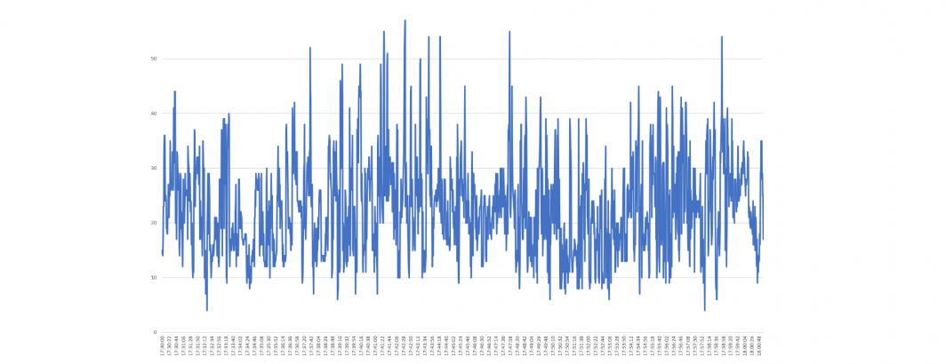
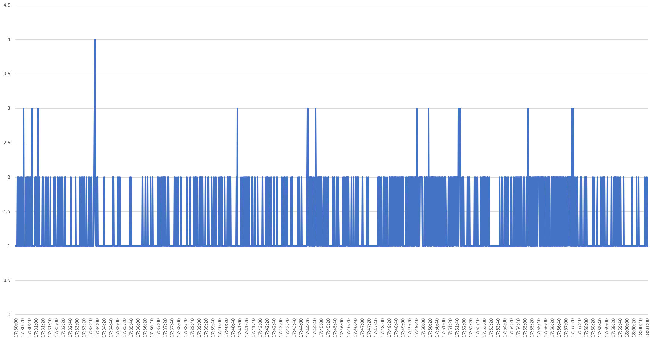
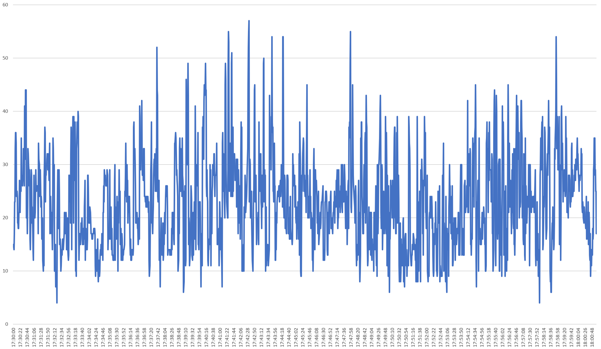
What does an evening news broadcast look like as seen through the eyes of Google's Cloud Video API? Using the Visual Global Entity Graph 2.0, a single line of SQL is all that's required to plot a given broadcast along key dimensions like the number of onscreen characters of text, the number of spoken words, the number of distinct visual entities depicted and so on for each second of airtime over the course of a 30 minute television evening news broadcast.
Take the NBC Nightly News With Lester Holt broadcast on June 17, 2020. The SQL query below summarizes several key characteristics by second of airtime, converting the broadcast times from the VGEGV2's native UTC timezone to the broadcast's collection timezone of PST:
SELECT DATE(date,"America/Los_Angeles") date_pst,TIME(date,"America/Los_Angeles") time_pst, numOCRChars, numShotChanges, numSpeakerChanges, numSpokenWords, numDistinctEntities FROM `gdelt-bq.gdeltv2.vgegv2_iatv` WHERE DATE(date) = "2020-06-18" and iaShowId='KNTV_20200618_003000_NBC_Nightly_News_With_Lester_Holt' order by date asc
This yields this spreadsheet.
You can see a series of graphs of this spreadsheet below, showing what a typical evening news broadcast looks like through these dimensions.
Characters Of Onscreen Text Per Second
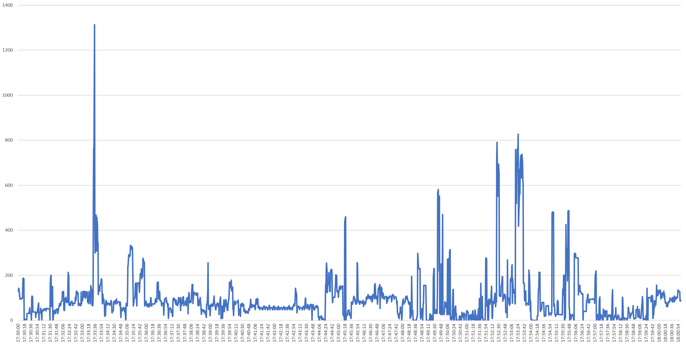
Spoken Words Per Second
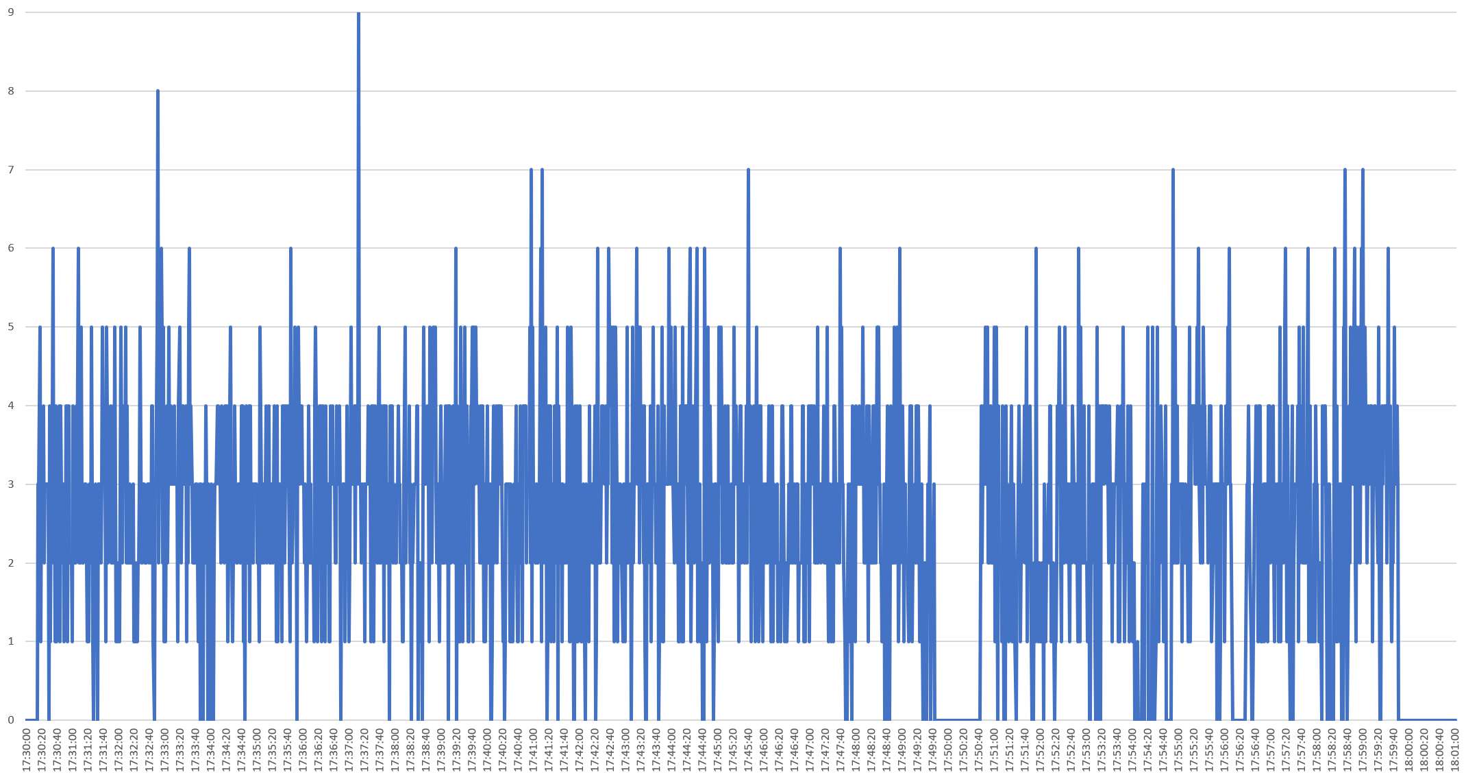
Speaker Changes Per Second
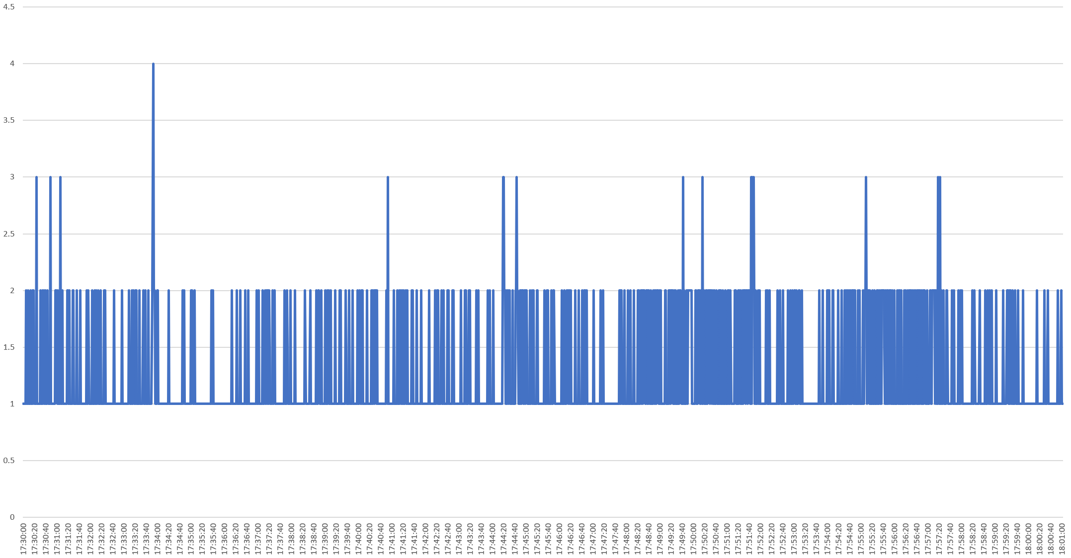
Shots Per Second
Distinct Entities Per Second
Hopefully this gives you some ideas of macro-level ways of understanding the visual anatomy of an evening television news broadcast!