
Government Cybersecurity Through Obscurity And Paying Attention To Data Lifecycles
An NSF survey's use of late night phone surveys from unknown numbers and argument that confirming encryption use is dangerous…
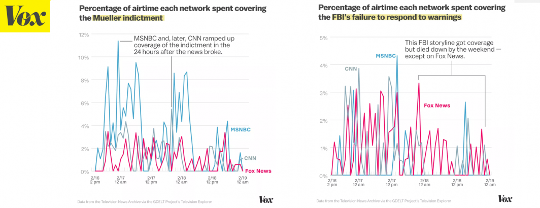
Vox: Fox News’s Appalling Past 72 Hours, Analyzed
Vox's Alvin Chang explores 72 hours in the life of Fox News as it covers several major recent stories and…

How Bad Data Practice Is Leading To Bad Research
Honest statistical error, misunderstanding of data and methods, failure to normalize, malicious manipulation and copy-paste Google Scholar-ship – poor data…

NSF's New Initiative To Bring The Cloud Era To Academic Big Data Research
NSF’s new collaboration to make Amazon, Google and Microsoft cloud credits available for academic research finally gives "big data" researchers…

Steven Pinker's "Enlightment Now" Mentions Culturomics 2.0
In his new book and a recent extract of it published in The Guardian, renowned Harvard psychologist Steven Pinker mentions…

Television Explorer Adds Russia Today (RT)
We've completed the addition of the July 2010 – present Russia Today (RT) English language backfile to the Television Explorer!…
Television Comparer Launches!
We're excited today to announce the launch of the brand new Television Comparer! Using the same platform as the main…
The New Television Explorer Launches!
We are incredibly excited to announce today the debut of the new 2.0 version of the Television Explorer, part of…
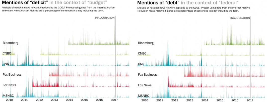
WashPost: Cable News Doesn't Talk About The Debt As Much As It Used To
The Washington Post's Philip Bump uses the Television Explorer to track changing coverage of the national debt. Read The Full…
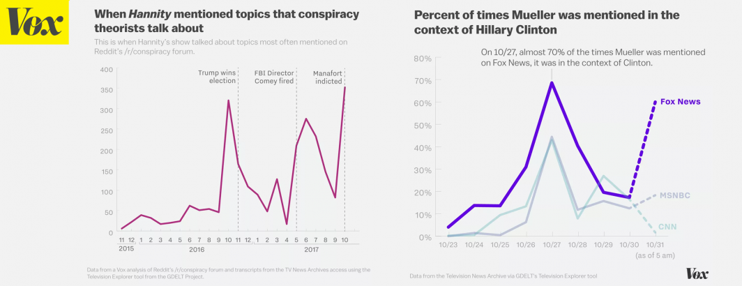
Vox: #ReleaseTheMemo Succeeded. Here's How The Mainstream Media Helped
Vox covers how domestic television news coverage helped advance the #ReleaseTheMemo agenda. Read The Full Article.

Building dictionaries for Word Encodings using BigQuery SQL
Google's Sergei Sokolenko demonstrates how to convert the GKG's themes, names and locations fields into a numeric BOW vector suitable…
Television Explorer: New Inventory Tables
With the forthcoming release of the Television Explorer 2.0 platform, we are excited to announce the availability of our new…

GDELT Analysis Emails Working Again
We rely on a major third party email infrastructure vendor to send outgoing emails from the GDELT Analysis site and…

Global News Broadcasting in the Pre-Television Era: A Cross-National Comparative Analysis of World War II Newsreel Coverage
This study examines historical newsreels: Although largely forgotten, the newsreel industry was the first news broadcasting system to convey visual…
Without Transparency, Democracy Dies In The Darkness Of Social Media
As Facebook explores its role in democracy, perhaps it could start with building transparency and democracy within its own walled…

Could The Cloud Save Government Websites From Going Dark In The Next Shutdown?
US Government agency websites hosted in the commercial cloud largely remained online during the government shutdown, while some agencies like…
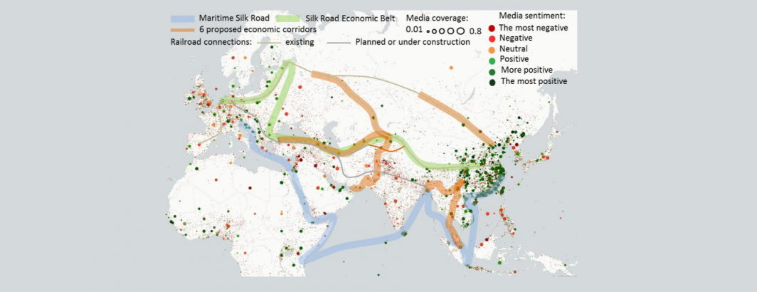
BBVA: China | One Belt One Road – What's In It For Latin America?
BBVA's latest report explores China-Latin America economic ties and interactions under the One Belt One Road initiative. Read The Full…

Using AI For Good: A New Data Challenge To Use AI To Triage Natural Disaster Aerial Imagery
A new collaboration of the World Bank, WeRobotics and OpenAerialMap yields an open data challenge to create AI tools to…

The Straits Times: Facebook Reacts To Pressure On Propaganda
The Straits Times covers Facebook's struggle to respond to propaganda on its platform, using a number of quotes from Kalev…

Facebook's Continued Quest To Make 1984 A Reality: Deciding What News Is 'Trustworthy'
Facebook's new "trustworthy" news initiative seems at first glance to at long last democratize the decisions affecting its two billion…

From Predictive Analytics To Mining Virtual Markets: The Tech That Offers Hope For Wildlife
The World Economic Forum surveys the state of counter-trafficking technology, mentioning GDELT. Read The Full Article.

Google's Cloud AutoML And Its Push To Democratize Point And Click AI For All
The dearth of top AI researchers and training data has precluded most companies from fully leveraging deep learning. Google's new…
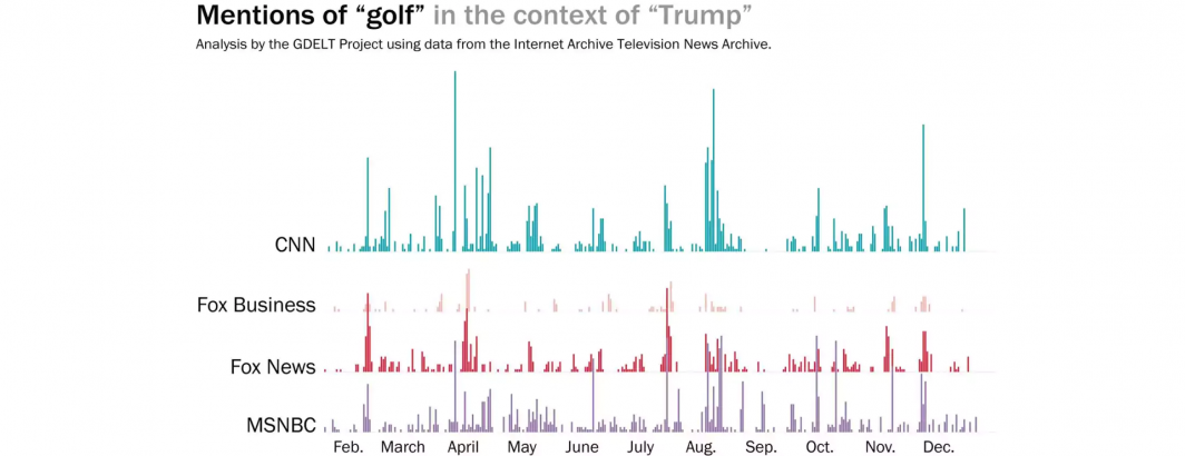
WashPost: American's Think Trump Doesn't Work As Hard As Most Presidents
The Washington Post's Philip Bump used the Television Explorer to report how often President Trump was mentioned in the context…

Facebook's News Feed Changes: Audience Access Fee And Escapism?
Facebook is finally starting to charge brands an access fee for the right to step foot in its walled garden…