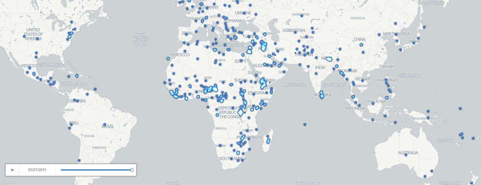
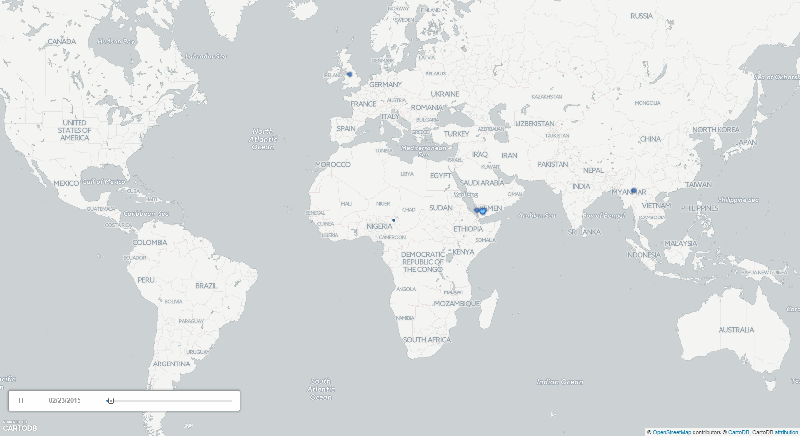
In a similar vein to our past maps of A Week in the Life of the World's News Media and A Month of BBC vs the New York Times, we're excited to offer our latest entrant into the realm of mapping the geography of the world's news outlets: three months of IRIN's global humanitarian news and analysis! The animated GIF movie below shows every worldwide location identified in coverage monitored from IRIN over the last three months, cumulatively added to the map over time by day. In just 10 seconds you are seeing the geographic focus of IRIN from late February to late May 2015!
Dots are NOT sized by the volume of news coverage mentioning that location, so a given dot might indicate one or one hundred articles about that location, however, the more coverage mentioning a location the brighter it becomes, so very light blue areas indicates locations of high attention in IRIN's coverage over time.
IRIN's emphasis on the non-Western world, especially Africa, Asia, and the Middle East is immediately clear on this map, especially its high volume of coverage of areas traditionally neglected by Western mainstream news media. The significant connectivity of Europe as an aid or stability partner with many of these regions is also clear from the map.
For those wishing to create a visualization of their own like this, the map above was created by repeating the process from Mapping a Week in the Life of the World's News Media and modifying the BigQuery query to filter by "SourceCommonName" and using the "Cumulative" option in Torque for the CartoDB map. The entire process, from BigQuery query, to conversion to GeoJSON, to creating the map in CartoDB, took less than 5 minutes!