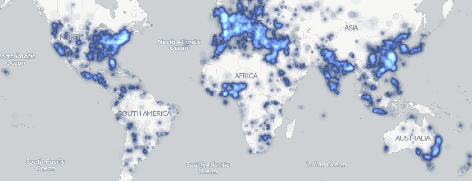
GDELT's ability to reach deeply into the geography of the world's local news media across 65 languages opens the door to creating some incredible explorations of "where" we hear from when we turn to the news and what kinds of underlying geographic patterns drive news coverage around the world. Using the power of Google BigQuery and CartoDB, we wanted to see what a week in the life of the world's news media actually looks like. The resulting map below shows every city-level location mentioned 3 or more times in a 15 minute period across the world's news from March 23, 2015 to March 28, 2015 at a 15 minute resolution. CartoDB's animation layers do not support changing the size of the dots dynamically, so the dots are not sized based on the number of articles mentioning that location (a dot could indicate 3 mentions or 300 mentions) and instead reflects the number of distinct locations mentioned every 15 minutes. Watching the map one can instantly see the "wave" of increased coverage that comes during daylight hours from local media in each region of the world. Watch as Asia experiences a surge of coverage, followed by Europe and then the US, repeating itself each day.
Click on the map below to see the full resolution 16 frames per second animation that shows the waves of coverage much more clearly.
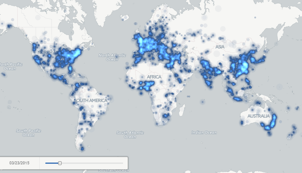 (Click to View Full Resolution Animation)
Creating the Map
Creating the map was incredibly simple. (Note however that you to create the full week-long map requires 70MB free in your CartoDB account, so only larger accounts will be able to create the full map). Modifying the geographic histogram from the Google BigQuery GKG 2.0 Sample Queries examples, the following query was run in Google BigQuery:
SELECT DATE, coord, cnt from (
SELECT DATE, coord, COUNT(*) as cnt
FROM (
select date, REGEXP_REPLACE(REGEXP_EXTRACT(SPLIT(V2Locations,';'),r'^[2-5]#.*?#.*?#.*?#.*?#(.*?#.*?)#'), '^(.*?)#(.*?)', '\1;\2') as coord
from [gdelt-bq:gdeltv2.gkg]
where DATE >= 20150322000000 and DATE <= 20150328999999 ) where coord is not null group by date, coord ORDER BY 3 DESC ) where cnt >= 3;
This yielded nearly 500,000 rows, which were exported to a CSV file. The header row was removed from the CSV file by hand and then the following PERL script was used to create a GeoJSON file from the results:
#!/usr/bin/perl
open(OUT, ">./EXPORT.geojson");
print OUT "{ "type": "FeatureCollection", "features": [nn";
open(FILE, "EXPORT.csv");
while(<FILE>) {
$_=~s/s+$//;
($date, $coords, $count) = split/,/, $_;
($lat, $long) = split/;/, $coords;
#$lat = int($lat); $long = int($long);
($year, $mon, $day, $hour, $min) = $date=~/^(dddd)(dd)(dd)(dd)(dd)/;
$jsondate = "$year-$mon-${day}T$hour:$min:00Z";
if (abs($lat) > 0 || abs($long) > 0) {
$lat = sprintf("%0.4f", $lat); $long = sprintf("%0.4f", $long);
$HASH{$jsondate}{"$long, $lat"}+=$count;
}
}
foreach $jsondate (keys %HASH) {
foreach $coords (keys %{$HASH{$jsondate}}) {
$MASTERJSON .= "{nt"type": "Feature",nt"geometry": { "type": "Point", "coordinates": [$coords] },nt"properties": {ntt"nummentions": $HASH{$jsondate}{$coords},ntt"urlpubtimedate": "$jsondate"nt}n},n";
}
}
close(FILE);
$MASTERJSON=~s/,s+$//s; #drop the trailing comma and carriage return…
print OUT $MASTERJSON;
print OUT "nn] } ";
close(OUT);
Note the commented out line that can optionally round off the coordinates if the number of unique points is too large for your map.
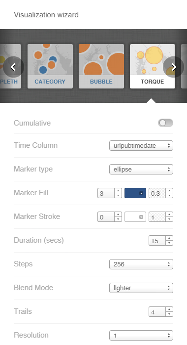
The GeoJSON file generated by the above script can then be imported directly into CartoDB and used in a Torque animation map to create the visualization above. The standard Visualization Wizard was used, with the settings as follows:
Congratulations, with a few mouse clicks you have mapped the geography of a week of the world's news coverage across 65 languages!