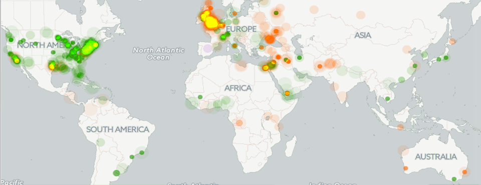
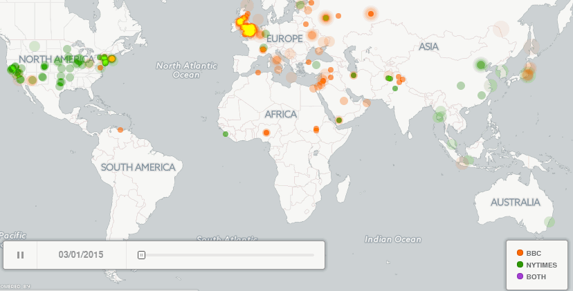
Following in the footsteps of our last post, Mapping a Week in the Life of the World's News Media, we wondered just how different the geographic focus of major international news outlets can be. We decided to compare a month of the geographic focus of the New York Times versus the BBC online, creating an animated map that shows all of the city-level locations mentioned in news coverage from either outlet over the course of March 2015 in 15 minute increments. Any city mentioned in a New York Times article is colored in green while cities mentioned in BBC online coverage are colored red and any location mentioned by both outlets in the same 15 minute period are colored purple. CartoDB's animated maps do not yet support dynamically changing the size of the dots on the map, so a given dot may represent a single mention or 100 mentions in a given 15 minute period (but due to the map having a time resolution of 15 minutes this has less of an impact).
Immediately striking about this map is just how different the geographic focus of the two outlets is and just how massively greater BBC's international coverage is. Both outlets exhibit considerable local coverage, with the BBC covering events across England and the New York Times showing a heavy emphasis on US news. However, the BBC seems to have far greater international reach, mentioning a far greater number of distinct international locations. Some of this may be due to the New York Times' propensity to report locations at the province level or as "near" a small number of major cities instead of the locations where they took place, but this would only account for a small portion of the difference. The very small degree of direct overlap indicates that even when covering the same locations, the two outlets have different reporting schedules, with one always reporting faster than the other.
Click on the map below to see the full-resolution animation.
 (Click to See Full Resolution Animation)
For those wishing to create a visualization of their own like this, the map above was created by repeating the process from Mapping a Week in the Life of the World's News Media and modifying the BigQuery query to filter by "SourceCommonName" and using the CartoDB "Torque Cat" visualization.