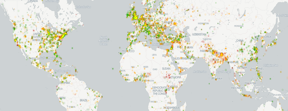
Today we're incredibly excited to unveil the second of two maps showcasing the enormous power of the spatial information captured in GDELT. A few moments ago we unveiled an interactive realtime map of the world's news allowing you to visualize the world's latest narratives through the eyes of the global media in 65 languages. To showcase the incredible potential of the vast array of emotional indicators assessed by GDELT and its 15 minute updates, we've created an animated map of the world's happiest and saddest news, updated every hour and visualizing the past 24 hours of human society as seen through the news media. It color-codes each location on Earth by the average "tone" of all news coverage mentioning that location monitored by GDELT, from bright red (highly negative) to bright green (highly positive) over the last 24 hours in 15 minute increments. Try zooming into Europe and watch the mesmerizing show and try picking out key events from today's news in the bursts and waves of emotion that wash over the map!
As you explore this map, keep in mind that emotion is extremely difficult to assess accurately, especially across the enormous variety of topics and authors that GDELT monitors and there is conflicting literature on how well different classes of emotional responses survive the translation process. Most importantly, while GDELT assesses more than 4,500 emotions and themes, the tone variable here is one of GDELT’s most basic indicators, designed to offer a reasonable general purpose approximation of how "positive" or "negative" an article is overall. Keep these considerations in mind in terms of attempting to draw conclusions about the "happiest" and "saddest" places on earth, but overall the map should offer a reasonable approximation of the emotional undercurrents of the world as seen through the eyes of the world's news media over the last 24 hours.
You can even click on the "Visible layers" dropdown in the upper right to turn on two additional layers that display locations with particularly happy or sad news, allowing you to browse directly to that coverage!
We'd like to thank CartoDB for making these maps possible and keep an eye on this blog for a series of new maps coming over the next few days and weeks!