Today we're incredibly excited to unveil an interactive realtime map of the world's news, updated every hour, as seen through the eyes of GDELT! This is just the first of a series of live GDELT maps that we will be unveiling over the coming weeks, powered by CartoDB's online mapping platform and showcasing the enormous power of the spatial information captured in GDELT.
Since the debut of GDELT 2.0 this past February we've heard from you loud and clear that you want the ability to interact with GDELT in more intuitive ways and we've released several tools, including our GDELT Trends analytic dashboard and an in-depth tutorial on using GDELT and Google BigQuery to conduct highly sophisticated realtime queries on the GKG. Today we continue that trend by releasing this first mapping interface to GDELT.
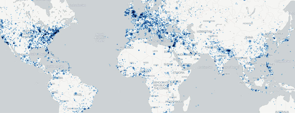
What you're seeing here is a live map, updated every hour, of what GDELT is monitoring throughout the world through the GDELT Global Knowledge Graph 2.0 across all 65 languages that it live translates. In a nutshell, GDELT monitors the world's news media in 65 languages, emphasizing small local news outlets in every corner of the globe, extracts a list of every location on earth mentioned across all of that news coverage, and puts a dot on the map above at every location that was mentioned in an article it monitored in the last hour. As you move your mouse across the map above, you will see a hover popup showing you the name of the location you are over, making it fast to rapidly drill into an area of interest. Clicking on a location will launch a popup showing all of the worldwide news coverage mentioning that location that GDELT monitored, along with a social sharing image if available to provide visual context to the events taking place there. By arranging the world's news spatially, you can instantly spot news happening in "unexpected" places or triage the deluge of information about a natural disaster by isolating coverage of rural areas of especial interest or vulnerability. The coverage you see listed when you click on a location spans 65 languages, so you can also see what stories are highly visible across languages and which seem to be emphasized only by the local vernacular press.
If you click on the "Visual layers" dropdown at the top of the page, you can turn on an animated overlay that shows the geography of the world's news media coverage over the last 24 hours in 15 minute increments. This is useful to spot sudden "bursts" of coverage indicative of major stories or waves of coverage as stories are contextualized across a region or, in some cases, physically spill across a region, as in fast-moving conflict. Note that the dots in the animated map are not sized, so a single dot can indicate one story or one million stories.
Behind the scenes an astronomical amount of computation goes into creating this map. Every 15 minutes GDELT processes the world's news media, translating it into English from 65 languages, and extracts all of the people, organizations, locations, counts, quotes, images, and over 4,500 emotions and themes. Identifying and disambiguating mentions of small remote villages across the entire surface of the earth from small local news outlets in 65 languages is an incredibly complex task. More than a decade of experience mapping the geography of the world's text collections and the largest deployment of streaming machine translation in the world powers GDELT's geocoding systems. Recognizing locations across languages is not a simple process. For example, the extensive noun declension of Estonian means that identifying mentions of “New York” requires recognizing “New York”, “New Yorki” , “New Yorgi”, “New Yorgisse”, “New Yorgis”, “New Yorgist”, “New Yorgile”, “New Yorgil”, “New Yorgilt”, “New Yorgiks”, “New Yorgini”, “New Yorgina”, “New Yorgita”, and “New Yorgiga”. Multiplied by over 10 million recognized locations on Earth across 65 languages and one can imagine the difficulties of multilingual recovery of textual geography.
Thus, as you browse the map above, you will undoubtedly find a fair amount of error in its geographic assignment. This ranges from a person's name being mistakenly assigned as a location to the wrong disambiguation of a location within a country. Regions with high rates of toponymic namespace conflict, those with large numbers of locations named after people, and languages that require word segmentation or which rely heavily on intent for disambiguation can all reduce the accuracy of the geocoding process. There is always going to be a fair degree of error in trying to geocode a large fraction of the world's news across 65 languages and a myriad of formats, especially when trying to disambiguate small town and village names when there are multiple places with that name in proximity to each other. However, in spite of all of this, in the general case the map should be reasonably accurate overall and offer a reasonable approximation of the geographic landscape of the world's news each hour.
Finally, we'd like to thank CartoDB for making these maps possible! We'll be rolling out a sequence of these maps over the coming days and can't wait to see what you're able to do with them, so stay tuned!