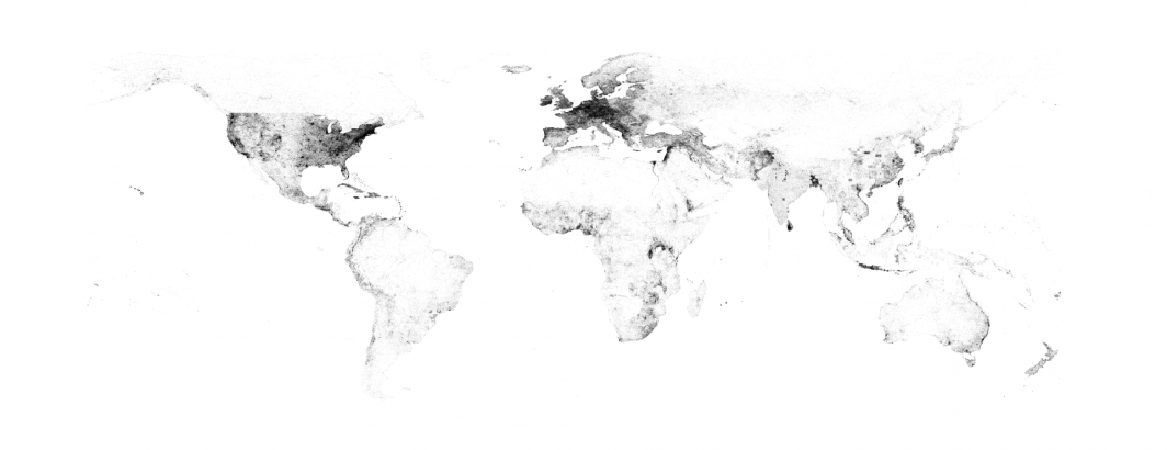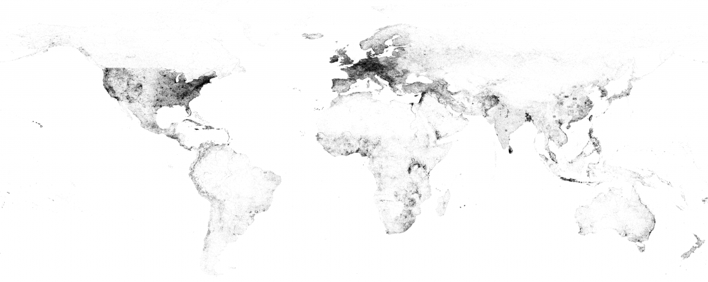
In 2015 we created a map of the world as seen through the eyes GDELT. This original map examined just five months of the GKG, raising the question of what GDELT looks like today, looking back through nearly four years of global data? The map below takes the more than 6.6 billion location mentions across the 850 million worldwide news articles monitored by GDELT 2015-2018, snaps them to a 0.001 degree grid and then visualizes the final dataset. Locations are not sized by the number of mentions they receive, meaning a major metropolis mentioned tens of millions of times will still only appear as a single small dot in the image below. Due to artifacts of the rasterization pipeline you will see a few areas of the map below with rectangular artifacting – those are technical issues, rather than meaningful geographic patterns.
Zoom into the United States in the map below and you'll see the interstate network and the transition marks where the eastern half of the country fades into the rural west and picks up again along the coast. Europe's boundaries are clearly visible as well, as is the coastal density in South America and Australia, the Sahara Desert in Africa, the Nile River in Egypt and the geographic distribution of Asia's population centers. Even the fighting in Syria can be seen clearly through the distribution of cities it has touched. Looking at a map like the one below really brings home just how global GDELT's reach truly is and just how much of the world we miss when we fail to look beyond our local newspaper.
Click on the image below to see the medium resolution version (3801 x 1513 pixels @ 1.7MB). You can also download the full resolution version (16384 x 8192 pixels @ 16MB), though not all browsers are capable of displaying such high resolution images and you may need to open it in Photoshop or other image viewing software to see it.
TECHNICAL DETAILS
The original workflow and code from the 2015 visualization was used as the base of this visualization. The only two changes were that the BigQuery command was modified to round to three decimals instead of two and the "bqcsvtomap.pl" PERL script was modified to render a black map on a white background, inverted from the original map, to make the visualization clearer and easier to print. This version also skipped the creation of the interactive tiled version of the map.
SELECT lat, long, COUNT(*) as numarticles
FROM (
select
ROUND(FLOAT(REGEXP_EXTRACT(SPLIT(V2Locations,';'),r'^[2-5]#.*?#.*?#.*?#.*?#(.*?)#.*?#')), 3) as lat,
ROUND(FLOAT(REGEXP_EXTRACT(SPLIT(V2Locations,';'),r'^[2-5]#.*?#.*?#.*?#.*?#.*?#(.*?)#')), 3) as long
from [gdelt-bq:gdeltv2.gkg]
)
where lat is not null and long is not null
group by lat,long
