To date GDELT has processed more than a billion worldwide news articles 1979-2019 to catalog more than half a billion distinct global events spanning the last 40 years. As protests appear to be sweeping the world in 2019, how might this data help us better understand protest trends over the past four decades? Is the world truly becoming more unstable? Or are the countries experiencing civil unrest today the same countries that have regularly experienced such unrest in recent decades? Is protest sweeping geographically across regions or does geography matter less today in a world when citizens can observe protests and adapt tactics from all across the world? Most importantly, is our world truly becoming more unstable or does it only look that way because we've experienced a relative lull in protests in recent years and to what degree is the accessibility of global news in the digital era making us more aware of protests in a way that we would not have 40 years ago?
Using Google's BigQuery platform we can turn half a billion global events into timlines and maps in just a matter of seconds with a single SQL query, while Carto's online mapping platform allows us to simply copy over our BigQuery results with a mouseclick to visualize them using its rich visualization tools.
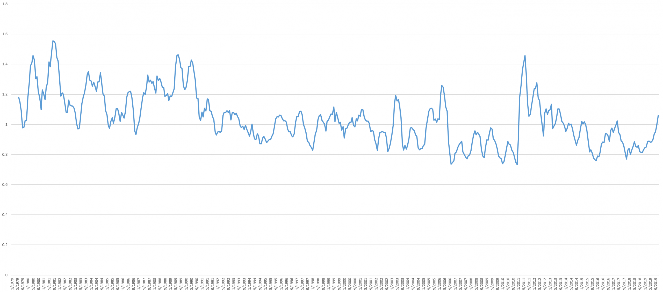
A Timeline Of Global Protest Intensity
What if we could simply plot a timeline of everything mentioned in the world's news media over the last 40 years by month and measure what percentage of those activities were protests? The timeline below does precisely this – taking the total volume of all news coverage monitored by GDELT each month that contained one or more recordable events and reporting the percentage of that coverage that mentioned at least one protest event. Through the power of BigQuery, it takes just a single query and a less than 20 seconds to process the results of more than a billion news articles into a single timeline of global protest intensity.
In this case we rely on the percentage of news coverage rather than the number of events because media attention offers a proxy for the "importance" of an event. A protest of 1,000 people that receives only a few press mentions is less likely to have a societal impact than a protest of 100 people that captured headlines across a nation. While highly imperfect and subject to myriad biases, media attention gives us a historical proxy for the "importance" of protest activity over time.
The resulting timeline was smoothed using a 6 month rolling average to make its macro-level trends more apparent. It appears that, at least through the eyes of the world's news media, the 1980's were a time of social turbulence, followed by the 1990's and early 2000's of relative calm other than a few periods of unrest, with the late 2000's a period of especial calm before the Arab Spring led to a wave of global protest intensity, decreasing through 2016, a second wave in 2017 and then a new wave beginning in late 2018 that continues through present.
Seen in light of the timeline below, the unrest of the past year can be seen to be part of a very real escalation in global protest intensity, but still a far cry from other moments in the past 40 years, such as the fall of the Soviet Union.
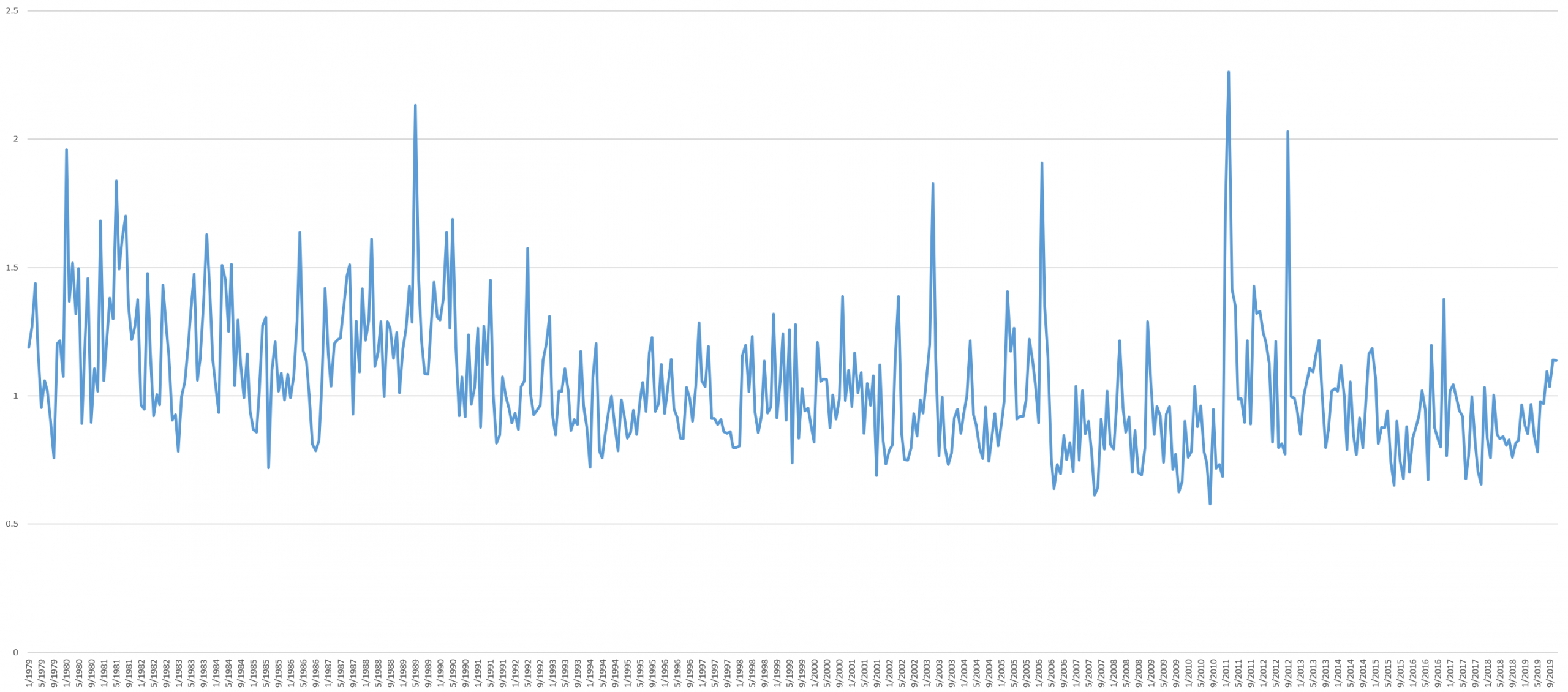
The smoothing used in the timeline above masks many significant moments of global protest, making them harder to discern. The timeline below shows the original unsmoothed graph, showing for example the mass protests against the Soviet Union in 1989 more clearly.
For those interested in performing their own analyses on the timeline above, the underlying CSV file is available for download. Those interested in building on this analysis can follow the full workflow at the bottom of this article.
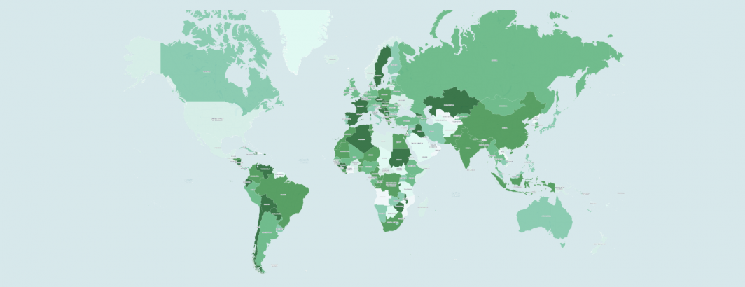
An Animated Country-Level Map Of 40 Years Of Global Protest
What would it look like to take the timeline above, break it down by country and view as an animated map of global protest intensity by country across the world over the last four decades?
The total number of articles recording protest events occurring in each country for a given year was divided by the total number of articles recording all events in that country for that year and repeated for each year 1979 through present using BigQuery. Countries were binned by quantile and colored from light (low protest intensity) through dark green (high protest intensity) using Carto's mapping platform.
The final result can be seen below. It is important to remember that this map shows only protest intensity, not overall conflict. A country that is in the midst of an active civil war may be less likely to exhibit significant protest activity since grievances are being expressed through arms rather than through civil action. Also note that some countries, especially smaller ones, may have relatively few recorded events in a given year, especially towards the beginning of the map period and thus even a small rise in protests may result in a large percentage-wise protest intensity increase, reflected as a large jump in the map.
While there are myriad fascinating findings in the map above, there are three findings of particular note with respect to today's world seemingly convulsing with protests:
- Protest Cycles. Many of the countries undergoing mass protests today are those that have undergone multiple similar cycles of protest activity in the last 40 years. Rather than protest spreading across the world in ways never before imaginable, an alternative interpretation might be that many of the countries in the headlines today are the same ones that have been the headlines repeatedly over the past few decades.
- The Rise Of Digital And Accessible Local News. Look closely at the graph above and you will notice that as the journalism world moves rapidly into the digital realm across the world in the early 2000's, the availability of local news sources in digital and digitized form from across the world increases exponentially. At the same time, a plethora of new local outlets come into being across the world or reinvent themselves for the digital era, greatly increasing our visibility across the world as events that formerly would not warrant even a cursory mention in the day's news suddenly are chronicled in detail, allowing us to see protests and other civil events at finer and finer resolution. This can be observed quiet starkly in the animation above when comparing the relative sparsity of the 1979 map compared with the 2019 map – we are able to observe protest activity occurring in the digital era at a resolution unimaginable for the print era – a phenomenon seen in other collections like Wikipedia.
- The Impact Of The Arab Spring. In both the timelines and map above, the Arab Spring marks a near-vertical inflection point in which two decades of relative calm instantly reversed into several years of elevated global unrest. The degree to which this reflects a world awakening to the potential of mass civil action to overthrow governments or whether it reflects continued growth in digital journalism and/or a global journalistic shift as the media devotes more attention to civic unrest for a period of time (such as how a plane crash leads to an elevated period of reporting on all things aviation) is unclear. Yet either way, if civil society perceives that protests are sweeping the globe and that those protests are succeeding in their demands, it is likely that this public information space will define accepted reality.
For those interested in diving into the trends of the map above in more detail, the following files are available for download:
- Movie File (5.6MB MP4). This is the movie file itself at 4K resolution, suitable for embedding in PowerPoints and other offline displays.
- Map Files (56MB ZIP). This is a ZIP file containing the individual map files, one per year at 4K resolution.
- CSV Data File. This is the CSV file the maps above were generated from, in the format Country/Year/ProtestIntensity.
TECHNICAL DETAILS
For those wishing to build upon the results above as a template, the full details of their construction are provided below.
Creating the timeline requires just a single SQL query in BigQuery:
select a.MonthYear MonthYear, (a.NumArticles / c.NumArticles)* 100 PercProtest from (
( SELECT MonthYear, sum(NumArticles) NumArticles FROM `gdelt-bq.full.events_partitioned` where EventRootCode='14' and _PARTITIONTIME >= TIMESTAMP("1979-01-01") and _PARTITIONTIME <= TIMESTAMP("2019-12-31") group by MonthYear ) a
JOIN
( SELECT sum(NumArticles) NumArticles, MonthYear FROM `gdelt-bq.full.events_partitioned` where _PARTITIONTIME >= TIMESTAMP("1979-01-01") and _PARTITIONTIME <= TIMESTAMP("2019-12-31") group by MonthYear ) c
ON a.MonthYear = c.MonthYear
) order by MonthYear
Creating the maps was similarly straightforward. First, a basemap was created that simply contains a list of all of the countries in GDELT's database using the BGN name format and spelling used by GDELT:
SELECT countryname FROM `gdelt-bq.extra.countrygeolookup` order by countryname
Save these results as a local CSV file and drag-drop into Carto. Within a few seconds Carto will create a new choropleth map layer with polygonal overlays for each country. Rename this map as "basemap".
Now create the data layer for the map using the query below:
select a.Year Year, b.CountryName, (a.NumArticles / c.NumArticles)* 100 PercProtest from (
( SELECT Year, ActionGeo_CountryCode CountryCode, sum(NumArticles) NumArticles FROM `gdelt-bq.full.events_partitioned` where EventRootCode='14' and _PARTITIONTIME >= TIMESTAMP("1979-01-01") and _PARTITIONTIME <= TIMESTAMP("2019-12-31") group by Year, ActionGeo_CountryCode ) a
JOIN
( select fips, countryname from `gdelt-bq.extra.countrygeolookup`) b
ON a.CountryCode = b.fips
JOIN
( SELECT ActionGeo_CountryCode CountryCode, sum(NumArticles) NumArticles, Year FROM `gdelt-bq.full.events_partitioned` where _PARTITIONTIME >= TIMESTAMP("1979-01-01") and _PARTITIONTIME <= TIMESTAMP("2019-12-31") group by Year, ActionGeo_CountryCode ) c
ON a.CountryCode = c.CountryCode AND a.Year = c.Year
) order by CountryName, Year
This will create a table where each row is a country/year pair and reporting the protest intensity of that country in that year.
Save this file as a CSV and import into Carto. Rename this dataset as "mapdata".
Now go to the "basemap" map and in the SQL wizard, type the following SQL and hit the Apply button:
SELECT basemap.cartodb_id, basemap.the_geom_webmercator,basemap.countryname,mapdata.percprotest FROM basemap, mapdata WHERE basemap.countryname = mapdata.countryname and mapdata.year=1979
Choose "Quantile" quantification, 7 buckets and the white-to-green color ramp under the "Map Layer Wizard".
You should now see a map of the 1979 data looking identical to the one in the animation above.
Now click on the "Export Image" button at the top left of the map. (If you don't see that button, you might have to click on the "Visualize" button at top right of the Carto interface to switch into map mode.) Experiment with different zoom levels, map positions and export pixel sizes until you have the desired looking static map export. In the case of the animation above, the map was centered at zoom level 4 with Libya at the center of the screen, with Zambia near the bottom of the map and the US and Nepal half cut off on the left and right edges of the screen, respectively, with an export pixel size of 4100 x 2200. Save the image as "1979.png".
Next change "and mapdata.year=1979" in the SQL Wizard to "and mapdata.year=1980", click Apply and repeat the Export Image process to save the image for 1980. Repeat this process for each of the years 1979 through 2019. You can compute other map layers from GDELT and visualize using this same approach, using the same basemap layer so that all of the results perfectly align.
Once you've saved the 40 individual map images, download them to a Linux machine and make sure you have ImageMagick and GNU parallel installed. Then run the following commands to add the year title to each map (as exported from Carto there is no title to tell what year it depicts).
mkdir MAPS
time find *.png | parallel --eta "convert {.}.png -limit thread 1 -pointsize 40 -draw \"gravity south fill black text 0,60 '{.}'\" ./MAPS/{.}-protestintensity.png"
Next convert the frames into an MP4 movie. Make sure you have ffmpeg installed and use the commands below to copy the frames and rename them (ffmpeg requires that frames be sequentially numbered) and then create a standard 2fps (half second per frame) MP4 movie file:
mkdir MOV
time find ./MAPS/*.png | parallel --eta 'cp {} ./MOV/{#}.png'
rm movie.mp4
time ffmpeg -start_number 1 -r 2 -i "./MOV/%d.png" -c:v libx264 -r 8 -pix_fmt yuv420p -vf "pad=ceil(iw/2)*2:ceil(ih/2)*2" ./MOV/movie.mp4
That's all there is to it! You now have a global protest intensity timeline and an animated global protest intensity map!
We'd like to thank Carto for the use of their mapping platform in the creation of the maps above!