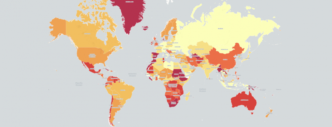
In 2015 we mapped global mentions of "inequality" across the world to trace how the topic was being internalized and conceptualized across each nation of the world, with just a single SQL query from BigQuery. As inequality races back to the forefront, it is worth reflecting on the topic's media coverage in 2015. (There is also an interactive clickable version of the map available.)
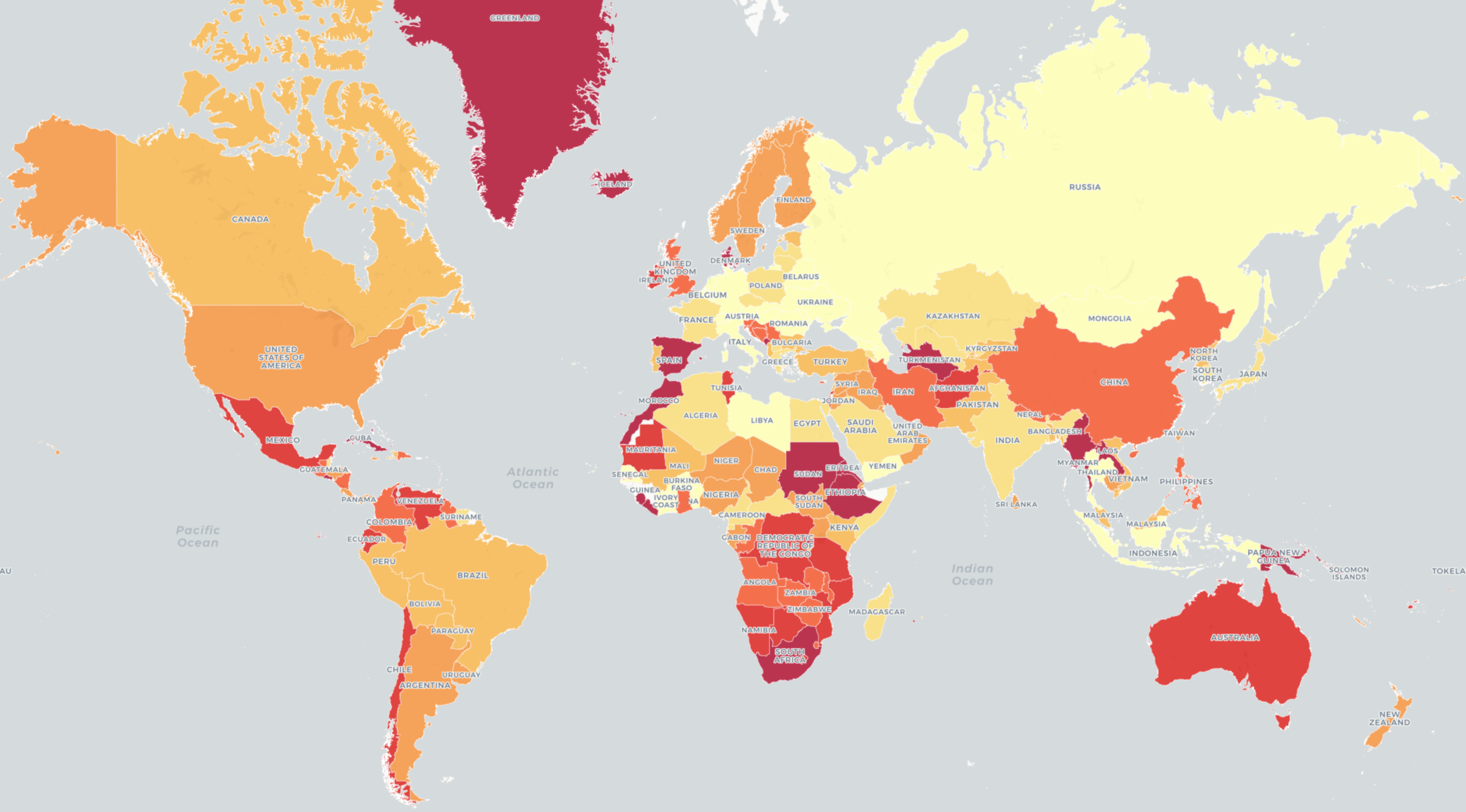
Interactive Clickable Version.
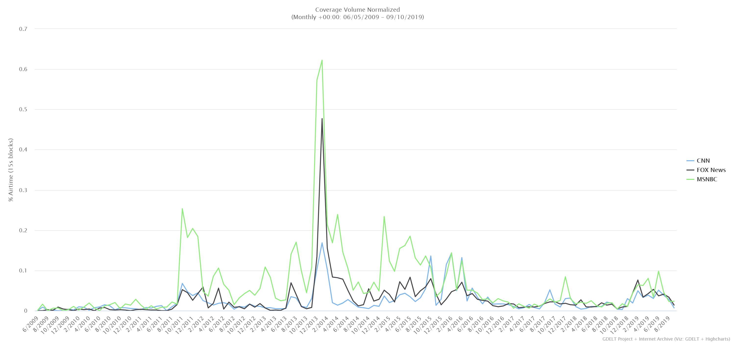
Yet, surprisingly within the US, television news coverage of inequality has largely tapered off from its 2015 highs, as seen in the timeline below, despite becoming a major Democratic buzzword.
Stay tuned as we explore some of the root undercurrents of global unrest over the coming weeks.