Earlier this week we released a massive new dataset in which Google's Cloud Video API watched a decade of evening television news broadcasts on ABC, CBS and NBC in the Internet Archive's Television News Archive and cataloged minute-by-minute what they saw. This dataset can be used for incredible at-scale visual narrative explorations.
For example, how much combined airtime across ABC, CBS and NBC was devoted each evening over the past decade to protests? The Video API assigns a set of labels to each second of footage that catalog the core visual objects and activities it "sees" on the screen.
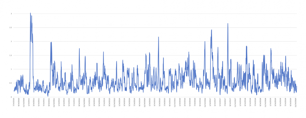
The timeline below shows the final result:
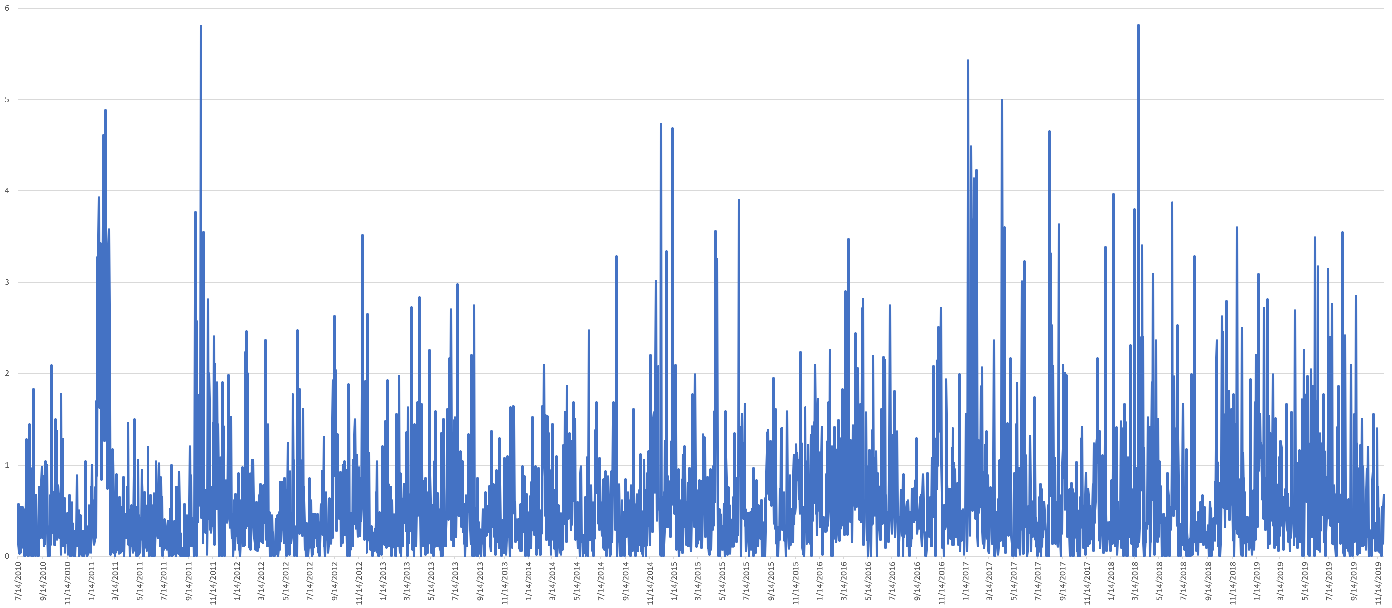
Visible in the spikes above are the Arab Spring, the October 2011 protests, March for Our Lives and myriad other global events.
The timeline below shows the same data using a 7-day rolling average to smooth it:
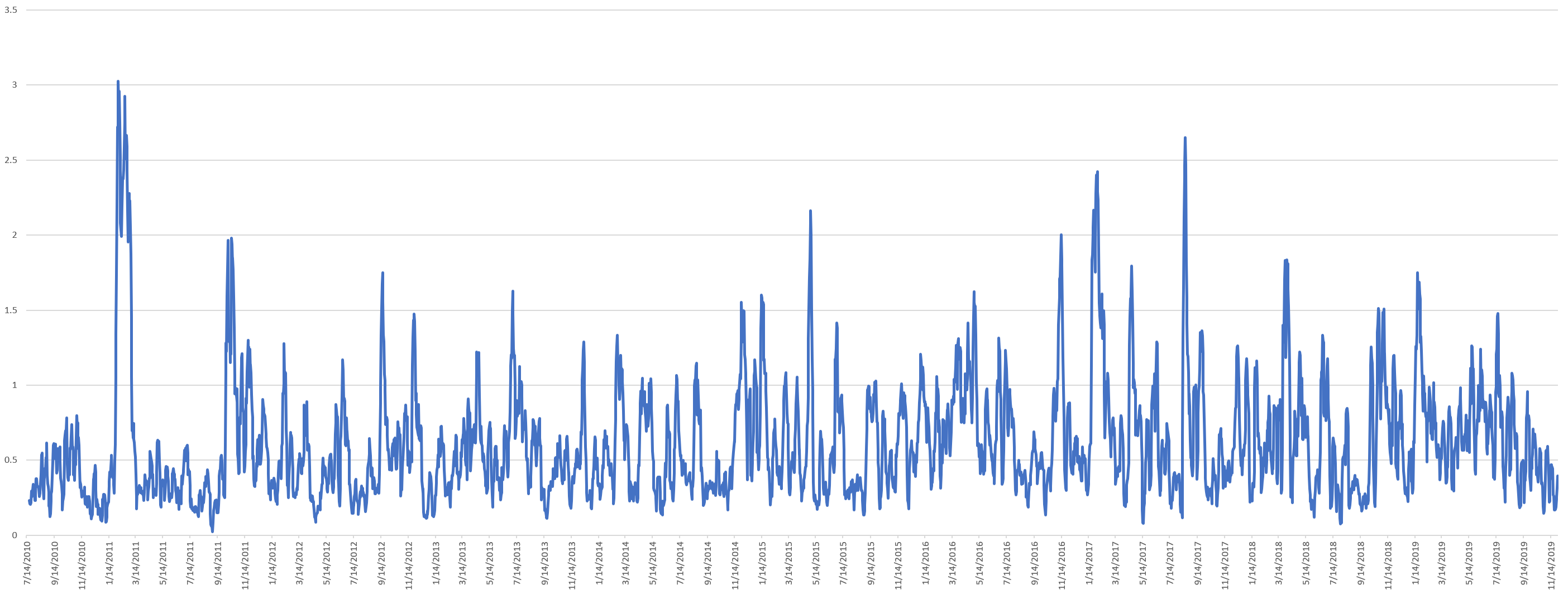
Here it can be seen that protests are almost cyclic in the news. With respect to the question of whether the world is experiencing greater mass mobilization in recent years compared with the past, the graph above does not appear to support this conclusion, showing slightly more protest coverage at the start of 2019, though decreasing in the latter half of 2019. Keep in mind that not all evening news programs air on weekends and some may feature hour-long editions at times in place of the typical 30-minute version, which is one of the reasons for normalizing as a percentage of airtime rather than reporting the raw number of airtime seconds.
Some of the minutes with the longest amount of protest coverage include:
- https://archive.org/details/KNTV_20170212_013000_NBC_Nightly_News_With_Lester_Holt/start/540
- https://archive.org/details/KGO_20160328_003000_ABC_World_News/start/240
- https://archive.org/details/KPIX_20170613_003000_CBS_Evening_News_With_Scott_Pelley/start/660
- https://archive.org/details/KPIX_20170121_013000_CBS_Evening_News_With_Scott_Pelley/start/2400
The results above are 100% machine generated, so will likely feature some amount of error. Nonetheless, the ability to have machines watch a decade of evening news broadcasts and catalog all of the protest coverage they see represents an extraordinary shift in how we are able to understand the news.
TECHNICAL DETAILS
Creating the timeline above required just a single SQL query in BigQuery, using a join to normalize the results:
select DAY, SUM(EntitySeconds) TotEntitySeconds, SUM(AllSeconds) TotAllSeconds, (SUM(EntitySeconds)/SUM(AllSeconds))*100 PercEntityAirtime from (
SELECT DATE(date, "America/Los_Angeles") DAY, sum(entity.numSeconds) EntitySeconds, 0 AllSeconds FROM `gdelt-bq.gdeltv2.vgeg_iatv`,UNNEST(entities) AS entity where entity.name='protest' group by DAY
UNION ALL
SELECT DATE(date, "America/Los_Angeles") DAY, 0 EntitySeconds, count(1) * 60 AllSeconds FROM `gdelt-bq.gdeltv2.vgeg_iatv` group by DAY
) group by DAY order by DAY asc
To generate a ranked list of the clips with the longest protest coverage:
SELECT DATETIME(date, "America/Los_Angeles") date, iaShowId, iaClipUrl,entity.numSeconds airtime FROM `gdelt-bq.gdeltv2.vgeg_iatv`,UNNEST(entities) AS entity where entity.name='protest' order by entity.numSeconds desc
Hopefully this gives you some ideas of how to start exploring the visual landscape of television news!