This guest post is by Amanda Traud, PhD, Data Scientist at L-3 Data Tactics.
With the rise in social media sites, the use of the Internet and machine coded datasets like GDELT, network analysis has become a hot topic lately. As this was the subject of both my Master’s thesis and my PhD dissertation, it’s not a huge surprise that I think network analysis is extremely useful for studying all kinds of data. To make networks a bit easier, I have created a Shiny App (http://shiny.rstudio.com) that a user can upload a network to and then carry out some simple analyses or query GDELT to create a network and carry out the same simple analyses. These analyses are meant to give the user a few different directions for further investigation of their data. Prior to discussing the ins and outs of this App, I provide a quick introduction to network science.
Introduction to Network Science
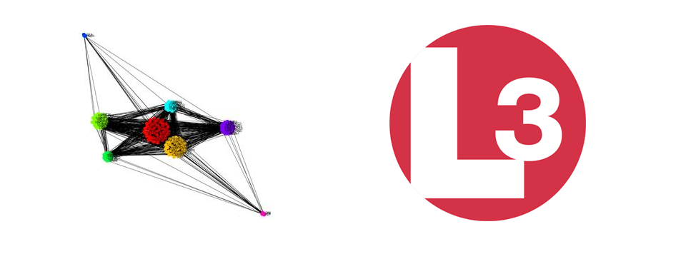
Network science is the study of networks. A network is a set of things that are connected to each other in some way. The items that are connected are sometimes called vertices or nodes and the connections are usually called edges or links. For example, in a Facebook network people are connected to other people via virtual friendship, so the nodes are people and the edges are the friendships. Networks don’t have to be made up of people or computers, nodes can be anything from animals to countries. Edges don’t have to be defined as an actual connection or a friendship. They could be a co-mention in an article, a similarity score, or an interaction of any kind. For example, in the figure below the nodes (which are represented by dots) are countries and the edges (which are represented by lines) are the average tone of articles (how positive or negative the article) that co-mention (both countries are mentioned) that pair of countries.
As in the above network, edges don’t have to be just presence or absence of a connection, but can also be weighted. In this example, the higher the average tone between countries, the higher the edge weight. This particular network is the output of another App I helped write, the GDELT Country Network App found at (https://shiny.data-tactics-corp.com/GDeltNetwork). This network is a one week snapshot of all articles from 9/30/2014 to 10/06/2014. Edges also don’t have to be undirected. For example, on Twitter I follow Kristen Bell, but Kristen Bell does not follow me, therefore the edge that would connect us would be represented by an arrow directed from me to Kristen. While networks can be directed or undirected, this particular app expects an undirected network. Now on to the app!
To access the app go to (https://shiny.data-tactics-corp.com/NetworkApp).
Loading the Network
To load a network, the user needs to upload an edgelist. An edgelist can be made in Excel and exported or exported from any number of network analysis software packages like Gephi, Cytoscape, and Pajek. An edgelist for this app is a .csv document where each row represents an edge with a column for each of the nodes on either end of the edge, a possible column for weights, and a possible first column for edge ID. The user must select whether the edgelist is comma separated, tab separated, or space separated, whether the edges are weighted, and whether the file has a header row. The user can also optionally import a table of node attributes, which can also be a tab, comma, or space separated file that can optionally have a header row. This node attribute table has a row for each node in the network, and each column represents an attribute with the first column a list of node ID’s matching the node ID’s used in the edgelist file. To label the nodes with a string different from their ID, a label column can be added to this attribute table. For example, in the above Country network, the node ID’s are the three letter country code. I usually just use node numbers to avoid confusion because a label column can be passed in with the node attribute table to label the dots with another name.

Once the user uploads a network and the optional attribute table, the user can view the network by clicking the Show My Network button. The network is graphed using a force directed layout, meaning nodes that are more connected to each other are placed closer together. With small networks, this type of graphing layout can reveal all kinds of things about a network. The user can hover over each node and reveal the node label and zoom in to each node or zoom out to see the whole network.

Degree and Betweenness Distribution Tabs
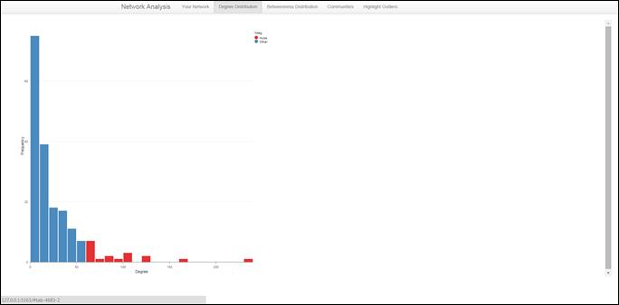
The user can then click on the Degree Distribution Tab. Each node’s degree is the sum of the edge weights connected to that node. In a Facebook network, the degree of a node is the number of Facebook friends that node has. This tab visualizes the distribution of degrees for the network uploaded by the user as a histogram. Hubs are also visualized in this tab. Hubs are nodes that have a significantly higher degree than the rest of the network. In this app, hubs are nodes that have a degree that is larger than the median of the degree distribution by more than two median absolute deviations. Hubs are colored red.
The user can also click on the Betweenness Distribution tab to see the distribution of the log of Betweenness for the user uploaded network. To calculate Betweenness, we need to think of edges as roads, each node as a town, and that we are traveling along in a small compact car. Because going off road with a compact car can be really dangerous, we can only travel on roads and through towns. Betweenness for town A (node A) is the number of routes that have to go through town A to get to any other town. This tab also shows bridges, which are nodes that have a significantly higher Betweenness than the rest of the network. Specifically, bridges are nodes with a Betweenness that is larger than the median of the Betweenness distribution by more than two median absolute deviations. Like hubs, bridges are denoted in red.

Communities Tab
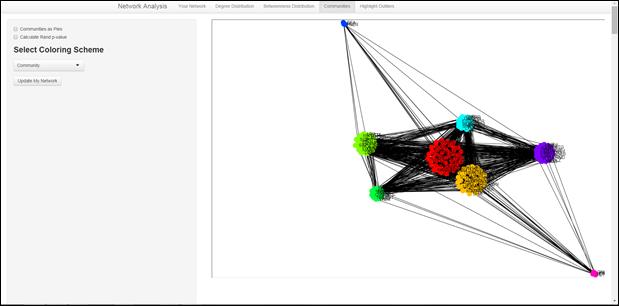
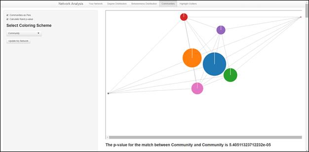
The user could then move on to the Communities Tab. Community detection is the calculation of groups of nodes that are more connected to each other than to the rest of the network. On this tab, the user can choose a coloring scheme (any of the uploaded attributes or any of the previously calculated values, i.e. if the user goes to the Outliers Tab first, they can use the outlier statistics for a coloring scheme as well), whether the communities should be graphed as pies, and whether to calculate the Rand Similarity score p-value for the match of communities to coloring scheme.

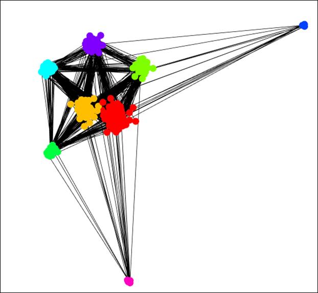
If the user chooses a coloring scheme and clicks Update My Network, the network is plotted in a force directed layout taking communities into account and nodes are colored by the coloring scheme chosen by the user. The nodes below are colored by community.
If the user checks the Communities as Pies box, the communities are re-plotted as pie charts illustrating how well the coloring scheme matches with the community division. Community is an excellent match with community in the country network as seen below. 😉

If the user checks the Calculate Rand P-value box, the p-value for the significance of the match is displayed below the plot. This box can be checked whether the networks are displayed as pies or not.
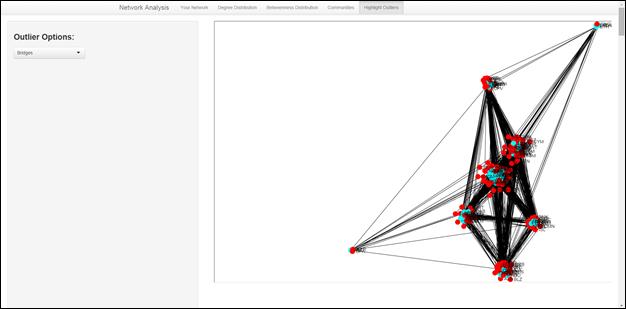
Outliers Tab
The user can also click on the Outliers tab. In this tab, the network is plotted with respect to communities, but outlier nodes are colored in blue. The user can choose from a pull down menu which type of outliers to show: hubs, isolates, largest cliques, and bridges. I discussed both hubs and bridges in detail in the Degree and Betweenness Distribution section, so I will leave those out here. Isolates are the opposite of hubs: nodes with no connections. Largest cliques are the largest number of nodes that are all connected to each other. For example, a clique of size 3 is a triangle. The user can pick one outlier at a time, and then hover over nodes for names, or zoom in to sections of the network. The bridges in the network below are colored in blue.
I would appreciate your feedback on this app and would love to hear about all the things discovered, tweet me at @altraud. Or, if you want to find out more about data science at L-3 please tweet (@rheimann) or email Richard Heimann, Chief Data Scientist (Richard.Heimann@l-3com.com). Our special thanks to the L-3 Data Tactics Data Science Team, Kalev H. Leetaru, GDELT, R, Python, D3, and Sigma.js.