The first part of this tutorial walked through the process of creating maps in CartoDB using the GDELT GKG GeoJSON feeds. This second part offers a brief overview of some of the more advanced kinds of maps that can be created in CartoDB using GDELT by expert users.
Expert Users: Google BigQuery + re:dash + oneclick
Advanced users can use Google BigQuery to generate geographic histograms to bring into CartoDB that allow queries over a much greater time period and with unlimited query complexity. Felipe Hoffa, Developer Advocate on big data at Google, put together this fantastic tutorial creating a heatmap of a day in the life of the global news media as seen through the eyes of GDELT.
In his Reddit post, Felipe walks through the process he used to create the map, including his BigQuery SQL query, a re:dash interface, and the streamlined process of importing into CartoDB using their new "oneclick" interface. Felipe shows how to integrate BigQuery "table decorators" to limit a query to just the previous 24 hours of data, vastly reducing query costs and computation time.
Read more about Felipe's workflow, including the code he used.
Expert Users: Google BigQuery + PERL
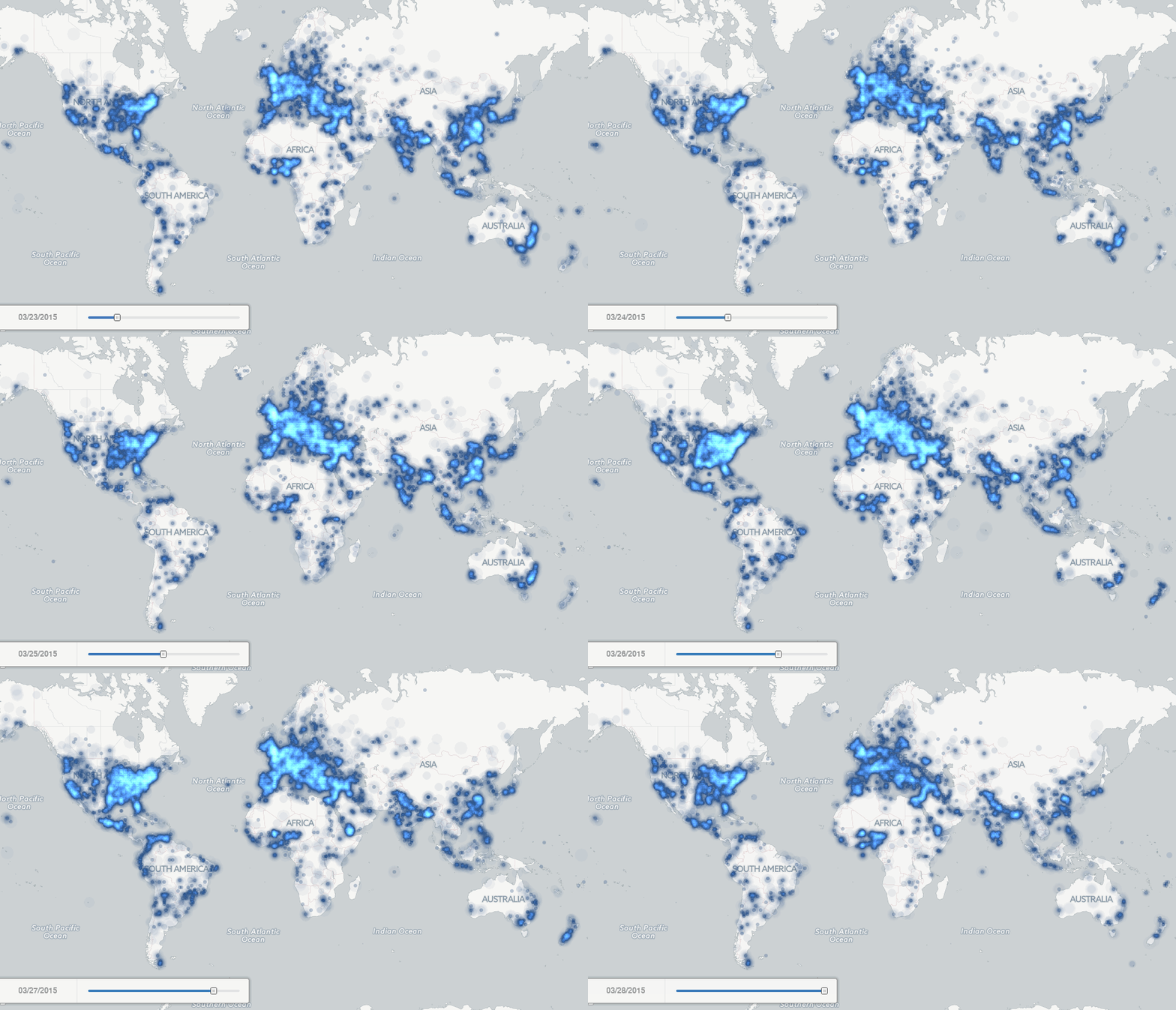
The Google BigQuery GKG 2.0 Sample Queries examples include a number of queries for compiling geographic histograms from the GKG 2.0 data. Adapting one of those queries and pairing it with a PERL script to convert the CSV output from Google BigQuery into GeoJSON format, the following Torque map was created (this is just an animated movie, as the original map was too large to keep):
You can also view the full-resolution 16 frame per second version of the animation or read the full tutorial to see the actual SQL and PERL code used to create the map.
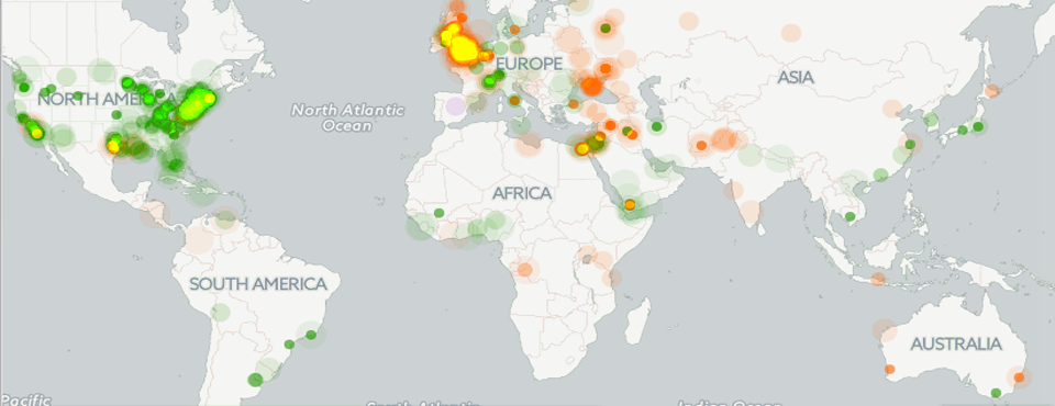
This code was modified to filter for just coverage from the BBC and from the New York Times and paired with a Torque Categorical visualization to create an animation of BBC vs New York Times international coverage over the month of March 2015 (this is also just an animation, as the original map was too large to keep):
You can also view the full-resolution animation or read the full tutorial with further details about how it was created.
Expert Users: Creating a Global Conflict Dashboard – Events + GKG
Finally, the most sophisticated users will likely write custom Python/PERL/etc programming scripts to do far more sophisticated preprocessing of GDELT and even combine the GKG with the GDELT Event Database. This can result in spectacular visualizations like the GDELT Global Conflict Dashboard (click here to view it in a new browser window):
With the support of the US Institute of Peace, this map combines the GDELT Global Knowledge Graph and GDELT Event datasets together to create a unified view of global protest and conflict activity. It was featured as the CartoDB Map of the Week for August 18, 2014. A more extensive writeup detailing its underpinnings and the thought process that went into creating it is available.
To create your own version of it requires advanced programming experience and knowledge of PERL. Those interested in creating their own version and who have the requisite expertise, should turn to the "Creating Your Own GDELT Dashboard Map With CartoDB" tutorial for a detailed walk through of the entire process of setting everything up and has links to download the PERL scripts used to create the dashboard. It uses the CartoDB SQL API to automatically updated the map each day.
Setting up a map like this, especially with the live update and use of multiple scripts and programming to combine and filter everything will be for expert users, but this provides a template for extremely sophisticated use of GDELT that combines its two data feeds in highly innovative ways.

