As of this past Friday, GDELT's Web Part Of Speech dataset now covers 11 languages: Chinese (Simplified), Chinese (Traditional), English, French, German, Italian, Japanese, Korean, Portuguese (Brazilian & Continental), Russian and Spanish. (Google's Natural Language API also supports Japanese, which has been added to the dataset as of today.). Looking across these languages, what does the overall part of speech distribution look like in such a multilingual world?
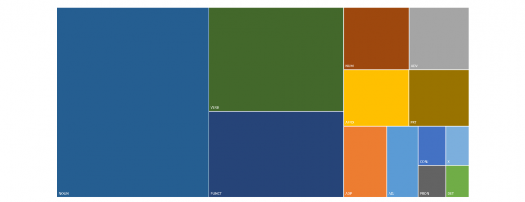
The hierarchical chart below shows the overall distribution across the 10 languages over the period January 17, 2020 through January 22, 2020.
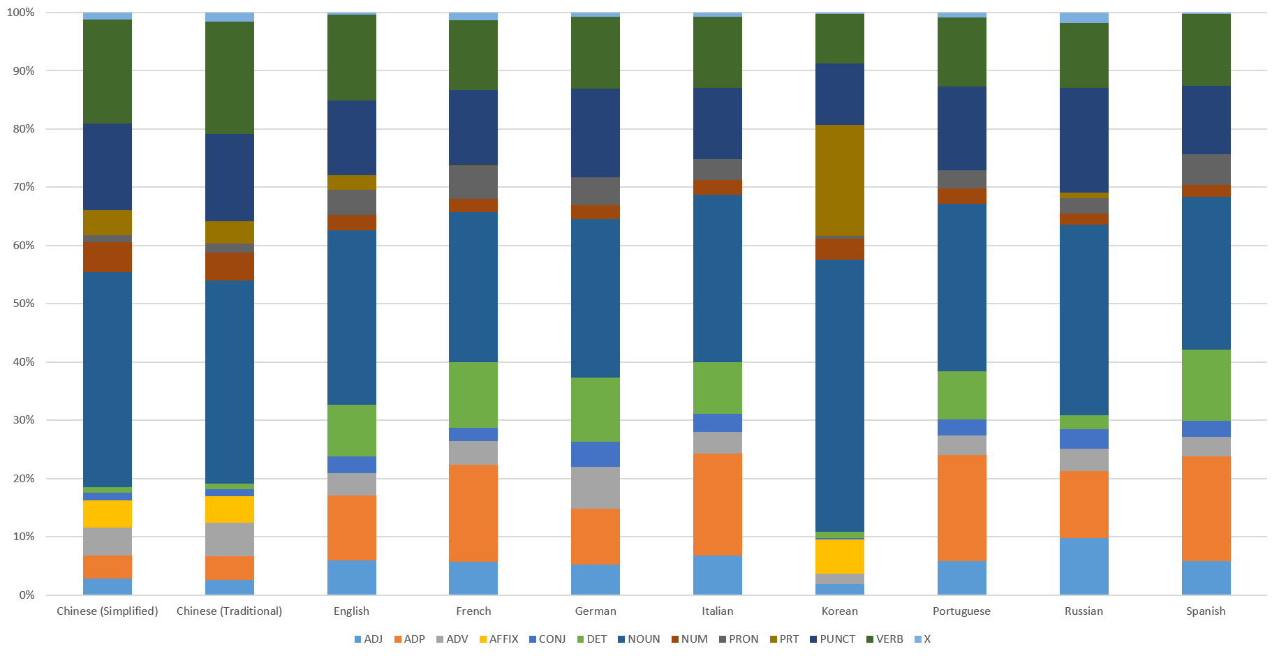
How does this distribution vary by language? The chart below breaks this distribution down by language showing just how much variation these distributions take on across languages.
For those interested in delving into the underlying data themselves, download the spreadsheet.
TECHNICAL DETAILS
Constructing the graph above required just a single SQL query in BigQuery:
select lang, posTag, sum(count) count FROM `gdelt-bq.gdeltv2.web_pos` where DATE(dateTime) >= "2020-01-17" group by lang, posTag order by lang asc, posTag asc