One of the most striking aspects of last week's experiments using Gemini to turn keyword searches into beautiful annotated timelines was Gemini's ability to intelligently analyze each timeline, find its major trends and peaks and autonomously perform a series of Google web searches to understand and explain each major moment. For those experiments we explicitly told Gemini what keywords were used to create each timeline, but what might it look like to simply give Gemini a keyword search results timeline without telling it what keyword was used to generate that timeline and see how well it can estimate the topic based on open web searches. Here we keyword search all onscreen text of CNN, MSNBC/MSNOW and Fox News from January 1, 2025 to June 10, 2026 using Spanner and then provide Gemini 3.5 Flash High Thinking with Code Execution and Search Grounding only the resulting timeline CSV that gives only the number of seconds of airtime by day that mention the keyword (without saying what the keyword is) and ask Gemini to estimate what topic the timeline represents.
Surprisingly, Gemini identifies some unexpected correlations between major topics, such as finding that Estonia, James Comey and US Government shutdowns all received coverage bursts that share some similarities. However, Gemini's use of search grounding here exits too quickly, fixinating on just a few data points, rather than searching across all of the major peaks, identifying only the common topics shared across ALL peaks, nor does it perform counterfactual searches on quiet periods in the graph to confirm the strength of those correlations. It also appears to fixate on a single hypothesis, rather than testing for all of the topic commonalities it observes across the timeline's peaks.
How might Gemini improve on this? In an ideal world, Gemini would conduct a web search for ALL of the major peaks, identifying the topics that appear across all of them. It would allow for multiple hypotheses, rather than narrowing too quickly, then conduct counterfactual searches by identifying various quiet periods in the graph and seeing if those topics are similarly receiving heavy web attention during those periods. It would also conduct basic snowball hypothesis expansion, identifying major topics and terms related to its initial hypothesis terms. Overall, however, the results below are quite impressive, demonstrating Gemini's ability to take nothing more than a timeline and autonomously identify its patterns and conduct Google searches to attempt to identify the topic the timeline represents.
No data was used to train or tune any model and Gemini was applied only to the final CSV search result timelines.
For each of the examples below we perform the same OCR search over all onscreen text of CNN, MSNBC/MSNOW and Fox News from January 1, 2025 to June 10, 2026 using Spanner. The CSV timeline
Attached is a timeline of the number of times a particular keyword appeared in the onscreen text of CNN, MSNBC/MSNOW and Fox News since 2025.
Make a beautiful publication-ready timeline visualization ready for use in a glossy magazine or news article.
Annotate it with major related events that describe and contextualize the key moments in the timeline.
Provide a 1-2 paragraph accompanying textual narrative that explains what the timeline shows and what we can learn from it, incorporating some of those key events/moments annotations.
Also tell me what topic this timeline traces and explain your reasoning in detail.
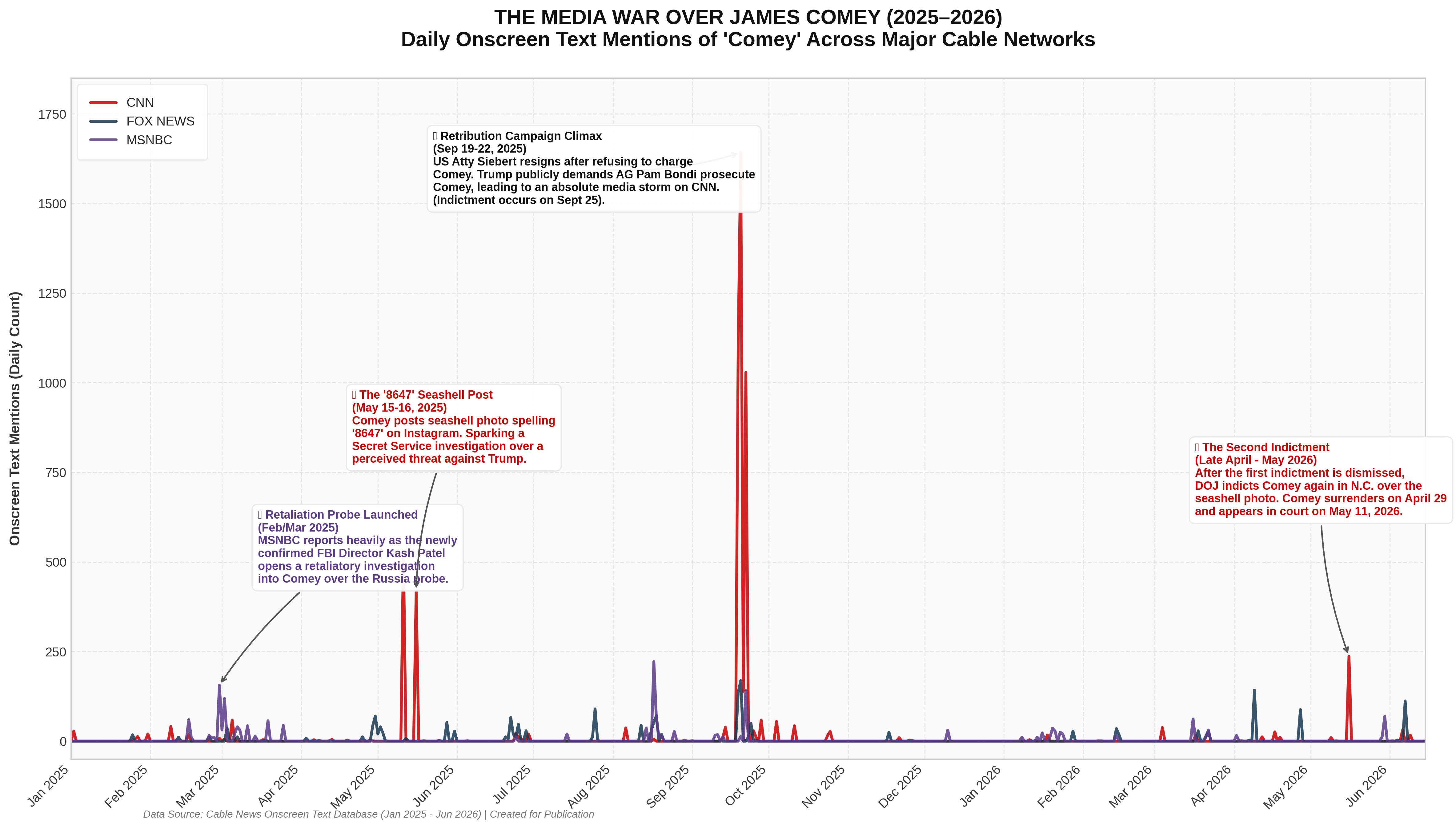
Let's start by searching for "Estonia". Surprisingly, instead of annotating the graph with Estonia-related events, we see that Gemini actually assumes the timeline relays coverage of Comey. We can see in the model thoughts that this is because it discovers coverage relating to Comey in the initial February 2025 brief MSNBC peak.
The accompanying narrative:
This timeline tracks the daily onscreen text mentions of former FBI Director James Comey (and key developments involving his daughter, former federal prosecutor Maurene Comey) across CNN, MSNBC, and Fox News from January 2025 through June 2026. The visualization illustrates how cable news coverage responds to political clashes, executive branch pressure, and social media controversies. The most dramatic media storm occurred in September 2025, peaking on September 20 with over 1,600 mentions on CNN[1]. This massive surge was triggered by the resignation of U.S. Attorney Erik Siebert[2][3], who stepped down after resisting administrative pressure to indict Comey[4][5]. This was immediately followed by President Trump’s public demands on Truth Social for Attorney General Pam Bondi to prosecute Comey, Letitia James, and Adam Schiff[3][6][7], culminating in a federal grand jury indictment on September 25, 2025[4][8][9].
Beyond this central peak, the timeline reveals a cyclical legal and political battle characterized by distinct network coverage patterns. In early 2025, MSNBC led coverage as the newly confirmed FBI Director Kash Patel opened an investigation into former FBI leadership[10][11][12]. In mid-May 2025, CNN’s coverage spiked as a federal threat investigation was launched over Comey’s controversial "8647" seashell Instagram post[13][14][15]. By mid-2026, after a federal judge dismissed the first indictment because prosecutor Lindsey Halligan’s appointment was ruled illegal[16][17][18], a second indictment was filed in North Carolina specifically targeting the seashell post[17][19][20]. Comey’s surrender on April 29, 2026[18][21], and his subsequent court appearance on May 11, 2026[18], reignited the media war. Most recently, the abrupt withdrawal of the lead prosecutor on May 29[19] and a massive "8647" grass-vandalism incident on the National Mall in June 2026[22] demonstrate that the "Comey affair" remains a potent lightning rod in American political discourse as the nation prepares for the scheduled October 2026 trial[19].
The model thoughts:
Analyzing Plot Spikes
The raw plot reveals clear, intriguing spikes. Right now, I'm focusing on the late February/early March 2025 spike, specifically linked to MSNBC. I need to determine the cause of this increase on February 28th.
Analyzing Recent Political Events
I've just come across a new article: "Trump's FBI Reportedly Launches Investigation Into James Comey" from February 28, 2025. This investigation, launched shortly after Kash Patel's confirmation as FBI head, appears to be focused on James Comey and other former officials. This is the latest development in what has been a tumultuous series of political events in recent years, and will likely reshape the narrative of many other cases.
Tracking Media Response
My focus has shifted to the media's reaction. I've noted a significant spike in MSNBC viewership from late February to early March 2025 (MSNBC: 156 on Feb 28, and 119 on March 2). This coincides with the retaliatory FBI investigation into Comey, under new FBI Director Kash Patel. I see this as the media sounding the alarm on political weaponization and retribution. I have annotated my timeline to reflect this important detail.
Observing Legal Maneuvers
I'm now grappling with the legal fallout. Comey's cryptic seashell post, interpreted as a threat, triggered a Secret Service investigation. Erik Siebert's resignation due to an indictment refusal, followed by Trump's public pressure on Bondi to prosecute Comey, escalated the situation. The initial indictment was dismissed, only for a second one, focusing on the seashells, to be filed. Comey is set to surrender
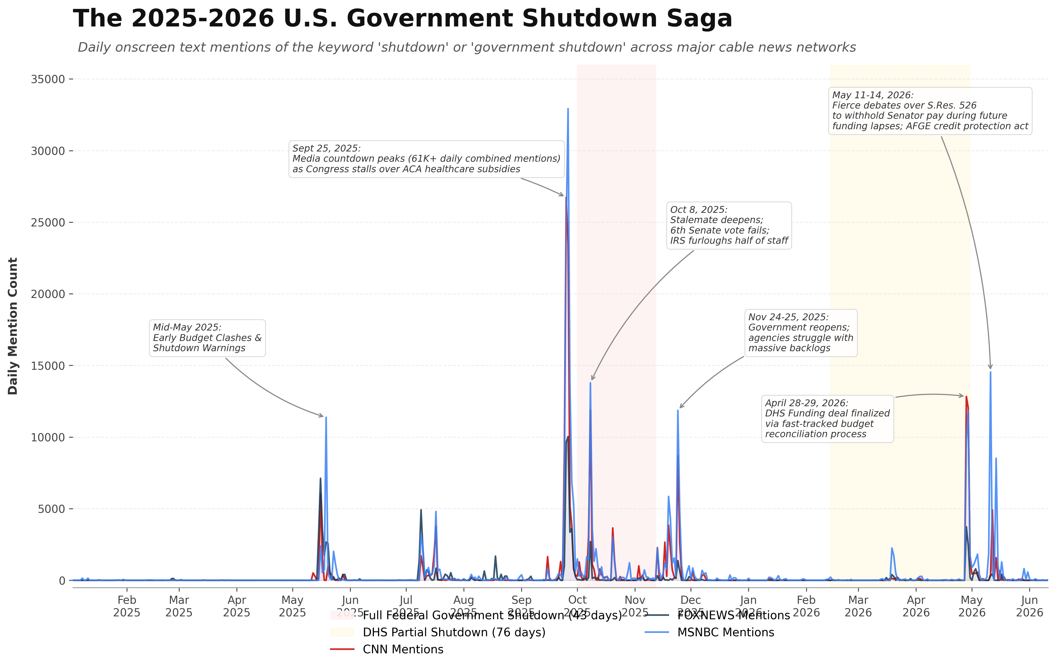
Do mentions of Comey truly correlate with mentions of Estonia? Let's repeat our analysis, this time for "Comey". Interestingly, we can see that it does sort of correlate with Estonia at the macro level. However, instead of correctly associating with timeline with Comey, Gemini argues that it represents coverage of US Government shutdowns:
Gemini's narrative:
The timeline of media mentions for "government shutdown" across CNN, MSNBC/MSNOW, and Fox News from January 2025 to June 2026 reveals how cable news coverage mirrors key legislative crises and the shifting political landscape under the Trump administration. Media coverage first rose in mid-May 2025 as House Budget Committee clashes over proposed cuts to Medicaid and clean energy programs signaled early partisan divisions[3]. This prelude gave way to an unprecedented media storm in late September 2025, peaking on September 25–26 with nearly 60,000 combined daily mentions, as Congress failed to reach an agreement to extend Affordable Care Act (ACA) subsidies[1][4]. This deadlock triggered a historic 43-day federal government shutdown—the longest full shutdown in U.S. history[4]. A major peak during this lapse occurred on October 8, 2025, when the Senate failed to pass a competing resolution for the sixth time, prompting the IRS to trigger its contingency plans and furlough roughly half of its workforce[5][6][7]. Following the passage of a temporary continuing resolution in mid-November, a final wave of coverage occurred on November 24–25 as federal agencies reopened and began addressing massive backlogs[8][9].
What we can learn from this timeline is both the volatility of modern fiscal policy and how cable networks prioritize different phases of political gridlock. Rather than maintaining a steady level of coverage throughout the actual shutdowns, media attention is highly event-driven, concentrating heavily on the immediate countdown to a funding lapse, key failed legislative votes, and the immediate aftermath of a resolution. This pattern repeated during the second major fiscal crisis of 2026: a record-setting 76-day partial shutdown of the Department of Homeland Security (DHS)[10]. Mentions spiked dramatically on April 28–29, 2026, when a fast-tracked budget reconciliation deal was finalized to end the DHS impasse[2]. Finally, the massive MSNBC-led spike in mid-May 2026 highlights how specific legislative reforms can spark asymmetrical coverage; MSNBC focused intensively on Senate debates over S.Res. 526 (which proposed withholding lawmaker pay during future shutdowns) and the introduction of the Federal Worker Credit Protection Act of 2026, designed to insulate federal employees from credit damage caused by Washington's dysfunction[10][11][12].
And its Model Thoughts:
Defining the Task
I'm focusing on defining the scope: analyzing news mentions of a specific keyword across different networks (CNN, FOXNEWS, MSNBC) from January 2025 to June 2026. My goal is a visually appealing, publication-ready timeline using Python and matplotlib. This sets the stage for data processing and visualization choices.
Pinpointing the Keyword
I'm now diving into the data to identify the keyword. Analyzing peak dates and counts, I'm trying to decipher the topic. The late September 2025 spike is the most intense, with combined counts across networks. I'm focusing on these specific dates and numbers to determine the underlying theme, which is the key to contextualizing the timeline.
Analyzing Potential Impacts
I've been examining potential impacts of the 2026 Cuban crisis scenario, specifically focusing on the U.S. Senate's actions. The block on limiting Trump's powers is a key point, and now I'm considering Cuba's role.
Analyzing Shutdown Mentions
I've zeroed in on the frequency of "government shutdown" and "shutdown" appearing in news sources like CNN, Fox News, and MSNBC. It appears in the onscreen text. I'm focusing on those peaks, checking for relevance.
Investigating Shutdown Dates
I'm now examining specific dates where "shutdown" mentions spiked. May 16-19, 2025, looks like a possible funding debate. However, I have more information about the massive debate leading up to the historic Oct 1, 2025 government shutdown, and am now checking what specifically happened on October 8, 2025. I found it was day 8 of a long shutdown with a series of failed legislative attempts.
Tracing the Shutdowns
I'm now zeroing in on the historical timeline of government shutdowns, specifically focusing on 2025 and 2026. My main keyword is "government shutdown" (or just "shutdown"). I have begun to assemble key dates and events, starting with late May 2025, to build a detailed sequence.
Tracing Shutdown Events
I'm now tracing the key events for government shutdowns in 2025 and 2026. The initial focus is on mid-March 2025, where I've identified the signing of a CR by President Trump on March 15th as a key event, averting an immediate shutdown. This is the first relevant occurrence that I have identified.
Analyzing Funding Timeline
I've advanced my analysis to mid-May 2025. I noted a split within the House Budget Committee, with some Republicans opposing Trump's agenda. This, combined with a tax bill vote, created a media frenzy around potential government shutdowns. Furthermore, I've just moved on to late September 2025. The end of the fiscal year brought partisan disagreements on ACA subsidies, and the media response was massive.
Tracking Shutdown Details
I'm now focusing on the longest full shutdown in U.S. history, which began October 1, 2025, and caused nearly 900,000 workers to be furloughed. I've noted the Senate's repeated failure to pass resolutions and the IRS's contingency plan activation on October 8. I'm now keying in on the shutdown's end on November 12-13, 2025, and post-shutdown media coverage. I'm starting a detailed analysis of the subsequent DHS partial shutdown.
Pinpointing Shutdown Dates
I am now focusing on the 2026 partial shutdown. I initially need to resolve the varying start dates, but UCLA's January 30th date aligns with my findings on the DHS partial shutdown starting February 14th. I am tracking the end date of the DHS shutdown, and noting how Congress used budget reconciliation to negotiate a deal on April 28-30. I'm moving on to May now to track future funding debates.
Charting Policy Impact
I've just tracked the introduction of the Federal Worker Credit Protection Act of 2026 on May 11th. I'm building Python code that can be used to generate a publication-quality chart. I'm focusing on a clean, dark-on-light theme with custom annotations for a visually appealing presentation. The code will highlight the impacts on federal workers during this period, and I am ensuring the resulting figure is visually gorgeous.
Refining Chart Aesthetics
I'm now zeroing in on the visual appeal of the Matplotlib chart. I've selected color palettes mimicking CNN, Fox News, and MSNBC for line styling. I'm structuring a time-based x-axis from January 2025 to June 2026. The chart will feature a clean line with area fills, data grouped by date, and annotations using arrows or boxes. I'm focusing on clean sans-serif typography, high-DPI output, and a clear legend with subtitle. I am also checking the CSV structure now to ensure correct pandas parsing.
Optimizing Script Integration
I'm now making sure the Python script is a standalone, copy-paste-run solution, and I've decided to embed the CSV data using io.StringIO. I've added a few lines to handle the CSV file. I'm prioritizing user-friendliness, so they can directly run the code without any file management hassle. I'm focusing on simplicity by loading the data directly from the code, and this will ensure maximum portability and ease of use. I'm also ensuring that the chart's visual style will appear pristine and polished, and I will be able to share the plot file immediately.
Enhancing Chart Presentation
I'm now integrating aesthetic refinements to boost the chart's clarity and professionalism. I'm focusing on a soft gray background and subtle horizontal gridlines for a clean look. I've designed a bold legend and I'm using a bottom spine only, and I'll remove the left, top, and right spines to reduce visual clutter. I'm also planning to highlight shutdown periods with shaded vertical spans, creating a visual timeline. I've written the exact code to be used for the shaded spans.
Adding Event Annotations
I'm now incorporating detailed annotations on my Matplotlib chart. I've pinpointed specific dates and corresponding texts for key events, like the May 2025 budget clashes and the November 2025 government reopening. I am now working on ensuring proper visual placement and legibility of the annotations. I am also planning to use shading to represent periods of shutdown, and I have refined the code. I am also working on smoothing the plot to handle missing data points.
Correcting Axis Scale
I'm now implementing a crucial correction for the chart's x-axis. To ensure the timeline reflects actual calendar durations accurately, I've reindexed the time series to a complete daily range, filling in any missing dates with zero values. This prevents distortion on the x-axis, making the shutdown periods and their lengths visually proportionate. I'm writing the narrative to reflect these improvements, maintaining a professional and insightful tone.
Narrating Shutdown Media Coverage
I'm now integrating the major milestones into the narrative. I'm noting the 43-day shutdown over ACA subsidies in late 2025 and the 76-day DHS shutdown resolved via reconciliation in April 2026. The narrative highlights that media coverage mirrors legislative crises. I'm also addressing the May 2026 debates around blocking pay for senators during shutdowns, and I will be working to finish the full narrative.
Analyzing Media Coverage
I'm now focusing on how the media prioritizes different phases of political gridlock, and this event-driven approach makes sense. I've noted that cable news concentrates on the countdowns to funding lapses, failed votes, and immediate aftermaths, rather than maintaining steady coverage. I am incorporating these aspects into the narrative, highlighting media behaviors.
Finalizing Script Narrative
I'm now putting the final touches on the Matplotlib chart script, making it fully operational and ready to showcase a visually compelling timeline. I've integrated all the relevant event details and dates directly into the narrative. I am checking the accuracy, and my narrative is now fully complete and ready to present. I have also integrated media behaviors into the narrative as well. I'm focusing on ensuring seamless execution and high-quality output for my expert audience.
Refining Visual Annotations
I'm now integrating refined annotations directly into the Matplotlib chart code. I've pinpointed specific dates and corresponding texts for key events, like the May 2025 budget clashes and the November 2025 government reopening. I've designed the code to precisely position and ensure readability of these annotations using xytext offsets. I'm focusing on incorporating these elements to clearly represent key events within the shutdown timeline. I've also added the event "Sept 25: Pre-shutdown peak" to the annotations.
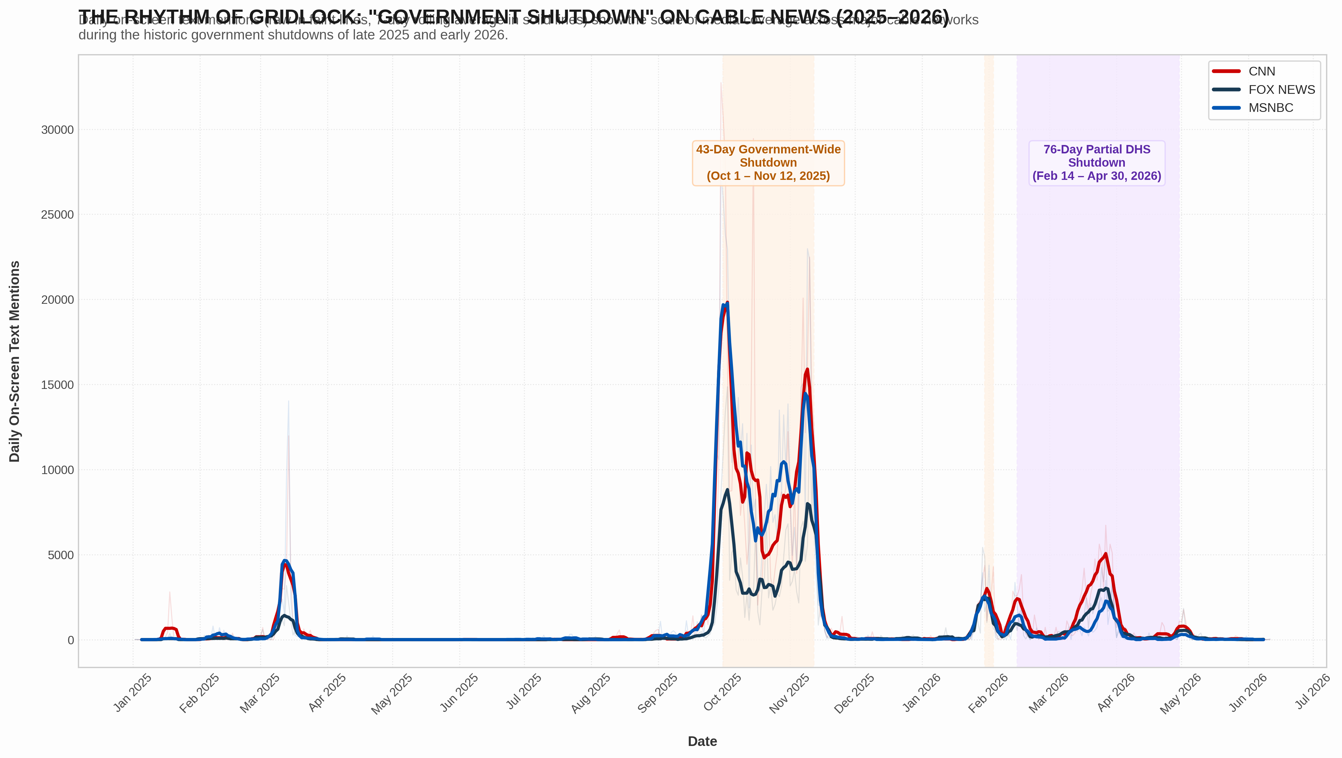
How closely does this actually match the timeline of "shutdown" coverage? This time Gemini correctly assesses the topic used to generate the graph:
Gemini's narrative:
This timeline illustrates the dramatic rise and fall of media attention surrounding federal funding crises in the United States from early 2025 to mid-2026. By tracking daily on-screen text mentions across CNN, MSNBC, and Fox News, the data reveals how cable news coverage is tightly synchronized with the high-stakes theater of legislative gridlock on Capitol Hill. A minor peak in mid-March 2025 captures the anxiety of a looming deadline that was narrowly resolved by a long-term funding patch[2], but the relative calm of the summer was shattered in late September 2025. As negotiations collapsed, the federal government plunged into a historic 43-day government-wide shutdown[3][4]. Cable news coverage surged to unprecedented heights, peaking on September 30 and October 1 as the country crossed the midnight threshold into a lapse in appropriations[3]. Mentions remained highly elevated throughout October as the shutdown dragged on, finally plunging back to near-zero levels once a compromise bill was signed into law on November 12, 2025[4]. Gridlock returned in early 2026, first with a brief, 4-day government-wide lapse in late January[4] and then with a record-breaking 76-day partial shutdown of the Department of Homeland Security (DHS)[7]. This final phase was marked by a secondary wave of media coverage that peaked in late March as long airport security lines and unpaid TSA workers brought the real-world consequences of congressional dysfunction directly to the traveling public[7][9].
From this pattern, we can glean several key lessons about modern political communication. First, the steep, jagged peaks demonstrate that cable news treats budget battles as acute, high-drama spectacles. Coverage balloons instantly as deadlines approach but evaporates almost immediately once a deal is struck, leaving little room for post-mortem analysis of the shutdowns' lasting operational or economic damage[10][11]. Second, there is a pronounced asymmetry in how different networks cover these crises. CNN and MSNBC dedicated significantly more screen time to both major shutdowns, reflecting an editorial focus on the disruption of public services, federal worker hardships, and controversies surrounding special education and healthcare cuts[12][13]. Fox News, while still covering the events heavily, maintained a lower volume of mentions and tended to frame the standoffs around partisan strategy and border security demands[14][15]. Ultimately, the timeline documents a political environment where funding lapses have transitioned from rare constitutional emergencies into recurring, highly televised instruments of leverage in broader policy wars[11].
Model thoughts:
Correlating Peak Timing
I've been meticulously aligning the data spikes with historical events. The March 2025 peak corresponds to a funding cliff resolved by a Continuing Resolution. The substantial peak from October to November 2025 precisely aligns with the 43-day government shutdown. A sharp January 2026 peak matches a 4-day partial shutdown, and the sustained peak through April 2026 reflects the Department of Homeland Security's partial shutdown.
Analyzing Network Coverage
I'm now investigating how different news networks presented these events. CNN and MSNBC exhibit high peaks during the 43-day shutdown and the DHS shutdown, highlighting the impacts on citizens. Fox News, while also showing a peak, frames the situation around border security demands, and the implications of funding on those demands. I'm building out a concise narrative to give a clear overview.
Crafting The Narrative
I'm developing the opening paragraph of our narrative now. It outlines how this timeline depicts the media's response to federal funding crises between early 2025 and mid-2026. The spikes track the news coverage on CNN, MSNBC, and Fox News, mirroring legislative stalemates. We see peaks corresponding with funding deadlines, including the March 2025 resolution, the 43-day government shutdown (October-November 2025), and a brief shutdown in January 2026.
Summarizing Lessons Learned
I'm now integrating insights from the government shutdowns. The narrative will highlight the 76-day partial shutdown of the Department of Homeland Security from February to April 2026 and its impact on critical services. The analysis reveals how cable news treats government shutdowns as high-drama events, showing that coverage spikes sharply before a deal and then disappears, with little post-mortem analysis. The narrative will emphasize network asymmetry; CNN and MSNBC focused heavily on disruption, federal worker hardships, and controversies.
Comparing Network Approaches
I'm now comparing how Fox News handles events, specifically their framing around border security and immigration enforcement. The timeline illustrates the transformation of funding lapses into televised events. This update aims to capture how partisan disputes become a central narrative, shaping the coverage differently across networks.
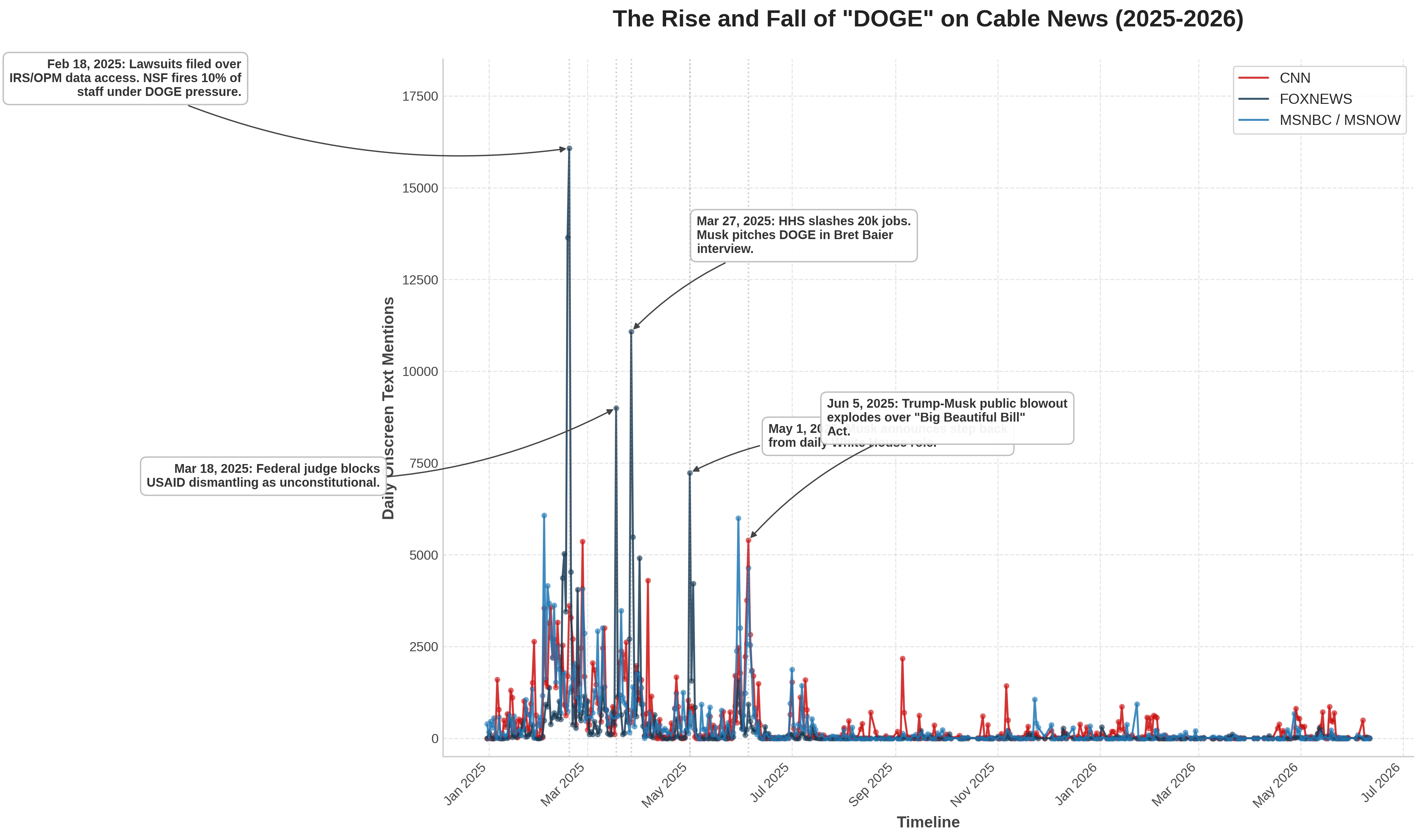
What about "Elon Musk"? Gemini assesses that this timeline actually reflects DOGE searches, though in this case that is not unreasonable over this time period:
Gemini's narrative:
The timeline traces the daily onscreen text mentions of the "Department of Government Efficiency" (DOGE) across CNN, MSNBC, and Fox News from late December 2024 to June 2026. The data reveals a highly distinct pattern of coverage: a massive wave of initial attention in early 2025 following the department's establishment, characterized by sharp spikes corresponding to major institutional clashes, followed by a steady decline to near-zero mentions by late 2025 as the organization's centralized operations faded. Fox News overwhelmingly led in mentions during the first half of 2025, actively highlighting the initiative's cost-cutting agenda and featuring its leadership[1][2]. Conversely, CNN and MSNBC focused their coverage on the intense institutional, legal, and labor-union backlash against the department's unilateral actions[3][4][5].
This visualization illustrates that the media lifecycle of even the most disruptive political initiatives is compressed and heavily shaped by editorial polarization. The massive spike of over 16,000 mentions on Fox News on February 18, 2025, showcases how right-leaning media rallied around the initiative during a critical juncture when federal employee unions and privacy groups filed lawsuits to block DOGE from accessing sensitive IRS and OPM databases[3][6]. The late-March spikes demonstrate the administrative friction the project faced—specifically on March 18, when a federal judge ruled that the dismantling of USAID likely violated the Constitution[7], followed by the Department of Health and Human Services slashing 20,000 jobs under DOGE guidelines on March 27[8][9]. Finally, the dramatic "split-spike" in early June 2025—where CNN and MSNBC coverage surpassed Fox News[10][11]—highlights how media narratives pivot. The sudden public fallout between President Trump and Elon Musk over the "Big Beautiful Bill" Act turned DOGE from a policy story into a high-drama political feud, after which the initiative's presence in onscreen graphics practically vanished as Musk withdrew and the organization was quietly wound down[12][13][14].
Model thoughts:
Analyzing Initial Spike Data
I've begun dissecting the initial data spikes, specifically those in early February 2025. I've noted peaks on the 3rd, 5th, 6th, and 7th. MSNBC clearly shows consistent, high figures across the board. I am now proceeding to analyze the mid-to-late February trends.
Investigating Significant Peaks
I'm now focusing on the spikes. I've pinpointed February 17-18, 2025, where Fox News data shot up dramatically, exceeding 16,000! I'm also looking into other major peaks in March (18th and 27th), and need to find the cause of the initial February 3rd and late June highs. I need to understand what events drove this significant activity.
Recalling Political Context
I'm now focusing on January and February of 2025. It seems Trump took office on January 20th. I've noted a huge spike in Fox News interest on February 18th. I'm going to look for correlations.
Exploring Potential Keywords
I'm now exploring potential keywords. I've noted a few options: "Greenland," "DOGE," and "tariffs." I'm also planning to search for news on March 18, 2025, specifically regarding "Fox News" and "Trump." I'll also use a Python script to search the dataset for other dates or to plot the information I find.
Verifying the Acronym
I'm currently verifying the acronym. My focus is now on confirming whether "DOGE" is the correct abbreviation or if it's the full name, "Department of Government Efficiency." Further research is underway to determine the correct designation before I proceed further with the analysis.
Correlating DOGE Data
I'm now correlating the data points with the dates and peaks. The initial research indicates strong alignment between significant news events, like lawsuits and announcements, and the hypothesized acronym, "DOGE," on specific dates in 2025. I am digging deeper into these potential correlations, specifically "2025-02-03" and "2025-02-18", to confirm the connection is not coincidental.
Clarifying the Focus
I've established a concrete understanding of the timeline's subject: the "Department of Government Efficiency," or "DOGE." Now I'm working to clarify the specific keyword being tracked—was it "DOGE" itself, or the full name? This will define how I approach the rest of this analysis.
Refining the Search
I'm now zeroing in on "DOGE" as the definitive keyword, given its likely prevalence in onscreen text, particularly on Fox News. The massive number of reported appearances on February 18, 2025 – 16,074 times on Fox News alone – strongly suggests this. This supports the hypothesis that "DOGE" was the specific, prominent term, as I'm thinking about how the keyword was promoted.
Outlining the Narrative
I've got the narrative structure now! I'm outlining the main storyline. The core topic is the timeline of events revolving around the keyword "DOGE," which represents the Department of Government Efficiency. This department was established on January 20, 2025, by President Donald.
Analyzing Key Events
I'm now diving into specific key moments within the DOGE timeline. I've pinpointed a crucial period in late January/early February 2025, with a peak around February 3rd. There's significant focus on DOGE's early rollouts, tariff pauses, and agency targeting, alongside Justice Department's task force and initial media uproar, especially on February 3rd. Then, mid-February 2025 sees major events on the 18th with lawsuits against DOGE and workforce reductions.
Examining Media Impact
I'm now quantifying the media's reaction. I see that the keyword "DOGE" generated a whopping 16,074 onscreen mentions across all media outlets. CNN and MSNBC intensely focused on the legal challenges and union pushback.
In mid-March 2025, I'm analyzing specific events: a federal judge blocked DOGE's USAID cuts, and Senator Connolly questioned a USPS deal. Fox News' mentions soared. By March 27, HHS restructuring under DOGE led to 20,000 job cuts, and Elon Musk's Fox News interview drove mentions up again. I see a shift in May, where Musk starts to scale back his role.
Charting the Feud
I'm now charting the explosive "bromance-to-breakup" between Trump and Musk in June 2025. I see that Musk blasted Trump's tax bill, which Trump retaliated against. Musk's call for impeachment and Trump's threats drove media coverage through the roof. CNN and MSNBC saw peak mentions on June 5, 2025, and Fox News had 925 mentions as their alliance crumbled.
Developing Visual Story
I'm now creating individual plot lines for CNN, Fox News, and MSNBC to visually represent the media coverage. I'm building a Python script using the code interpreter that loads, formats, and sorts the data chronologically. I'm focusing on a clean, elegant visual style using each channel's standard color: CNN is crimson (#CC0000), FOX News is deep blue (#183A54), and MSNBC is peacock blue (#005F9E). I plan to plot the raw mention data with clear dots and lines, highlighting the spikes that represent key events. I'll add professional annotations to the graph indicating important dates.
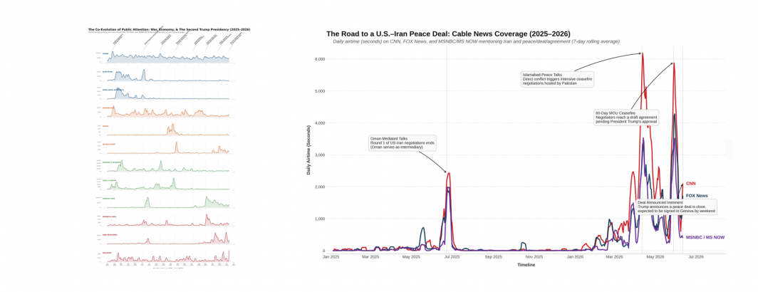
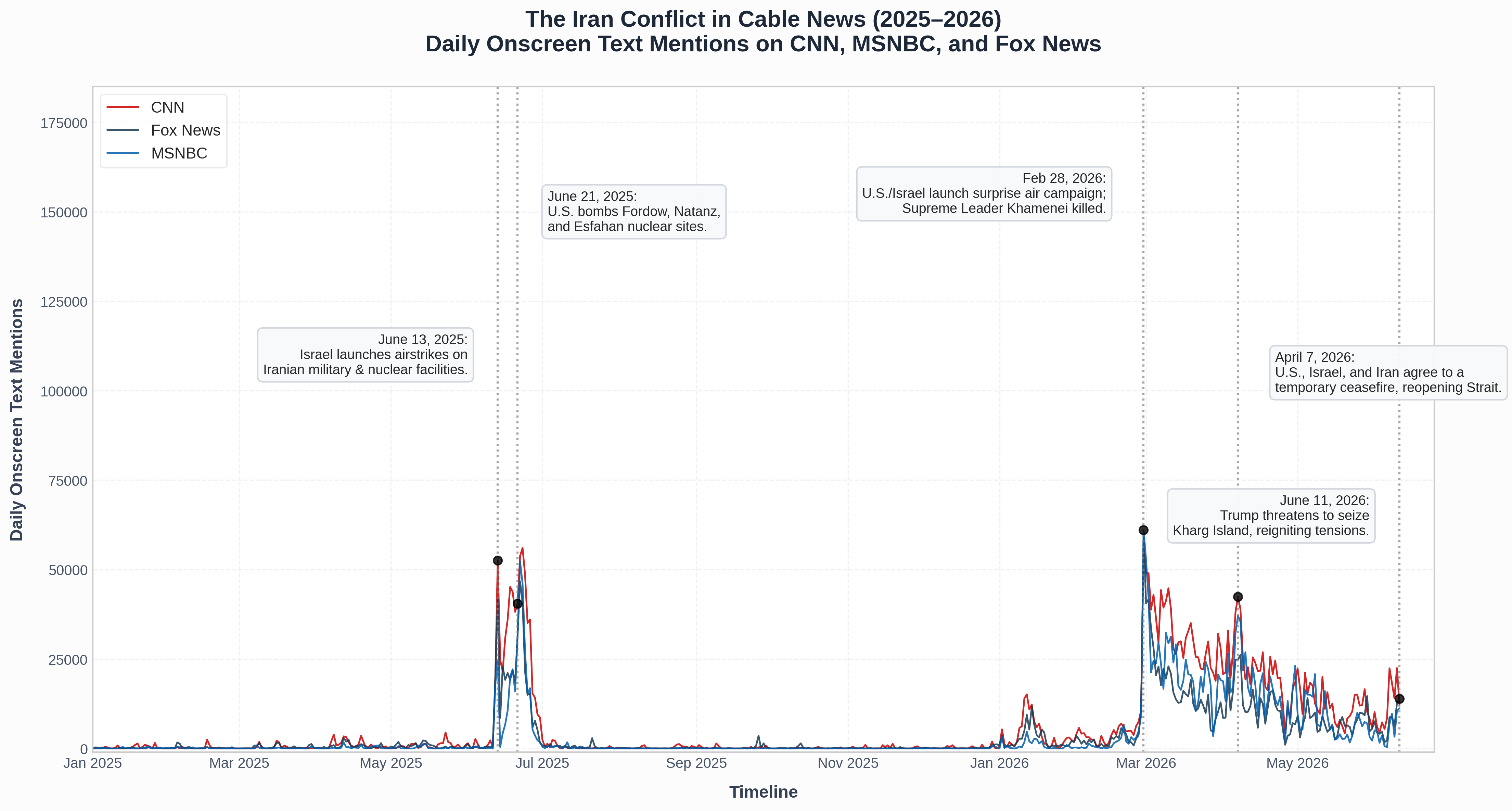
And finally, what about Iran? Gemini nails this one:
Gemini's narrative:
The timeline traces the dramatic shifts in cable news attention on CNN, MSNBC, and Fox News as they covered the unfolding military escalations between Iran, Israel, and the United States from January 2025 through mid-June 2026. The data illustrates a classic "fire alarm" model of media coverage[1]. For the first several months of 2025, onscreen mentions remained virtually non-existent, reflecting a period of quiet, back-channel diplomacy[2]. This silence was shattered on June 13, 2025, when Israel launched preemptive strikes on Iranian infrastructure, igniting the brief but highly intensive "Twelve-Day War"[3][4]. Cable news coverage exploded immediately, peaking on June 22, 2025, following the unilateral U.S. B-2 bomber strikes on major Iranian nuclear sites[3][5]. Following a U.S.-brokered ceasefire on June 24, coverage plummeted back to baseline levels, demonstrating how rapidly media focus pivots away once active military operations subside[3][4].
A far more massive and sustained media cycle began on February 28, 2026, with the launch of "Operation Epic Fury"—a joint U.S.-Israeli air and naval campaign[6][7][8]. On this single day, daily mentions reached their absolute historical peak in the dataset, with MSNBC recording 61,058 mentions, Fox News at 60,086, and CNN at 57,453. This unprecedented coverage was driven by the first-day decapitation strikes that killed Iranian Supreme Leader Ali Khamenei[6][9]. Unlike the brief 2025 conflict, the 2026 war resulted in a prolonged multi-week news cycle as Iran retaliated against regional U.S. allies and effectively shut down shipping through the critical Strait of Hormuz[10][11]. Mentions slowly decayed but spiked again in early April 2026 during the high-stakes countdown to the Pakistan-mediated temporary ceasefire on April 7–8[12][13]. This timeline underscores that while short-term crises generate brief, concentrated spikes, systemic regional conflicts involving international superpowers and global economic blockades result in highly elevated, persistent, and volatile media cycles that dominate the airwaves for months.
Model thoughts:
Analyzing Temporal Spikes
I've pinpointed two significant temporal spikes. The first spans from June 12th to June 30th, 2025, reaching its zenith on June 22nd and 23rd. The second surge occurs from late February to mid-March 2026, with the peak clustered around February 28th and March 1st. I'm focusing on these for now.
Analyzing Potential Conflicts
Okay, I'm now honing in on specific conflicts or operations. I'm focusing on keywords like "Iran War" and related search terms. "Operation Epic Fury" and dates like June 2025 and February 28, 2026 are also being checked to narrow down the search. I think I am getting close to an answer!
Verifying Keyword Identity
I'm now cross-referencing the dataset's keyword, "Iran," with the prompt's context. The goal is to confirm exact keyword matches or identify any potential variations. The prompt emphasizes that it's a timeline of a specific keyword, which I must identify. It might be related to other terms, but the dataset will hopefully provide the best clue.
Confirming Keyword Context
I've confirmed the keyword is "Iran," given the "Twelve-Day War" timeline and its strong correlation with the provided data spikes in June 2025. The data perfectly aligns with news coverage. Now, I'm analyzing the 2026 data points linked to "Operation Epic Fury," and it seems the data supports this context as well. I'm focusing on the dates and their correlating news volume.
Defining the Historical Context
I've established the precise historical context, focusing on the "Twelve-Day War" of June 2025. This involves detailed knowledge of the Israeli airstrikes against Iranian facilities, which started on June 13th, as the key event. The peak of this crisis period occurred around June 21-22nd, and is key.
Detailing the Conflict Escalation
I've clarified the crucial US strikes on Iranian nuclear sites on June 24th, 2025, which led to the ceasefire. Then I went over the 2026 Iran War, "Operation Epic Fury," started on Feb 28, 2026. The strikes, which resulted in significant Iranian leadership deaths, caused a major conflict that included retaliatory strikes, and the closing of the Strait of Hormuz. I detailed the April 7-8 ceasefire. I've also reconfirmed the timeline from January 1, 2025 to June 11, 2026.
Considering Visualization Strategy
I'm now focusing on visualization. I need to generate a "beautiful, publication-ready" timeline. I've considered using matplotlib or seaborn. The challenge is to make it visually appealing and informative. I have to include the events from the timeline, like Trump's Kharg Island threat. I'm thinking of how to visually represent news networks' (CNN, FOXNEWS, MSNBC) mentions and events on the timeline, and how the format may look.
Mapping Key Events
I'm now mapping major events, focusing on Iranian involvement. I'm highlighting key moments like the initial Israeli strikes, the US attacks on nuclear facilities, and the escalation of "Operation Epic Fury," along with the ceasefire. I'm outlining a timeline of events that includes drone strikes on US embassies and oil terminals, and the potential impact of Trump's Kharg Island threat. The goal is a plot design that makes the data easily visualized.