A week and a half ago we unveiled a tutorial on mapping GDELT in CartoDB using our GKG GeoJSON files. However, this tutorial required over 500MB of disk space available in your CartoDB account, placing it beyond the reach of the majority of users. Instead, this tutorial will show you how to use the new GKG GeoJSON API with CartoDB to create rich interactive clickable animated maps of the news with just a few mouse clicks and which require only a few MB of disk space, allowing even small CartoDB user accounts and academic accounts to create maps from GDELT!
Follow the tutorial below to get started!
Finding the Right Query
The first step in making a map from GDELT is to come up with the right query to filter the massive GDELT firehose to just the person/organization/topic/outlet/language you're interested in. It is important to understand that GDELT does not offer fulltext search of the news like Google News – instead it applies highly sophisticated data mining algorithms to the news to compute a variety of metadata about each article, including a list of all major person names, organizations, and GDELT Themes mentioned in each article (along with the location each was most closely associated with) and the news outlet, language, and emotional dimensions of the article. This means that when it comes to topical searches, instead of searching for an arbitrary keyword or phrase, you must find a GDELT Theme closest to the topic you are interested in. All names and Themes are searched in English, with GDELT live translating the news from 65 languages into English for processing.
Fire up a new browser window and point it to the GDELT Geographic News Search website. Start tying a query of interest into the search box at the top of the map and the autocomplete dropdown will help guide you to names and GDELT Themes of interest. Read more detail on the announcement blog post that goes into detail about the various advanced search commands, such as searching by language or news outlet. Experiment as much as you want until you find a query that returns what you're looking for.
If all you want is a quick map to embed on your website that displays a clickable layer of the last hour of matching news coverage and an animation of the geographic patterns of the last 24 hours, you can just follow the instructions for embedding a Geographic News Search map directly on your website and you're done. However, you're limited to the look-and-feel of the Geographic News Search interface, you can only display a single query at a time (you can't include multiple queries on the same map), and the clickable map layer only displays the last hour of coverage.
To solve these issues you need to make your own map in CartoDB using GDELT to provide the underlying live data stream!
Feeding the Data to CartoDB Using the API
At this point you have a query that filters GDELT to exactly what you're interested in. Now you need to feed that data into CartoDB. We're going to use the GDELT GKG API to create a set of new tables in your CartoDB account that will provide a live feed from GDELT directly to your CartoDB account!
Let's say you're trying to map global unrest and your query used the GDELT Theme "UNREST". The URL bar in your browser should look like "http://gns.gdeltproject.org/?QUERY=UNREST". Delete everything appearing before the question mark (leave the question mark though) and replace it with "http://api.gdeltproject.org/api/v1/gkg_geojson" (this switches your query from the Geographic News Search website to the GKG API). Now add on to the end of it "&TIMESPAN=1440&OUTPUTFIELDS=url,name,sharingimage" (these are a set of parameters that tell the API to output all matching coverage from the last 1,440 minutes (24 hours), and to include the URL, human readable location name, and social sharing image for each article).
The final URL should now look like "http://api.gdeltproject.org/api/v1/gkg_geojson?QUERY=UNREST&TIMESPAN=1440&OUTPUTFIELDS=url,name,sharingimage". If you browse to this URL in your browser you should see a bunch of computer code (this is what is called a "GeoJSON" file) – note that this may take up to 20 seconds to load due to all of the computations happening behind the scenes.
Copy this URL somewhere safe – you will need it in a moment.
Now, open a new browser window and sign into your CartoDB.com account and click on the dropdown at top-left in your CartoDB dashboard to switch to the "Your Datasets" view. You should now see a list of your current data tables that you've created in your CartoDB account.
Click on the bright green "New Dataset" button at top right. Paste in the URL from above into the box and click "Submit". If you have a "John Snow" level CartoDB account or an academic CartoDB account that has "sync tables" enabled, you will then see a screen asking you how often you'd like to sync the data. Click on "Every Hour" and then click on the green "Connect Dataset" button at the bottom of the page. NOTE that if you do not have "sync tables" enabled for your CartoDB account (only "John Snow" and above and academic accounts do), then the map table will not update – this will be a one-time snapshot of matching GDELT data. With sync tables, CartoDB will automatically ping GDELT every hour and update your table with the latest rolling window of the last 24 hours, meaning your maps will always be updated without you having to do a thing!
At this point you should now see a new table called "gkg_geojson". Click on the italic "Add description" link that appears right under the table name and type some short description so that you remember what this table is (make sure to include the words "clickable layer" somewhere in the description so you remember this is the clickable layer). This is table is going to feed our clickable layer of all matching coverage from the last 24 hours. The table will automatically limit itself to the first 30,000 matching articles to minimize the disk space needed in your account.
Now, take the URL from above again and we're going to make a few changes to it again. Change "OUTPUTFIELDS=url,name,sharingimage" to just "OUTPUTFIELDS=tone" and add "OUTPUTTYPE=2" to the end of the URL, but leave the rest of the URL the same. Thus, you should now have as your new URL "http://api.gdeltproject.org/api/v1/gkg_geojson?QUERY=UNREST&TIMESPAN=1440&OUTPUTFIELDS=tone&OUTPUTTYPE=2".
Repeat the process from above, clicking on the green "New Dataset" button, pasting this new URL in, click on "Every Hour" for sync, and click on the green "Connect Dataset" button at the bottom of the page.
You should now see a new table called "gkg_geojson_1". Click on the italic "Add description" link that appears right under the table name and type some short description so that you remember what this table is (make sure to include the words "animated layer" somewhere in the description so you remember this is the animated layer). This is table is going to feed our animated layer of all matching coverage from the last 24 hours. Like the first table, this one will also automatically limit itself to the first 30,000 location+time entries to minimize disk space, so may actually reflect the last 12 hours instead of the last 24 hours at times.
At this point you now have a live data feed of all GDELT coverage from the last 24 hours about UNREST feeding into your CartoDB account! The first table includes the URL and social sharing image of each article so that you can make a clickable map layer that displays the URLs of all articles mentioning each location. The second table includes only the average "tone" of all articles mentioning each location in 15 minute increments over the last 24 hours. Best of all, CartoDB will automatically refresh each table every hour to get the latest data from GDELT – you don't have to do anything (its magic)!
Creating the Map
At this point you've set up the two data tables containing the matching results from GDELT, which live update every hour. So, now all that remains is to actually create a map from these tables!
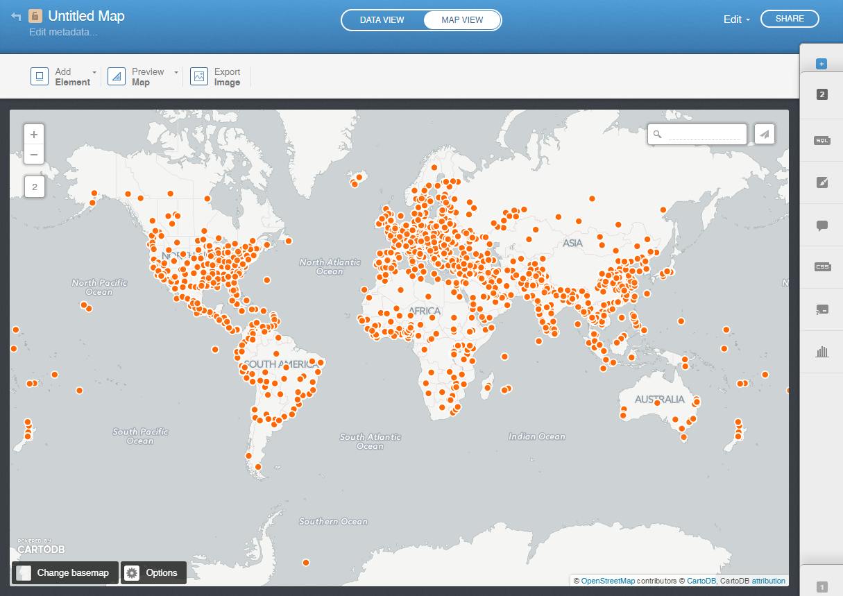
In your CartoDB dashboard click on the dropdown at top left again and switch to "Your Maps" view. Now click on the green "New Map" button at top right. Then click on "Create New Map" from the screen that appears. This will display a list of all of your tables. Click on the two tables from above ("gkg_geojson" and "gkg_geojson_1" and click on the green "Create Map" button at the bottom of the screen.
After a few seconds you should be placed into the CartoDB map maker and should see a screen that looks like this:
Click on the "Untitled Map" label at the top left and type in a new title for your map – here we'll call it "GKG API Tutorial: UNREST", but you might want to call it something more interesting.
Now its time to actually configure the map layers. At the very bottom right of the screen you should see a small light grey square with the number "1" on it. Click on this and the right side of the screen should slide out into the layer editor toolbar.
Your screen should now look something like this:

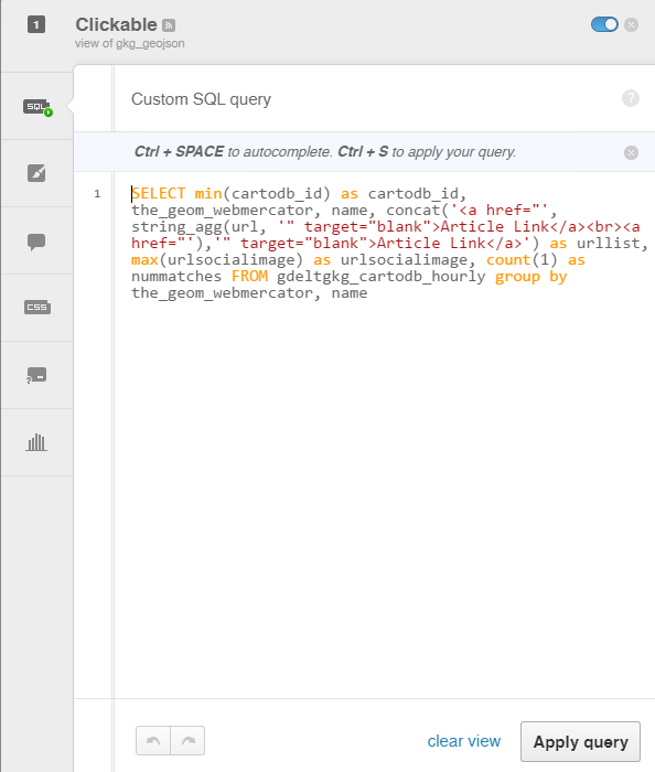
Double-click on the bold words "gkg geojson" at the top of the tab and type "Clickable" and hit enter. This will rename the map layer. The toolbar has defaulted to the “Map Layer Wizard” view that allows you to change the visual look and feel for your layers. We’ll come back to this in a moment. First, click on the “SQL” button running along the left side of the tab. Here we're going to paste in some SQL code that transforms our table into what we need for the map. Paste the following SQL code into the box and then click on the “Apply query” button at the bottom of the screen. The SQL below may look a bit complex, but don’t worry, you won't have to edit it at all – just copy-paste it in as-is.
SELECT min(cartodb_id) as cartodb_id, the_geom_webmercator, name, concat('<a href="', string_agg(url, '" target="blank">Article Link</a><br><a href="'),'" target="blank">Article Link</a>') as urllist, max(urlsocialimage) as urlsocialimage, count(1) as nummatches FROM gdeltgkg_cartodb_hourly group by the_geom_webmercator, name
The toolbar should now look like:
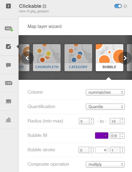
Now, click on the paintbrush-in-a-box icon just below the SQL icon to go back to the Map Layer Wizard. Make sure that “Bubble” is selected as the map type, change “Column” to “nummatches”, change "Radius" to "5" and "15", change “Bubble fill” to whatever color you like, and change the alpha layer selector to its right to “0.6”, change “Bubble stroke” to “0” and change “Composite operation” to “Multiply”. The wizard should now something like:
Now click on the icon on the left side of the layer toolbox under the paintbrush icon that looks like a popup quote. Click on the “Hover” tab at the top of the screen. Turn on the “Name” field so it looks like this:
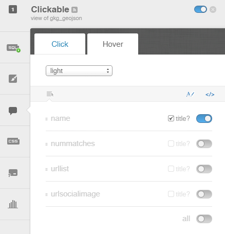
This will configure your map so that when users mouse over a location a brief popup will tell them the name of the city under their mouse, to make it easier to navigate dense maps or to identify particular cities of interest.
Now, click on the “Click” tab at the top. Change the dropdown at top to “Image Header” (it’s the last option in the dropdown and you may have to scroll down to it).Turn on the “urlsocialimage” field and make sure that “title” is unchecked beside it. Click and drag it to the top of the list of fields. Turn on the “name” field, make sure that “title” is unchecked beside it, and drag it to be second on the list. Finally, turn on “urllist”, make sure that “title” is CHECKED, and drag it to be third on the list. The screen should now look like:
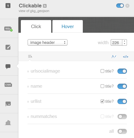
This configures your map so that when a user clicks on a location a popup will appear that displays the list of coverage found in the last hour mentioning that location and will display the “social sharing image” from the first article at the top of the popup if one is available. Locations for which no article had a social sharing image will result in a blank grey popup header, while those with images will display the image, adding additional context.
At this point we've fully configured the clickable map layer, so now its time to create the animated map layer!
Click on the “2” tab (it should be right above the "1" tab). Double click on its name ("gkg geojson 1") and change to "Animated". Switch to its SQL tab and change its SQL to and click on the "Apply query" button at bottom right (once again – don't worry about how complex the code looks – you just have to copy-paste it over, not modify it in any way):
SELECT *, to_timestamp(urlpubtimedate, 'YYYY-MM-DD HH24:MI') as animtime, CASE WHEN avgurltone <= 0 and avgurltone >= -5 THEN 'sad' WHEN avgurltone < -5 THEN 'verysad' WHEN avgurltone > 0 and avgurltone <= 5 THEN 'happy' WHEN avgurltone > 5 THEN 'veryhappy' ELSE 'neutral' END AS happysad FROM gkg_geojson_1
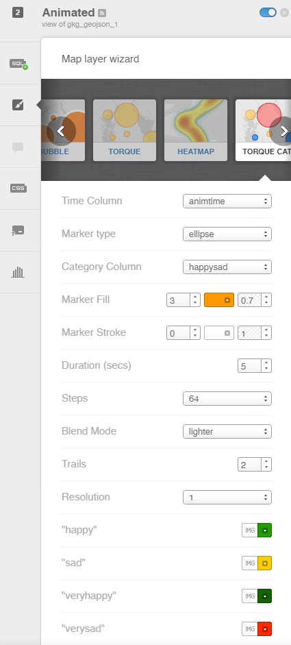
Then, click on the paintbrush-in-a-box icon just below the SQL icon to go back to the Map Layer Wizard. For the map type, scroll through the map type gallery towards the right until you find the "Torque Cat" type. Make sure the map type is set to “Torque Cat” and that “Time Column” is set to “animtime”, then set “Marker Fill” to "3" and leave the color part alone, but set the transparency level to "0.7". Set “Marker Stroke” to 0, “Duration” to “5”, “Steps” to “64”, “Blend Mode” to “lighter”, “Trails” to 2, and “Resolution” to “1”. Click on the color beside each of the labels at the bottom to pick what color you would like to use for "happy", "sad", "veryhappy" and "verysad".
It should look something like:
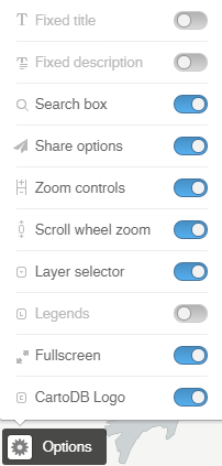
Now click on the “Options” button at the bottom left of the page (it has a gear icon beside it). From the popup that appears, disable “Legends” and enable “Scroll wheel zoom” and “Layer selector” and “Fullscreen”. It should look like:
The page should now look something like this:

Finally, click on the "Share" button in the top right of the page. If you copy the "Get the link" URL, you'll get a URL that you can share with others. In this case the URL we get is "https://gdelt.cartodb.com/viz/3a07dad0-041e-11e5-9887-0e4fddd5de28/public_map". Alternatively, if you copy the "Embed It" code, you'll get a snippet of HTML code that you can paste into your webpage (if you are pasting into a blog like WordPress, you'll need to switch to "Text" mode to paste in HTML code). In this case the code is:
<iframe width='100%' height='520' frameborder='0' src='https://gdelt.cartodb.com/viz/3a07dad0-041e-11e5-9887-0e4fddd5de28/embed_map' allowfullscreen webkitallowfullscreen mozallowfullscreen oallowfullscreen msallowfullscreen></iframe>
The final embedded map should look like:
If the map is a bit off-center or if you would like it zoomed in more, then pan and zoom the map while editing it in the CartoDB editor and CartoDB will automatically replicate the chosen center/zoom for your embedded maps. If you are embedding your maps in web pages, you may find that when using your mouse scrollwheel to scroll down your page, the mouse becomes "caught" when you reach the map and instead of continuing to scroll down the page, it zooms the map. In this case, go back to the map Options at the bottom left of the CartoDB map editor and turn off Scroll Wheel Zoom. You might also wish to turn off the searchbox that appears in the top right of the final map – this allows you to type in the name of a city to zoom to it, but may be confusing to some users.
Congratulations! That's all there is to it! You've now created a live map of global coverage monitored by GDELT discussing the topic "UNREST" across 65 languages! CartoDB will automatically download the latest results from the GDELT API every hour and update your table, so you never have to do anything more – from now on this map will self-update once an hour!
There are all kinds of additions that you can make to this map! For example, change the API URL of the Clickable layer to "http://api.gdeltproject.org/api/v1/gkg_geojson?QUERY=UNREST&TIMESPAN=1440&OUTPUTFIELDS=url,name,sharingimage,tone" (add "tone" to the list of OUTPUTFIELDS) and then change the SQL of the clickable layer to:
SELECT min(cartodb_id) as cartodb_id, the_geom_webmercator, name, concat('<a href="', string_agg(url, '" target="blank">Article Link</a><br><a href="'),'" target="blank">Article Link</a>') as urllist, max(urlsocialimage) as urlsocialimage, count(1) as nummatches FROM gdeltgkg_cartodb_hourly where urltone < -2 group by the_geom_webmercator, name
This will filter the returned coverage to display only those articles with strongly negative emotional undertones. Conversely, changing to "urltone > 2" will display only those articles with strongly positive emotional undertones. (Technically "urltone" can range from -100 to +100, but in practice usually ranges from -10 to +10 and often from -5 to +5). If you did this with "FOOD_SECURITY" as your GDELT Theme, the "urltone > 2" query will return articles like the launch of an expo with an emphasis on fighting malnutrition and hunger in Italy or the announcement of a new charity campaign to distribute food aid in Egypt, while the "urltone < -2" query will return coverage of alleged death camps in Thailand where Rohingya Muslims from Burma were starved to death and the rapidly deteriorating conditions in Yemen. Thus, in addition to topical filtering, you can filter coverage to display only the most positive or most negative coverage.