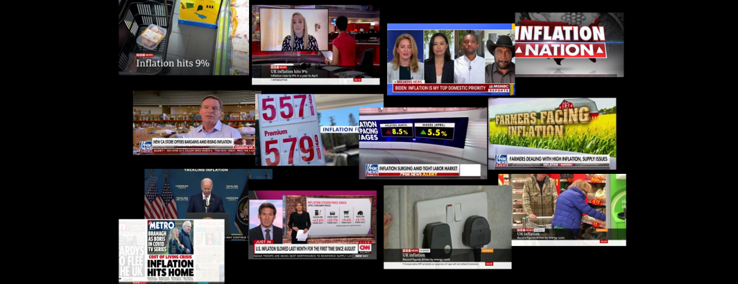
How is the topic of inflation being visually presented across television news? When the word "inflation" is spoken or seen in the onscreen text, what are the imagery that television channels show to illustrate it? Is it an empty grocery cart or barren shelves, capturing food inflation? Power transmission wires, outlets and light switches for energy costs? Gas pumps for transportation costs? The insides of stores for the cost of goods? Newspaper frontpages for media coverage? Infographics and charts to present the data behind it? Pundits in the studio or policymakers at podiums?
Keyword searching closed captioning and OCR'd onscreen text can help us identify where inflation is being explicitly mentioned by name, but even the most advanced visual assessment tools today struggle to describe these kinds of visual landscape questions. Models can be trained to recognize specific known themes like gas pump signs or grocery stores, but won't understand the connection between a power outlet and the concept of inflation as rising energy costs and so on.
This suggests a critical need for the ability to rapidly visually triage and assess complex topics across television news by combining the power of machines to process vast amounts of information and present it in digested forms that allow the incredible power of the human brain's visual cortex to perform these kinds of more complex assessments.
Stay tuned for an incredible announcement in the coming days introducing the future of at-scale human-machine understanding of moving imagery.