Last week we announced the new GDELT Stability Dashboard API, created through the support of the PeaceTech Lab. To demonstrate how to use the timeline for visualizing major events around the world, below we show what you would get today from the API for Israel and the Maldives in both tone and instability views.
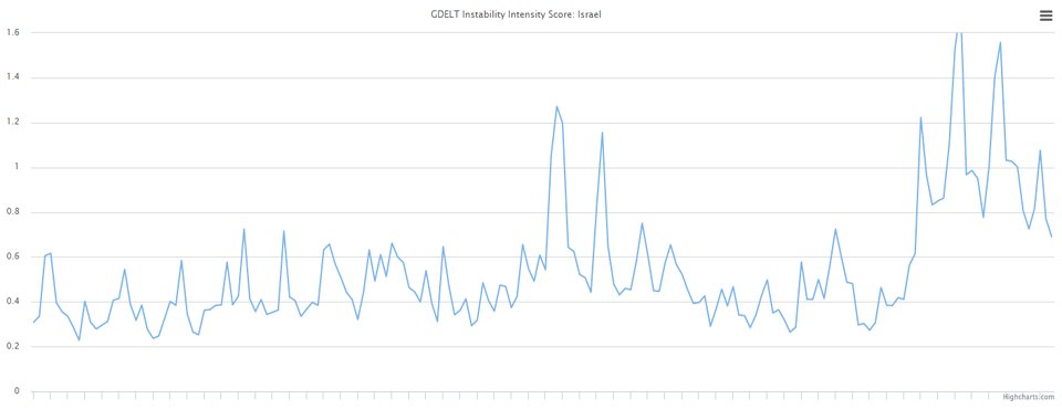
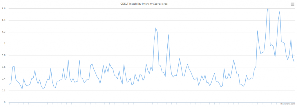
Israel Instability
The image below shows the Instability Timeline in daily resolution for Israel, showing major surges around the July 31 / August 1st clashes and protests and the recent lone wolf attacks. Encouragingly, though, the graph also suggests that the lone wolf attacks are decreasing slightly compared with their peaks over the last few weeks. You can embed the live-updating version of this timeline (which will likely look different by the time you read this blog post, since it updates continuously) using the URL:
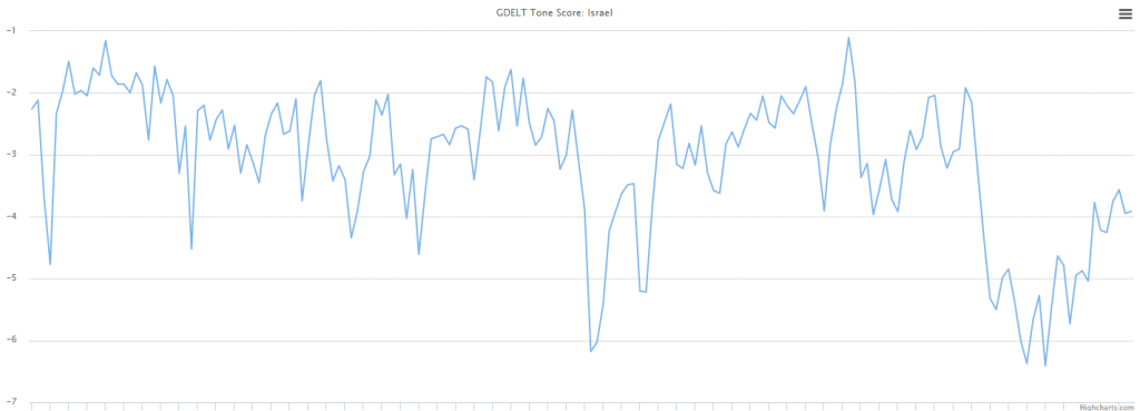
Israel Tone
Similarly, the timeline below shows the average tone of coverage about Israel over the last 180 days at daily resolution, showing similar surges in negativity around the major events chronicled above, and a similar decrease in negativity, suggesting an improving situation. You can embed the live version of this timeline via the URL:
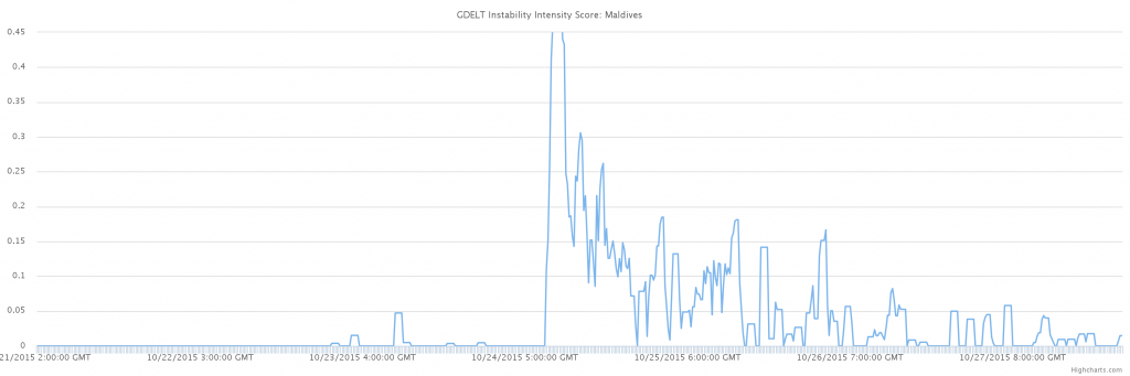
Maldives Instability
Switching to the instability in the Maldives, where the Vice President was arrested last week on charges of attempting to assassinate the President, the timeline below shows what a major event like the arrest of a senior government leader looks like in the 15 minute view. Here the arrest can be seen as a sudden massive surge followed by a rapid ramp down as reports of followup arrests of his alleged conspirators and other related actions wrap up. Even if you were not paying attention to the latest Maldives news, a quick glance at this timeline would certainly tell you that something major happened last week. You can embed the live version of this timeline via the URL (smoothing is enabled due to the very low volume of reporting about the Maldives):
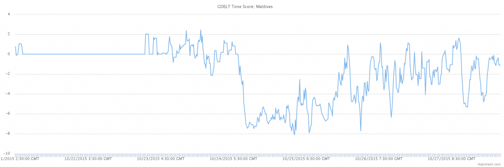
Maldives Tone
In similar fashion, the timeline below shows the average tone of coverage of the Maldives, showing a massive surge towards negativity, reflecting both the arrest and all of the reports recounting the attempted assassination of the President and the purported evidence against the Vice President. It also shows that coverage has steadily recovered in the days since as there has been little new news or actions related to the case. You can embed the live version of this timeline via the URL:
Hopefully these four simple examples give you an idea of what the new API is capable of and how major world events are starkly reflected in the visualizations it offers.