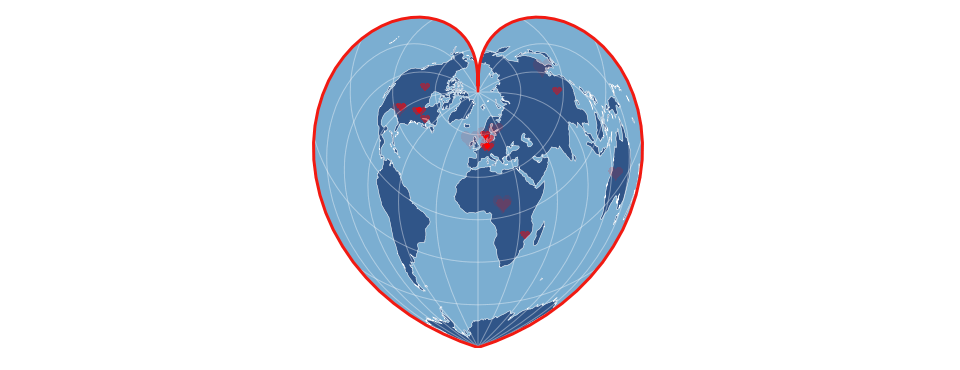
This neat visualization by Kenneth Davis over at geovisualist.com uses the GDELT GeoJSON API and CartoDB to map positive coverage of refugees around the world, using a projection that shapes the earth into a heart and using hearts for the location markers and updates every hour. The result is quite a striking visualization of a major global issue.