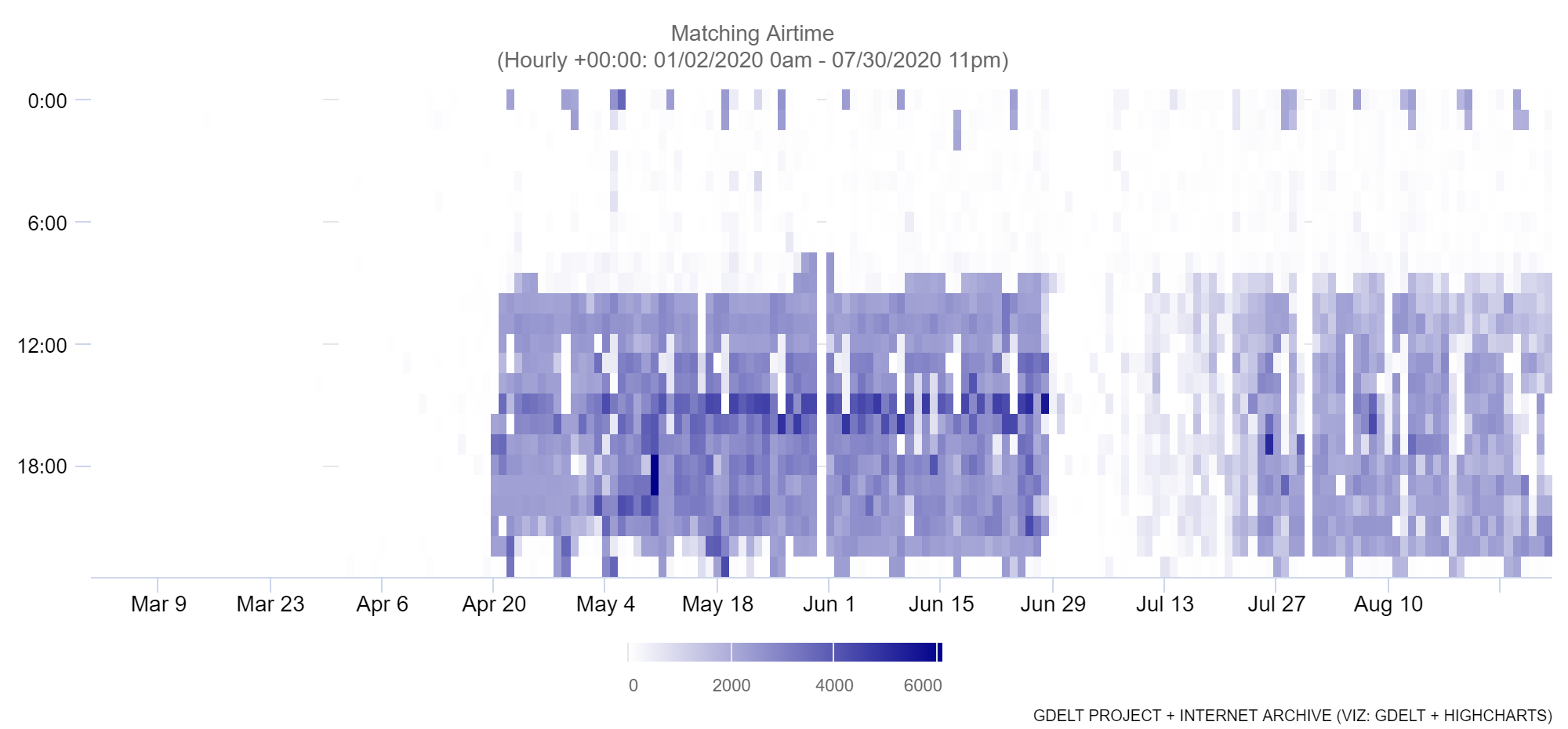
We're excited to announce a new visualization coming to the TV AI Explorer this week: heatmaps! This visualization style displays days on the X axis and hours from 0 to 23 along the Y axis, with each cell being colored from white (0) to dark blue (maximum value). You can see an early example of this visualization applied to an OCR text search for "johns hopkins" on CNN, showing how its COVID-19 dashboard tends to appear in the middle of the day (times in UTC in this example). We're tremendously excited about the new kinds of analytic capabilities this new visualization will enable!