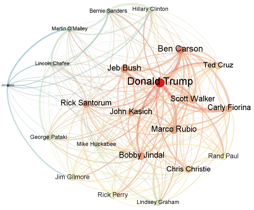
One of the visualization's in Kalev's latest piece for Forbes involved exploring the network structure around how the 2016 candidates are being contextualized within television news. Every mention of each of the candidates on major national US television networks August 7 to September 22, 2015 was identified and a list of the words appearing within 10 seconds of each mention compiled. The contextualized word histogram for each candidate was then Pearson correlated against every other candidate, resulting in a final network diagram showing the overlap among the language the major national television networks are using to describe each candidate. The thicker and redder the line between two candidates, the more similar is the language found in context with their mentions, while the thinner and bluer the line is, the more dissimilar their language. Each candidate’s name is sized based on the average similarity of them to all other candidates.
This is a powerful visualization technique for examining a slate of candidates or political leaders to understand media contextualization and how reporters are focusing and describing them for their audiences.