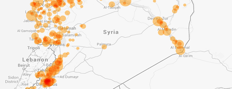
Last week Palantir released the visualization below that it produced in collaboration with the Carter Center mapping conflict events in Syria over the first half of 2014 based on hand analysis and coding of social media streams, including thousands of videos shot within the country. This got us wondering how GDELT's fully automated realtime view of the Syrian conflict lined up with this hand compiled ground data.
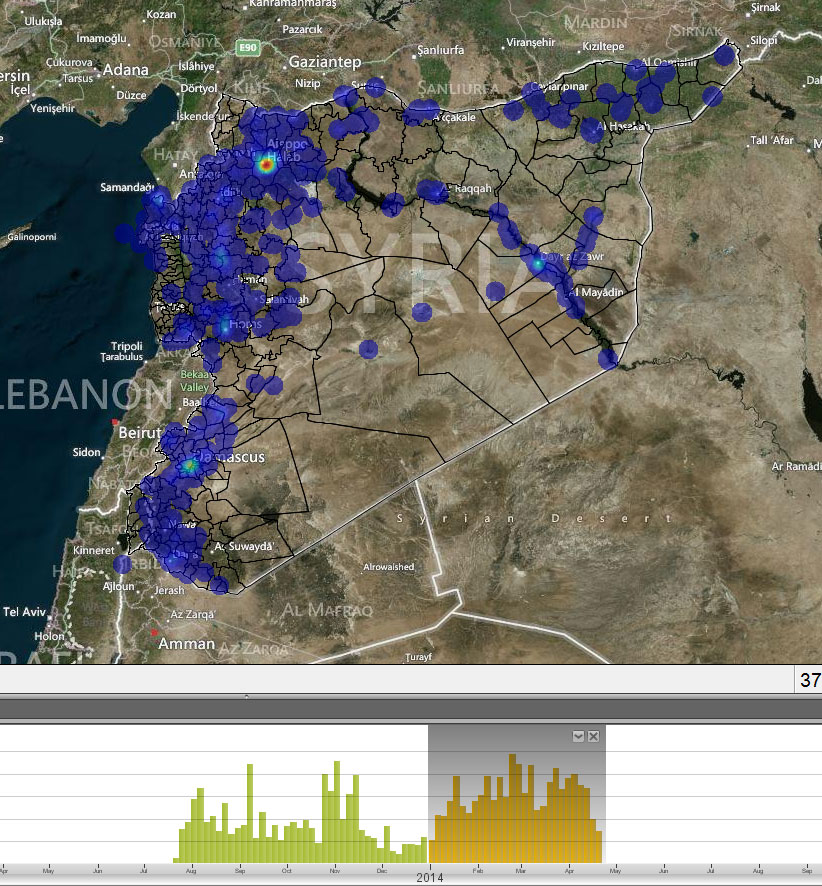
Image from https://www.palantir.com/2014/06/mapping-the-syrian-crisis-with-the-carter-center/)
To see how GDELT compares, we whipped up the map below using the GDELT Analysis Service EVENT Heatmap Visualizer, which uses GDELT in Google BigQuery, and fed the resulting CSV file into CartoDB. The resemblance of the two maps is striking, with GDELT's spatial profile of the conflict (generated completely by machine and updated every 15 minutes) lining up exceptionally closely with the Carter Center's hand compilation of social media content.
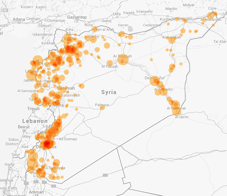
As GDELT prepares to transition from daily to 15 minute updates later this summer, just imagine being able to map the contours of conflict almost as it happens!