As GDELT is increasingly finding pilot use in operational trend detection contexts, we have been receiving a growing number of requests from users integrating it with professional GIS software like ESRI’s ArcGIS platform. Users are looking to combine GDELT with other GIS datasets, perform various types of spatial analyses, or to overlay it onto thematic and human terrain base layers.
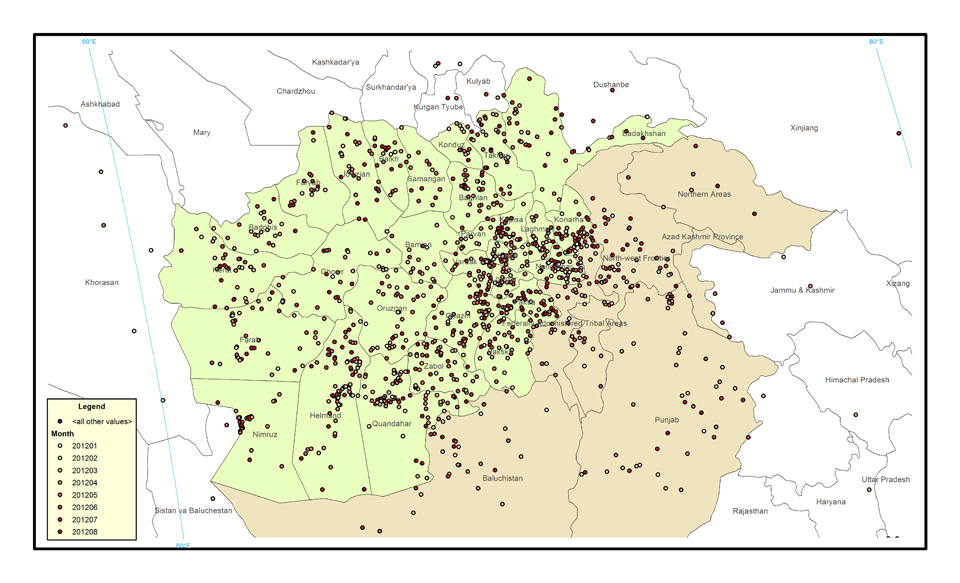
A pilot project for an NGO explored mapping Material Conflict in Afghanistan and the surrounding region by month from January to August 2012 to visualize how the country’s violence was evolving. Of particular interest was whether violence was moving inwards from the border region with Pakistan. The map below shows a composite view of the eight-month period, with a dot at every location where one or more events were reported during the time period.
Dots are not sized by the number of events, so a single dot could represent one event or one hundred events during that month. Each month was assigned a color from light yellow to dark red and each location is colored by the latest month an event was reported at that location. Thus, a bright yellow location only reported violence in January 2012 and not afterwards, while a light orange location reported its last violence in April 2012 and a dark red location reported violence in August 2012.
It is immediately clear that the bulk of the violence in Afghanistan centers on its border with the Pakistani North-west Frontier region and clusters in key areas in the other provinces. It is also clear that despite the majority of attacks clustering in certain areas, violence touches nearly every portion of the country.
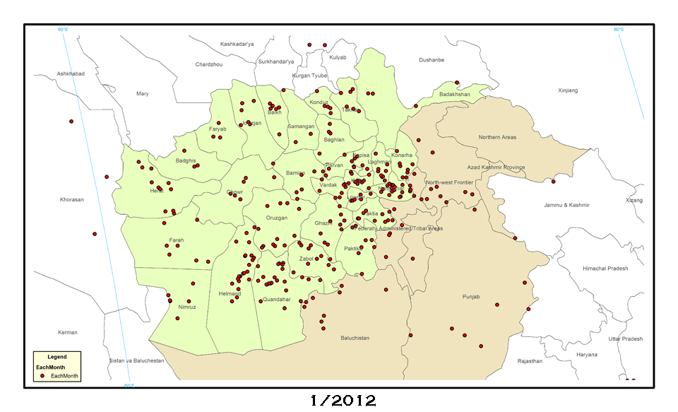
While this map clearly shows the spatial diversity of conflict in Afghanistan, it makes it hard to understand how it is changing over time. Thus, the following animated map shows the unrest by month over this time, capturing considerable spatial movement, including substantial clustering effects and a diffusion of violence from the border region inwards.
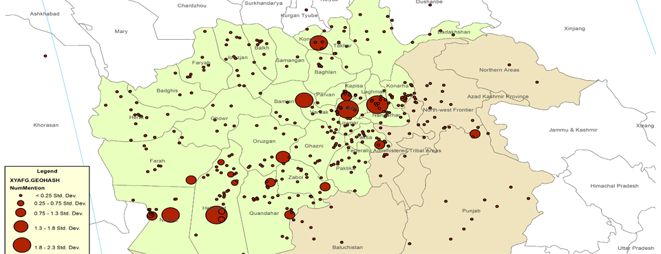
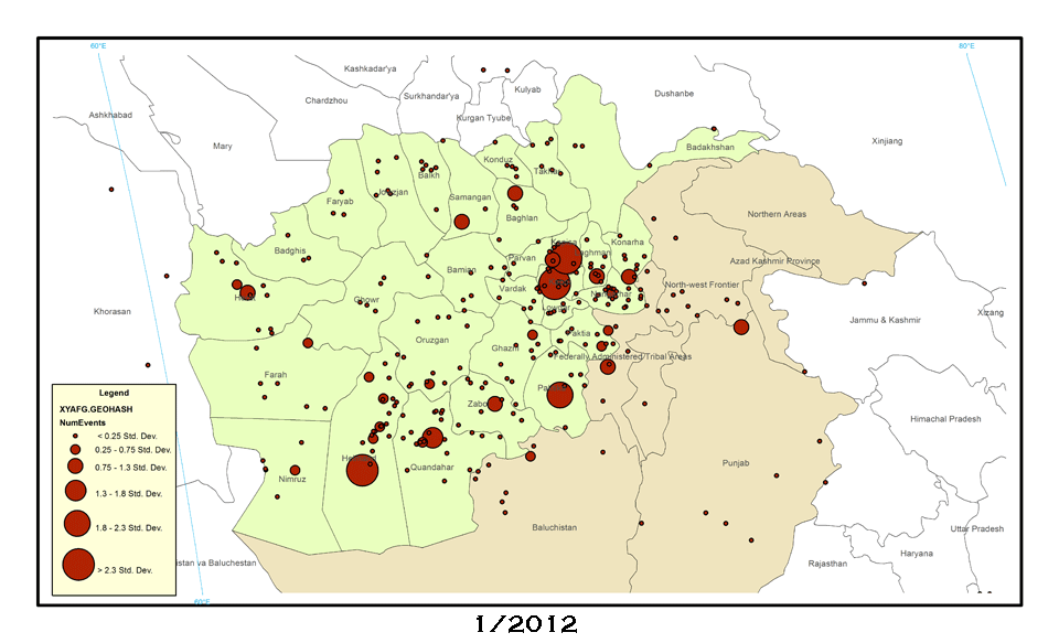
To further tease apart the contours of this spread of unrest, the map below shows only the two months of January and August 2012, but sizes each point based on the number of events at each location and so yields a better picture of how the intensity of conflict changed over time. In particular, the shift in higher-intensity violence from the border region with the North-west Frontier inwards is instantly visible.
Hopefully these maps offer insight into ways in which GDELT can be used to visualize broad spatial patterns in the evolution of violence in a country over time and its use in GIS packages. Happy mapping!