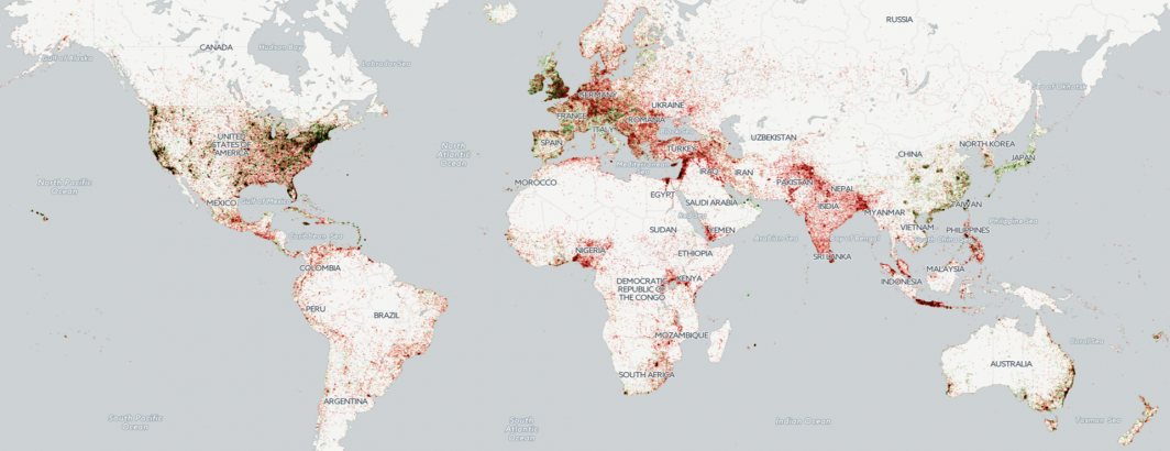
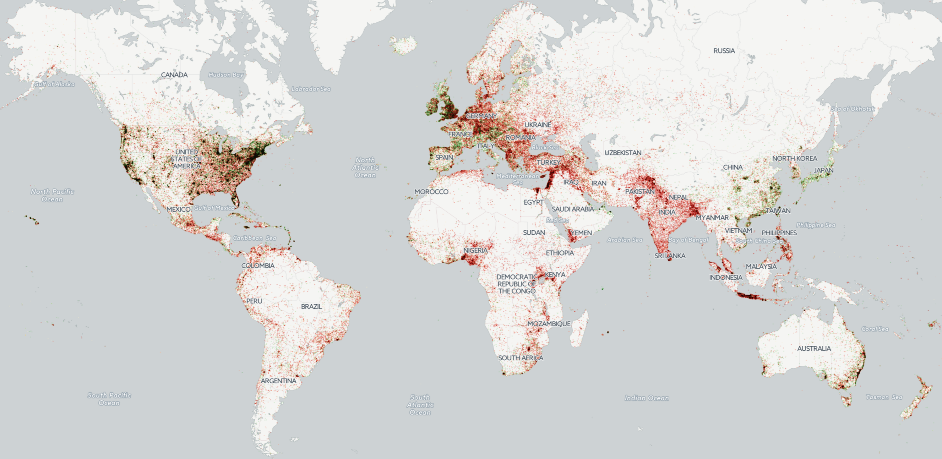
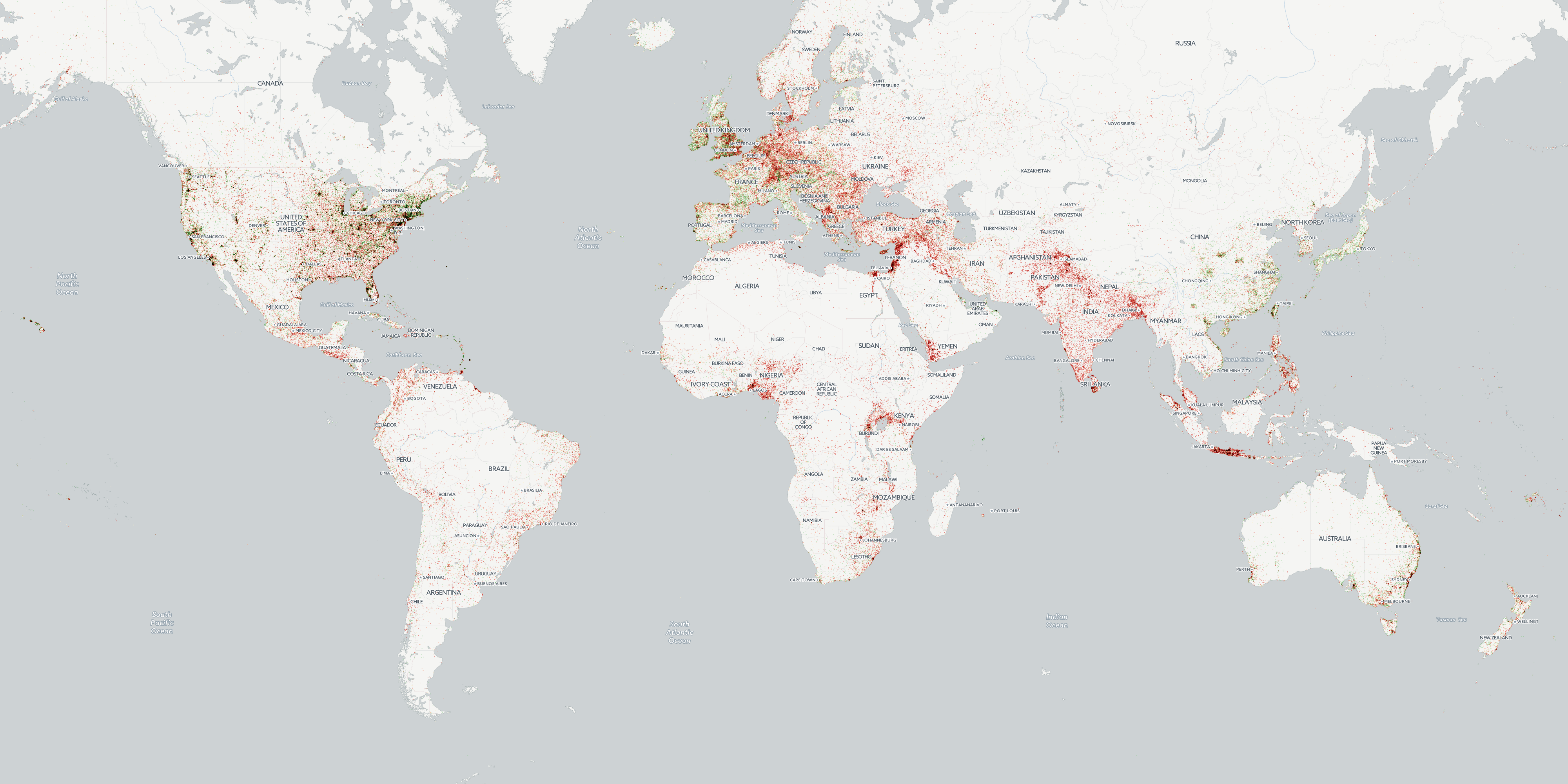
This new map repeats last year's map of global happiness using BigQuery and Carto to map global happiness in 2016 as seen through the eyes of the world's news media. Click on the map below to download the full resolution map or you can download the low resolution version.
TECHNICAL DETAILS
To create the map, we're going to use the GDELT GKG 2.0 dataset "gdeltv2.gkg" available in Google BigQuery, which as of this writing is now at 493 million records and totals 5.08TB.
Run the SQL query below, which, in a single line of SQL, compiles a list all 2.2 billion location mentions across the 267 million articles processed by GDELT in 2016 and computes the average emotion of all mentions of each location, outputing a final emotional histogram. Only locations mentioned one or more times on at least 15 different days during the year are considered, to ensure that a surge of mentions of a location on a single day that never receives future coverage won't skew the results.
select location, REGEXP_REPLACE(location, r',.*', '') locationname, REGEXP_REPLACE(location, r'^.*,', '') locationcountry, featureid, latitude, longitude, avgtone, stddevtone, cnt, numdays from (
select min(location) location, max(latitude) latitude, max(longitude) longitude, featureid, AVG(tone) avgtone, stddev(tone) stddevtone, min(tone) mintone, max(tone) maxtone, count(1) cnt, count(distinct(DATE)) numdays from (
SELECT REGEXP_EXTRACT(SPLIT(V2Locations,';'),r'^[2-5]#(.*?)#') as location,
REGEXP_EXTRACT(SPLIT(V2Locations,';'),r'^[2-5]#.*?#.*?#.*?#.*?#(.*?)#') as latitude,
REGEXP_EXTRACT(SPLIT(V2Locations,';'),r'^[2-5]#.*?#.*?#.*?#.*?#.*?#(.*?)#') as longitude,
REGEXP_EXTRACT(SPLIT(V2Locations,';'),r'^[2-5]#.*?#.*?#.*?#.*?#.*?#.*?#(.*?)#') as featureid,
float(REGEXP_REPLACE(V2Tone, r',.*', "")) tone,
substr(string(DATE), 1, 8) DATE
FROM [gdeltv2.gkg] where DATE >= 20160000000000 and DATE <= 20161231999999
) where featureid is not null group by featureid order by cnt desc
) where numdays > 15
Once the query completes, you should have a file with 192,385 locations. Import this into Carto and use it to create a new map.
Set the SQL for your new map to the following (change "tonemap" to the name of your dataset). This will create a new column called "case" that quantizes the tone field into a set of 5 values that represent a good set of levels based on the response characteristics of the GDELT Core Tone field.
SELECT *, CASE when avgtone <= -1.5 then -2 when avgtone < -0.5 then -1 when avgtone > 0.5 then 1 when avgtone >= 1.5 then 2 else 0 end FROM tonemap
Chose "Choropleth" as the map type and use the green-yellow-red color ramp with 5 buckets and set compositing to "multiply." Carto offers several quantification options, but here we are going to manually specify the thresholds. Once you've configured the map as described above, go to the "CSS" (CartoCSS) tab in your map and change it to the following:
/** choropleth visualization */

#tonemap{
 marker-fill-opacity: 0.6;
 marker-line-color: #FFF;
 marker-line-width: 0;
 marker-line-opacity: 1;
 marker-width: 2;
 marker-fill: #1a9850;
 marker-allow-overlap: true;
 marker-comp-op: multiply;
}
#tonemap [ case = -2] {
 marker-fill: #d73027;
}
#tonemap [ case = -1] {
 marker-fill: #f79272;
}
#tonemap [ case = 0] {
 marker-fill: #fff2cc;
}
#tonemap [ case = 1] {
 marker-fill: #8cce8a;
}
#tonemap [ case = 2] {
 marker-fill: #1a9850;
}
Now click the "Apply style" button at the bottom right of the tab and your map should now be complete!
Happy mapping!