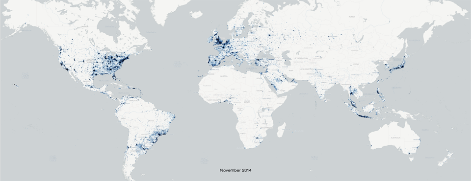
Kalev's latest article, "Who's Doing the Talking on Twitter?", was published in The Atlantic yesterday. The article includes an animated GIF movie showing the geographic footprint of all geotagged tweets in the Twitter Streaming API by month from January 2012 to December 2014, showing the geographic evolution and spread of Twitter over time.
For those looking for a higher-resolution version of the map, you can click on the link below to access the full 4000×2000 pixel animated GIF (around 28MB). This allows you to zoom further into the map to see finer detail on Twitter's spread.
See the Full Resolution Animated GIF.
Read the Full Article.