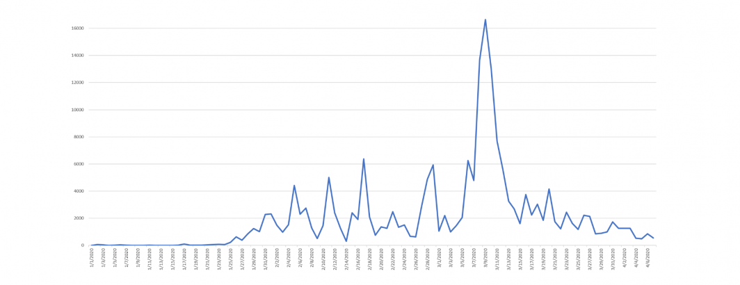
Using our massive new Covid-19 Geographic News Database, its possible with a simple SQL query to visualize geographic timelines. For example, how many times per day were locations in California mentioned in the context of "quarantines" in English language news coverage since the start of this year?
Asking this question requires just a single SQL query:
select DATE(PARSE_TIMESTAMP("%Y%m%d%H%M%S", CAST(DATETIME AS STRING)), "America/Los_Angeles") dday, count(1) Vol, avg(Tone) Tone from (
SELECT DATETIME, REGEXP_EXTRACT(URLSet, r'^(.*?)<FDIV>') URL, NativeTitle, GLocation, GCountryCode, GAdm1Code, Tone, GLat, GLon , GContextualText FROM `[TABLE]` WHERE DATE(_PARTITIONTIME) >= "2020-01-01" and
(LOWER(GContextualText) like '%quarantin%') and GAdm1Code='USCA' and LangCode='eng'
) group by dday order by dday asc
One challenge with the query above, however, is that for early dates in which there were few to no Covid-19 quarantine mentions regarding locations in California, there will be holes in the data for days with no quarantine results.
Instead, using this template from Mikhail Berlyant, we can construct a complete timeline:
WITH your_current_result AS (
select DATE(PARSE_TIMESTAMP("%Y%m%d%H%M%S", CAST(DATETIME AS STRING)), "America/Los_Angeles") dday, count(1) Vol, avg(Tone) Tone from (
SELECT DATETIME, REGEXP_EXTRACT(URLSet, r'^(.*?)<FDIV>') URL, NativeTitle, GLocation, GCountryCode, GAdm1Code, Tone, GLat, GLon , GContextualText FROM `[TABLE]` WHERE DATE(_PARTITIONTIME) >= "2020-01-01" and
(LOWER(GContextualText) like '%quarantin%') and GAdm1Code='USCA' and LangCode='eng'
) group by dday order by dday asc
), days AS (
SELECT day
FROM (
SELECT
MIN(DATE(2020, 1, 1)) min_dt,
MAX(dday) max_dt
FROM your_current_result
), UNNEST(GENERATE_DATE_ARRAY(min_dt, max_dt)) day
)
SELECT day,
LAST_VALUE(Vol IGNORE NULLS) OVER(ORDER BY day) Vol,
LAST_VALUE(Tone IGNORE NULLS) OVER(ORDER BY day) Tone
FROM days
LEFT JOIN your_current_result
ON day = dday
This yields the following graph:
Hopefully this brief example has showcased how you can leverage this incredible new geographic dataset to explore temporal patterns as well!