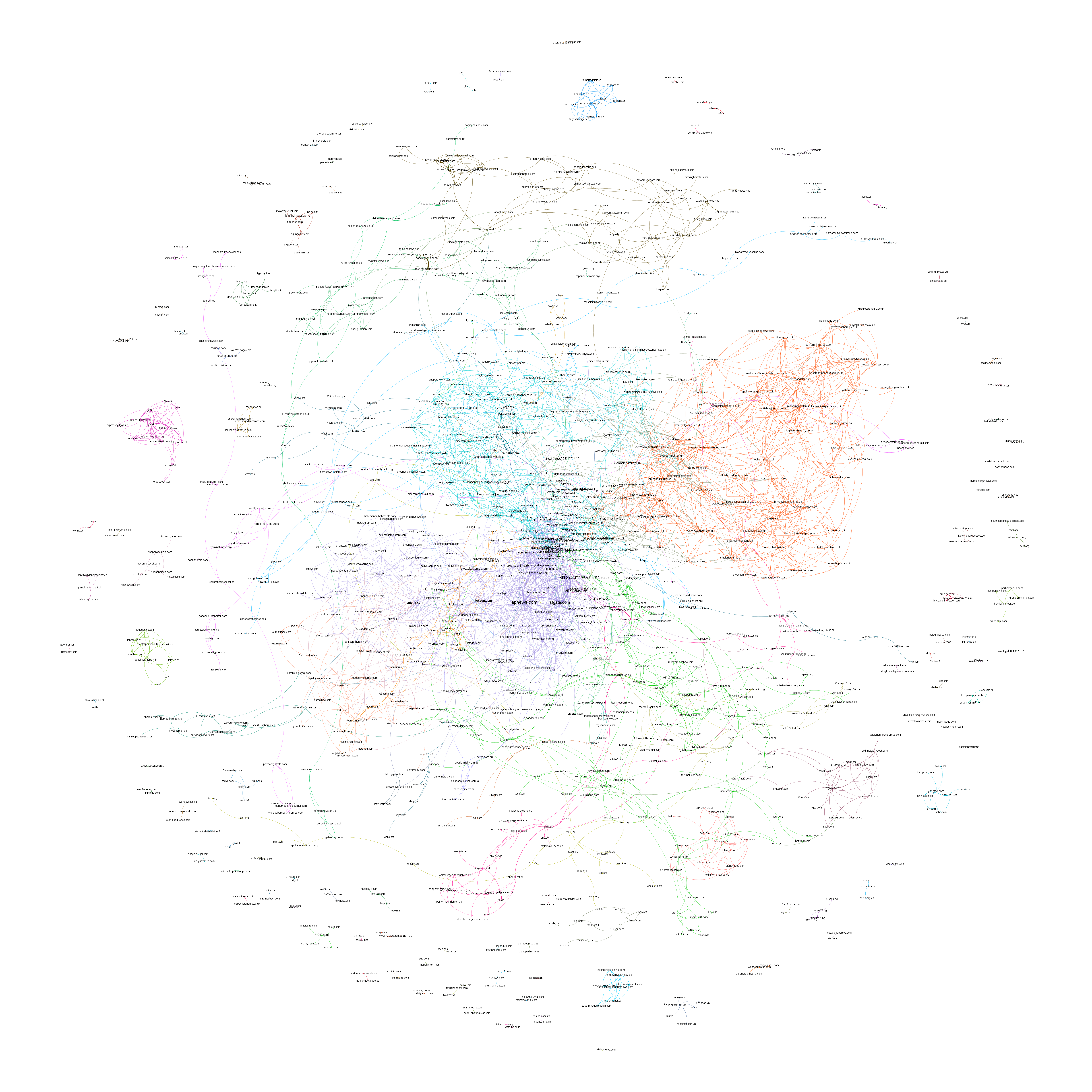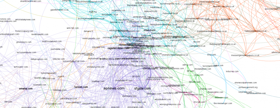
Using the new Global Similarity Graph, what can we learn about which news outlets have the highest overlap of articles with the same titles? Articles that have the exact same title typically represent wire stories, syndicated content and stories shared across the platforms of a common owner, offering clues to the global news distribution network. Using a single SQL query we can visualize this network in Gephi:
select Source, Target, "Undirected" Type, count(1) cnt, ( count(1)/SUM(count(1)) OVER () ) Weight from (
   select IF(fromDomain<toDomain, fromDomain, toDomain) Source, IF(fromDomain<toDomain, toDomain, fromDomain) Target, simScore from (
      SELECT NET.REG_DOMAIN(fromUrl) fromDomain, NET.REG_DOMAIN(toUrl) toDomain, simScore FROM `gdelt-bq.gdeltv2.gsg` WHERE NET.REG_DOMAIN(fromUrl) != NET.REG_DOMAIN(toUrl) and type='title' and DATE(fromDate) = "2021-07-02"
   )
) group by Source, Target having count(1) > 5 order by Weight desc limit 10000
You can see the final graph below. Note that since this is based on just a single day's worth of data it reflects just a momentary snapshot rather than a more holistic look at title overlap. However, even with this extremely limited amount of data, major nodes like apnews.com, reuters.com, msn.com and sfgate.com are all visible as nexus points.